
019matplotlib设置双y轴折线和柱状图
一、
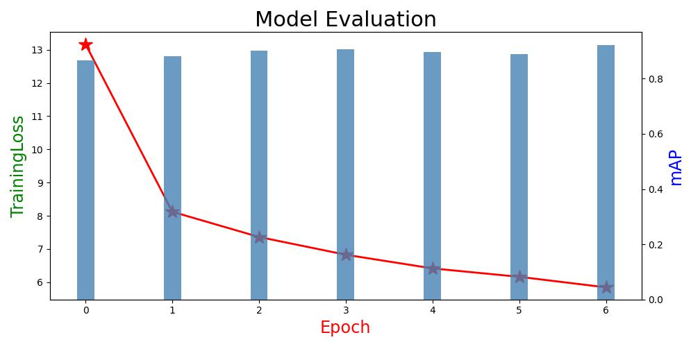
在写论文时需要统计YOLOv3训练的数据集的数据,x轴为Epoch数量,左边Y轴为TrainingLoss,右边Y轴统计mAP值,使用matplotlib实现如下:
# Adding a Y-Axis Label to the Secondary Y-Axis in Matplotlib
# importing the libraries
import numpy as np
import matplotlib.pyplot as plt

# creating data for plot
# data arrangement between 0 and 50
# with the difference of 2
# x-axis
x = np.arange(0, 7, 1)

# y-axis values
# y1 = x ** 2

# secondary y-axis values
# y2 = x ** 3
y1 = [13.1660, 8.1212, 7.3614, 6.8263, 6.4143, 6.1612, 5.8441]
y2 = [0.8662,  0.8821, 0.9005, 0.9078, 0.8962, 0.8889, 0.9225]

# plotting figures by creating aexs object
# using subplots() function
fig, ax = plt.subplots(figsize=(10, 5))
plt.title('Model Evaluation',fontsize=22)

# using the twinx() for creating another
# axes object for secondary y-Axis
ax2 = ax.twinx()
ax.plot(x, y1, color='r',marker='*',ms=15,linewidth=2.0)
# ax2.plot(x, y2, color='b')
ax2.bar(x=x, height=y2, label='mAP', width=0.2, color='steelblue', alpha=0.8)

# giving labels to the axises
ax.set_xlabel('Epoch', color='r',fontsize="xx-large")
ax.set_ylabel('TrainingLoss', color='g',fontsize="xx-large")

# secondary y-axis label
ax2.set_ylabel('mAP', color='b',fontsize="xx-large")

# defining display layout
plt.tight_layout()
plt.savefig("result.jpg")
# show plot
plt.show()
效果图如下所示:
Reference: https://www.geeksforgeeks.org/how-to-add-a-y-axis-label-to-the-secondary-y-axis-in-matplotlib/

 浙公网安备 33010602011771号