


手写ant design vue的longing效果
初衷: ant design vue中的对话框使用spin加载非常鸡肋
实现方式: 主要使用css3的动画
实现结果:
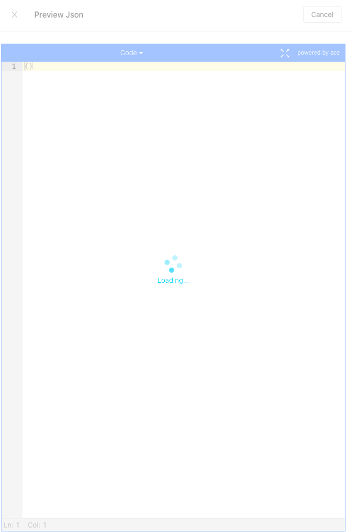
 1         <div class="loading-container" id="myLoadingContainer" v-if="loading">
 2             <span class="loading-span">
 3               <i></i>
 4               <i></i>
 5               <i></i>
 6               <i></i>
 7             </span>
 8             <div class="text-container">
 9                 Loading...
10             </div>
11         </div>
css:
    .loading-container {
        z-index: 999;
        position: absolute;
        left: 50%;
        top: 50%;
        bottom: 0;
        right: 0;
        transform: translate(-50%, -50%);
        display: flex;
        justify-content: center;
        align-items: center;
        flex-direction: column;
        background-color: rgba(255, 255, 255, .5);
        width: 100%;
        height: 100%;
        cursor: pointer;
        font-size: 14px;
        .loading-span {
            position: relative;
            display: inline-block;
            font-size: 32px;
            width: 1em;
            height: 1em;
            transform: rotateZ(45deg);
            transition: transform .3s cubic-bezier(.78, .14, .15, .86);
            animation: Rotate45 1.2s infinite linear;
            :nth-child(1) {
                top: 0;
                left: 0;
            }
            :nth-child(2) {
                top: 0;
                right: 0;
                animation-delay: .4s;
            }
            :nth-child(3) {
                bottom: 0;
                right: 0;
                animation-delay: .8s;
            }
            :nth-child(4) {
                left: 0;
                bottom: 0;
                animation-delay: 1.2s;
            }
        }
        .loading-span>i {
            height: 14px;
            width: 14px;
            background-color: #00D8FF;
            display: block;
            position: absolute;
            border-radius: 100%;
            transform: scale(.75);
            transform-origin: 50% 50%;
            opacity: .3;
            animation: myAnimationMove 1s infinite linear alternate;
        }
    }

    .loading-container>.text-container {
        padding-top: 5px;
        text-shadow: 0 1px 2px #fff;
        color: #00D8FF;
        font-variant: tabular-nums;
        font-feature-settings: 'tnum';
        font-size: 14px;
    }

    @keyframes Rotate45 {
        to {
            transform: rotate(405deg);
        }
    }

    @keyframes myAnimationMove {
        to {
            opacity: 1;
        }
    }
