vant4组件源码——Button
基于VUE3+TS的vant组件研究,主要分析一下Button组件
一、组件结构
|-src                                   #主要文件路径
  |-button                              #公共组件
    |-demo							    #组件示例
      |-index.vue
    |-Button.tsx      				    #组件封装
    |-index.less						#组件样式
    |-index.ts                          #组件声明注册
    |-types.ts                          #组件传参定义和类型约束
  |-utils                               #工具类
    |-basic.ts                          #基础工具
    |-constant.ts                       #常量声明
    |-create.ts                         #类名生成
    |-dom.ts                            #事件工具
    |-format.ts                         #格式化工具
    |-index.ts                          #工具汇总声明
    |-props.ts                          #类型辅助工具
    |-with-install.ts                   #组件注册工具
  /* ... */
二、实现一个简单的按钮组件
1.Button.tsx 中封装组件
import { defineComponent } from "vue";
import './index.less'
// 定义组件的传参
export const buttonProps =  {
    type: 'primary' | 'dashed' | 'link'
}
const Button = defineComponent({
    props: buttonProps,
    setup(props, { slots }) {
        const { type } = props // 依据传参修改className
        return () => (
            <button class={`van-button van-button--${props.type}`}>
                {slots.default()/* 组件文本展示 */}
            </button>
        )
    }
})
export default Button
2.index.less,实现简单的样式
.van-button {
    &--primary{
        color: #fff;
        background: #1989fa;
        border: 0;
        padding: 10px;
        border-radius: 4px;
    }
}
3.App.vue中使用
<script setup lang="ts">
import Button from './components/button/Button'
</script>
<template>
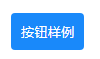
<Button type="primary">按钮</Button>
</template>
4.效果
三、代码解析
1.button组件
(1) Button.tsx,组件封装
import { defineComponent, type PropType, type CSSProperties,type ExtractPropTypes } from "vue";
import './index.less'
import { ButtonType,ButtonSize,ButtonNativeType,ButtonIconPosition,LoadingType } from './types'
import { extend,makeStringProp,numericProp,preventDefault,createNamespace,BORDER_SURROUND } from '../utils'
import { routeProps, useRoute } from "@/components/composables/use-route";
const [name, bem] = createNamespace('button')
// 导出参数类型
export type ButtonProps = ExtractPropTypes<typeof buttonProps>;
// 按钮传参值定义
export const buttonProps = extend({}, routeProps, {
    tag: makeStringProp<keyof HTMLElementTagNameMap>('button'), // 按钮根节点的 HTML 标签
    text: String,
    icon: String,
    type: makeStringProp<ButtonType>('default'),
    size: makeStringProp<ButtonSize>('normal'),
    color: String,
    block: Boolean,
    plain: Boolean,
    round: Boolean,
    square: Boolean,
    loading: Boolean,
    hairline: Boolean,
    disabled: Boolean,
    iconPrefix: String,
    nativeType: makeStringProp<ButtonNativeType>('button'),
    loadingSize: numericProp,
    loadingText: String,
    loadingType: String as PropType<LoadingType>,// 指定加载类型为定义的string传参值
    iconPosition: makeStringProp<ButtonIconPosition>('left')
}
// Button组件渲染
export default defineComponent({
    name, // 组件名称
    props: buttonProps, // 传参
    emits: ['click'], // 重写click事件,将click事件作为组件的自定义事件
    // setup函数包含两个参数,实例props、context上下文对象,从context中解构出emit事件和slots插槽
    setup(props, { emit, slots }) {
        const route = useRoute() // 创建路由对象
        // 1.渲染加载图标
        const renderLoadingIcon = () => {
            // 如果插槽中存在名为loading的插槽,则返回slots.loading()
            if (slots.loading) {
                return slots.loading()
            }
            // 否则返回固定的结构
            return (
                <span>加载中...</span>
            )
        }
        // 2.渲染图标
        const renderIcon = () => {
            // 传参loading为true时渲染加载图标
            if (props.loading) {
                return renderLoadingIcon()
            }
            // 如果存在名为icon的插槽,则返回slots.icon()
            if (slots.icon) {
                return <div class={bem('icon')}>{ slots.icon() }</div>
            }
            // 传送了icon则展示
            if (props.icon) {
                return (
                    <span class={bem('icon')}>图标:{ props.icon }</span>
                )
            }
        }
        // 3.渲染文字
        const renderText = () => {
            let text;
            // 加载状态,则展示loadingText的文字
            if (props.loading) {
                text = props.loadingText;
            } else {
            // 如果存在默认插槽则展示插槽内容,否则展示text的文字
                text = slots.default ? slots.default() : props.text;
            }

            if (text) {
                return <span  class={bem('text')}>{text}</span>
            }
        }
        // 4.自定义样式处理
        const getStyle = () => {
            const { color, plain } = props;
            if (color) {
                const style: CSSProperties = {
                    color: plain ? color : 'white'
                }
                // 非朴素按钮自定义颜色生效
                if (!plain) {
                  // 用background代替backgroundColor使得linear-gradient能够生效
                  style.background = color;
                }

                if (color.includes('gradient')) {
                    style.border = 0;// 渐变色删除边框
                } else {
                    style.borderColor = color;
                }

                return color
            }
        }
        // 5.绑定监听事件
        const onClick = (event: MouseEvent) => {
            if (props.loading) {
                preventDefault(event); // 阻止默认点击行为
            } else if (!props.disabled) {
                emit('click', event); // 调用父组件的方法
                route()
            }
        }

        return () => {
            // 解构传参
            const { tag, type, size, block, round, plain, square, loading, disabled, hairline, nativeType, iconPosition } = props;
            // 依据传参生成css类名
            const classes = [
                bem([type, size, { plain, block, round, square, loading, disabled, hairline }]),
                { [BORDER_SURROUND]: hairline}
            ]
            // 返回button组件的虚拟DOM结构,tag已经在buttonProps中声明为button标签
            return (
                <tag
                    type={nativeType}
                    class={classes}
                    style={getStyle()}
                    disabled={disabled}
                    onClick={onClick}
                >
                    <div class={bem('content')}>
                        {iconPosition === 'left' && renderIcon() /* 渲染左图标 */}
                        {renderText() /* 渲染文字 */}
                        {iconPosition === 'right' && renderIcon() /* 渲染右图标 */}
                    </div>
                </tag>
            )
        }
    }
})
(2) index.ts,组件声明注册
import { withInstall } from '../utils'
import _Button from './Button'

// 为组件选项对象挂载Install方法
export const Button = withInstall(_Button);
// 导出组件选项
export default Button;
// 导出组件props
export { buttonProps } from './Button'
// 导出Props类型
export type { ButtonProps } from './Button'

export type {
    ButtonType,
    ButtonSize,
    ButtonThemeVars,
    ButtonNativeType,
    ButtonIconPosition,
} from './types'; // 导出其他类型限定

// 声明模块
declare module 'vue' {
    // 全局注册组件
    export interface GlobalComponents {
        VanButton: typeof Button
    }
}
(3) types.ts,联合类型
// 传参联合类型定义汇总
// 类型
export type ButtonType = 'default' | 'primary' | 'success' | 'warning' | 'danger'
// 尺寸
export type ButtonSize = 'large' | 'normal' | 'small' | 'mini'
// 原生 button 标签的 type 属性
export type ButtonNativeType = NonNullable<ButtonHTMLAttributes['type']>;
// 加载类型
export type LoadingType = 'circular' | 'spinner';

/* ... */
2.utils
(1) basic.ts,基础工具
export const extend = Object.assign; // 合并两个对象的属性
(2) constant.ts,常量声明
export const BORDER = 'van-hairline';
export const BORDER_SURROUND = `${BORDER}--surround`;
(3) create.ts,类名生成
export type Mod = string | { [key: string]: any } // 字符串或者对象(对象的key值为string)
export type Mods = Mod | Mod[] // 字符串、对象、字符串数组或者对象数组
// --className的拼接,返回值为string
function genBem(name: string, mods?: Mods): string {
    if (!mods) {
        return '';
    }
    // 单字符串,返回如下拼接的className
    if (typeof mods === 'string') {
        return ` ${name}--${mods}`;
    }
    // 数组,拼接数组中的所有元素
    if (Array.isArray(mods)) {
        return (mods as Mod[]).reduce<string>(
            (ret, item) => ret + genBem(name, item),
            ''
        )
    }
    // 对象,拼接对象的所有key值
    return Object.keys(mods).reduce(
        (ret, key) => ret + (mods[key] ? genBem(name, key) : ''),
        ''
    )
}
/**
 * bem helper
 * b() // 'button'
 * b('text') // 'button__text'
 * b({ disabled }) // 'button button--disabled'
 * b('text', { disabled }) // 'button__text button__text--disabled'
 * b(['disabled', 'primary']) // 'button button--disabled button--primary'
 */
export function createBEM(name: string) {
    return (el?: Mods, mods?: Mods): Mods => {
        if (el && typeof el !== 'string') {
            mods = el;
            el = ''
        }
        el = el ? `${name}__${el}` : name;

        return `${el}${genBem(el, mods)}`
    }
}
// 组件元素名
export function createNamespace(name: string) {
    const prefixedName = `van-${name}`
    return [
        prefixedName,
        createBEM(prefixedName)
    ] as const
}
(4) dom.ts,事件工具
export const stopPropagation = (event: Event) => event.stopPropagation() // 阻止捕获和冒泡阶段中当前事件的进一步传播

export function preventDefault(event: Event, isStopPropagation?: boolean) {
    if (typeof event.cancelable !== 'boolean' || event.cancelable) {
        event.preventDefault(); // 阻止事件的默认动作
    }

    if (isStopPropagation) {
        stopPropagation(event);
    }
}
(5) format.ts,格式化工具
// 驼峰式命名规则转换,camelise('hello-world') => helloWorld
const camelizeRE = /-(\w)/g
export const camelize = (str: string): string => str.replace(camelizeRE, (_, c) => c.toUpperCase());
(6) props.ts,类型辅助工具
/**
 * 道具类型辅助对象
 * 帮助我们编写更少的代码并减少捆绑包大小
 */
import type { PropType } from 'vue'

// 数字和字符串类型
export const numericProp = [Number, String]
// 返回传参的类型和默认值
export const makeStringProp = <T>(defaultVal: T) => ({
    type: String as unknown as PropType<T>,
    default: defaultVal
})
(7) with-install.ts,组件注册工具
import { camelize /* 驼峰命名 */ } from "./format";
import type { App, Component } from 'vue'
// 事件类型
type EventShim = {
    new(...args: any[]): {
        $props: {
            onClick?: (...args: any[]) => void
        }
    }
}
// 泛型、App和事件的联合类型
export type WithInstall<T> = T & { install(app: App): void; } & EventShim

export function withInstall<T extends Component>(options: T) {
    (options as Record<string, unknown>).install = (app: App) => {
        const { name } = options;
        if (name) {
            app.component(name, options); // 注册组件
            app.component(camelize(`-${name}`), options); // 注册驼峰名称的组件
        }
    }
    return options as WithInstall<T>
}
VUE3语法
-
getCurrentInstance用来获取当前组件实例,类似vue2的this,使用其中的proxy对象 -
PropType获得类型的推断提示和自动补全;属性校验 -
ExtractPropTypes提取props的类型 -
ComponentPublicInstance获取上下文 -
ComponentCustomProperties组件公共实例 -
RouteLocationRaw要导航到的路由地址 -
ButtonHTMLAttributes原生 button 元素属性集合 -
CSSProperties用于增加样式属性绑定中的允许值
TS语法
<T>泛型
function getArr<T>:函数泛型,只有在传递时才知道
cont:T:内容值泛型
function getArr<T>(cont:T, len:number):T[]{}:返回数组泛型
const arr:Array<T> = []和const arr:T[] = []:声明一个数组泛型,必须给一个初始值
const arr1 = getArr<number>(11.1,3):传递的类型是数字
-
keyof类似js的Object.keys(),但是会把取到的键值类型组成联合类型- 获取对象所有属性类型
- 参考链接
  type Object = {
	key1: string,
	key2: number
  }
  type obj = Object[keyof Object] // 相当于 Object['key1' | 'key2'] => Object['key1'] | Object['key2'] => 'string' | 'number'
HTMLElementTagNameMap一个标签到具体元素的映射,querySelector方法的返回值是HTMLElementTagNameMap[K],querySelectorAll返回的是NodeListOf<HTMLElementTagNameMap[K]>
interface HTMLElementTagNameMap {
	"a": HTMLAnchorElement;
    "body": HTMLBodyElement;
    "br": HTMLBRElement;
    "button": HTMLButtonElement;
    "div": HTMLDivElement;
    "h1": HTMLHeadingElement;
    "hr": HTMLHRElement;
    "html": HTMLHtmlElement;
    "img": HTMLImageElement;
    "input": HTMLInputElement;
    "li": HTMLLIElement;
    "p": HTMLParagraphElement;
    "span": HTMLSpanElement;
    "strong": HTMLElement;
    "style": HTMLStyleElement;
    "table": HTMLTableElement;
    "ul": HTMLUListElement;
	// ...
}
NonNullable删除null和`undefinedas关键字用于进行类型断言,允许开发人员显式地指定一个值的类型- 类型断言,可以将一个类型强制转换成另一个类型,如:
let valNumber: number = 10;
let valString: string = valNumber as string
- 缩小类型范围
let valVariable: any = 'antguo';
let valLength: number = (myVariable as string).length; // 编译器确定为字符串类型可以调用length
- 解决类型推断问题,指定firstElement的类型为数字,而不是默认的联合类型:number | undefined
let valArray = [1,2,3];
let firstElement = valArray[0] as number
Record<Keys, Type>
type Mod = { [key: string]: any } // 索引签名,用于具有未知字符串键和特定值的对象类型
等同于
type Mod = Record<string, any>
使用Record更简明,适用于枚举的keys
Component组件类型化,给实例注入props,component等属性declare module
JS语法
Array.isArray(obj)确定对象是否为数组,是返回true,否返回false[...].reduce(function(total,currentValue,index,arr),initialValue)方法,传参为一个回调函数和一个传递给函数的初始值
| 参数 | 描述 |
|---|---|
| function() | 必需,用于执行每个数组元素的函数 |
| total | 必需,初始值,或者计算结束后的返回值 |
| currentValue | 必需,当前元素,没有初始值则从第二个元素开始 |
| currentIndex | 可选,当前元素的索引 |
| arr | 可选,当前元素所属的数组对象 |
| initialValue | 可选,传递给函数的初始值,没有则默认数组元素的第一个值 |
??空值合并操作符,左侧为null或者undefined时才返回右侧值
问题记录
1.Cannot use JSX unless the '--jsx' flag is provided.
解决:在tsconfig.json中添加"jsx": "preserve"
