R语言6章
library(vcd)
counts<-table(Arthritis$Improved)
简单条形图
barplot(counts,main="Simple Bar Plot",xlab="Improvement",ylab="Frequency")
堆积条形图分组条形图
library(vcd)
counts<-table(Arthritis$Improved,Arthritis$Treatment)
barplot(counts,main="Stacked Bar Plot",xlab="Treatment",ylab="Frequency",col=c("red","yellow","green"),legend=rownames(counts))
barplot(counts,main="Grouped Bar Plot",xlab="Treatment",ylab="Frequency",col=c("red","yellow","green"),legend=rownames(counts),beside=TRUE)
均值条形图
states<-data.frame(state.region,state.x77)
means<-aggregate(states$Illiteracy,by=list(state.region),FUN=mean)
means<-means[order(means$x),]
barplot(means$x,names.arg=means$Group.1)
title("Mean illiteracy Rate")
条形图的微调
par(mar=c(5,8,4,2))
par(las=2)
counts<-table(Arthritis$Improved)
barplot(counts,main="Treatment Ountcome",horiz=TRUE,cex.names=0.8,names.arg=c("No Improvement","Some Improvement","Marked Improvement"))
棘状图
library(vcd)
attach(Arthritis)
counts<-table(Treatment,Improved)
spine(counts,main="Spinogram Example")
detach(Arthritis)
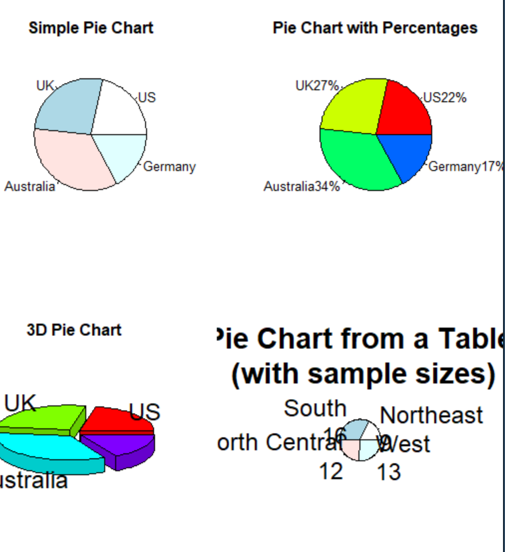
饼图
par(mfrow=c(2,2))
slices<-c(10,12.4,16,8)
lbls<-c("US","UK","Australia","Germany","France")
pie(slices,labels=lbls,main="Simple Pie Chart")
pct<-round(slices/sum(slices)*100)
lbls2<-paste(lbls,"",pct,"%",sep="")
pie(slices,label=lbls2,col=rainbow(length(lbls2)),
main="Pie Chart with Percentages")
library(plottrix)
pie3D(slices,labels=lbls,explode=0.1,main="3D Pie Chart")
mytable<-table(state.region)
lbls3<-paste(names(mytable),"\n",mytable,sep="")
pie(mytable,labels=lbls3,main="Pie Chart from a Table\n (with sample sizes)")
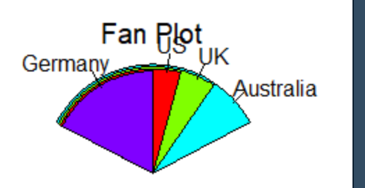
install.packages("plotrix")
library(plotrix)
slices<-c(10,12.4,16,8)
lbls<-c("US","UK","Australia","Germany","France")
fan.plot(slices,labels=lbls,main="Fan Plot")
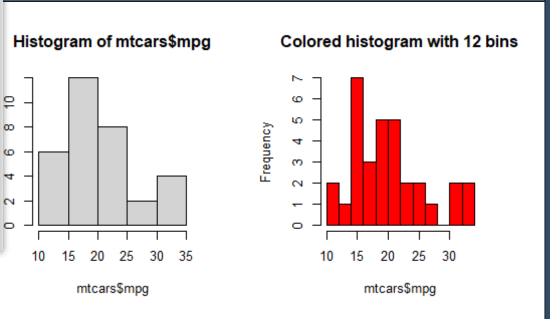
直方图
par(mfrow=c(2,2))
hist(mtcars$mpg)
#指定 组数和颜色
hist(mtcars$mpg,breaks=12,col="red",xlabs="Miles Per Gallon",main="Colored histogram with 12 bins")
par(mfrow=c(2,2))
hist(mtcars$mpg)
hist(mtcars$mpg,breaks=12,col="red",xlabs="Miles Per Gallon",main="Colored histogram with 12 bins")
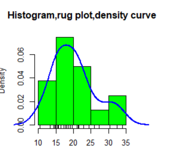
#添加轴须图
hist(mtcars$mpg,freq=FALSE,breakks=12,col="green",xlab="Miles Per Gallon",main="Histogram,rug plot,density curve")
rug(jitter(mtcars$mpg))
lines(density(mtcars$mpg),col="blue",lwd=2)
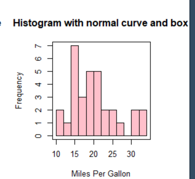
#添加正密度曲线和外框
x<-mtcars$mpg
h<-hist(x,breaks=12,col="pink",xlab="Miles Per Gallon",main="Histogram with normal curve and box")
xfit<-seq(min(x),max(x),length-40)
yfit<-yfit*diff(h$mids[1:2])*length(x)
lines(xfit,yfit,col="blue",lwd=2)
box()
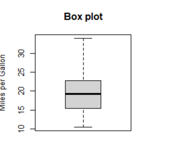
箱线图
boxplot(mtcars$mpg,main="Box plot",ylab="Miles per Gallon")
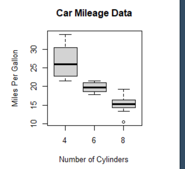
#使用并列箱线图进行跨组比较
boxplot(mpg~cyl,data=mtcars,main="Car Mileage Data",xlab="Number of Cylinders",ylab="Miles Per Gallon")
点图
dotchart(mtcars$mpg,labels=row.names(mtcars),cex=0.7,main="Gas Mileage for Car Models",xlabs="Miles Per Gallon")

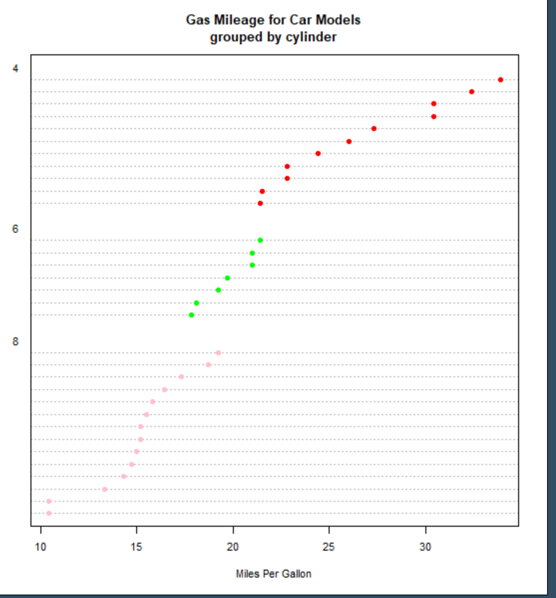
#分组、排序、着色后的点图
x<-mtcars[order(mtcars$mpg),]
x$cyl<-factor(x$cyl)
x$color[x$cyl==4]<-"red"
x$color[x$cyl==6]<-"green"
x$color[x$cyl==8]<-"pink"
dotchart(x$mpg,
lables=row.names(x),
cex=0.7,
groups=x$cyl,
gcolor="black",
color=x$color,
pch=19,
main="Gas Mileage for Car Models\ngrouped by cylinder",xlab="Miles Per Gallon")

 浙公网安备 33010602011771号