Step 1
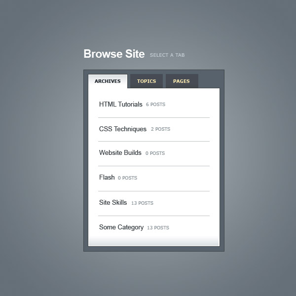
First things first, we need something that looks awesome. So a quick trip to Photoshop and voila we have a nice mockup of what our tabbed component should look like. It’s pretty straight forward with a few extra gradients to make it nettuts awesome. You can grab the Photoshop PSD file for this image if you want to take a closer look, but it’s pretty simple and we can build it off the flat JPG really.
Step 2
The first thing to do when building of course is to get a rough idea how you are going to do it. This gets easier the more things you’ve developed. Looking at this image I would say the best thing to do is:
- Have a container <div> which we’ll place everything inside of. That way if we needed to position our box or drop it into a sidebar, we can just grab everything wrapped in the <div> and copy+paste it somewhere.
- Then we’ll have the heading area, probably with a <h> tag
- Then below that we’ll have a second <div> tag which will hold the tabs and content. This is the dark grey box in the image.
- Then inside there we’ll use an unordered list <ul> where each element is a link for the tabs. This will let us use the <li> bits of the list to position the tabs and the <a> bits to style them and give them rollovers and on/off states.
- Then below that we’ll create a final <div> area which has the content for each tab. We’ll need one of these for each tab, and we’ll show or hide them depending on which tab has been clicked.
SO to summarize, it’ll be something like this:
- <div>
- <h4>Heading</h4>
- <div>
- <ul>
- <li><A>Tab</A></li>
- <li><A>Tab</A></li>
- <li><A>Tab</A></li>
- </ul>
- <div>Content for Tab 1</div>
- <div>Content for Tab 2</div>
- <div>Content for Tab 3</div>
- </div>
- </div>
<div>
	<h4>Heading</h4>
    <div>

        <ul>
            <li>Tab</li>
            <li>Tab</li>
            <li>Tab</li>
        </ul>

        <div>Content for Tab 1</div>
        <div>Content for Tab 2</div>
        <div>Content for Tab 3</div>

    </div>

</div>
Don’t worry if looking at that image doesn’t immediately make you think of that structure. Sometimes you just need to do things by trial and error. In my case I’ve made these little tabbed things a few times and I know that this is a nice simple way of making them.
Also it’s nice to think about the structure like this before you have lots of class names and ids and content because it can get hard to see the forest from the trees later on. Especially when you add the content for all the different tabs.
So now that we have a picture in mind of how to build our structure, let’s get to it!
Step 3
Now if you’ve followed my tutorials on PSDTUTS you’ll know that I love a good gradient background. So before we even start with the tabbed structure, let’s get ourselves a nice background!
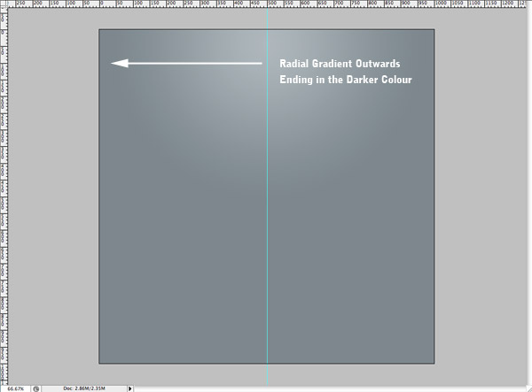
Open up Photoshop, create a 1000px x 1000px document and draw a nice (subtle) radial gradient like the one shown below. Note that I’ve drawn out from the centre/top and made sure that the gradient is finished by the time I get to the edge of the document. That means I can set the background color in HTML to be the darker colour and if someone stretches their browser window it’ll be seamless.
Step 4
So create a new directory for the project, then create a second directory inside there called images and save that image inside as background.jpg. When saving use File > Save for Web and Devices and select JPG with a quality setting of about 70. That comes out to a file size of 16kb which is not too bad. There used to be a time where you really had to scrimp and save, but now you just want to make sure you’re not being stupidly wasteful with your file sizes.
Now we create a HTML document and write in some code:
- <!DOCTYPE html PUBLIC "-//W3C//DTD XHTML 1.0 Strict//EN"
- "http://www.w3.org/TR/xhtml1/DTD/xhtml1-strict.dtd">
- <html xmlns="http://www.w3.org/1999/xhtml" xml:lang="en" lang="en">
- <head>
- <title>Tabbed Structure - Regular</title>
- <link rel="stylesheet" href="style.css" type="text/css" media="screen" />
- </head>
- <body>
- </body>
- </html>
<!DOCTYPE html PUBLIC "-//W3C//DTD XHTML 1.0 Strict//EN"
 "http://www.w3.org/TR/xhtml1/DTD/xhtml1-strict.dtd">
<html xmlns="http://www.w3.org/1999/xhtml" xml:lang="en" lang="en">
<head>
	<title>Tabbed Structure - Regular</title>
	<link rel="stylesheet" href="style.css" type="text/css" media="screen" />
</head>

<body>
</body>
</html>
So that will be the base of our HTML. Now we’ll create the style.css document and write in the following:
- body {
- background-image:url(images/background.jpg);
- background-repeat:no-repeat;
- background-position:top center;
- background-color:#657077;
- margin:40px;
- }
body {
	background-image:url(images/background.jpg);
	background-repeat:no-repeat;
	background-position:top center;
	background-color:#657077;
	margin:40px;
}
A couple of things to note here:
- It’s possible to write this same CSS using shorthand and reduce the number of lines used, but it’s much clearer this way and better for tutorial writing!
- We have a background image (the gradient) and we’ve set it to no-repeat, because we only want it to appear once, it’s centered and finally the background color (#657077) is the darker colour.
- I’ve added a margin of 40px. This is just for positioning my stuff later on so that it looks nice.
You can see the resulting HTML document here. Note that if you resize your window it’s a nice seamless graduated background. Wunderbar!
Step 5
Next we add our structure to the page so that we can begin styling it.
- <!DOCTYPE html PUBLIC "-//W3C//DTD XHTML 1.0 Strict//EN"
- "http://www.w3.org/TR/xhtml1/DTD/xhtml1-strict.dtd">
- <html xmlns="http://www.w3.org/1999/xhtml" xml:lang="en" lang="en">
- <head>
- <title>Tabbed Structure - Regular</title>
- <link rel="stylesheet" href="style.css" type="text/css" media="screen" />
- </head>
- <body>
- <div id="tabbed_box_1" class="tabbed_box">
- <h4>Browse Site <small>Select a Tab</small></h4>
- <div class="tabbed_area">
- <ul class="tabs">
- <li><a href="" id="tab_1" class="active">Archives</a></li>
- <li><a href="" id="tab_2">Topics</a></li>
- <li><a href="" id="tab_3">Pages</a></li>
- </ul>
- <div id="content_1" class="content">Content for Tab 1</div>
- <div id="content_2" class="content">Content for Tab 2</div>
- <div id="content_3" class="content">Content for Tab 3</div>
- </div>
- </div>
- </body>
- </html>
<!DOCTYPE html PUBLIC "-//W3C//DTD XHTML 1.0 Strict//EN"
 "http://www.w3.org/TR/xhtml1/DTD/xhtml1-strict.dtd">
<html xmlns="http://www.w3.org/1999/xhtml" xml:lang="en" lang="en">
<head>
	<title>Tabbed Structure - Regular</title>
	<link rel="stylesheet" href="style.css" type="text/css" media="screen" />
</head>

<body>

<div id="tabbed_box_1" class="tabbed_box">
	<h4>Browse Site <small>Select a Tab</small></h4>
    <div class="tabbed_area">

        <ul class="tabs">
            <li><a href="" id="tab_1" class="active">Archives</a></li>
            <li><a href="" id="tab_2">Topics</a></li>
            <li><a href="" id="tab_3">Pages</a></li>
        </ul>

        <div id="content_1" class="content">Content for Tab 1</div>
        <div id="content_2" class="content">Content for Tab 2</div>
        <div id="content_3" class="content">Content for Tab 3</div>

    </div>

</div>

</body>
</html>
So as you can see I’ve basically used the same structure I mentioned in Step 2. I’ve added some ids and classes and some actual content. Here’s the reasoning behind what I’ve done:
- For the heading, I’ve placed the subtext "Select a Tab" in a <small> element. This lets me use the <h4> element for overall positioning and the <small> element to restyle and position the subtext.
- The container <div> has an id="tabbed_box_1" and a class="tabbed_box". I’ve done this because we might reuse this code multiple times on the same page. If we did that we could use the id’s to position each one in different places. But we’d still have the class to do the styling. Whereas if we’d use the id for styling, we’d end up having to define the same styles again and again for different id’s.
- I’ve given the links and content areas id’s because we need to use Javascript to manipulate them later.
- Finally I’ve given the <ul> element a class name. Actually we could style it without a class just by styling
.tabbed_area ul { }but this could get confused with future <ul>’s we put inside the content area. So it’s better for it to have a class name for us to refer to.
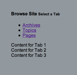
OK so without styles it doesn’t really look like much…. yet!
Step 6
Now with styling up elements, I think it’s best to work from the outside element in. So we’ll start with this element – <div id=”tabbed_box” class=”container”> – which we’ll use to position the box nicely in the center of our document using this code:
- #tabbed_box {
- margin: 0px auto 0px auto;
- width:300px;
- }
#tabbed_box {
	margin: 0px auto 0px auto;
	width:300px;
}
Step 7
Now we’ll do the heading area. We can style the heading like this:
- .tabbed_box h4 {
- font-family:Arial, Helvetica, sans-serif;
- font-size:23px;
- color:#ffffff;
- letter-spacing:-1px;
- margin-bottom:10px;
- }
- .tabbed_box h4 small {
- color:#e3e9ec;
- font-weight:normal;
- font-size:9px;
- font-family:Verdana, Arial, Helvetica, sans-serif;
- text-transform:uppercase;
- position:relative;
- top:-4px;
- left:6px;
- letter-spacing:0px;
- }
.tabbed_box h4 {
	font-family:Arial, Helvetica, sans-serif;
	font-size:23px;
	color:#ffffff;
	letter-spacing:-1px;
	margin-bottom:10px;
}
.tabbed_box h4 small {
	color:#e3e9ec;
	font-weight:normal;
	font-size:9px;
	font-family:Verdana, Arial, Helvetica, sans-serif;
	text-transform:uppercase;
	position:relative;
	top:-4px;
	left:6px;
	letter-spacing:0px;
}
A few things to note here:
- Instead of just defining styles for h4, I’ve defined for .tabbed_box h4. This is important in a larger HTML document because you might have another h4 style somewhere else. So you want to make sure you don’t overlap or cause future overlap problems.
- You’ll notice I’ve also adjusted the bottom margin on the h4 to 10px. This is so that the spacing looks right. It’s important to know that many elements have default values. For example a h4 already has a bottom margin, and it’s larger than we’d want. So if we didn’t set this ourselves it would appear with a larger margin. Some people use special stylesheets that reset all these default values, but I’ve gotten used to resetting them individually when I need to.
- You’ll see that I’ve also used the text-transform attribute to make the small text all capitals. We could of course have just written it in caps, but I just like doing it this way!
- Also you’ll notice in the small definition, I’ve given it a position:relative definition, this is so that I can adjust where it appears, moving it up 4px to the top and 6px to the right.
- Finally when styling the h4 element I gave it a negative letter spacing, but that means the small element gets the same negative letter spacing too which we don’t want. So I have to define it again as 0px there. This is thanks to the fact that styles cascade down – hence the name Cascading Style Sheets. Often times you’ll notice something looks weird on your page and it will be because the element has inherited some style you totally forgot about. When I first did this bit of styling I stared at the small bit for ages trying to figure out why it looked so bunched up, until I remembered!
Step 8
Next we’ll give our inner <div> a bit of styling with this code:
- .tabbed_area {
- border:1px solid #494e52;
- background-color:#636d76;
- padding:8px;
- }
.tabbed_area {
	border:1px solid #494e52;
	background-color:#636d76;
	padding:8px;
}
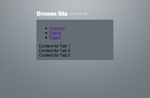
This just gives it a bit of definition and spaces the interior elements away from the sides. You can see where we’re up to in the image below.
By working from the outside in, we’ve given our element a bit of shape and it’s a lot easier to see how it’s going to wind up looking. Also often you will have constraints coming from the outside in, for example the box might need to fit into a column of certain width. Finally it’s also a good idea to go outside in, because then any style inheritance is clear. For example if you went the other way and did the interior elements first, later styles might affect those interior elements and you’d need to go back and readjust anyway.
Step 9
Now we get to the good stuff – the tabs! If we add this little piece of CSS we’ll go a long way to making the tabs look more like tabs:
- ul.tabs {
- margin:0px; padding:0px;
- }
- ul.tabs li {
- list-style:none;
- display:inline;
- }
ul.tabs {
	margin:0px; padding:0px;
}
ul.tabs li {
	list-style:none;
	display:inline;
}
This code says that the <ul> element with class ‘tabs’ should have no margins and no padding. It also says that all the <li> elements within should have no bullet points attached to them. Finally we change the display from the default ‘block’ to ‘inline’. Let me explain that last bit in a bit more detail.
- Elements on a page generally have three common values for ‘display’. They are block, inline, or none.
- Setting an element to none makes it invisible. We’ll use that fact later on.
- Setting an element to inline make it flow along with other elements the way text does. So here instead of appearing below each other, the <li> elements flow along horizontally.
- Setting an element to block makes it a rectangular area that appears generally below the last element.
- That’s a really simplified explanation, you can get a longer one over at Web Design From Scratch
There are actually other display values which you can read about at Quirksmode.
Step 10
Of course our ‘tabs’ still look pretty crappy, so let’s give them some style. We’ve used the <li> element to position them, but we’ll use the <a> element to style them, like this:
- ul.tabs li a {
- background-color:#464c54;
- color:#ffebb5;
- padding:8px 14px 8px 14px;
- text-decoration:none;
- font-size:9px;
- font-family:Verdana, Arial, Helvetica, sans-serif;
- font-weight:bold;
- text-transform:uppercase;
- border:1px solid #464c54;
- }
- ul.tabs li a:hover {
- background-color:#2f343a;
- border-color:#2f343a;
- }
- ul.tabs li a.active {
- background-color:#ffffff;
- color:#282e32;
- border:1px solid #464c54;
- border-bottom: 1px solid #ffffff;
- }
ul.tabs li a {
	background-color:#464c54;
	color:#ffebb5;
	padding:8px 14px 8px 14px;
	text-decoration:none;
	font-size:9px;
	font-family:Verdana, Arial, Helvetica, sans-serif;
	font-weight:bold;
	text-transform:uppercase;
	border:1px solid #464c54;
}
ul.tabs li a:hover {
	background-color:#2f343a;
	border-color:#2f343a;
}
ul.tabs li a.active {
	background-color:#ffffff;
	color:#282e32;
	border:1px solid #464c54;
	border-bottom: 1px solid #ffffff;
}
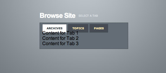
So what we’ve done here is:
- Style up the <a> tag so that it’s padded out and has the right background and text colours, and has the right font settings.
- Created a second style for a:hover and darkened the background color and border. Note that we don’t need to set all the other <a> settings because they are inherited. We just need to change the ones that we want changed when the user rolls their mouse over the tab.
- Finally we have a third style for when the <a> has a class="active". In other words for the tab that is selected. Here again we set the background colour to white and change the text colour. One thing to note is that we also change the bottom border to white. This is so that the tab will look like it is attached to the content area (when we add it in later!)
Step 11
There are two things we need to do to make the content areas work. The first is we should make the second two areas vanish and the second is to make them look appropriately styled.
- .content {
- background-color:#ffffff;
- padding:10px;
- border:1px solid #464c54;
- }
- #content_2, #content_3 { display:none; }
.content {
	background-color:#ffffff;
	padding:10px;
	border:1px solid #464c54;
}
#content_2, #content_3 { display:none; }
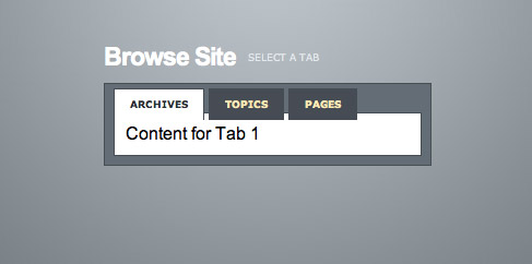
You’ll see that the first part of the CSS tells the browser that all elements with class="content" should be white with padding and a border (the same colour as the tabs). The second part says that the elements with id="content_2" and id="content_3" should have a display:none, or in otherwords should be invisible.
Later on when we add some Javascript we can use the script to alternate between display:none and display:block to make them show and hide.
So here’s how our tabs are looking, you can also see a HTML version of where we are at. As you can see it’s looking pretty close now, but we need to fix the spacing and add some actual content in.
Step 12
Fixing the spacing issue is actually simply a matter of adding margins back to the <ul> element like this:
- ul.tabs {
- margin:0px; padding:0px;
- margin-top:5px;
- margin-bottom:6px;
- }
ul.tabs {
	margin:0px; padding:0px;
	margin-top:5px;
	margin-bottom:6px;
}
To be perfectly honest I’m not sure why that spacing issue occurred. Sometimes HTML mystifies me, but I just adjust settings until things right themselves. Sometimes in the process I figure out what was the cause, sometimes I don’t. I guess what I’m saying is, unless you’re going to really get into the nitty gritty details of w3 specs, sooner or later you’re going to run into some issues that you can’t explain. Don’t let it get you down, just adjust until you find a fix or a solution.
Step 13
Now we’ll add some content into the content area. I avoided this earlier as I wanted to keep the HTML looking simple. Here’s some:
- <div id="tabbed_box_1" class="tabbed_box">
- <h4>Browse Site <small>Select a Tab</small></h4>
- <div class="tabbed_area">
- <ul class="tabs">
- <li><a href="" id="tab_1" class="active">Topics</a></li>
- <li><a href="" id="tab_2">Archives</a></li>
- <li><a href="" id="tab_3">Pages</a></li>
- </ul>
- <div id="content_1" class="content">
- <ul>
- <li><a href="">HTML Techniques <small>4 Posts</small></a></li>
- <li><a href="">CSS Styling <small>32 Posts</small></a></li>
- <li><a href="">Flash Tutorials <small>2 Posts</small></a></li>
- <li><a href="">Web Miscellanea <small>19 Posts</small></a></li>
- <li><a href="">Site News <small>6 Posts</small></a></li>
- <li><a href="">Web Development <small>8 Posts</small></a></li>
- </ul>
- </div>
- <div id="content_2" class="content">
- <ul>
- <li><a href="">December 2008 <small>6 Posts</small></a></li>
- <li><a href="">November 2008 <small>4 Posts</small></a></li>
- <li><a href="">October 2008 <small>22 Posts</small></a></li>
- <li><a href="">September 2008 <small>12 Posts</small></a></li>
- <li><a href="">August 2008 <small>3 Posts</small></a></li>
- <li><a href="">July 2008 <small>1 Posts</small></a></li>
- </ul>
- </div>
- <div id="content_3" class="content">
- <ul>
- <li><a href="">Home</a></li>
- <li><a href="">About</a></li>
- <li><a href="">Contribute</a></li>
- <li><a href="">Contact</a></li>
- </ul>
- </div>
- </div>
- </div>
<div id="tabbed_box_1" class="tabbed_box">
	<h4>Browse Site <small>Select a Tab</small></h4>
    <div class="tabbed_area">

        <ul class="tabs">
            <li><a href="" id="tab_1" class="active">Topics</a></li>
            <li><a href="" id="tab_2">Archives</a></li>
            <li><a href="" id="tab_3">Pages</a></li>
        </ul>

        <div id="content_1" class="content">
        	<ul>
            	<li><a href="">HTML Techniques <small>4 Posts</small></a></li>
            	<li><a href="">CSS Styling <small>32 Posts</small></a></li>
            	<li><a href="">Flash Tutorials <small>2 Posts</small></a></li>
            	<li><a href="">Web Miscellanea <small>19 Posts</small></a></li>
            	<li><a href="">Site News <small>6 Posts</small></a></li>
            	<li><a href="">Web Development <small>8 Posts</small></a></li>
			</ul>
        </div>
        <div id="content_2" class="content">
        	<ul>
            	<li><a href="">December 2008 <small>6 Posts</small></a></li>
            	<li><a href="">November 2008 <small>4 Posts</small></a></li>
            	<li><a href="">October 2008 <small>22 Posts</small></a></li>
            	<li><a href="">September 2008 <small>12 Posts</small></a></li>
            	<li><a href="">August 2008 <small>3 Posts</small></a></li>
            	<li><a href="">July 2008 <small>1 Posts</small></a></li>
			</ul>
        </div>
        <div id="content_3" class="content">
        	<ul>
            	<li><a href="">Home</a></li>
            	<li><a href="">About</a></li>
            	<li><a href="">Contribute</a></li>
            	<li><a href="">Contact</a></li>
			</ul>
        </div>

    </div>

</div>
So here I’ve just added a bunch of unordered lists in to the three content areas. Incidentally I’m mocking this up as if it was to be used on a WordPress blog. But really you could be using this for all sorts of things. The new FlashDen homepage that I worked on a few days ago uses tabbed areas to show different types of recent files.
Now we’ll add some styling to make those look a bit nicer:
- .content ul {
- margin:0px;
- padding:0px 20px 0px 20px;
- }
- .content ul li {
- list-style:none;
- border-bottom:1px solid #d6dde0;
- padding-top:15px;
- padding-bottom:15px;
- font-size:13px;
- }
- .content ul li a {
- text-decoration:none;
- color:#3e4346;
- }
- .content ul li a small {
- color:#8b959c;
- font-size:9px;
- text-transform:uppercase;
- font-family:Verdana, Arial, Helvetica, sans-serif;
- position:relative;
- left:4px;
- top:0px;
- }
.content ul {
	margin:0px;
	padding:0px 20px 0px 20px;
}
.content ul li {
	list-style:none;
	border-bottom:1px solid #d6dde0;
	padding-top:15px;
	padding-bottom:15px;
	font-size:13px;
}
.content ul li a {
	text-decoration:none;
	color:#3e4346;
}
.content ul li a small {
	color:#8b959c;
	font-size:9px;
	text-transform:uppercase;
	font-family:Verdana, Arial, Helvetica, sans-serif;
	position:relative;
	left:4px;
	top:0px;
}
Once again we’re styling our lists up. This time rather than giving the <ul> element a classname, I’ve simply added styles to all <ul> elements inside elements with the class="content". This just means I don’t need to write as many class names into my HTML which makes it neater and cleaner.
Other things to note:
- Once again we’ve removed the bullet points off the <li> elements with list-style:none.
- This time we’re styling the list elements as opposed to the <a>’s. This is important because if we might have a menu item which isn’t a link, and this way it’ll still fit neatly in.
- Once again I’ve used a <small> wrapped inside the <a> to make the post count. I’ve used a text-transform to make it all caps and some relative positioning to nudge it over to the right a bit.
Step 14
So this is what our page looks like:
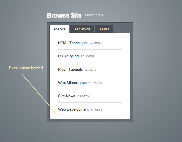
Overall it’s pretty good except we have one too many borders. But that’s OK, we can fix it with a magic pseudo-selector called ‘last-child‘ like this:
- .content ul li:last-child {
- border-bottom:none;
- }
.content ul li:last-child {
	border-bottom:none;
}
This style just applies to the last element of its own kind – i.e. that last <li> element. Now I should point out that last-child doesn’t work in all browsers. In particular IE6 doesn’t like it. But that’s OK because it’s not the end of the world if the border is there, and it’s my subtle way of punishing anyone who hasn’t got an at least vaguely up to date browser ![]()
Step 15
Now there’s just one more step to finish our HTML, and that is to some nice background images to our elements. As you will recall some of the elements in my original PSD file had subtle gradients. So now it’s time to add those in. There are three graduated bits: (a) on the active tab (b) on the inactive tabs and (c) at the bottom of the content area. Here are the three images we’ll be needing:


They’re a bit hard to see, but basically they are each small slices of gradient that we’ll set as repeating background images. Here is a close up of the one for the tab (note I’ve added a thin border around it so it’s a bit clearer. Notice that there is a 1px white line at the top. That will make the tab look really sharp.

So we need to make a few adjustments to the CSS code to add in background images, like this:
- ul.tabs li a {
- background-image:url(images/tab_off.jpg);
- background-repeat:repeat-x;
- background-position:bottombottom;
- }
- ul.tabs li a.active {
- background-image:url(images/tab_on.jpg);
- background-repeat:repeat-x;
- background-position:top;
- }
- .content {
- background-image:url(images/content_bottom.jpg);
- background-repeat:repeat-x;
- background-position:bottombottom;
- }
ul.tabs li a {
	background-image:url(images/tab_off.jpg);
	background-repeat:repeat-x;
	background-position:bottom;
}
ul.tabs li a.active {
	background-image:url(images/tab_on.jpg);
	background-repeat:repeat-x;
	background-position:top;
}
.content {
	background-image:url(images/content_bottom.jpg);
	background-repeat:repeat-x;
	background-position:bottom;
}
Note that I actually inserted these extra bits in with the rest of their class definitions, but for the sake of brevity have just copied in extracts. As you can see in all three cases we’re repeating a background image along the x axis only. In the case of two (the off tab and the content area) we’re doing it along the bottom, and in the other it’s along the top.
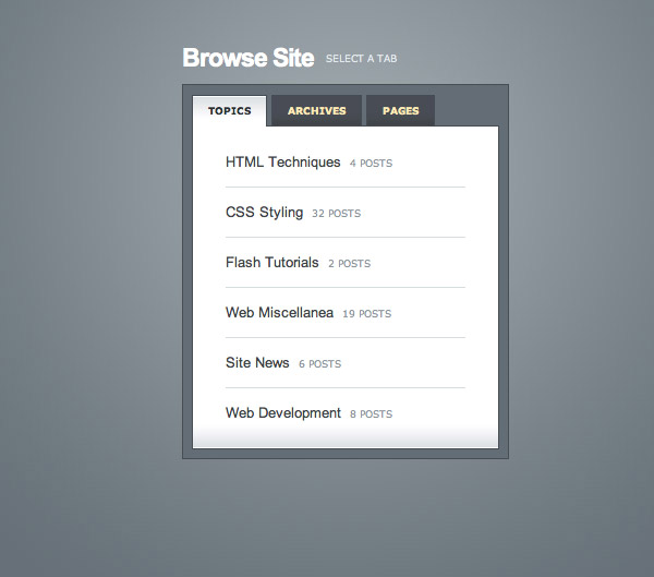
Styled!
And with that we’ve officially finished the HTML/CSS part of this tutorial. You can see the finished styled page here.
Adding a Simple Script
The next thing we need to do is add some Javascript to make our tabs actually do something. First we’re going to do this by hand and then I’ll show you how to use a Javascript library to accomplish the same thing. Now I should point out that I’m no JS expert, and I’m hoping to bring in some real programatic masters to write tutorials here, so if you notice me doing anything which is a bit dubious, feel free to leave a comment and I’ll touch up the tutorial and make it a little more best practices!
So first let’s outline what we want to do when someone clicks on a tab. We want to switch off our current tab, switch on the new one, hide the current content area and show the new one.
Now we could have something clever that works out which tab is currently on and switches it off, but it’s easier just to go through and switch them all off, and then switch on the one we want. Similarly for the content areas, we can hide all three of them and then show the one we want. This saves us having to work out the current state of affairs.
Finding Elements using the DOM
The elements we are working with look like this:
- <a href="" id="tab_1" class="active">
- <div id="content_1" class="content">
Now in Javascript we can find an element simply by using it’s id and the document.getElementById() method. So document.getElementById(‘content_1′) would give us the first content area. We can then set it’s display style to none using this line:
document.getElementById(‘content_1′).style.display = ‘none’;
Similarly to see a class we use:
document.getElementById(‘tab_1′).className = ‘active’;
So then a really simple approach would be to write:
- function tabSwitch(new_tab, new_content) {
- document.getElementById('content_1').style.display = 'none';
- document.getElementById('content_2').style.display = 'none';
- document.getElementById('content_3').style.display = 'none';
- document.getElementById(new_content).style.display = 'block';
- document.getElementById('tab_1').className = '';
- document.getElementById('tab_2').className = '';
- document.getElementById('tab_3').className = '';
- document.getElementById(new_tab).className = 'active';
- }
function tabSwitch(new_tab, new_content) {

	document.getElementById('content_1').style.display = 'none';
	document.getElementById('content_2').style.display = 'none';
	document.getElementById('content_3').style.display = 'none';
	document.getElementById(new_content).style.display = 'block';

	document.getElementById('tab_1').className = '';
	document.getElementById('tab_2').className = '';
	document.getElementById('tab_3').className = '';
	document.getElementById(new_tab).className = 'active';

}
This would be placed inside a file, let’s call it functions.js. We’d then call this script by changing our tab links to:
- <script src="functions.js" type="text/javascript"></script>
- <ul class="tabs">
- <li><a href="javascript:tabSwitch('tab_1', 'content_1');" id="tab_1" class="active">Topics</a></li>
- <li><a href="javascript:tabSwitch('tab_2', 'content_2');" id="tab_2">Archives</a></li>
- <li><a href="javascript:tabSwitch('tab_3', 'content_3');" id="tab_3">Pages</a></li>
- </ul>
<script src="functions.js" type="text/javascript"></script>
<ul class="tabs">
    <li><a href="javascript:tabSwitch('tab_1', 'content_1');" id="tab_1" class="active">Topics</a></li>
    <li><a href="javascript:tabSwitch('tab_2', 'content_2');" id="tab_2">Archives</a></li>
    <li><a href="javascript:tabSwitch('tab_3', 'content_3');" id="tab_3">Pages</a></li>
</ul>
And sure enough, here’s an example of our super simple javascript example. It works!
A More Complex Script
Now there are some very obvious problems with this script. Not least of which is that if you add another tab you’re going to have to change your function. And if you had more than one set of tabs on a page you’ll need two functions! So let’s beef it up a little:
- function tabSwitch_2(active, number, tab_prefix, content_prefix) {
- for (var i=1; i < number+1; i++) {
- document.getElementById(content_prefix+i).style.display = 'none';
- document.getElementById(tab_prefix+i).className = '';
- }
- document.getElementById(content_prefix+active).style.display = 'block';
- document.getElementById(tab_prefix+active).className = 'active';
- }
function tabSwitch_2(active, number, tab_prefix, content_prefix) {

	for (var i=1; i < number+1; i++) {
	  document.getElementById(content_prefix+i).style.display = 'none';
	  document.getElementById(tab_prefix+i).className = '';
	}
	document.getElementById(content_prefix+active).style.display = 'block';
	document.getElementById(tab_prefix+active).className = 'active';

}
Our second version of the tab switching function takes a couple more arguments but is a bit cleverer. It assumes that we have a set of tabs and a set of content areas and they have id's that have a prefix and a set of incrementing numbers. I.e. tab_1, tab_2 ... and content_1, content_2 ...
The first argument our function takes, 'active', is the number tab/content we want on. The second argument, 'number', is the number of tabs being used. The third and fourth arguments are the prefixes used in the ids of our elements.
The function then has a for loop that cycles through from 1 to the number of tabs and switches them all off, then switches the two we want back on at the end. In other words it's the same script as before, but we've just made it a tiny bit smarter.
So in our example to call the function we would have this code:
- <script src="functions.js" type="text/javascript"></script>
- <ul class="tabs">
- <li><a href="javascript:tabSwitch_2(1, 3, 'tab_', 'content_');" id="tab_1" class="active">Topics</a></li>
- <li><a href="javascript:tabSwitch_2(2, 3, 'tab_', 'content_');" id="tab_2">Archives</a></li>
- <li><a href="javascript:tabSwitch_2(3, 3, 'tab_', 'content_');" id="tab_3">Pages</a></li>
- </ul>
<script src="functions.js" type="text/javascript"></script>
<ul class="tabs">
    <li><a href="javascript:tabSwitch_2(1, 3, 'tab_', 'content_');" id="tab_1" class="active">Topics</a></li>
    <li><a href="javascript:tabSwitch_2(2, 3, 'tab_', 'content_');" id="tab_2">Archives</a></li>
    <li><a href="javascript:tabSwitch_2(3, 3, 'tab_', 'content_');" id="tab_3">Pages</a></li>
</ul>
This means that later on if we had a second set of tabs, we could give them different id prefixes and use the same function again and again.
View the second javascript example.
Using jQuery
Lately there have been a lot of Javascript libraries appearing, and in fact there are (at least) two that are specifically made for achieving this tab effect: MooTabs and DomTab. I haven't used either, but from a brief glance they looked quite usable.
However as I've heard a lot about the jQuery library, I decided to attempt the same tab switching using jQuery. I have a feeling my solution could use some work, but it's still interesting to look through.
So first, go to the jQuery site and download the latest version of their script library.

Getting the Hang of jQuery
jQuery provides a bunch of functions that allow you to select groups of things. For example if you wanted to select every element on the page that is a link (i.e. <a> elements) and then make them vanish, you would place this in your <head> area:
- <script src="scripts/jquery-1.2.3.min.js"></SCRIPT>
- <script>
- // When the document loads do everything inside here ...
- $(document).ready(function(){
- $("a").slideUp();
- });
- </script>
<script src="scripts/jquery-1.2.3.min.js">

<script> // When the document loads do everything inside here ... $(document).ready(function(){ $("a").slideUp(); }); </script>
The first line adds the jQuery script library. The main script area is inside a piece of code that looks like this: $(document).ready(function(){}); This basically tells your browser to execute everything inside when it hits the page. So in our case we're giving it the command:
- $("a").slideUp();
$("a").slideUp();
This says find everything that is an <a> and execute slideUp() on it. Or in other words: find all the links and make them vanish with a sliding up effect. Try adding that script to a page and load it and you'll see all your links vanish. Pretty neat huh?
Anyhow there are loads of ways to select things, and you can read about them in the API and documentation. You can do things like find every element with a certain class, a certain id and so on. At some point I'll write a proper introduction to jQuery tutorial here, but for the moment, that tiny intro will do - besides having just an hour of experience with jQuery I suspect it'd be something of a travesty for me to write an intro to it!
Sliding Away with Selectors
So after a little experimentation I came up with a way to use jQuery to make my tabs slide in and out. To do this first I modified my links to not have any javascript, but rather to have a title attribute and an extra class="tab". Notice that you can give an element two classes by doing this: class="tab active".
- <ul class="tabs">
- <li><a href="#" title="content_1" class="tab active">Topics</a></li>
- <li><a href="#" title="content_2" class="tab">Archives</a></li>
- <li><a href="#" title="content_3" class="tab">Pages</a></li>
- </ul>
<ul class="tabs">
    <li><a href="#" title="content_1" class="tab active">Topics</a></li>
    <li><a href="#" title="content_2" class="tab">Archives</a></li>
    <li><a href="#" title="content_3" class="tab">Pages</a></li>
</ul>
Now using these two elements, basically I can get all the links with the class 'tab' and I can also find any element whose id equals the title attribute of the link that was just clicked. Here's the script (placed in the <head>) which explains this a bit better:
- <script src="scripts/jquery-1.2.3.min.js"></script>
- <script>
- // When the document loads do everything inside here ...
- $(document).ready(function(){
- // When a link is clicked
- $("a.tab").click(function () {
- // switch all tabs off
- $(".active").removeClass("active");
- // switch this tab on
- $(this).addClass("active");
- // slide all elements with the class 'content' up
- $(".content").slideUp();
- // Now figure out what the 'title' attribute value is and find the element with that id. Then slide that down.
- var content_show = $(this).attr("title");
- $("#"+content_show).slideDown();
- });
- });
- </script>
 <script src="scripts/jquery-1.2.3.min.js"></script>
    <script>

	  // When the document loads do everything inside here ...
	  $(document).ready(function(){

		// When a link is clicked
		$("a.tab").click(function () {

			// switch all tabs off
			$(".active").removeClass("active");

			// switch this tab on
			$(this).addClass("active");

			// slide all elements with the class 'content' up
			$(".content").slideUp();

			// Now figure out what the 'title' attribute value is and find the element with that id.  Then slide that down.
			var content_show = $(this).attr("title");
			$("#"+content_show).slideDown();

		});

	  });
  </script>
So I've added comments in to help explain. Basically when any link with the class 'tab' is clicked, we do everything inside that function.
And to see the final working example with jQuery, click here!
Final Words
OK so a few minutes after making my jQuery example, I discovered that there is in fact a special 'tabs' visual control in jQuery. I'll have to have a play with that tomorrow as no doubt it will make life a lot simpler!
In the meantime I hope you enjoyed the tutorial and got something out of it.


 浙公网安备 33010602011771号