CSS Flexbox layout 1
一直都不太清楚水平和垂直,想了好久怎么才能更好的形容呢?突然想到了这杆称,可以很好的形容主副轴
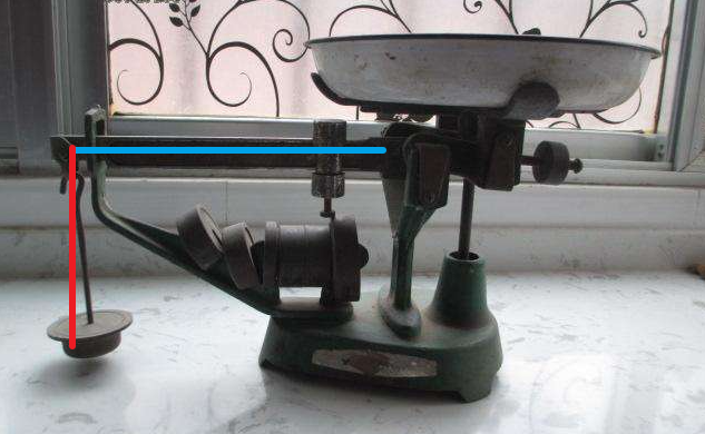
蓝主轴(水平):好比称杆
红副轴(垂直):好比称托,可以放秤砣(盒子)(或者想象成算盘)
开局给你一个 flex 看你如何布局 Hello World~
display: flex
flex 布局有主轴和副轴
# 主轴 对齐方式
justify-content: space-between;
justify-content: space-around;
justify-content: space-evenly;
justify-content: flex-start;
justify-content: flex-end;
justify-content: center;
#使用margin属性控制水平对齐
margin-left: auto;
# 副轴 对齐方式
align-items: space-between;
align-items: space-around;
align-items: space-evenly;
align-items: flex-start;
align-items: flex-end;
align-items: center;
# 子元素覆盖对齐方式
align-self: flex-end;
更改 主轴副轴
flex-direction: column;
flex-direction: column-reverse;
flex-direction: row;
flex-direction: row-reverse;
设置 flex 子元素折行
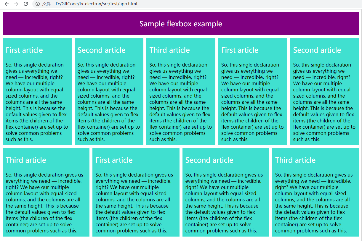
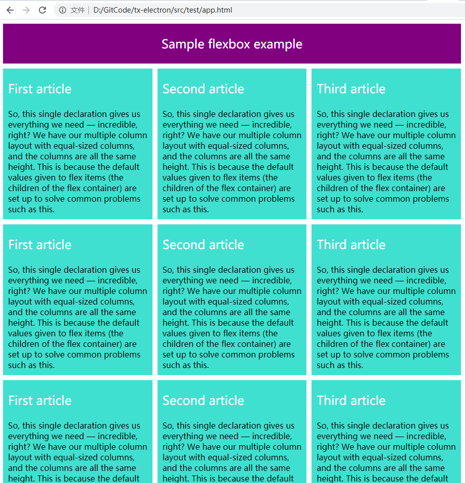
flex-wrap: wrap;
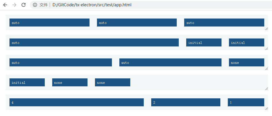
空间占比
# 根据盒子内容自动改变
flex-basis: auto;
#
min-width: 250px;
# 容器中剩余空间的分配
flex-grow
# 仅在默认宽度之和大于容器的时候才会发生收缩
flex-shrink
实战

 浙公网安备 33010602011771号