import numpy as np
import matplotlib.pyplot as plt
plt.style.use('ggplot')
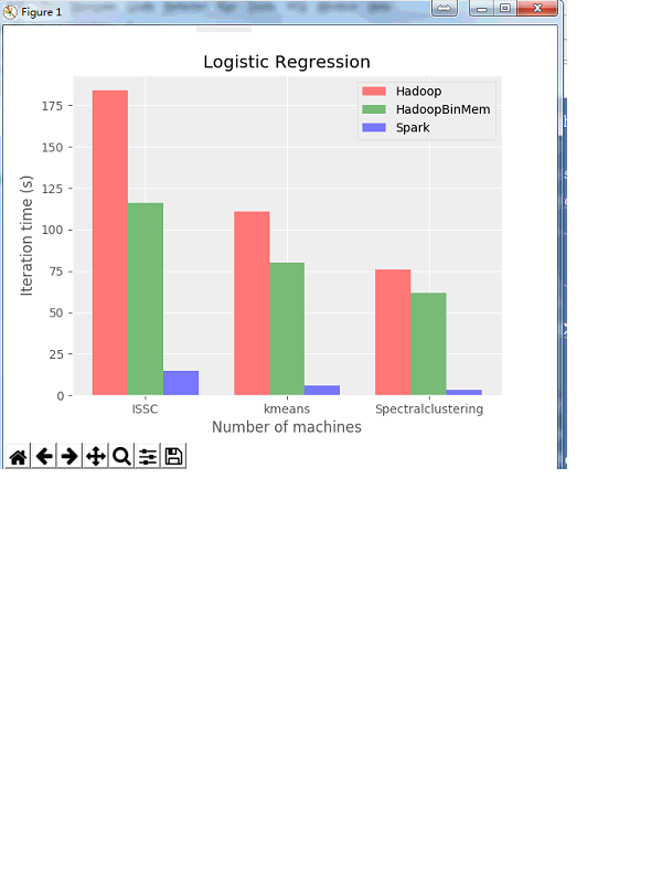
logistic_regression = [
[184, 111, 76],
[116, 80, 62],
[15, 6, 3]
]
engines = ['Hadoop', 'HadoopBinMem', 'Spark']
colors = 'rgb'
fig, ax1 = plt.subplots(ncols=1)
idx = np.arange(len(logistic_regression[0]))
n = len(logistic_regression)
width = 1.0 / (n + 1)
for i in range(n):
ax1.bar(idx + i * width, logistic_regression[i], width, color=colors[i], alpha=0.5)
xpos = idx + (i + 0.5) * width
ypos = logistic_regression[i]
#for j in range(len(ypos)):
#ax1.text(xpos[j], ypos[j], str(ypos[j]), ha='center', va='bottom', rotation=90)
ax1.legend(engines)
#ax1.set_xticks(idx + 0.5, [25, 50, 100])
ax1.set_xticks(idx+1*0.25)
ax1.set_xticklabels(["ISSC","kmeans","Spectralclustering"])
#ax1.set_xlim([1, 4])
ax1.set_xlabel('Number of machines')
ax1.set_ylabel('Iteration time (s)')
ax1.set_title('Logistic Regression')
plt.show()
![]()


 浙公网安备 33010602011771号