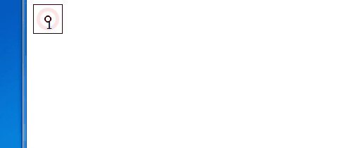
CSS3向外扩散的圆
<!DOCTYPE html>
<html>
<head>
<meta http-equiv="Content-Type" content="text/html; charset=utf-8" />
<title>无标题文档</title>
<style>
@keyframes warn {
0% {
transform: scale(0);
opacity: 0.0;
}
25% {
transform: scale(0);
opacity: 0.1;
}
50% {
transform: scale(0.1);
opacity: 0.3;
}
75% {
transform: scale(0.5);
opacity: 0.5;
}
100% {
transform: scale(1);
opacity: 0.0;
}
}
@-webkit-keyframes "warn" {
0% {
-webkit-transform: scale(0);
opacity: 0.0;
}
25% {
-webkit-transform: scale(0);
opacity: 0.1;
}
50% {
-webkit-transform: scale(0.1);
opacity: 0.3;
}
75% {
-webkit-transform: scale(0.5);
opacity: 0.5;
}
100% {
-webkit-transform: scale(1);
opacity: 0.0;
}
}
.container {
position: relative;
width: 40px;
height: 40px;
border: 1px solid #000;
}
/* 保持大小不变的小圆圈 */
.dot {
position: absolute;
width: 6px;
height: 6px;
left: 15px;
top: 15px;
-webkit-border-radius: 20px;
-moz-border-radius: 20px;
border: 2px solid red;
border-radius: 20px;
z-index: 2;
}
/* 产生动画(向外扩散变大)的圆圈 */
.pulse {
position: absolute;
width: 24px;
height: 24px;
left: 2px;
top: 2px;
border: 6px solid red;
-webkit-border-radius: 30px;
-moz-border-radius: 30px;
border-radius: 30px;
z-index: 1;
opacity: 0;
-webkit-animation: warn 3s ease-out;
-moz-animation: warn 3s ease-out;
animation: warn 3s ease-out;
-webkit-animation-iteration-count: infinite;
-moz-animation-iteration-count: infinite;
animation-iteration-count: infinite;
}
</style>
</head>
<body>
<div class="container">
<div class="dot">1</div>
<div class="pulse"></div>
</div>
</body>
</html>

 浙公网安备 33010602011771号