
SciTech-Mathematics-Probability+Statistics- Pandas DataFrame Histogram/BarChart/Boxplot/Scatterplot + Relative Frequency Histogram: Definition + Example()
Links:
- How to Plot Multiple Series from a Pandas DataFrame
- How to Make a Scatterplot From a Pandas DataFrame
- Pandas: How to Plot Multiple Columns on Bar Chart
- How to Add a Title to Seaborn Plots (With Examples)
Histogram from Pandas DataFrame
BY ZACH BOBBITTPOSTED ON AUGUST 5, 2021
You can use the following basic syntax to create a histogram from a pandas DataFrame:
df.hist(column='col_name')
The following examples show how to use this syntax in practice.
import pandas as pd
#create DataFrame
df1 = pd.DataFrame({
'points': [25, 12, 15, 14, 19, 23, 25, 29, 29, 31, 31, 33],
'assists': [5, 7, 7, 9, 12, 9, 9, 4, 7, 7, 8, 9],
'rebounds': [11, 8, 10, 6, 6, 5, 9, 12, 10, 7, 7, 9]})
#view first five rows of DataFrame
df1.head()
points assists rebounds
0 25 5 11
1 12 7 8
2 15 7 10
3 14 9 6
4 19 12 6
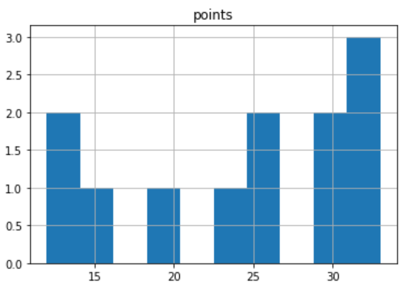
#create histogram for 'points' column
df1.hist(column='points')
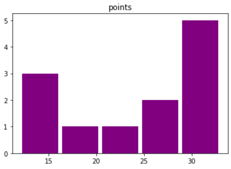
#customize the histogram with specific colors, styles, labels, and number of bins:
df1.hist(column='points', bins=5, grid=False, rwidth=.9, color='purple')
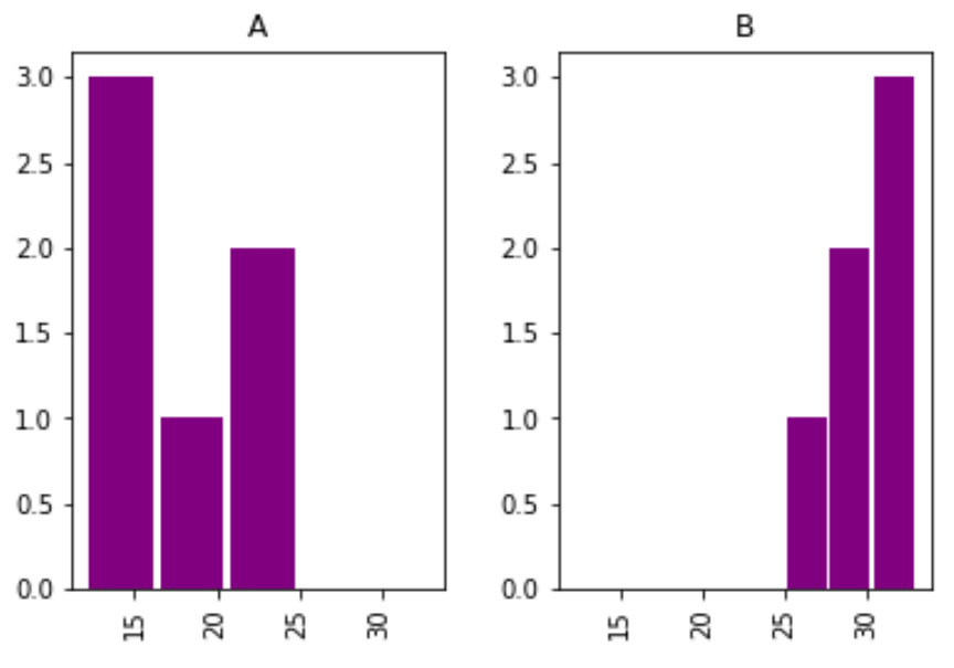
#create DataFrame
df2 = pd.DataFrame({
'team':['A', 'A', 'A', 'A', 'A', 'A',
'B', 'B', 'B', 'B', 'B', 'B'],
'points': [25, 12, 15, 14, 19, 23, 25, 29, 29, 31, 31, 33]})
#create histogram for each team
df2.hist(column='points', by='team', bins=3, grid=False, rwidth=.9,
color='purple', sharex=True)
| df1.hist(column='points') | df1.hist(column='points', bins=5,...) | df2.hist(column='points', by='team', bins=3,...) |
|---|---|---|
 |
 |
 |
The x-axis displays the points scored per player and the y-axis shows the frequency for the number of players who scored that many points.
Note that the sharex argument specifies that the two histograms should share the same x-axis.
This makes it easier to compare the distribution of values between the two histograms.
Additional Resources
The following tutorials explain how to create other common plots in Python:
How to Create Boxplot from Pandas DataFrame
How to Plot Multiple Pandas Columns on Bar Chart
Boxplot from Pandas DataFrame
BY ZACH BOBBITTPOSTED ON JULY 20, 2021
You can use the following syntax to create boxplots from a pandas DataFrame:
#create boxplot of one column
df.boxplot(column=['col1'])

#create boxplot of multiple columns
df.boxplot(column=['col1', 'col2'])

#create boxplot grouped by one column
df.boxplot(column=['col1'], by='col2')
The following examples show how to use this syntax in practice with the following DataFrame:
import pandas as pd
#create DataFrame
df = pd.DataFrame({'conference': ['A', 'A', 'A', 'B', 'B', 'B'],
'points': [5, 7, 7, 9, 12, 9],
'assists': [11, 8, 10, 6, 6, 5],
'rebounds': [4, 2, 5, 8, 6, 11],})
#view DataFrame
df
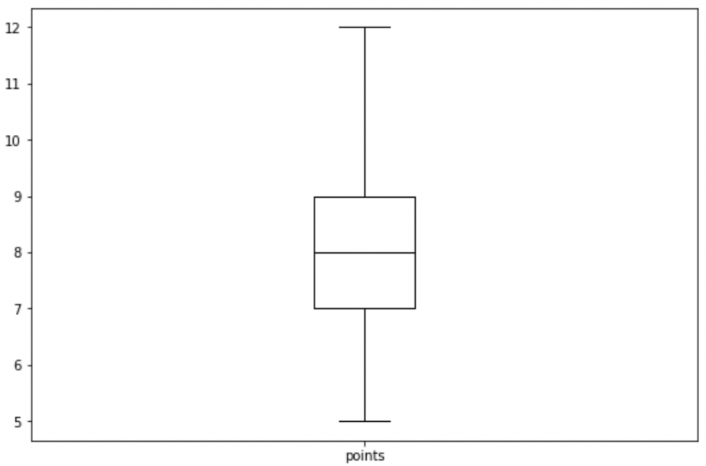
# Example 1: Boxplot of One Column
df.boxplot(column=['points'], grid=False, color='black')
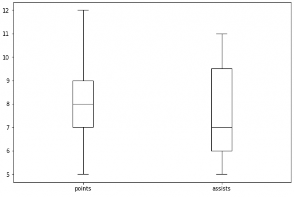
#Example 2: Boxplot of Multiple Columns
df.boxplot(column=['points', 'assists'], grid=False, color='black')
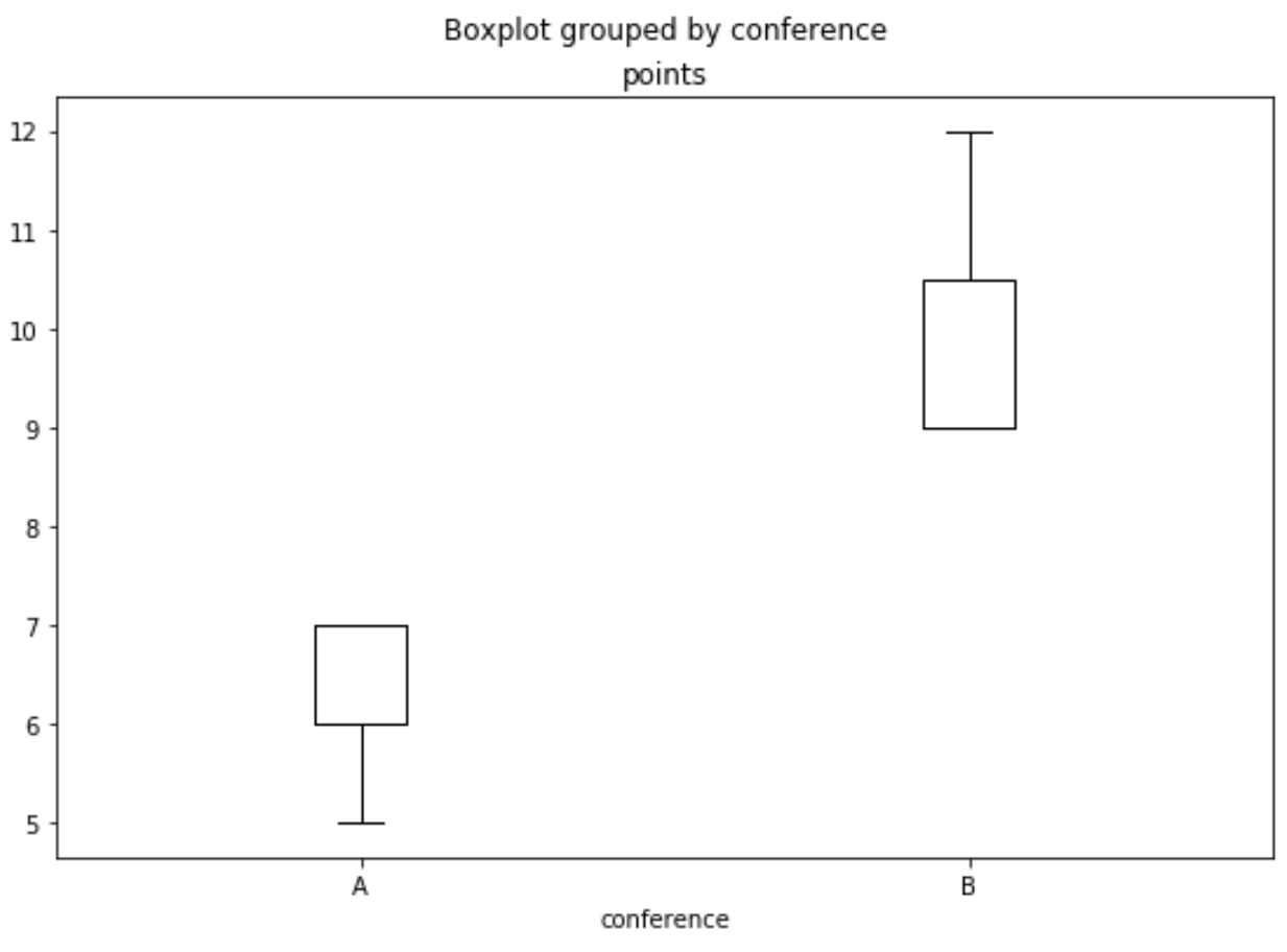
#Example 3: Boxplot Grouped by One Column
df.boxplot(column=['points'], by='conference', grid=False, color='black')
| Example 1: df.boxplot(column=['points'], | Example 2: df.boxplot(column=['points', 'assists'], | Example 3: df.boxplot(column=['points'], by='conference', |
|---|---|---|
 |
 |
 |
BarChart from Pandas DataFrame
Multiple Columns
Pandas: How to Plot Multiple Columns on Bar Chart
BY ZACH BOBBITTPOSTED ON APRIL 8, 2021
You can use the following syntax to plot multiple columns of a pandas DataFrame on a single bar chart:
df[['x', 'var1', 'var2', 'var3']].plot(x='x', kind='bar')
The x column will be used as the x-axis variable and var1, var2, and var3 will be used as the y-axis variables.
The following examples show how to use this function in practice.
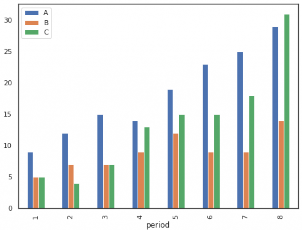
Plot Columns on a Bar Chart
The following code shows how to plot three columns on a bar chart, specifying that the column named period should be used as the x-axis variable:
import pandas as pd
import matplotlib.pyplot as plt
#create fake data
df = pd.DataFrame({'period': [1, 2, 3, 4, 5, 6, 7, 8],
'A': [9, 12, 15, 14, 19, 23, 25, 29],
'B': [5, 7, 7, 9, 12, 9, 9, 14],
'C': [5, 4, 7, 13, 15, 15, 18, 31]})
#plot columns on bar chart
df[['period', 'A', 'B', 'C']].plot(x='period', kind='bar')
# We could also choose to plot only certain columns, such as A and B:
df[['period', 'A', 'B']].plot(x='period', kind='bar')
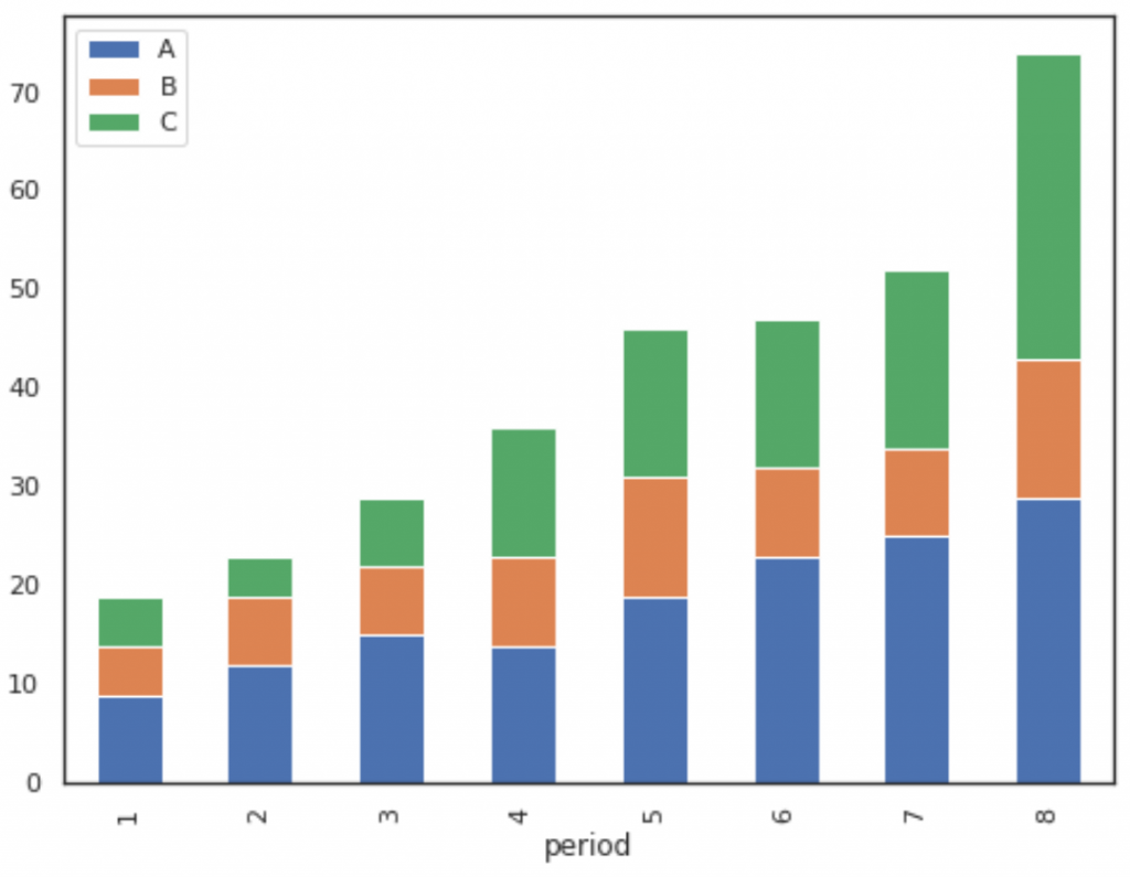
#create fake data
df = pd.DataFrame({'period': [1, 2, 3, 4, 5, 6, 7, 8],
'A': [9, 12, 15, 14, 19, 23, 25, 29],
'B': [5, 7, 7, 9, 12, 9, 9, 14],
'C': [5, 4, 7, 13, 15, 15, 18, 31]})
#create stacked bar chart
df[['period', 'A', 'B', 'C']].plot(x='period', kind='bar', stacked=True)
# To change the colors of the bars, simply use the color argument as follows:
df[['period', 'A', 'B', 'C']].plot(x='period', kind='bar', stacked=True,
color=['red', 'pink', 'gold'])
| Example 1: df[['period', 'A', 'B', 'C']].plot(x='period', kind='bar') | Example 2: df[['period', 'A', 'B', 'C']].plot(x='period', kind='bar', stacked=True) |
|---|---|
 |
|
 |
|
Relative Frequency Histogram: Definition + Example
BY ZACH BOBBITTPOSTED ON FEBRUARY 19, 2020
Often in statistics you will encounter tables that display information about frequencies.
Frequencies simply tell us how many times a certain event has occurred.
For example, the following table shows how many items a particular shop sold in a week based on the price of the item:
| Item Price(Unit: Dollar) | Frequency |
|---|---|
| 1 – 10 | 20 |
| 11 – 20 | 21 |
| 21 – 30 | 13 |
| 31 – 40 | 8 |
| 41 – 50 | 4 |
This type of table is known as a frequency table.
In one column we have the "class" and in the other column we have the frequency of the class.
Often we use frequency histograms to visualize the values in a frequency table,
since it's typically easier to gain an understanding of data when we can visualize the numbers.
A histogram lists the classes along the x-axis of a graph,
and uses bars to represent the frequency of each class along the y-axis.
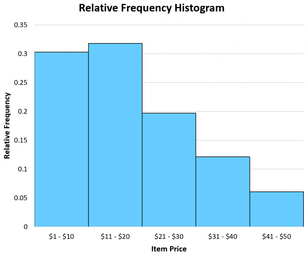
The following frequency histogram provides a visual representation of the frequency table above:

Frequency histogram example
A close cousin of a frequency table is a relative frequency table, which simply lists the frequencies of each class as a percentage of the whole.
The following table shows the relative frequencies of the same dataset we saw earlier:
| Item Price(Unit: Dollar) | Frequency | Relative Frequency |
|---|---|---|
| 1 – 10 | 20 | 0.303 |
| 11 – 20 | 21 | 0.318 |
| 21 – 30 | 13 | 0.197 |
| 31 – 40 | 8 | 0.121 |
| 41 – 50 | 4 | 0.061 |
In total, there were 66 items sold. Thus, we found the relative frequency of each class by taking the frequency of each class and dividing by the total items sold.
For example, there were 20 items sold in the price range of
Next, there were 21 items sold in the price range of
We perform the same calculation for each class to get the relative frequencies.
Once we have the relative frequency of each class, we can then create a relative frequency histogram to visualize these relative frequencies.
Similar to a frequency histogram, this type of histogram displays the classes along the x-axis of the graph and uses bars to represent the relative frequencies of each class along the y-axis.
The only difference is the labels used on the y-axis. Instead of displaying raw frequencies, a relative frequency histogram displays percentages.
Example of a relative frequency histogram
When to Use a Relative Frequency Histogram
A frequency histogram can be useful when you're interested in raw data values.
For example, a shop might have a goal to sell at least 10 items each week in the
By creating a frequency histogram of their data, they can easily see that they're not meeting their goal of selling 10 items per week in this price range:
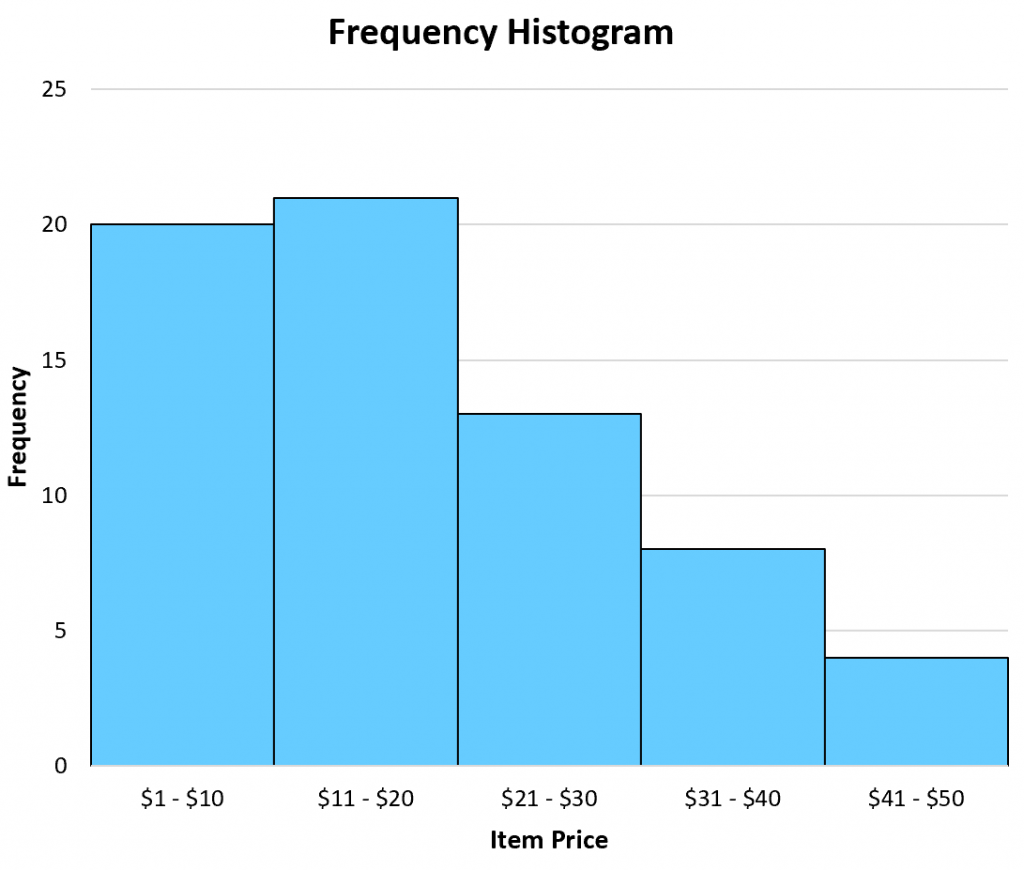
Frequency histogram example
Conversely, a relative frequency histogram is useful when you're interested in percentage values.
For example, a shop might have a goal of selling 5% of their total items in the
By creating a relative frequency histogram of their data, they can see that they are meeting this goal:

Example of a relative frequency histogram
Note that a frequency histogram and a relative frequency histogram will both look the exact same. The only difference is the values displayed on the y-axis.
Additional Resources
The following tutorials explain how to create relative frequency histograms in different statistical software:


【推荐】国内首个AI IDE,深度理解中文开发场景,立即下载体验Trae
【推荐】编程新体验,更懂你的AI,立即体验豆包MarsCode编程助手
【推荐】抖音旗下AI助手豆包,你的智能百科全书,全免费不限次数
【推荐】轻量又高性能的 SSH 工具 IShell:AI 加持,快人一步
· TypeScript + Deepseek 打造卜卦网站:技术与玄学的结合
· Manus的开源复刻OpenManus初探
· AI 智能体引爆开源社区「GitHub 热点速览」
· C#/.NET/.NET Core技术前沿周刊 | 第 29 期(2025年3.1-3.9)
· 从HTTP原因短语缺失研究HTTP/2和HTTP/3的设计差异