

一个设置容器和网格布局的小技巧
查看bootstrap实现网格布局的源码,可以发现: 网格容器(类属性.container或者.container-fluid标识的元素),网格中的行(.row标识的元素)都包括了一个和类属性.clearfix对应的CSS规则集。上述两类CSS声明中引用的mixin分别如下:
.container-fixed(@gutter: @grid-gutter-width) {
    ...
    &:extend(.clearfix all);
}

.make-row(@gutter: @grid-gutter-width) {
    ...
  &:extend(.clearfix all);
}
.clearfix 是一个mixin,定义在一个单独文件中,全部内容如下:
// Clearfix
//
// For modern browsers
// 1. The space content is one way to avoid an Opera bug when the
//    contenteditable attribute is included anywhere else in the document.
//    Otherwise it causes space to appear at the top and bottom of elements
//    that are clearfixed.
// 2. The use of `table` rather than `block` is only necessary if using
//    `:before` to contain the top-margins of child elements.
//
// Source: http://nicolasgallagher.com/micro-clearfix-hack/

.clearfix() {
  &:before,
  &:after {
    content: " "; // 1
    display: table; // 2
  }
  &:after {
    clear: both;
  }
}
注释简单解释了两条CSS属性的设置理由,并且说明了这个clearfix的方法来自一个个人网站: http://nicolasgallagher.com/micro-clearfix-hack/
这几条CSS声明相当简短,但是对CSS没有深入理解的人恐怕一眼还看不明白(我就是看了半天还不明白的人),更不用说想出这么一个绝妙的方法。
这几行声明涉及到了好几个CSS中关键的概念。在分析这几行代码的原理之前,首先要明白.clearfix的作用是什么。当我们创建一个布局容器的时候,我们希望这个容器内部的元素的布局不受容器外部元素的影响,同时容器内部的元素也不要影响到外部的元素。clearfix就是为了实现这个目的。
为什么这里需要使用伪元素?
要屏蔽容器内部和外部元素的相互影响,肯定要对容器内部的第一个元素和最后一个元素进行一些设置。如果一个前端布局框架要求用户必须对容器内的首尾两个元素添加特定的class属性来实现这个目的,那这个框架实在有点蠢。伪元素这个时候正好派上用场。
伪元素是伪的,因为它不属于html/xml文档,也不会被添加到DOM树中,但是它在页面上看起来又跟元素一样,也可以设置各种显示属性。
content: " "; display: table;
然后,我们来看第一个规则集:content: " "; display: table;
为什么content要是" "
(引号中间有个空格)。也就是说,content只有一个空格,而从标准 https://www.w3.org/TR/CSS2/visuren.html#block-formatting
(9.4.2 Inline formatting contexts)中的规定看:
Line boxes that contain no text, no preserved white space, no inline elements with non-zero margins, padding, or borders, and no other in-flow content (such as images, inline blocks or inline tables), and do not end with a preserved newline must be treated as zero-height line boxes for the purposes of determining the positions of any elements inside of them, and must be treated as not existing for any other purpose.
content中只有空格的时候,这个伪元素占据的高度会是0,这正是我们需要的。
display为什么要设置为table?
要回答这个问题,需要知道before这个伪元素在这里发挥的是什么作用。这里before的作用避免margin-top的合并。
CSS中,垂直方向的相邻margin是会合并的,这里的所说的相邻,不仅包括两个兄弟元素之间的相邻margin,也包括一个容器内的首个元素和它的父元素之间的top
margin,最后一个元素和父元素的bottom margin,
以及一个高度为0的元素的上下margin。当然,margin也不是在任何情况下都会合并,比如两个相邻margin之间有边框的时候就不会合并。
如果不阻止这种合并,就会出现这种让容器使用者觉得奇怪的现象:
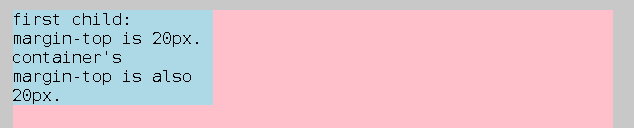
上面这个图,粉红色的区域是container,
浅蓝色的区域是container内的第一个元素,这个元素以及container都设置了margin-top,而且都是20px,结果两个margin合并了,给人的感觉是第一个元素的margin-top根本没生效。
如何阻止这种合并呢,那就要看合并什么时候会发生。标准文档规定了多种两个margin被认为是相邻的情况(https://www.w3.org/TR/CSS2/box.html#collapsing-margins
(8.3.1 Collapsing margins):
Two margins are adjoining if and only if:
- both belong to in-flow block-level boxes that participate in the same block
formatting context
- no line boxes, no clearance, no padding and no border separate them (Note that certain zero-height line boxes (see 9.4.2) are ignored for this purpose.)
- both belong to vertically-adjacent box edges, i.e. form one of the following
pairs:
- top margin of a box and top margin of its first in-flow child
- bottom margin of box and top margin of its next in-flow following sibling
- bottom margin of a last in-flow child and bottom margin of its parent if the parent has 'auto' computed height
- top and bottom margins of a box that does not establish a new block formatting context and that has zero computed 'min-height', zero or 'auto' computed 'height', and no in-flow children
当display设置为table时,上面的第一条规则就不满足了,为什么呢?
这里包含两个原因,首先是表格会产生一个匿名的table-cell,
而table-cell会创建一个新的block formatting context,所以before中的内容和container元素就不再属于同一个block
formatting context。这两点相关的CSS标准分别是:
https://www.w3.org/TR/CSS2/tables.html#anonymous-boxes
Any table element will automatically generate necessary anonymous table objects around itself, consisting of at least three nested objects corresponding to a 'table'/'inline-table' element, a 'table-row' element, and a 'table-cell' element.
https://www.w3.org/TR/CSS2/visuren.html#block-formatting
Floats, absolutely positioned elements, block containers (such as inline-blocks, table-cells, and table-captions) that are not block boxes, and block boxes with 'overflow' other than 'visible' (except when that value has been propagated to the viewport) establish new block formatting contexts for their contents.
clear: both;
这一条规则的含义相对是比较明显的,就是清除浮动。
当容器内的元素使用了float布局的时候,如果不将伪元素after的两侧clear掉,float的元素就可能位于container外面,就像下面这样:
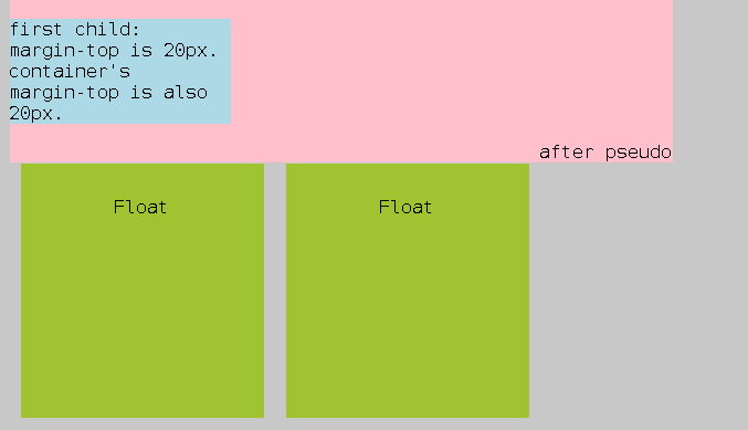
因为float的元素并不会影响container的高度。
容器内的元素漂到了容器外面,这显然不是我们期望的行为。clear
伪元素after两侧的结果就是,after必须放在float的元素的下面,container就被撑高了,就像下面这样:
注:为了更清楚的看到伪元素的作用,这里把after的content设置为了"after
pseudo"。
结语
这简短的几行代码竟然涉及了这么多CSS布局的基础性原理。

