matlab 好看的折线图和柱状图代码
柱状图:
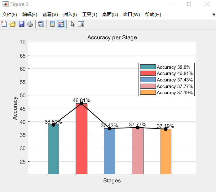
% Data
stages = {'180_20', '160_40', '140_60', '120_80', '100_100'};
accuracy = [38.8, 46.81, 37.43, 37.77, 37.19];
bar_width = 0.4; % Define the width of each bar

% Setting colors for bars
colors = [
    79/255, 157/255, 166/255;   % #4F9DA6
    255/255, 89/255, 89/255;    % #FF5959
    110/255, 158/255, 206/255;  % #6e9ece
    232/255, 157/255, 160/255 ; % #E89DA0
    255/255, 173/255, 90/255;   % #FFAD5A
];

% Plotting the bar chart
figure;
hold on;
for i = 1:numel(stages)
    bar(i, accuracy(i), 'BarWidth', bar_width, 'FaceColor', colors(i, :));
    text(i, accuracy(i), sprintf('%.2f%%', accuracy(i)), 'HorizontalAlignment', 'center', 'VerticalAlignment', 'bottom');
end

% Plotting the line chart
plot(1:numel(stages), accuracy, '-o', 'Color', 'black', 'LineWidth', 1.5, 'MarkerFaceColor', 'black');

xlabel('Stages');
ylabel('Accuracy');
title('Accuracy per Stage');
xticks([]); % Hide tick marks on x-axis
xticklabels(stages);
grid on;

% Adding legend
legend(['Accuracy ', num2str(accuracy(1)), '%'], ...
       ['Accuracy ', num2str(accuracy(2)), '%'], ...
       ['Accuracy ', num2str(accuracy(3)), '%'], ...
       ['Accuracy ', num2str(accuracy(4)), '%'], ...
       ['Accuracy ', num2str(accuracy(5)), '%'], ...
       'Location', 'southwest');
hold off;
折线图:
% 指定目录路径
directory_path = 'C:\Users\zy\Documents\MATLAB\polt';
% 获取目录中所有 .xls 文件
files = dir(fullfile(directory_path, '1.xls')); % 修改为 '*.xls'
% 初始化数据矩阵
data = [];
% 逐个读取文件
for i = 1:length(files)
% 构建当前文件的完整路径
file_path = fullfile(directory_path, files(i).name);
% 读取文件数据
[~, ~, file_data] = xlsread(file_path);
% 提取数值数据
numeric_data = cell2mat(file_data(2:end, 2:end));
% 将数据添加到矩阵
data = [data, numeric_data];
end
% 创建时间步长数组
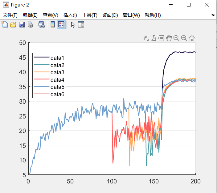
time_steps = 1:size(data, 1);
% 指定颜色
colors = [
26/255, 8/255, 65/255; % #1A0841
79/255, 157/255, 166/255; % #4F9DA6
255/255, 173/255, 90/255; % #FFAD5A
255/255, 89/255, 89/255; % #FF5959
110/255, 158/255, 206/255; % #6e9ece
232/255, 157/255, 160/255 % #E89DA0
];
% 绘制折线图
figure;
hold on;
num_colors = min(size(data, 2), size(colors, 1)); % 获取 data 和 colors 中较小的列数
for i = 1:num_colors
% 绘制每一列数据
plot(time_steps, data(:, i), 'Color', colors(i, :), 'LineWidth', 1.5);
end
% 设置图例位置
legend('Location', 'Best');
% 添加网格线
grid on;
% 设置图例文字大小
set(gca, 'FontSize', 12);

 浙公网安备 33010602011771号