Bootstarp
我们使用bootstrap库可以很方便的写一些好看的样式,他的内部给我们封装了很多很多的css样式和一些非常好的js事件,以后我们只需要把他的类库文件引入到我们的文档中就能使用
我们在使用的过程中,只需要通过增加和删除class属性值就能够达到某种特殊效果
如何使用:https://www.bootcss.com/在百度中搜索
bootstrap的版本:v3、v4、v5我们推荐使用v3就行
v3版本依赖 jQuery,v4、v5版本不依赖jQuery
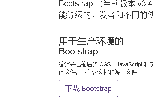
bootstrap安装
下载下来后是压缩包,解压后可以看见文件的结构。
其中包括编译并压缩过的css集成包。
编译并压缩过的JavaScript插件
1、在以下链接中下载bootstrap,使用时将文件放入pycharm中
起步 · Bootstrap v3 中文文档 | Bootstrap 中文网 (bootcss.com)
2、以下链接可以直接找到对应版本复制标签放进模板中即可使用
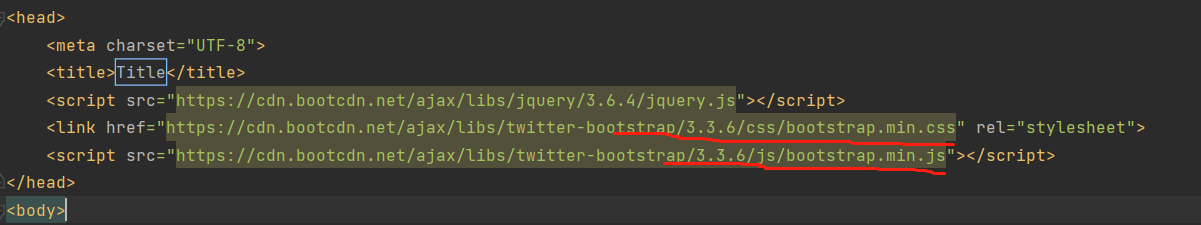
Normalize.css
为了增强跨浏览器渲染的一致性,我们使用了 Normalize.css,这是由 Nicolas Gallagher 和 Jonathan Neal 维护的一个CSS 重置样式库
布局容器
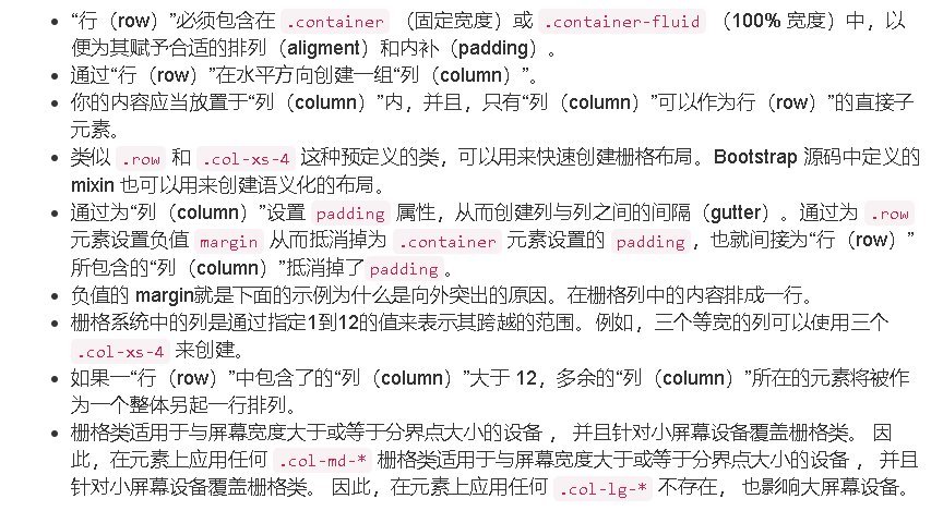
bootstrap需要为页面内容和栅格系统包裹一个.container容器。提供两个类做此用处的类,注意,由于padding等属性,这两个属性不能相互嵌套。
故,在后续写页面时先写个div,并且class=‘container’。
.container类用于固定宽度并支持响应布局的容器。
<div class="container">
  ...
</div>
.container-fluid 类用于 100% 宽度,占据全部视口(viewport)的容器
<div class="container-fluid">
  ...
</div>
栅格系统
栅格系统用于通过一系列的行(row)与列(column)的组合来创建页面布局,你的内容就可以放入这些创建好的布局中。
在栅格系统中,我们在 Less 文件中使用以下媒体查询(media query)来创建关键的分界点阈值。
/* 超小屏幕(手机,小于 768px) */
/* 没有任何媒体查询相关的代码,因为这在 Bootstrap 中是默认的(还记得 Bootstrap 是移动设备优先的吗?) */

/* 小屏幕(平板,大于等于 768px) */
@media (min-width: @screen-sm-min) { ... }

/* 中等屏幕(桌面显示器,大于等于 992px) */
@media (min-width: @screen-md-min) { ... }

/* 大屏幕(大桌面显示器,大于等于 1200px) */
@media (min-width: @screen-lg-min) { ... }
我们偶尔也会在媒体查询代码中包含 max-width 从而将 CSS 的影响限制在更小范围的屏幕大小之内。
@media (max-width: @screen-xs-max) { ... }
@media (min-width: @screen-sm-min) and (max-width: @screen-sm-max) { ... }
@media (min-width: @screen-md-min) and (max-width: @screen-md-max) { ... }
@media (min-width: @screen-lg-min) { ... }
例子(分割一行,按12进行分):
    <style>
        .c1 {
            height: 100px;
            border: 1px solid black;
            background: pink;
        }

        @media screen  and (max-width: 800px) {
            .c1 {
                height: 100px;
                border: 1px solid black;
                background: green;
            }
        }

    </style>
</head>
<body>
<div class="container c1">
<!--    分12格-->
    <div class="row">
        <div class="col-lg-1 c1"></div>
        <div class="col-lg-1 c1"></div>
        <div class="col-lg-1 c1"></div>
        <div class="col-lg-1 c1"></div>
        <div class="col-lg-1 c1"></div>
        <div class="col-lg-1 c1"></div>
        <div class="col-lg-1 c1"></div>
        <div class="col-lg-1 c1"></div>
        <div class="col-lg-1 c1"></div>
        <div class="col-lg-1 c1"></div>
        <div class="col-lg-1 c1"></div>
        <div class="col-lg-1 c1"></div>
    </div>
    <hr>
<!--    分4格-->
    <div class="row">
        <div class="col-lg-3 c1"></div>
        <div class="col-lg-3 c1"></div>
        <div class="col-lg-3 c1"></div>
        <div class="col-lg-3 c1"></div>

    </div>
</div>
排版
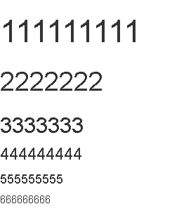
标题
HTML 中的所有标题标签,<h1> 到 <h6> 均可使用。另外,还提供了 .h1 到 .h6 类,为的是给内联(inline)属性的文本赋予标题的样式。
<h1>111111111</h1>
<h2>2222222</h2>
<h3>3333333</h3>
<h4>444444444</h4>
<h5>555555555</h5>
<h6>666666666</h6>
在标题内还可以包含 <small> 标签或赋予 .small 类的元素,可以用来标记副标题
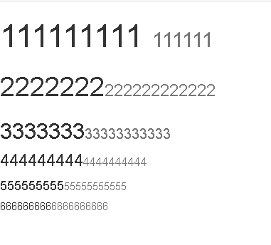
<h1>111111111 <small>111111</small></h1>
<h2>2222222<small>222222222222</small></h2>
<h3>3333333<small>33333333333</small></h3>
<h4>444444444<small>4444444444</small></h4>
<h5>555555555<small>55555555555</small></h5>
<h6>666666666<small>6666666666</small></h6>
内联文本元素
高亮文本
例如:
You can use the mark tag to <mark>highlight</mark> text.

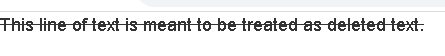
被删除文本
例如:
<del>This line of text is meant to be treated as deleted text.</del>
插入文本
额外插入的文本使用 <ins> 标签。
<ins>This line of text is meant to be treated as an addition to the document.</ins>

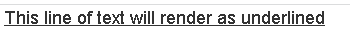
带下划线文本
为文本添加下划线,使用 <u> 标签
<u>This line of text will render as underlined</u>
小号文本
对于不需要强调的inline或block类型的文本,使用 <small> 标签包裹,其内的文本将被设置为父容器字体大小的 85%。标题元素中嵌套的 <small> 元素被设置不同的 font-size 。
你还可以为
<small>This line of text is meant to be treated as fine print.</small>
行内元素赋予 .small 类以代替任何 <small> 元素。

着重
通过增加 font-weight 值强调一段文本
<strong>rendered as bold text</strong>

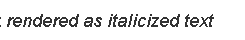
斜体
用斜体强调一段文本。
<em>rendered as italicized text</em>
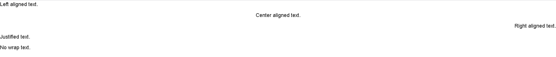
对齐
<p class="text-left">Left aligned text.</p>
<p class="text-center">Center aligned text.</p>
<p class="text-right">Right aligned text.</p>
<p class="text-justify">Justified text.</p>
<p class="text-nowrap">No wrap text.</p>
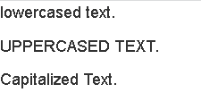
改变大小写
<p class="text-lowercase">Lowercased text.</p>
<p class="text-uppercase">Uppercased text.</p>
<p class="text-capitalize">Capitalized text.</p>
表格
table table-bordered table-striped table-hover
1、为任意 <table> 标签添加 .table 类可以为其赋予基本的样式
2、条纹状表格:通过 .table-striped 类可以给 <tbody> 之内的每一行增加斑马条纹样式。
3、带边框的表格:添加 .table-bordered 类为表格和其中的每个单元格增加边框
4、鼠标悬停:通过添加 .table-hover 类可以让 <tbody> 中的每一行对鼠标悬停状态作出响应。
5、紧缩表格:通过添加 .table-condensed 类可以让表格更加紧凑,单元格中的内补(padding)均会减半。
状态类
通过这些状态类可以为行或单元格设置颜色。
| Class | 描述 |
|---|---|
.active |
鼠标悬停在行或单元格上时所设置的颜色 |
.success |
标识成功或积极的动作 |
.info |
标识普通的提示信息或动作 |
.warning |
标识警告或需要用户注意 |
.danger |
标识危险或潜在的带来负面影响的动作 |
<!-- On rows -->
<tr class="active">...</tr>
<tr class="success">...</tr>
<tr class="warning">...</tr>
<tr class="danger">...</tr>
<tr class="info">...</tr>

<!-- On cells (`td` or `th`) -->
<tr>
  <td class="active">...</td>
  <td class="success">...</td>
  <td class="warning">...</td>
  <td class="danger">...</td>
  <td class="info">...</td>
</tr>
表单
独的表单控件会被自动赋予一些全局样式。所有设置了 .form-control 类的 <input>、<textarea> 和 <select> 元素都将被默认设置宽度属性为 width: 100%;。 将 label 元素和前面提到的控件包裹在 .form-group 中可以获得最好的排列。
不要将表单组和输入框组混合使用
不要将表单组直接和输入框组混合使用。建议将输入框组嵌套到表单组中使用。
以上所有具体使用看可在以下查找:
全局 CSS 样式 · Bootstrap v3 中文文档 | Bootstrap 中文网 (bootcss.com)

 浙公网安备 33010602011771号