WEB01_Day03(上)-盒子模型、文本相关样式、CSS三大特性、定位

一、盒子模型

1.1 定义:

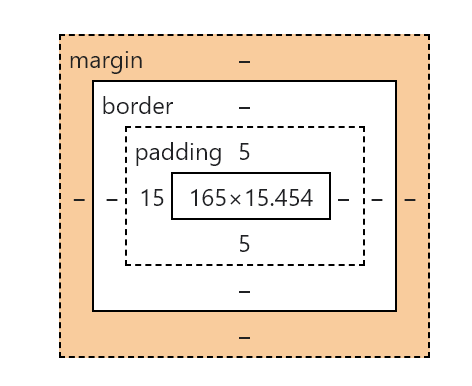
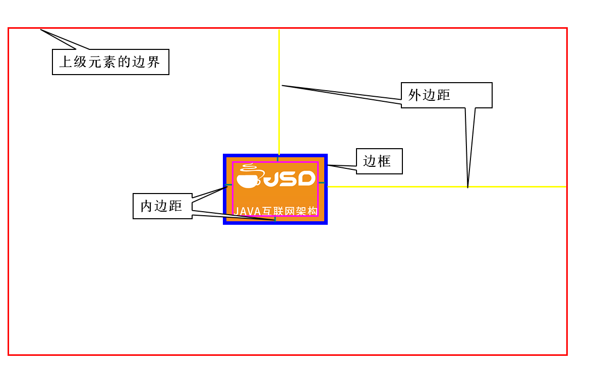
  盒子模型是所有标签(HTML元素)都拥有的模型特征。盒子模型中规定所有标签拥有的层级结构,使用盒子模型可以进行对标签元素进行修饰和定位处理。如图所示:

  • 元素的宽和高

  • 元素的内边距

  • 元素的边框

  • 元素的外边距

1.2 盒子模型:元素宽高

  盒子模型中使用宽和高进行控制元素的大小。如果需要对于元素的大小进行赋值,可以使用像素px进行赋值,也可以使用百分比的方式进行赋值(对上级元素进行百分比设置赋值)

注意:块级元素可以进行设置宽和高,行内元素不可以设置宽和高,行内块可以进行设置宽和高

1.3 盒子模型:内边距

  • 表示方式:padding

  • 作用:用来表示元素内容到边框之间的距离

  • 赋值的方式:

    • padding:5px; 表示上下左右四个方向的内边距值为5像素。

    • padding:10px 5px; 表示上下的像素值为10像素,左右的像素值为5像素。

    • padding:1px 2px 3px 4px; 表示顺时针方位(上右下左)的内边距的值分别为1、2、3、4像素

    • padding-left/right/top/bottom:3px; 表示距离单独的某一个方位的内边距像素值为3像素。

  • 特征:内边距这个范围内是可以显示颜色或者图片。

 <!DOCTYPE html>
 <html lang="en">
 <head>
     <meta charset="UTF-8">
     <meta http-equiv="X-UA-Compatible" content="IE=edge">
     <meta name="viewport" content="width=device-width, initial-scale=1.0">
     <title>内边距案例</title>
     <style type="text/css">
         div {
             background-color: rgb(70, 99, 180);
             width: 533px;
             height: 300px;
             /* 上方内边距 */
             /* padding-top: 10px; */
             /* 右侧内边距 */
             /* padding-right: 10px; */
             /* 下方内边距 */
             /* padding-bottom: 10px; */
             /* 左侧内边距 */
             /* padding-left: 10px; */
             /* 四个方向的像素值一样 */
             /* padding: 10px; */
             /* 上下像素   左右像素 */
             /* padding: 10px 20px; */
             padding: 10px 20px 30px 40px;
 
        }
     </style>
 </head>
 <body>
     <div>
         <!-- 设置内边距:元素到边框的距离,在此距离中会显示背景颜色和图片 -->
         <img src="../img/1.jpg">
     </div>
 </body>
 </html>

1.4 盒子模型:边框

  • 边框:border

  • 作用:可以设置元素的边框,包括边框粗细,颜色样式等,让元素更美观

  • 赋值方式 :

    • border:边框粗细 边框样式 颜色; 四个方向添加边框

    • border-left/right/top/bottom: 边框粗细边框样式颜色; 单独某个方向赋值

    • border-radius: 圆⻆值越大越圆当值大于宽高(包括边框)一半时为正圆

 <!DOCTYPE html>
 <html lang="en">
 <head>
     <meta charset="UTF-8">
     <meta http-equiv="X-UA-Compatible" content="IE=edge">
     <meta name="viewport" content="width=device-width, initial-scale=1.0">
     <title>边框案例</title>
     <style type="text/css">
         div {
             /*
            dotted - 定义点线边框
            dashed - 定义虚线边框
            solid - 定义实线边框
            double - 定义双边框
            groove - 定义 3D 坡口边框。效果取决于 border-color 值
            ridge - 定义 3D 脊线边框。效果取决于 border-color 值
            inset - 定义 3D inset 边框。效果取决于 border-color 值
            outset - 定义 3D outset 边框。效果取决于 border-color 值
            none - 定义无边框
            hidden - 定义隐藏边框
            */
             background-color: violet;
             width: 533px;
             height: 300px;
             padding: 10px;
             border: 10px solid blue;
             /* border-bottom:10px solid coral; */
             border-radius: 3px;
        }
     </style>
 </head>
 <body>
     <div>
         <img src="../img/1.jpg">
     </div>
 </body>
 </html>

1.5 盒子模型:外边距

  • 外边距:margin

  • 作用:设置元素边框到上级元素或其它同级元素的距离,这个距离不会出现当前元素的背景,但是也计算在当前元素总的宽和高中

  • 赋值方式 :

    • margin-left /top/right /bottom 单独给某一个方向添加外边距

    • margin:10px 给四个方向添加10个像素外边距

    • margin: 10px 20px 上下10 左右20px

    • margin: 0 auto 上下0 左右自动居中

    • margin: 10px 20px 30px 40px

  • 案例一:同级元素之间外边距设置

 <!DOCTYPE html>
 <html lang="en">
 <head>
     <meta charset="UTF-8">
     <meta http-equiv="X-UA-Compatible" content="IE=edge">
     <meta name="viewport" content="width=device-width, initial-scale=1.0">
     <title>外边距01</title>
     <style type="text/css">
         body {
             margin: 0;
             padding: 0;
        }
 
         #d1 {
             background-color: red;
             width: 100px;
             height: 80px;
             display: inline-block;
             /* 上右下左外边距相同 */
             /* margin: 10px; */
             /* margin-top margin-right margin-left */
             /* margin-bottom: 10px; */
             margin-right: 20px;
        }
 
         #d2 {
             background-color: green;
             width: 100px;
             height: 80px;
             display: inline-block;
             /* margin: 0 auto; */
        }
     </style>
 </head>
 <body>
     <div id="d1">第一个div</div>
     <div id="d2">第二个div</div>
 </body>
 </html>
  • 案例二:上级元素之间外边距设置

 <!DOCTYPE html>
 <html lang="en">
 <head>
     <meta charset="UTF-8">
     <meta http-equiv="X-UA-Compatible" content="IE=edge">
     <meta name="viewport" content="width=device-width, initial-scale=1.0">
     <title>外边距02</title>
     <style type="text/css">
         #father {
             width: 300px;
             height: 300px;
             background-color: red;
             /* 解决外边距粘连问题 */
             overflow: hidden;
        }
         #son {
             width: 150px;
             height: 150px;
             background-color: green;
             margin-left: 20px;
             /*
            设置距离父级元素的上外边距时,会对父级的div的位置产生影响
            运行以后可以发现,父级div整体是向下进行移动了,
            这种现象也称之为外边距粘连问题。
              */
             margin-top: 30px;
        }
     </style>
 </head>
 <body>
     <div id="father">
         <div id="son"></div>
     </div>
 </body>
 </html>


二、文本相关样式

2.1文本修饰和字体设置

  • 文本水平对齐方式 text-align:left/right/center

  • 文本修饰 text-decoration:overline/underline/line-through/none

  • 文本阴影 text-shadow: 颜色 x偏移值 y偏移值浓度值越大越模糊

  • 行高 line-height: 20px 实现文本垂直居中

  • 字体大小 font-size:20px;

  • 字体加粗 font-weight: bold加粗 normal去掉加粗效果

  • 斜体 font -style:italic(斜体)/oblique(倾斜)/normal(正常)

  • 字体系列设置 font-family:xxx,xxxx;

  • font : 字体 xxx,xxx,xxxx;(最不常用的)

 <!DOCTYPE html>
 <html lang="en">
 <head>
     <meta charset="UTF-8">
     <meta http-equiv="X-UA-Compatible" content="IE=edge">
     <meta name="viewport" content="width=device-width, initial-scale=1.0">
     <title>文本修饰和字体设置</title>
     <style type="text/css">
         div {
             width: 700px;
             height: 100px;
             /* 设置div背景颜色 */
             background-color: moccasin;
             /* 设置字体颜色 */
             color: orangered;
             /* 设置字体大小 */
             font-size: 50px;
             /* 设置行高(一行文本所占用的告诉,显示的时候会垂直居中) */
             line-height: 90px;
             /* 水平对齐方式 */
             text-align: center;
             /*
            文本修饰
            text-decoration:overline/underline/line-through/none
              */
             text-decoration: overline;
             /*
            加粗
            normal 默认值。定义标准的字符。
            bold 定义粗体字符。
            bolder 定义更粗的字符。
            lighter 定义更细的字符。
            */
             font-weight: bold;
             /* 斜体 */
             font-style: italic;
             /* 设置字体 */
             font-family: 宋体;
             /* 文本阴影 (颜色 x轴偏移量   y轴偏移量   浓度)*/
             text-shadow: seagreen -8px -8px 2px;
             /* font:italic bold 12px/20px arial,sans-serif; */
        }
 
         a {
             text-decoration: none;
        }
         span {
             text-decoration: line-through;
        }
 
     </style>
 </head>
 <body>
     <div>今天是星期日</div>
     <a href="https://www.tmooc.cn/">达内慕课网</a>程序员的首选学习平台
     <span>原价xxx价格</span>现价xxx钱
 
 </body>
 </html>

2.2 CSS项目实战

学子商城练习(一)

 <!DOCTYPE html>
 <html lang="en">
 <head>
     <meta charset="UTF-8">
     <meta http-equiv="X-UA-Compatible" content="IE=edge">
     <meta name="viewport" content="width=device-width, initial-scale=1.0">
     <title>学子商城1</title>
     <style type="text/css">
         body {
             /* 字体颜色 */
             color: #666;
             /* 字体设置 */
             font: 12px "simhei", Arial, Helvetica, sans-serif;
             /* 背景颜色 */
             background-color: #f5f5f5;
        }
 
         #container {
             width: 611px;
             height: 376px;
             background-color: #e8e8e8;
             /* 背景图片 */
             background-image: url("http://doc.canglaoshi.org/tstore_v1/images/itemCat/study_computer_img1.png");
             /* 图片去除重复显示 */
             background-repeat: no-repeat;
             /* 设置背景图片的位置 */
             background-position: 90% 70%;
             background-size: 318px 319px;
             /* 解决外边距粘连问题 */
             overflow: hidden;
        }
 
         #container>div{
             width: 245px;
             height: 232px;
             /* */
             margin: 68px 0 0 36px;
        }
 
         .p1 {
             font-size: 32px;
             color: #333;
        }
         .p3 {
             font-size: 24px;
             color: #0aa1ed;
             font-weight: bold;
             margin-bottom: 12px;
        }
         input {
             width: 133px;
             height: 40px;
             color: #fff;
             background-color: #0aa1ed;
             font-size: 20px;
             border: 0;
             /* 设置圆角 */
             border-radius: 3px;
             /* 设置指针样式 */
             cursor: pointer;
        }


     </style>
 </head>
 <body>
     <div id="container">
         <div>
             <p class="p1">灵越 燃7000系列</p>
             <p class="p2">
                酷睿双核i5处理器|256GB SSD| 8GB内存<br>
                英特尔HD显卡620含共享显卡内存
             </p>
             <p class="p3">¥4999.00</p>
             <input type="button" value="查看详情">
         </div>
     </div>
 </body>
 </html>

学子商城练习(二)

 <!DOCTYPE html>
 <html lang="en">
 <head>
     <meta charset="UTF-8">
     <meta http-equiv="X-UA-Compatible" content="IE=edge">
     <meta name="viewport" content="width=device-width, initial-scale=1.0">
     <title>学子商城02</title>
     <style type="text/css">
         body {
             /* 字体颜色 */
             color: #666;
             /* 字体设置 */
             font: 12px "simhei", Arial, Helvetica, sans-serif;
             /* 背景颜色 */
             background-color: #f5f5f5;
        }
         
         #container {
             width: 375px;
             height: 376px;
             background-color: #e8e8e8;
             background-image: url("http://doc.canglaoshi.org/tstore_v1/images/itemCat/study_computer_img2.png");
             background-repeat: no-repeat;
             background-size: 286px 248px;
             background-position: 80% 90%;
             overflow: hidden;
        }
 
         #container>div {
             width: 253px;
             height: 233px;
             /* */
             margin: 38px 0 0 25px;
        }
 
         .p1 {
            font-size: 32px;
            color: #333;
            margin-bottom: 12px;
        }
 
         .p3 {
             font-size: 24px;
             color: #0aa1ed;
             /* 设置和按钮的外边距 */
             margin-bottom: 12px;
        }
 
         a {
             width: 132px;
             height: 40px;
             background-color:#0aa1ed ;
             border: 0;
             color: #fff;
             /* a标签是一个行内元素,需要变成块级元素才能设置宽和高 */
             display: block;
             font-size: 20px;
             text-decoration: none;
             text-align: center;
             border-radius: 3px;
             /* 行高 */
             line-height: 40px;
        }
 
     </style>
 </head>
 <body>
     <div id="container">
         <div>
             <p class="p1">颜值 框不住</p>
             <p class="p2">
                酷睿双核i5处理器|256GB SSD| 8GB内存<br>
                英特尔HD显卡620含共享显卡内存
             </p>
             <p class="p3">¥6888.00</p>
             <a href="">查看详情</a>
         </div>
     </div>
 </body>
 </html>


三、CSS三大特性

  • 继承性

    元素可以继承上级元素的文本相关样式,元素自带效果不受继承影响

    比如:超链接a标签的字体颜色,h1-h6字体大小

  • 层叠性

    多个选择器有可能选择到同一个元素, 如果作用的样式不同则全部层叠生效,如果作用的样式相同则由优先级决定

  • 优先级

    作用范围越小优先级越高 id>class>标签名>继承(继承属于间接选中)


四、定位(非常重要)

4.1 定义

  排列(摆放)元素的方式

4.2 分类

  • 静态定位(文档流定位)

显示特点:默认情况下,块元素垂直排列,行内元素左右排列,这种默认排列的方式叫默认定位,也叫文档流定位

格式:position:static(默认)

移动元素:通过外边距

缺点:定位单调上下或者左右

  • 特殊定位

浮动定位: 可以让块元素左右排列

相对定位: 让元素以自身为目标产生微小的偏移

绝对定位: 让元素以父辈为目标产生较大的偏移

固定定位: 让元素以窗口为目标产生巨大的偏移

4.3 相对定位

显示特点:目标不离队(不脱离流)以自身为目标产生偏移,通常偏移量很小,不管元素在哪里仍然占用原来的位置

格式:position: relative;

移动元素:通过top/bottom/left/right 让元素相对于初始位置做位置偏移

 <!DOCTYPE html>
 <html lang="en">
 <head>
     <meta charset="UTF-8">
     <meta http-equiv="X-UA-Compatible" content="IE=edge">
     <meta name="viewport" content="width=device-width, initial-scale=1.0">
     <title>相对定位</title>
     <style type="text/css">
         div {
             width: 100px;
             height: 100px;
             border: 1px solid green;
        }
 
         /* #d2 {
           
            position: relative;
            left: 150px;
            top: 150px;
        } */
 
         #d2:hover {
              /* 相对定位 */
              position: relative;
             left: 150px;
             top: 150px;
        }
 
     </style>
 </head>
 <body>
     <div>div1</div>
     <div id="d2">div2</div>
     <div>div3</div>
 </body>
 </html>

4.4 绝对定位

以带有position属性的父辈为目标产生偏移,若父辈都有position则以就近的父辈为目标,若父辈都没有position则以body为目标

显示特点:目标离队(脱离流)

格式:position: absolute;

移动元素:通过top/bottom/left/right 让元素相对于窗口(默认)或某一个上级元素 (需要在上级元素中做相对定位)做位置偏移

 <!DOCTYPE html>
 <html lang="en">
 <head>
     <meta charset="UTF-8">
     <meta http-equiv="X-UA-Compatible" content="IE=edge">
     <meta name="viewport" content="width=device-width, initial-scale=1.0">
     <title>绝对定位</title>
     <style type="text/css">
         div {
             width: 100px;
             height: 100px;
             border: 2px solid green;
        }
 
         #d2 {
             position: absolute;
             top: 100px;
             left: 100px;
        }
         
         #father {
             width: 200px;
             height: 200px;
             background-color: royalblue;
             margin: 100px;
             position: relative;
        }
 
         #son {
             width: 100px;
             height: 100px;
             background-color: lightsalmon;
             /* 以父级元素为基准,进行绝对定位 */
             position: absolute;
             left: 20px;
             top: 20px;
        }
 
     </style>
 </head>
 <body>
     <div>div1</div>
     <div id="d2">div2</div>
     <div>div3</div>
 
     <div id="father">
         <div id="son"></div>
     </div>
 
 </body>
 </html>

4.5 固定定位

以浏览器窗口为目标产生偏移

显示特点:目标离队(脱离流)

格式position: fixed;

移动元素:通过top/bottom/left/right 让元素相对于窗口做位置偏移

 <!DOCTYPE html>
 <html lang="en">
 <head>
     <meta charset="UTF-8">
     <meta http-equiv="X-UA-Compatible" content="IE=edge">
     <meta name="viewport" content="width=device-width, initial-scale=1.0">
     <title>固定定位</title>
     <style type="text/css">
         div {
             width: 40px;
             height: 40px;
             border: 2px solid red;
             background-color: blue;
             position: fixed;
             left: 100px;
             top: 400px;
        }
     </style>
 </head>
 <body>
     <img src="../img/长图.png">
     <div>一动不动</div>
 </body>
 </html>

4.6 浮动定位

作用: 可以让块元素左右排列显示

特点: 浮动的目标会离队(脱离流)

1)元素从当前行向左或向右浮动,当撞到上级元素边框或其它浮动元素时停止。

2)如果一行显示不下会自动换行,换行时有可能被卡住

3)如果元素的所有子元素全部浮动则自动识别的高度为0,通过给元素添加 overflow:hidden解决

步骤: 1)目标离队; 2)弟弟前进; 3)目标到达指定位置;

格式: 左浮动float:left,右浮动float:right

右浮动案例:

 <!DOCTYPE html>
 <html lang="en">
 <head>
     <meta charset="UTF-8">
     <meta http-equiv="X-UA-Compatible" content="IE=edge">
     <meta name="viewport" content="width=device-width, initial-scale=1.0">
     <title>右浮动</title>
     <style type="text/css">
         div {
             width: 100px;
             height: 100px;
             margin: 10px;
        }
         #d1 {
             background-color: red;
           
        }
         #d2 {
             background-color: green;
           
        }
         #d3 {
             background-color: blue;
             
             
        }
         /*
        浮动会让元素脱离文档流,如果是当前文档流中某一个元素设置了浮动,
        为了防止干扰整个文档流,建议其他元素也进行设置浮动
        */
         #d1,#d2,#d3 {
             float: right;
        }
 
     </style>
 </head>
 <body>
     <div id="d1">div1</div>
     <div id="d2">div2</div>
     <div id="d3">div3</div>
 </body>
 </html>

左浮动案例:

 <!DOCTYPE html>
 <html lang="en">
 <head>
     <meta charset="UTF-8">
     <meta http-equiv="X-UA-Compatible" content="IE=edge">
     <meta name="viewport" content="width=device-width, initial-scale=1.0">
     <title>左浮动</title>
     <style type="text/css">
         div {
             width: 100px;
             height: 100px;
             margin: 10px;
        }
         #d1 {
             background-color: red;
           
        }
         #d2 {
             background-color: green;
           
        }
         #d3 {
             background-color: blue;
             
             
        }
         /*
        浮动会让元素脱离文档流,如果是当前文档流中某一个元素设置了浮动,
        为了防止干扰整个文档流,建议其他元素也进行设置浮动
        */
         #d1,#d2,#d3 {
             float: left;
        }
 
     </style>
 </head>
 <body>
     <div id="d1">div1</div>
     <div id="d2">div2</div>
     <div id="d3">div3</div>
 </body>
 </html>

4.7 练习

 <!DOCTYPE html>
 <html lang="en">
 <head>
     <meta charset="UTF-8">
     <meta http-equiv="X-UA-Compatible" content="IE=edge">
     <meta name="viewport" content="width=device-width, initial-scale=1.0">
     <title>照片墙练习</title>
     <style type="text/css">
         body {
             background-color: cadetblue;
        }
         ul {
             /* 去除列表前面的点 */
             list-style-type: none;
             width: 780px;
             margin: 20px auto;
             /* 去除左侧自带的内边距 */
             padding: 0;
        }
         li {
             width: 218px;
             padding: 10px;
             margin: 10px;
             border: 1px solid #ccc;
             float: left;
             background-color: #fff;
        }
         p {
             text-align: center;
        }
         li:hover {
             position: relative;
             left: 2px;
             top: -2px;
        }
 
     </style>
 </head>
 <body>
     <!-- 无序列表实现照片墙 -->
     <ul>
         <li>
             <img src="../img/01.jpg">
             <p>啊,Teacher苍!!!</p>
         </li>
         <li>
             <img src="../img/02.jpg">
             <p>您在何方?</p>
         </li>
         <li>
             <img src="../img/03.jpg">
             <p>莫非是去了xx地方</p>
         </li>
         <li>
             <img src="../img/04.jpg">
             <p>听说那边的风景还不错</p>
         </li>
         <li>
             <img src="../img/05.jpg">
             <p>回来的时候记得带点土特产</p>
         </li>
         <li>
             <img src="../img/06.jpg">
             <p>想您!!!</p>
         </li>
     </ul>
 </body>
 </html>

4.8 总结

  • 相对定位:如果偏移量较小,并且不脱离文档流(不离开之前的位置)

  • 固定定位:如果元素需要挂载到窗口上不动

  • 浮动定位:如果块级元素需要左右排列

  • 绝对定位:如果以上的定位都不能满足要求,就采用绝对定位(不要纠结)


posted @ 2021-08-08 21:12  Coder_Cui  阅读(57)  评论(0编辑  收藏  举报