
css 绘制图形
1、绘制三角形
用 css 画三角形主要是利用边框 border 来设置的,是不是有点迷惑?我们先试试把 div 四条边框设置成不同的颜色看看会出现什么效果:

<head>
    <style>
        .triangle {
            width: 50px;
            height: 50px;
            border-bottom: 200px solid #ce7486;
            border-left: 200px solid #3898b1;
            border-right: 200px solid darkgoldenrod;
            border-top: 200px solid #8361c9;
        }
    </style>
</head>
<body>
    <div class="triangle"></div>
</body>
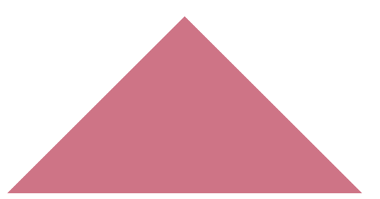
可以看出边框是呈现一个三角形的趋势往内推,那么如果我们只想要一个向上趋势的三角形该怎么做呢?很简单,把盒子的宽高设为0,其它角度的边框颜色设置为透明就可以了,如下:
<head>
    <style>
        .triangle {
            width: 0;
            height: 0;
            border-bottom: 200px solid #ce7486;
            border-left: 200px solid transparent;
            border-right: 200px solid transparent;
            border-top: 200px solid transparent;
        }
    </style>
</head>
<body>
    <div class="triangle"></div>
</body>
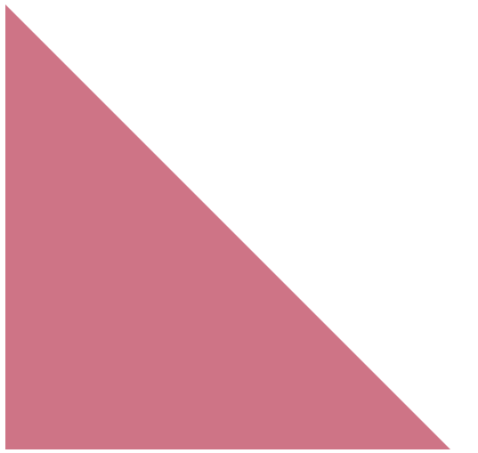
还可以绘制直角三角形:
<style>
        .triangle {
            width: 0;
            height: 0;
            border-bottom: 200px solid #ce7486;
            border-left: 200px solid #ce7486;
            border-right: 200px solid transparent;
            border-top: 200px solid transparent;
        }
    </style>
2、绘制箭头
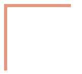
利用边框加上旋转,我们设置两个相邻的边框,然后做 45 度的旋转,这样就可以得到不同类型的箭头了。
<head>
    <style>
        .triangle {
            width: 100px;
            height: 100px;
            border-left: 5px solid darksalmon;
            border-top: 5px solid darksalmon;
        }
    </style>
</head>
<body>
    <div class="triangle"></div>
</body>
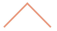
转 45 度:
<style>
        .triangle {
            width: 100px;
            height: 100px;
            border-left: 5px solid darksalmon;
            border-top: 5px solid darksalmon;
            transform: rotate(45deg);
        }
</style>
3、绘制圆
绘制圆主要是使用 css3 的属性 border-radius
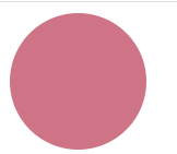
<head>
    <style>
        .circle {
            width: 100px;//宽高要相等,否则是椭圆
            height: 100px;
            border-radius: 50%;
            background-color: #ce7486;
        }
    </style>
</head>
<body>
    <div class="circle"></div>
</body>
绘制圆环:
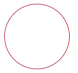
<style>
        .circle {
            width: 100px;
            height: 100px;
            border: 2px solid #ce7486;
            border-radius: 50%;
            background-color: white;
        }
</style>
4、画一条 0.5px 的线
直接设置 0.5px ,在不同的浏览器会有差异,谷歌浏览器直接把 0.5px 四舍五入变成了 1px.
可以设置成 1px,再使用缩放功能。
<head>
    <style>
        .outline {
            height: 1px;
            background-color: black;
            transform: scaleY(0.5);
        }
    </style>
</head>
<body>
    <div class="outline"></div>
</body>

 浙公网安备 33010602011771号