
Python 绘图
绘图
常用的 Python 绘图工具是 Matplotlib。Matplotlib 是一个广泛使用的 Python 2D 绘图库,用于创建静态、交互式和动画可视化图表。
折线图
使用 plot 函数在 Matplotlib 中创建折线图:
import matplotlib.pyplot as plt

# 数据
x = [1, 2, 3, 4, 5]
y = [2, 3, 5, 7, 11]

# 创建折线图
plt.plot(x, y, marker='o', linestyle='-', color='b', label='Line 1')
# 设置标题和标签
plt.title('Simple Line Plot')
plt.xlabel('X Axis')
plt.ylabel('Y Axis')
plt.legend()
# 显示图形
plt.show()

散点图
使用 scatter 函数在 Matplotlib 中创建散点图:
import matplotlib.pyplot as plt

# 数据
x = [1.0, 1.5, 2.0, 2.5, 3.0, 3.5, 4.0]
y = [300.0, 400.0, 500.0, 550.0, 650.0, 750.0, 800.0]

# 创建散点图
plt.scatter(x, y, marker='x', c='r')
# 设置标题和标签
plt.title("Housing Prices")
plt.xlabel('Size (1000 sqft)')
plt.ylabel('Price (in 1000s of dollars)')
# 显示图形
plt.show()

热力图
绘制热力图需要使用 Matplotlib 库和 Seaborn 库。Seaborn 是一个基于 Matplotlib 的 Python 数据可视化库。它提供了更高级的界面和更美观的默认样式。
import numpy as np
import seaborn as sns
import matplotlib.pyplot as plt

# 创建一个 10x10 的虚拟点击率数据(0 到 1 之间)
np.random.seed(0)
data = np.random.rand(10, 10)

# 设置绘图风格
sns.set_theme(style="whitegrid")
plt.rcParams['font.family'] = ['Times New Roman', 'SimSun']

# 创建热力图
plt.figure(figsize=(8, 6))
ax = sns.heatmap(data, annot=True, fmt=".2f", cmap="YlGnBu", cbar_kws={'label': '点击率'}, linewidths=0.5)

# 设置标题和标签
ax.set_title("市场营销效果评估热力图", fontsize=16)
ax.set_xlabel("区域", fontsize=12)
ax.set_ylabel("城市", fontsize=12)

# 显示图形
plt.show()

放大图
import numpy as np
import matplotlib.pyplot as plt
from mpl_toolkits.axes_grid1.inset_locator import mark_inset

# 绘制主图
x = np.linspace(0.1, 100, 100)
y = np.sin(x) / x
fig, ax = plt.subplots()
ax.plot(x, y)

# 绘制插入图
x1 = x[10:50]
y1 = y[10:50]
axins = ax.inset_axes([0.4, 0.4, 0.5, 0.5])  # 创建插入图 (x, y, w, h)
axins.plot(x1, y1)  # 绘制插入图

# 添加连接线
mark_inset(
    ax,
    axins,
    loc1=2,                 # 主图连接点位置
    loc2=4,                 # 插入图连接点位置
    fc=(0.2, 0.5, 1, 0.3),  # 连接线颜色
    ec=(0, 0, 0, 0.3),      # 边框颜色
    linewidth=1.5,          # 连接线宽度
    linestyle='--',         # 连接线样式
)

plt.tight_layout()
plt.show()

更多示例
折线图
import numpy as np
import matplotlib.pyplot as plt

plt.rcParams['font.family'] = ['Times New Roman', 'SimSun'] # 设置字体族
plt.rcParams['axes.unicode_minus'] = False # 显示负号

x = np.array([3,5,7,9,11,13,15,17,19,21])

A = np.array([0.9708, 0.6429, 1, 0.8333, 0.8841, 0.5867, 0.9352, 0.8000, 0.9359, 0.9405])
B = np.array([0.9708, 0.6558, 1, 0.8095, 0.8913, 0.5950, 0.9352, 0.8000, 0.9359, 0.9419])
C = np.array([0.9657, 0.6688, 0.9855, 0.7881, 0.8667, 0.5952, 0.9361, 0.7848, 0.9244, 0.9221])
D = np.array([0.9664, 0.6701, 0.9884, 0.7929, 0.8790, 0.6072, 0.9352, 0.7920, 0.9170, 0.9254])

# label 在图示(legend)中显示。若为数学公式,则最好在字符串前后添加 $ 符号
# color: b:blue, g:green, r:red, c:cyan, m:magenta, y:yellow, k:black, w:white
# 线型:- -- -. : ,
# marker: . , o v < * + 1

plt.figure(figsize=(10,5))
plt.grid(linestyle="--") # 设置背景网格线为虚线
ax = plt.gca()

ax.spines['top'].set_visible(False) # 去掉上边框
ax.spines['right'].set_visible(False) # 去掉右边框

# A 图
plt.plot(x, A, color="black", label="A algorithm", linewidth=1.5)
# B 图
plt.plot(x, B, "k--", label="B algorithm", linewidth=1.5)
# C 图
plt.plot(x, C, color="red", label="C algorithm", linewidth=1.5)
# D 图
plt.plot(x, D, "r--", label="D algorithm", linewidth=1.5)

# 设置标题
plt.title("example", fontsize=12, fontweight='bold')

# 设置坐标轴刻度标识
x_ticks=['dataset1', 'dataset2', 'dataset3', 'dataset4', 'dataset5', ' dataset6', 'dataset7', 'dataset8', 'dataset9', 'dataset10'] # X 轴刻度的标识
plt.xticks(x, x_ticks, fontsize=12, fontweight='bold')
plt.yticks(fontsize=12, fontweight='bold')

# 设置坐标轴标签
plt.xlabel("Data sets", fontsize=13, fontweight='bold')
plt.ylabel("Accuracy", fontsize=13, fontweight='bold')

# 设置坐标轴范围
plt.xlim(3,21)
# plt.ylim(0.5,1)

# 显示图例
# plt.legend()
plt.legend(loc=0, numpoints=1)
leg = plt.gca().get_legend()
ltext = leg.get_texts()
plt.setp(ltext, fontsize=12, fontweight='bold') # 设置图例字体的大小和粗细

plt.savefig('filename.svg') # 建议保存为 svg 格式,再用 inkscape 转为矢量图 emf 后插入 word 中
plt.show()

设置
字体
为每个元素单独设置字体
import matplotlib.pyplot as plt

times = {'fontname':'Times New Roman'}  # Times New Roman
cmmi10 = {'fontname':'cmmi10'}          # Computer Modern Math Italic

plt.title('title',**times)              # 设置标题使用 Times New Roman
plt.xlabel('xlabel', **cmmi10)          # 设置 X 轴标签使用 Computer Modern Math Italic
设置全局字体
import matplotlib.pyplot as plt

plt.rcParams.update({
    'font.family': 'serif',
    'font.serif': ['Times New Roman', 'SimSun'],  # 设置有衬线字体栈
    'mathtext.fontset': 'stix',                   # 设置数学字体为 STIX
    'font.size': 12
})
参见:Fonts in Matplotlib | Matplotlib documentation
数学公式
可以通过启用 TeX 选项来显示 LaTeX 公式(需要电脑已安装 TeX Live):
import matplotlib.pyplot as plt
import numpy as np

# 启用 LaTeX 风格
plt.rcParams['text.usetex'] = True

x = np.linspace(0, 10, 1000)
y = np.sin(x**2) * np.exp(-x/3) + 0.5 * np.cos(3*x) / (1 + x)

# 显示图形
plt.plot(x, y)
plt.title(r'$\sin(x^2)e^{-x/3} + \frac{1}{2}\frac{\cos(3x)}{1+x}$')
plt.xlabel(r'$x$')
plt.ylabel(r'$\sin(x^2)e^{-x/3} + \frac{1}{2}\frac{\cos(3x)}{1+x}$')
plt.show()

参考:How to change fonts in matplotlib (python)? | Stack Overflow
如果需要同时显示数学公式和中文字体,需要配置 XeLaTeX 包:
import matplotlib.pyplot as plt
import matplotlib
import numpy as np

# 使用 pgf 后端(XeLaTeX)
matplotlib.use('pgf')

plt.rcParams['pgf.preamble'] = '\n'.join([
    r'\usepackage{xeCJK}',
    r'\setCJKmainfont{SimSun}'
])

# 生成数据点
x = np.linspace(-5, 5, 1000)
y = x**2 * np.exp(-x**2/4)

# 绘制函数曲线
plt.figure(figsize=(8, 6))
plt.plot(x, y, 'b-', label=r'$f(x)=x^2e^{-x^2/4}$')
plt.grid(True, alpha=0.3)
plt.title(r'高斯型二次函数曲线 $f(x)=x^2e^{-x^2/4}$')
plt.xlabel(r'$x$')
plt.ylabel(r'$f(x)$')
plt.legend(loc='best')
plt.tight_layout()

# 保存为 PDF 文件
plt.savefig('figure.pdf')
plt.close()
使用了 XeLaTeX 的缺点是无法交互式地显示图像,只能打印图像。并且只能打印 PDF 而不能打印 SVG。
风格
matplotlib
plt.style.use('ggplot')
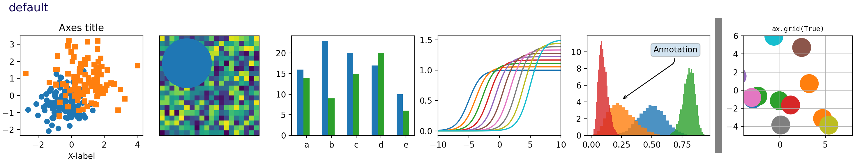
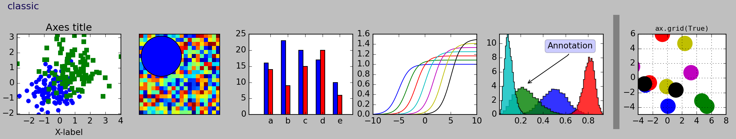
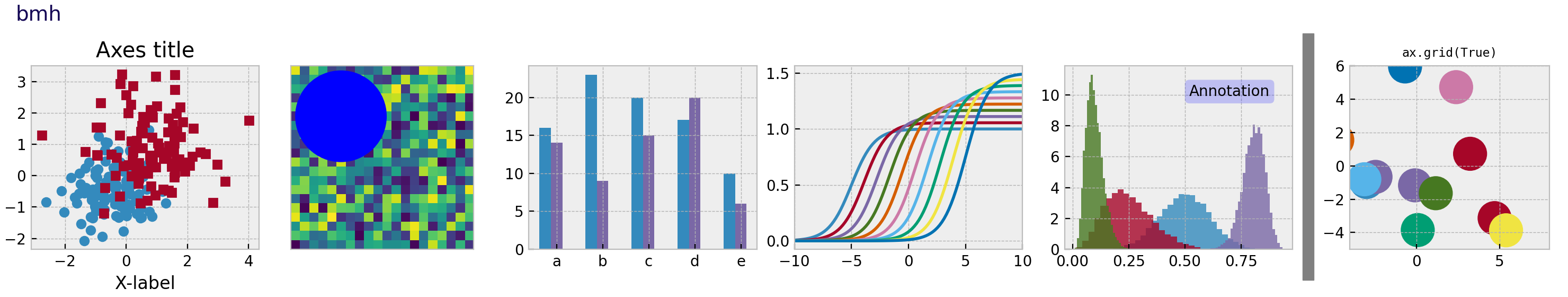
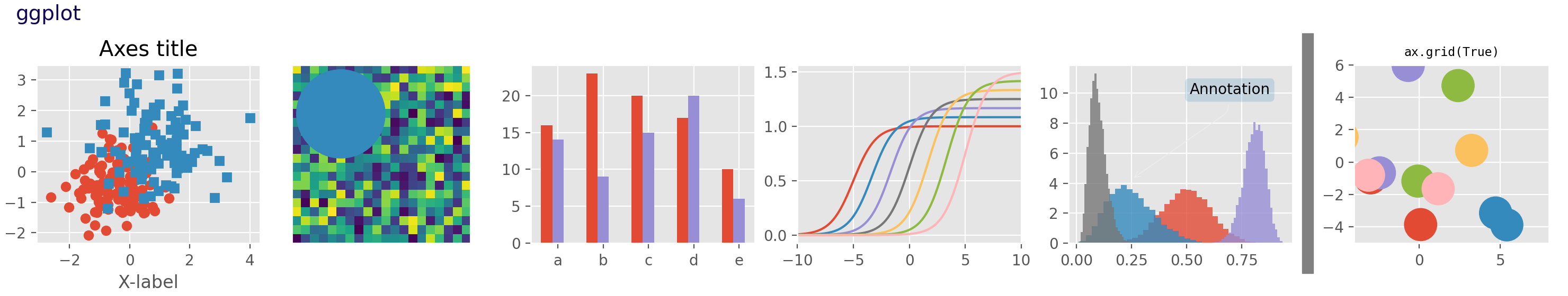
参见:Style sheets reference | Matplotlib documentation
pip install "matplotx[all]"
import matplotlib.pyplot as plt
import matplotx
import numpy as np

# 创建数据
rng = np.random.default_rng(0)
offsets = [1.0, 1.50, 1.60]
labels = ["no balancing", "CRV-27", "CRV-27*"]
x0 = np.linspace(0.0, 3.0, 100)
y = [offset * x0 / (x0 + 1) + 0.1 * rng.random(len(x0)) for offset in offsets]

# 绘图
with plt.style.context(matplotx.styles.dufte):
    for yy, label in zip(y, labels):
        plt.plot(x0, yy, label=label)

    plt.xlabel("distance [m]")
    matplotx.ylabel_top("voltage [V]")  # 将 ylabel 移动到顶部
    matplotx.line_labels()  # 绘制 line label
    plt.savefig("matplotx.svg", bbox_inches="tight")
    plt.close()

import matplotlib.pyplot as plt
import scienceplots
import numpy as np

x = np.linspace(0, 10, 100)
y1 = np.sin(x) + 0.1 * np.random.randn(100)
y2 = np.cos(x) + 0.1 * np.random.randn(100)

# 设置风格
plt.style.use(['science','ieee'])

# 绘图
plt.figure(figsize=(6, 4))
plt.plot(x, y1, label="Series 1", linewidth=1)
plt.plot(x, y2, label="Series 2", linewidth=1)
plt.title(f"IEEE Style", fontsize=10, fontweight="bold")
plt.xlabel("X Axis", fontsize=8)
plt.ylabel("Y Axis", fontsize=8)
plt.legend()
plt.grid(True, alpha=0.3)

plt.savefig("ieee.svg", bbox_inches="tight")
plt.close()

import numpy as np
import seaborn as sns
import matplotlib.pyplot as plt

x = np.linspace(0, 14, 100)

plt.figure(figsize=(6, 4))
for i in range(1, 11):
    plt.plot(x, np.sin(x + i * .5) * (12 - i) * 1)

sns.set_theme()
plt.savefig("seaborn.svg", bbox_inches="tight")
plt.close()

import mplcyberpunk
import numpy as np
import matplotlib.pyplot as plt

x = np.linspace(0, 14, 100)

plt.style.use("cyberpunk")
plt.figure(figsize=(6, 4))
for i in range(1, 11):
    plt.plot(x, np.sin(x + i * .5) * (12 - i) * 1)

mplcyberpunk.add_glow_effects()  # 加入辉光效果
plt.savefig("cyberpunk.svg", bbox_inches="tight")
plt.close()

图像格式
plt.savefig('plot.svg')           # 保存为 SVG
plt.savefig('plot.pdf')           # 保存为 PDF
plt.savefig('plot.eps')           # 保存为 EPS
plt.savefig('plot.png', dpi=300)  # 保存为 PNG
- SVG 适合在网页上显示图像
- PDF 适合用于文档
- EPS 适合高质量印刷
Troubleshooting
Matplotlib 找不到字体
findfont: Font family 'Times New Roman' not found.
解决方法:清除 matplotlib 缓存:
rm -rf ~/.cache/matplotlib

 浙公网安备 33010602011771号