![]()
<!DOCTYPE html>
<html lang="en">
<head>
<meta charset="UTF-8">
<title>CSS背景色径向渐变</title>
<style>
#grad1{
height: 150px;
width: 200px;
/* border-radius: 500px;*/ /* 这里不能设置圆角,长宽不一致效果没显示 */
background: -webkit-radial-gradient(red,yellow, green);
background: -o-radial-gradient(red,yellow, green);
background: -moz-radial-gradient(red,yellow, green);
background: radial-gradient(Ellipse,red,yellow, green);
/* circle 圆形 默认为椭圆 Ellipse */
}
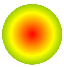
#grad2{
height: 200px;
width: 200px;
border-radius: 200px; /*边框圆角 200px:指定圆角半径 最后显示为一个圆太阳 */
background: -webkit-radial-gradient(red,yellow, green);
background: -o-radial-gradient(red,yellow, green);
background: -moz-radial-gradient(red,yellow, green);
background: radial-gradient(circle,red,yellow, green);
/* circle 圆形 默认为椭圆 Ellipse */
}
</style>
</head>
<body>
<h3>径向渐变--颜色结点均匀分布(椭圆)</h3>
<div id="grad1"></div>
<p><strong>注意:</strong> Internet Explorer 9 及之前的版本不支持渐变。</p>
<br/>
<hr color="red">
<h3>径向渐变--颜色结点均匀分布(圆)</h3>
<div id="grad2"></div>
<p><strong>注意:</strong> Internet Explorer 9 及之前的版本不支持渐变。</p>
<br/>
</body>
</html>


 浙公网安备 33010602011771号