import pandas as pd
unrate = pd.read_csv('unrate.csv')
unrate['DATE'] = pd.to_datetime(unrate['DATE'])
print(unrate.head(12))
         DATE  VALUE
0  1948-01-01    3.4
1  1948-02-01    3.8
2  1948-03-01    4.0
3  1948-04-01    3.9
4  1948-05-01    3.5
5  1948-06-01    3.6
6  1948-07-01    3.6
7  1948-08-01    3.9
8  1948-09-01    3.8
9  1948-10-01    3.7
10 1948-11-01    3.8
11 1948-12-01    4.0
import matplotlib.pyplot as plt
# matplotlib inline
# Using the different pyplot functions, we can create, customize, and display a plot.
plt.plot()
plt.show()
first_twelve = unrate[0:12]
plt.plot(first_twelve['DATE'],first_twelve['VALUE'])
plt.show()
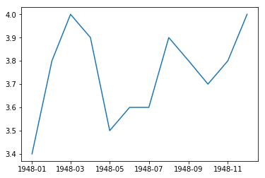
# While the y-axis looks fine, the x-axis tick labels are too close together and are unreadable
# We can rotate the x-axis tick labels by 90 degrees so they don't overlap
# We can specify degrees of rotation using a float or integer value.
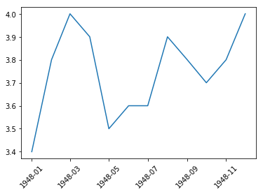
plt.plot(first_twelve['DATE'], first_twelve['VALUE'])
plt.xticks(rotation=45)
# print help(plt.xticks)
plt.show()
# xlabel(): accepts a string value, which gets set as the x-axis label.
# ylabel(): accepts a string value, which is set as the y-axis label.
# title(): accepts a string value, which is set as the plot title.
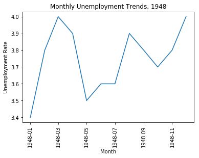
plt.plot(first_twelve['DATE'], first_twelve['VALUE'])
plt.xticks(rotation=90)
plt.xlabel('Month')
plt.ylabel('Unemployment Rate')
plt.title('Monthly Unemployment Trends, 1948')
plt.show()