
纯css绘制太极图(练手)
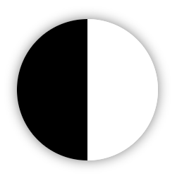
一、先绘制基础原型
.box-circle{
	width: 0; height: 200px; margin: 50px; position: relative;
	border-left: 100px solid #000; border-right: 100px solid #fff;
	box-shadow: 0 0 15px rgba(0,0,0,.5); border-radius: 200px;
}
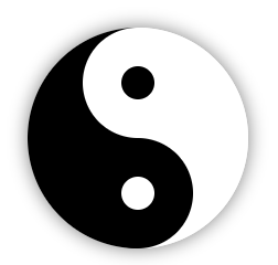
二、开始绘制
<!-- 运用伪类进行圆的绘制、box-shadow可节约标签与伪类的使用 -->
.box-circle:after,.box-circle:before{
    content: ""; display: block; position: absolute;
}
.box-circle:before{
    background: #fff;top:0;left:-50px;z-index: 1;
    width: 100px; height: 100px; border-radius: 50%;
    box-shadow: 0 100px 0 #000;
}
.box-circle:after{
    width: 30px;height: 30px;border-radius: 50%;
    top: 35px; left: -15px; z-index: 2;
    background: #000; box-shadow: 0 100px 0 #fff;
}
三、动画
.box-circle{
	animation: rotation 2.5s linear infinite;
}

@keyframes rotation{
	from{transform: rotate(0deg);}
	to{transform: rotate(-360deg);}
}

/* 浏览器兼容同上 */
@-moz-keyframes name{}
@-ms-keyframes name{}
@-webkit-keyframes name{}
animation 属性是一个简写属性,用于设置六个动画属性:
- animation-name 规定动画名称
- animation-duration 规定完成动画所花费的时间,以秒或毫秒计【默认0】
- animation-timing-function 规定动画的速度曲线【见下表】。
- animation-delay 规定在动画开始之前的延迟【默认0】。
- animation-iteration-count 规定动画播放次数【infinite 无限次播放、数值】。
- animation-direction 规定是否应该轮流反向播放动画【normal默认正常播放、alternate轮流反向播放】。
animation-timing-function参数:
| linear | 动画从头到尾的速度是相同的。 |
| ease | 默认。动画以低速开始,然后加快,在结束前变慢。 |
| ease-in | 动画以低速开始。 |
| ease-out | 动画以低速结束。 |
| ease-in-out | 动画以低速开始和结束。 |
| cubic-bezier(n,n,n,n) | 在 cubic-bezier 函数中自己的值。可能的值是从 0 到 1 的数值。 |

 浙公网安备 33010602011771号