Pyplot tutorial,Pyplot官方教程自翻译
| matplotlib.pyplot is a collection of command style functions that make matplotlib work like MATLAB. Each pyplot function makes some change to a figure: e.g., creates a figure, creates a plotting area in a figure, plots some lines in a plotting area, decorates the plot with labels, etc. In matplotlib.pyplot various states are preserved across function calls, so that it keeps track of things like the current figure and plotting area, and the plotting functions are directed to the current axes (please note that “axes” here and in most places in the documentation refers to the axes part of a figure and not the strict mathematical term for more than one axis). |
matplotlib.pyplot是一个命令行风格的函数集合,使matplotlib像MATLAB一样工作。每个pyplot 函数会对图形窗口(figure)做一些改变,例如:创建一个图形窗口、在图形窗口上创建一个绘图区(plotting area)、在绘图区上画一些线条、在线条上标注说明文字等等。在matplotlib.pyplot中,通过函数调用保留不同的状态,这样就可以对当前图形(figure)和绘图区(plotting area)保持跟踪,并且当前绘制函数(plotting functions)被导向到当前坐标系(请注意这里的“坐标”,在文档中的大多数地方,指的是图形窗口的坐标部分,而非严格意义上的数学术语)
import matplotlib.pyplot as plt

plt.plot([1,2,3,4])

plt.ylabel('some numbers')

plt.show()
(Source code, png, pdf)
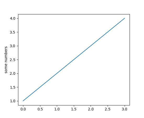
You may be wondering why the x-axis ranges from 0-3 and the y-axis from 1-4. If you provide a single list or array to the plot() command, matplotlib assumes it is a sequence of y values, and automatically generates the x values for you. Since python ranges start with 0, the default x vector has the same length as y but starts with 0. Hence the x data are [0,1,2,3].
你可能感到奇怪,为什么x轴的范围是多0到3而y轴是从1到4。如果你只给plot() 命令提供了一个列表或数组参数,matplotlib认为它是一个y值的序列,然后自动生成x值。因为Python的序列范围从0开始,所以默认的x向量与y向量有相同的长度,但是x从0开始。因此,x的值是[0,1,2,3]。
plot() is a versatile command, and will take an arbitrary number of arguments. For example, to plot x versus y, you can issue the command:
plot()是个通用【或万能的】(versatile command)的命令,它有一个可变数量的参数。例如,绘制x和y,你可以发出以下命令:
plt.plot([1, 2, 3, 4], [1, 4, 9, 16])
For every x, y pair of arguments, there is an optional third argument which is the format string that indicates the color and line type of the plot. The letters and symbols of the format string are from MATLAB, and you concatenate a color string with a line style string. The default format string is ‘b-‘, which is a solid blue line. For example, to plot the above with red circles, you would issue
对于每一对x和y参数,有一个第三个参数可以设置图的颜色和线型。字母和符号的字符串格式来自MATLAB,颜色字母与线型字符紧贴。默认的字符串格式为“b-”,这是一条实心蓝色线。例如,要用红色圆点绘制上图,你要使用以下命令:
import matplotlib.pyplot as plt
plt.plot([1,2,3,4], [1,4,9,16], 'ro')
plt.axis([0, 6, 0, 20])
plt.show()
(Source code, png, pdf)
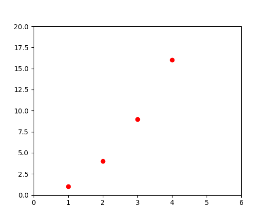
See the plot() documentation for a complete list of line styles and format strings. The axis() command in the example above takes a list of [xmin, xmax, ymin, ymax] and specifies the viewport of the axes.
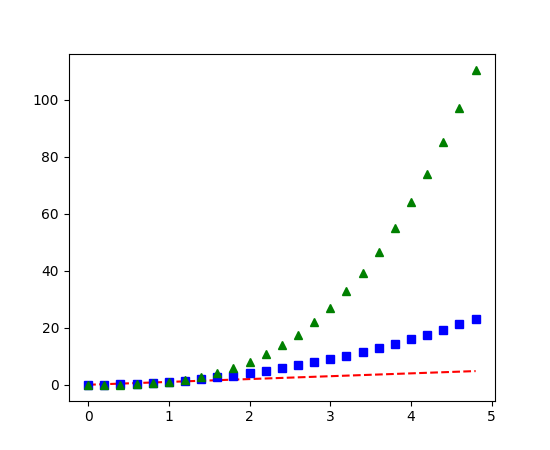
If matplotlib were limited to working with lists, it would be fairly useless for numeric processing. Generally, you will use numpy arrays. In fact, all sequences are converted to numpy arrays internally. The example below illustrates a plotting several lines with different format styles in one command using arrays.
查看 plot()文档以获得完整的线型和格式化字符串。 axis() 命令在上例中接受了一个形如 [xmin, xmax, ymin, ymax]的列表并且说明了坐标的视口(viewport)【什么是视口?】
如果matplotlib只限于使用list工作,那它对于数据处理就没什么价值了。一般来讲,你会使用numpy数组。事实上,所有序列(sequence)都会在内部转为numpy数组。下面的例子展示了在一条命令中使用数组用不同的格式绘制多条线条。
import numpy as np

import matplotlib.pyplot as plt

 # evenly sampled time at 200ms intervals

t = np.arange(0., 5., 0.2)

 # red dashes, blue squares and green triangles

plt.plot(t, t, 'r--', t, t**2, 'bs', t, t**3, 'g^')

plt.show()
(Source code, png, pdf)
Controlling line properties 控制线条属性
Lines have many attributes that you can set: linewidth, dash style, antialiased, etc; see matplotlib.lines.Line2D. There are several ways to set line properties
对于线图,有很多可以控制的属性:线条宽度、线条样式、抗锯齿等等。点击matplotlib.lines.Line2D查看详细。有很多方法可以设置线的属性:
- Use keyword args:
- 使用关键字参数:
plt.plot(x, y, linewidth=2.0)
- Use the setter methods of a Line2D instance. plot returns a list of Line2D objects; e.g., line1, line2 = plot(x1, y1, x2, y2). In the code below we will suppose that we have only one line so that the list returned is of length 1. We use tuple unpacking with line, to get the first element of that list:
- 使用Line2D实例的设置方法。plot返回一个Line2D对象的列表,例如:line1,line2=plot(x1, y1, x2, y2),在下面的代码中,假设只有一条线,这样返回的列表长度为1。我们把线条组成的元组拆包到变量line,得到列表的第1个元素。
line, = plt.plot(x, y, '-')
line.set_antialiased(False) # turn off antialising
- Use the setp() command. The example below uses a MATLAB-style command to set multiple properties on a list of lines. setp works transparently with a list of objects or a single object. You can either use python keyword arguments or MATLAB-style string/value pairs:
- 使用setp() 命令。下面的例子使用了MATLAB样式的命令在一个线条列表上设置多个属性。setp透明地与单个对象或多个对象的列表一起工作。既可以用python的关键字参数,也可以用MATLAB风格的“字符串/值”对。
-
lines = plt.plot(x1, y1, x2, y2)
# use keyword args
plt.setp(lines, color='r', linewidth=2.0)
# or MATLAB style string value pairs
plt.setp(lines, 'color', 'r', 'linewidth', 2.0)
Here are the available Line2D properties.
下面是Line2D的有效属性
|
Property |
Value Type |
|
alpha |
float |
|
animated |
[True | False] |
|
antialiased or aa |
[True | False] |
|
clip_box |
a matplotlib.transform.Bbox instance |
|
clip_on |
[True | False] |
|
clip_path |
a Path instance and a Transform instance, a Patch |
|
color or c |
any matplotlib color |
|
contains |
the hit testing function |
|
dash_capstyle |
['butt' | 'round' | 'projecting'] |
|
dash_joinstyle |
['miter' | 'round' | 'bevel'] |
|
dashes |
sequence of on/off ink in points |
|
data |
(np.array xdata, np.array ydata) |
|
figure |
a matplotlib.figure.Figure instance |
|
label |
any string |
|
linestyle or ls |
[ '-' | '--' | '-.' | ':' | 'steps' | ...] |
|
linewidth or lw |
float value in points |
|
lod |
[True | False] |
|
marker |
[ '+' | ',' | '.' | '1' | '2' | '3' | '4' ] |
|
markeredgecolor or mec |
any matplotlib color |
|
markeredgewidth or mew |
float value in points |
|
markerfacecolor or mfc |
any matplotlib color |
|
markersize or ms |
float |
|
markevery |
[ None | integer | (startind, stride) ] |
|
picker |
used in interactive line selection |
|
pickradius |
the line pick selection radius |
|
solid_capstyle |
['butt' | 'round' | 'projecting'] |
|
solid_joinstyle |
['miter' | 'round' | 'bevel'] |
|
transform |
a matplotlib.transforms.Transform instance |
|
visible |
[True | False] |
|
xdata |
np.array |
|
ydata |
np.array |
|
zorder |
any number |
To get a list of settable line properties, call the setp() function with a line or lines as argument
调用setp() 函数,以一条或多条线图作为参数传入,即可获得一个可设置的线图属性列表:
In [69]: lines = plt.plot([1, 2, 3])

In [70]: plt.setp(lines)

  alpha: float

  animated: [True | False]

  antialiased or aa: [True | False]

  ...snip
Working with multiple figures and axes
工作在多个图形和坐标上
MATLAB, and pyplot, have the concept of the current figure and the current axes. All plotting commands apply to the current axes. The function gca() returns the current axes (a matplotlib.axes.Axes instance), and gcf() returns the current figure (matplotlib.figure.Figure instance). Normally, you don’t have to worry about this, because it is all taken care of behind the scenes. Below is a script to create two subplots.
MATLAB和pyplot,有当前图形和坐标的概念。所有绘制命令都是对当前坐标进行操作。gca()函数返回当前坐标系(一个matplotlib.axes.Axes实例),gcf() 返回当前图形。通常你不必担心,因为这些都是幕后工作。下面是创建两个子图的脚本:
import numpy as np

import matplotlib.pyplot as plt


def f(t):

    return np.exp(-t) * np.cos(2*np.pi*t)


t1 = np.arange(0.0, 5.0, 0.1)

t2 = np.arange(0.0, 5.0, 0.02)


plt.figure(1)

plt.subplot(211)

plt.plot(t1, f(t1), 'bo', t2, f(t2), 'k')


plt.subplot(212)

plt.plot(t2, np.cos(2*np.pi*t2), 'r--')

plt.show()
(Source code, png, pdf)
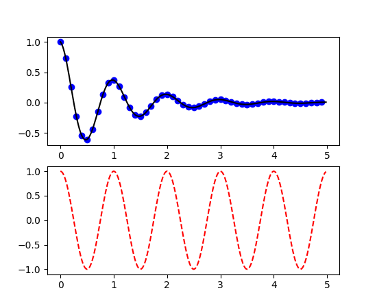
The figure() command here is optional because figure(1) will be created by default, just as a subplot(111) will be created by default if you don’t manually specify any axes. The subplot() command specifies numrows, numcols, fignum where fignum ranges from 1 to numrows*numcols. The commas in the subplot command are optional if numrows*numcols<10. So subplot(211) is identical to subplot(2, 1, 1). You can create an arbitrary number of subplots and axes. If you want to place an axes manually, i.e., not on a rectangular grid, use the axes() command, which allows you to specify the location as axes([left, bottom, width, height]) where all values are in fractional (0 to 1) coordinates. See pylab_examples example code: axes_demo.py for an example of placing axes manually and pylab_examples example code: subplots_demo.py for an example with lots of subplots.
figure() 命令在这里是可选项,因为 figure(1) 是默认创建的,就像如果你不去手动创建任何坐标系,那么subplot(111)也会自动创建一个一样。subplot()命令接受numrows、numcols、fignum 参数,fignum 范围是从1到 numrows*numcols的乘积。如果numrows*numcols的乘积小于10,那么逗号是可选项,可加可不加。所以subplot(211)与 subplot(2, 1, 1)完全相同。你可以在子图和坐标系中创建任意数。如果你要手动放置一个坐标系,而不是在一个矩形的网格上,使用axes() 命令,它可以通过函数axes([left, bottom, width, height])来指定坐标系的位置,这个坐标系的值在0~1之间。查看pylab_examples example code: axes_demo.py获得手动设置轴线示例代码,查看pylab_examples example code: subplots_demo.py获得多子图示例代码。
You can create multiple figures by using multiple figure() calls with an increasing figure number. Of course, each figure can contain as many axes and subplots as your heart desires:
随着图形编号的增加,你可以调用多次figure() 函数来创建多个图形。当然,每个图形都可以包含你期望的图形和坐标。
import matplotlib.pyplot as plt

plt.figure(1)                # the first figure

plt.subplot(211)             # the first subplot in the first figure

plt.plot([1, 2, 3])

plt.subplot(212)             # the second subplot in the first figure

plt.plot([4, 5, 6])


plt.figure(2)                # a second figure

plt.plot([4, 5, 6])          # creates a subplot(111) by default


plt.figure(1)                # figure 1 current; subplot(212) still current

plt.subplot(211)             # make subplot(211) in figure1 current

plt.title('Easy as 1, 2, 3') # subplot 211 title
You can clear the current figure with clf() and the current axes with cla(). If you find it annoying that states (specifically the current image, figure and axes) are being maintained for you behind the scenes, don’t despair: this is just a thin stateful wrapper around an object oriented API, which you can use instead (see Artist tutorial)
If you are making lots of figures, you need to be aware of one more thing: the memory required for a figure is not completely released until the figure is explicitly closed with close(). Deleting all references to the figure, and/or using the window manager to kill the window in which the figure appears on the screen, is not enough, because pyplot maintains internal references until close() is called.
你可以使用clf() 函数清除当图形,使用cla()清除当前坐标。如果你觉得后台保留状态打扰了你,不要绝望:这只是围绕着面向对象API的一个瘦状态包,你可以使用。【这句没明白】
如果你正在制作多个图形,你要意识到一件事情:如果不明确调用close()函数来关闭图形,那么图形所占内存就不会被完全释放。删除所有对图形的引用,或者使用windows的任务管理器杀掉显示在屏幕上的图形窗口,这些都不够,因为pyplot保持了内部的引用,直到调用close()显式关闭。
Working with text
操作文本
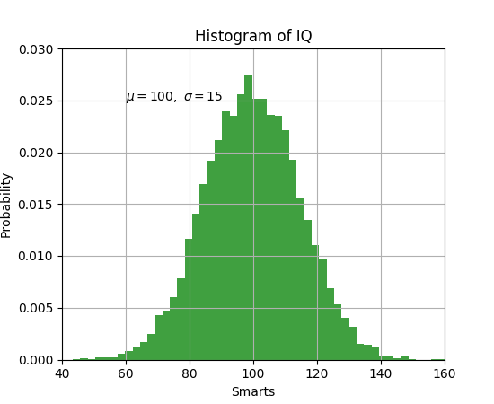
The text() command can be used to add text in an arbitrary location, and the xlabel(), ylabel() and title() are used to add text in the indicated locations (see Text introduction for a more detailed example)
可以在任意位置使用 text()命令,xlabel()、ylabel()、 title()用来在指定位置添加文本。(查看Text introduction 得到更加详细的示例)
import numpy as np

import matplotlib.pyplot as plt


# Fixing random state for reproducibility

np.random.seed(19680801)


mu, sigma = 100, 15

x = mu + sigma * np.random.randn(10000)


# the histogram of the data

n, bins, patches = plt.hist(x, 50, normed=1, facecolor='g', alpha=0.75)


plt.xlabel('Smarts')

plt.ylabel('Probability')

plt.title('Histogram of IQ')

plt.text(60, .025, r'$\mu=100,\ \sigma=15$')

plt.axis([40, 160, 0, 0.03])

plt.grid(True)

plt.show()
(Source code, png, pdf)
All of the text() commands return an matplotlib.text.Text instance. Just as with with lines above, you can customize the properties by passing keyword arguments into the text functions or using setp():
所有的 text()命令会返回一个matplotlib.text.Text实例。正像上图所示,你可以通过向文本函数传入参数或使用 setp()函数,来定制属性。
t = plt.xlabel('my data', fontsize=14, color='red')
These properties are covered in more detail in Text properties and layout.
这些属性在Text properties and layout中有详细描述。
Using mathematical expressions in text
在文本中使用数学表达式
matplotlib accepts TeX equation expressions in any text expression. For example to write the expression in the title, you can write a TeX expression surrounded by dollar signs:
plt.title(r'$\sigma_i=15$')
Matplotlib可以在任何文本表达式中接受TeX等式。例如,在标题中写 这个被$符号的TeX表达式:
The r preceding the title string is important – it signifies that the string is a raw string and not to treat backslashes as python escapes. matplotlib has a built-in TeX expression parser and layout engine, and ships its own math fonts – for details see Writing mathematical expressions. Thus you can use mathematical text across platforms without requiring a TeX installation. For those who have LaTeX and dvipng installed, you can also use LaTeX to format your text and incorporate the output directly into your display figures or saved postscript – see Text rendering With LaTeX.
标题中的前导字母r很重要,它标志着这个字符串是原始字符串,不要进行python的转码。Matplotlib有个内建的TeX表达式分析器和布局引擎,承载它自己的数学字体,查看详细Writing mathematical expressions。这样你就可以跨平台使用数学文本而不需要安装一个TeX软件。对于那些安装了LaTeX和dvipng的人,你也可以使用LaTeX来格式化你的文本,合并输出目录到你的显示图形或保存脚本,查看Text rendering With LaTeX。
Annotating text
The uses of the basic text() command above place text at an arbitrary position on the Axes. A common use for text is to annotate some feature of the plot, and the annotate() method provides helper functionality to make annotations easy. In an annotation, there are two points to consider: the location being annotated represented by the argument xy and the location of the text xytext. Both of these arguments are (x,y) tuples.
import numpy as np
import matplotlib.pyplot as plt

ax = plt.subplot(111)

t = np.arange(0.0, 5.0, 0.01)
s = np.cos(2*np.pi*t)
line, = plt.plot(t, s, lw=2)

plt.annotate('local max', xy=(2, 1), xytext=(3, 1.5),
            arrowprops=dict(facecolor='black', shrink=0.05),
            )

plt.ylim(-2,2)
plt.show()
(Source code, png, pdf)
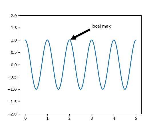
In this basic example, both the xy (arrow tip) and xytext locations (text location) are in data coordinates. There are a variety of other coordinate systems one can choose – see Basic annotation and Advanced Annotation for details. More examples can be found in pylab_examples example code: annotation_demo.py.
在这个基础的例子里,xy两个坐标(箭头)和xytext位置(文本位置)都在数据坐标里。也有其它形式的坐标系统可以选择,查看Basic annotation 和 Advanced Annotation查看详细信息。在pylab_examples example code: annotation_demo.py可查看更多示例。
Logarithmic and other nonlinear axes
对数和其它非线性坐标
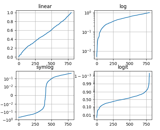
matplotlib.pyplot supports not only linear axis scales, but also logarithmic and logit scales. This is commonly used if data spans many orders of magnitude. Changing the scale of an axis is easy:
matplotlib.pyplot不仅支持线性坐标尺度,也支持对数和分对数尺度(logarithmic and logit scales)。如果数据跨越了多个大小的顺序,就会用到这个功能【这句话的意思是可能是同一个坐标上有不同的度量尺度】。改变一个坐标的尺度很容易:
plt.xscale(‘log’)
An example of four plots with the same data and different scales for the y axis is shown below.
下面是对于y轴的相同数据不同尺度(scales)的四个绘图(plot)
import numpy as np

import matplotlib.pyplot as plt

from matplotlib.ticker import NullFormatter  # useful for `logit` scale

# Fixing random state for reproducibility

np.random.seed(19680801)

# make up some data in the interval ]0, 1[

y = np.random.normal(loc=0.5, scale=0.4, size=1000)

y = y[(y > 0) & (y < 1)]

y.sort()

x = np.arange(len(y))


# plot with various axes scales

plt.figure(1)


# linear

plt.subplot(221)

plt.plot(x, y)

plt.yscale('linear')

plt.title('linear')

plt.grid(True)


# log

plt.subplot(222)

plt.plot(x, y)

plt.yscale('log')

plt.title('log')

plt.grid(True)


# symmetric log

plt.subplot(223)

plt.plot(x, y - y.mean())

plt.yscale('symlog', linthreshy=0.01)

plt.title('symlog')

plt.grid(True)


# logit

plt.subplot(224)

plt.plot(x, y)

plt.yscale('logit')

plt.title('logit')

plt.grid(True)

# Format the minor tick labels of the y-axis into empty strings with

# `NullFormatter`, to avoid cumbering the axis with too many labels.
# 用“NullFormatter”把Y轴的子刻度清空,以避免太多显示标签
plt.gca().yaxis.set_minor_formatter(NullFormatter())

# Adjust the subplot layout, because the logit one may take more space
# than usual, due to y-tick labels like "1 - 10^{-3}"
# 适应子图布局,因为logit图形会比普通图形战胜更多的空间,因为y轴刻度从1到10^{-3}
plt.subplots_adjust(top=0.92, bottom=0.08, left=0.10, right=0.95, hspace=0.25,wspace=0.35)
plt.show()
(Source code, png, pdf)
It is also possible to add your own scale, see Developer’s guide for creating scales and transformations for details.
你也可以添加你自己的尺度,查看Developer’s guide for creating scales and transformations获得更详细的信息

 浙公网安备 33010602011771号