


css动画
元素的显示与隐藏
1.几种方法
/* 隐藏,不占据屏幕空间 */
display: none;
/* 重新显示出来 */
display: block;
/* 隐藏,同时占据屏幕空间 */
visibility: hidden;
/* 重新显示出来 */
visibility: visible;
/* 隐藏,占据屏幕空间,透明度,取值为0-1之间的值 */
opacity: 0.5;
opacity: 1;
2.溢出处理
产生滚动条的条件:1.元素的高是固定的,因为如果只靠元素自动撑开是永远不会产生特定范围内的滚动条的2.设置overflow:auto;
ps:超出内容隐藏掉
overflow: hidden;
过渡动画效果
transition:过渡的属性 动画时长 时间函数 延迟时间;
eg:
transition: all 3s //属性为all,时长为3S
transition: all 3s linear 5s; //属性为all,时长为3S,匀速,延迟5S后在开始过度动画
1
2
/* 光标悬停在元素上的时候展现的样式 */
div:hover{
width: 300px;
background-color: green;
//在元素里面设置什么属性都会自动动画
}
2.div文字溢出可滑动,不出现滚动条

<div>超出div设定宽度超出div设定宽度超出div设定宽度超出div设定宽度超出div设定宽度超出div设定宽度超出div设定宽度超出div设定宽度超出div设定宽度超出div设定宽度超出div设定宽度超出div设定宽度超出div设定宽度超出div设定宽度超出div设定宽度超出div设定宽度超出div设定宽度超出div设定宽度超出div设定宽度超出div设定宽度超出div设定宽度超出div设定宽度超出div设定宽度超出div设定宽度超出div设定宽度超出div设定宽度超出div设定宽度超出div设定宽度超出div设定宽度超出div设定宽度超出div设定宽度超出div设定宽度超出div设定宽度超出div设定宽度超出div设定宽度超出div设定宽度超出div设定宽度超出div设定宽度超出div设定宽度超出div设定宽度</div>

div{

border:1px solid #000000;

height: 25px;

width: 50px;

overflow-x: auto;

white-space: nowrap;

overflow-y: hidden;


}

div::-webkit-scrollbar {

display: none;    /* 隐藏滚动条 */
}
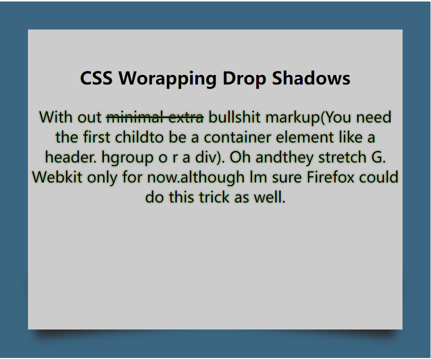
3、字体变颜色和div盒子底部翘起来


<!DOCTYPE html>
<html lang="en">

<head>
    <meta charset="UTF-8">
    <meta http-equiv="X-UA-Compatible" content="IE=edge">
    <meta name="viewport" content="width=device-width, initial-scale=1.0">
    <title>Document</title>
    <style>
        .demc {
            width: 400px;
            margin: auto;
            background-color: #3A6682;
            padding: 30px;
            position: relative;
            z-index: -2;
        }

        .demc1 {
            width: 400px;
            height: 300px;
            background-color: #CCCCCC;
            text-align: center;
            padding-top: 20px;
            position: relative;
        }
        p{
            text-shadow: 0px 0px 1px pink,0px 0px 2px green;
        }
        .demc1::before, .demc1::after{
            content: "";
            position: absolute;
            bottom: 10px;
            left: 5px;
            width: 50%;
            height: 20%;
            box-shadow: 0 10px 10px #2b2929;
            transform: rotate(-5deg);
            z-index: -1;

        }
        .demc1::after{
            right: 5px;
            left: auto;
            transform: rotate(5deg);
        }
    </style>
</head>

<body>
    <div class="demc">
        <div class="demc1">
            <h3>CSS Worapping Drop Shadows</h3>
            <p>With out <del> minimal extra</del> bullshit markup(You need the
                first childto be a container element like a header. hgroup o
                r a div). Oh andthey stretch G. Webkit only for now.although
                lm sure Firefox could
                do this trick as well.
            </p>
        </div>
    </div>
</body>

</html>
运行结果:
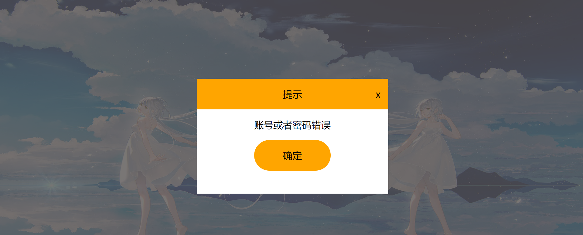
4、点击元素遮住后的元素
<!DOCTYPE html>
<html lang="en">

<head>
    <meta charset="UTF-8">
    <meta http-equiv="X-UA-Compatible" content="IE=edge">
    <meta name="viewport" content="width=device-width, initial-scale=1.0">
    <title>Document</title>
    <style>
        *{
            margin: 0px;
            padding: 0px;

        }
        body,html{
            width: 100%;
            height: 100%;
        }
        .div1{
            width: 100%;
            height: 100%;
            background-image: url(./img/t011fafa2d5a51becd2.jpg);
            background-size: 100% 100%;
            position: relative;
            z-index: 1;

        }
        .login{
            width: 200px;
            height: 120px;
            background-color: orange;
            position: absolute;
            margin: auto;
            top: 50%;
            left: 50%;
            margin-top: -100px;
            margin-left: -60px;
            font-size: 50px;
            line-height: 120px;
            text-align: center;
        }
        .hide{
            width: 100%;
            height: 100%;
            background-color: rgba(88, 84, 82, .8);
            z-index: 5;
            position: absolute;
            top: 0;
            display: none;
        }
        .title{
            width: 500px;
            height: 300px;
            background-color: #fff;
            position: absolute;
            top: 50%;
            left: 50%;
            margin-top: -150px;
            margin-left: -250px;
        }
        .prompt{
            height: 80px;
            background-color: orange;
            text-align: center;
            line-height: 80px;
            font-size: 25px;
            position: relative;
        }
        .prompt span{
           position: absolute;
           right: 20px;
           display: inline-block;
        }
        .Account{
            height: 80px;
            text-align: center;
            line-height: 80px;
            font-size: 25px;
        }
        .ok{
            width: 200px;
            height: 80px;
            font-size: 25px;
            background-color: orange;
            border-radius: 80px;
            margin: auto;
            text-align: center;
            line-height: 80px;

        }
        #Cancel{
            cursor: pointer;
        }
    </style>
</head>
<body>

    <div class="div1">
        <div class="login" id="btn">登录</div>
    </div>
    <div class="hide">
        <div class="title">
            <div class="prompt">
                提示<span id="Cancel">x</span>
            </div>
            <div class="Account">
                <span>账号或者密码错误</span>
            </div>
            <div class="ok">
                确定
            </div>
        </div>
    </div>
   <script>
     document.getElementById('btn').onclick = function () {
                document.getElementsByClassName("hide")[0].style.display="block";
    };
    document.getElementById('Cancel').onclick = function () {
                document.getElementsByClassName("hide")[0].style.display="none";
    }
   </script>
</body>
</html>
运行结果:
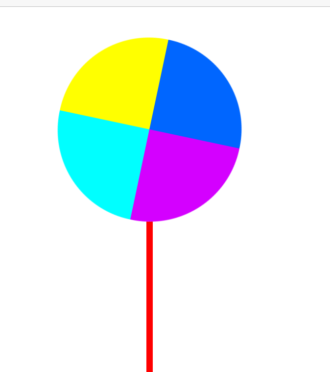
5、帮帮糖转动
<!DOCTYPE html>
<html lang="en">

<head>
    <meta charset="UTF-8">
    <meta http-equiv="X-UA-Compatible" content="IE=edge">
    <meta name="viewport" content="width=device-width, initial-scale=1.0">
    <title>Document</title>
    <style>
        * {
            margin: 0px;
            padding: 0px;
        }

        #wrap {
            width: 300px;
            height: 700px;
            margin: auto;
            margin-top: 50px;
            position: relative;
        }

        #zhou {
            width: 300px;
            height: 300px;
            position: relative;
            /*定义动画周期*/
            animation: fengchezhuandong 3s;
            /*设定转动次数为无限*/
            animation-iteration-count: infinite;
            /*定义转动速率为匀速*/
            animation-timing-function: linear;
        }

        /*定义动画*/
        @keyframes fengchezhuandong {
            from {
                transform: rotate(0deg);
            }

            to {
                transform: rotate(360deg);
            }
        }
        .zhizhen {
            width: 150px;
            height: 150px;
            float: left;

        }

        .z1 {
            background-color: rgb(212, 0, 255);
            border-radius: 150px 0 0;


        }

        .z2 {
            background-color: aqua;
            border-radius: 0 150px 0 0;
        }

        .z3 {
            background-color: #0066ff;
            border-radius: 0 0 0 150px;
        }

        .z4 {
            background-color: yellow;
            border-radius: 0 0 150px 0;
        }
        #zhuzi{
            width: 10px;
            height: 350px;
             background-color: red;
            margin: auto;
        }
    </style>
</head>

<body>
    <div id="wrap">
        <div id="zhou">
            <div class="zhizhen z1"></div>
            <div class="zhizhen z2"></div>
            <div class="zhizhen z3"></div>
            <div class="zhizhen z4"></div>
        </div>
        <div id="zhuzi"></div>

    </div>
</body>

</html>
运行结果:
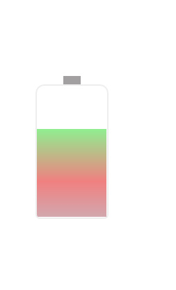
6、充电持动画
<!DOCTYPE html>
<html lang="en">

<head>
    <meta charset="UTF-8">
    <meta http-equiv="X-UA-Compatible" content="IE=edge">
    <meta name="viewport" content="width=device-width, initial-scale=1.0">
    <title>Document</title>
    <style>
        .content{
            width: 84px;
            height: 160px;
            margin: auto;
            margin-top: 300px;
            position: relative;
        }
        .content::before{
            content: "";
            width: 20px;
            height: 10px;
            position: absolute;
            background-color: rgba(70, 66, 66,.5);
            top: -10px;
            left: 32px;
        }
        .demc {
            width: 80px;
            height: 150px;
            border: 2px solid #eee;
            position: relative;
            overflow: hidden;
            border-radius: 10px 10px 5px 5px;
        }
        .demc1 {
            animation: chongdian 5s;
            animation-iteration-count: infinite;
            /*定义转动速率为匀速*/
            animation-timing-function: linear;
            position: relative;
            height: 150px;
            bottom: -150px;
        }

        @keyframes chongdian {
            from {
                bottom: -150px;
                background: linear-gradient(lightgreen,lightcoral 40%,lightblue);
            }

            to {
                bottom: 0px;
                background: linear-gradient(lightgreen,lightcoral 40%,lightblue);
            }
        }
    </style>
</head>

<body>
    <div class="content">
        <div class="demc">
            <div class="demc1">

            </div>

        </div>
    </div>
</body>

</html>
运行结果:


【推荐】国内首个AI IDE,深度理解中文开发场景,立即下载体验Trae
【推荐】编程新体验,更懂你的AI,立即体验豆包MarsCode编程助手
【推荐】抖音旗下AI助手豆包,你的智能百科全书,全免费不限次数
【推荐】轻量又高性能的 SSH 工具 IShell:AI 加持,快人一步
· 无需6万激活码!GitHub神秘组织3小时极速复刻Manus,手把手教你使用OpenManus搭建本
· Manus爆火,是硬核还是营销?
· 终于写完轮子一部分:tcp代理 了,记录一下
· 别再用vector<bool>了!Google高级工程师:这可能是STL最大的设计失误
· 单元测试从入门到精通