多子图绘制
plt.subplot(211)
plt.subplot(223)
plt.subplot(224)
REF
- matplotlib说明框中字体粗细, 不能使用times 字体格式, 可以设置 matplotlib中x轴y轴字号或字体修改
- matplotlib设置图片边缘距离(left=0.1, right=0.9, top=0.9, bottom=0.1)
- plt.title 设置标题或标注和图片之间的距离; 各个子图之间的距离
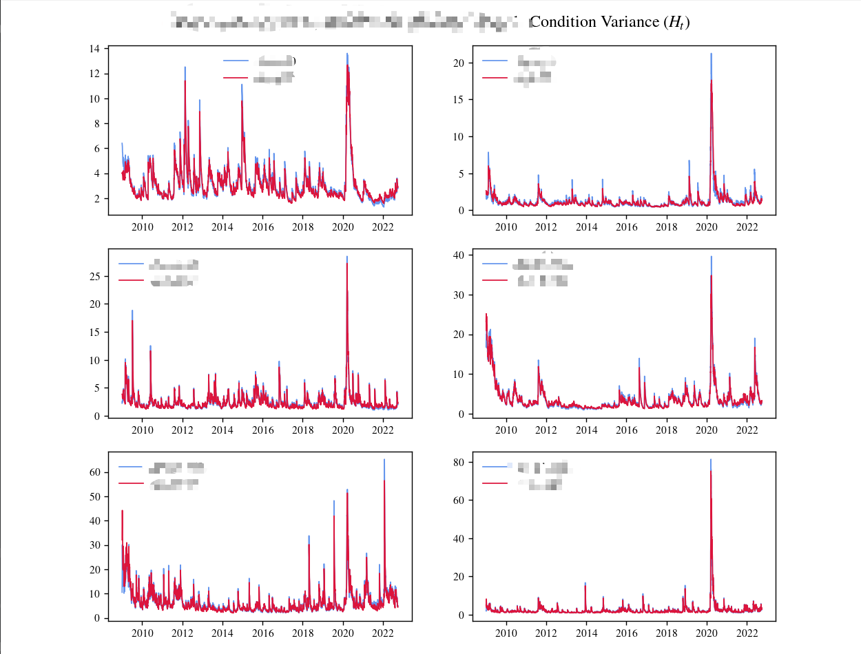
df_check_H 为 pd.DataFrame, index 为时间,如果不是需要用 pd.to_datetime() 转化一下。
fig = plt.figure(figsize=(10, 16),)  #  layout="constrained", 使得图片更加紧凑
# fig.tight_layout()
col_i = 0
col_j = 0
col_num = 2
len_fig = int(df_check_H.shape[1]/2)
plt.suptitle(' $|$ Condition Variance ($H_t$)',
             fontsize=14,
             # fontweight='medium',
             weight='bold')  # 共同 title
plt.subplots_adjust(left=0.125, right=0.9, top=0.935, bottom=0.110)
for i_ in range(1, len_fig + 1):
    col_j += col_num
    plt.subplot(int(len_fig/col_num), col_num, i_)
    plt.plot(df_check_H.index, df_check_H.loc[:, cols_H[col_i]],
             linewidth=1, linestyle='solid', color='#6495ED',
             label=cols_H[col_i])
    plt.plot(df_check_H.index, df_check_H.loc[:, cols_H[col_i+1]],
             linewidth=1, linestyle='solid', color='#DC143C',
             label=cols_H[col_i+1])

    # plt.plot(df_check_H.index, df_check_H.loc[:, cols_H[col_i:col_j]],
    #          linewidth=1, linestyle='solid',
    #          label=cols_H[col_i:col_j])

    plt.autoscale(enable=True, axis='x', tight=False)
    plt.tick_params(axis='both', which='major', labelsize=9)
    # plt.axhline(linewidth=0.5, color='black')
    plt.legend(fontsize='medium', frameon=False, prop={'style': 'italic', 'weight': 'bold'})  # fontsize 'medium', frameon=False 不显示边框
    col_i += col_num
plt.show(block=True)
ax 绘制
plt.subplot(2, 2, 1)
plt.plot(df_check_H.index, df_check_H.loc[:, cols_H[:2]], label=cols_H[:2])
plt.legend()

plt.subplot(2, 2, 2)
plt.plot(df_check_H.index, df_check_H.loc[:, cols_H[2:4]], label=cols_H[2:4])
plt.legend()

plt.subplot(2, 2, 3)
plt.plot(df_check_H.index, df_check_H.loc[:, cols_H[4:6]], label=cols_H[4:6])
plt.legend()

plt.subplot(2, 2, 4)
plt.plot(df_check_H.index, df_check_H.loc[:, cols_H[6:8]], label=cols_H[6:8])
plt.legend()

 浙公网安备 33010602011771号