matlplot 基本应用
font-size-matplolib; 更加细致设置lable Make Your Matplotlib Plots Stand Out Using This Cheat Sheet; bar 图, 个人每个资产组成的bar图;
style: 如何绘制Nature和Science等期刊风格的插图:科研论文绘图模块-Science Plots; github: SciencePlots
[plt.rcParams参数总结](https://www.cnblogs.com/Renyi-Fan/p/13855303.html)
# rc('font', **{'family': 'serif', 'serif': ['Times']})
rc('font', **{'family': 'sans-serif',})
rc('text', usetex=True)
- xtick 的替换, 改变横坐标和纵坐标上的刻度(ticks)
时间类: 主刻度, 副刻度; Matplotlib dates
# ref: https://geek-docs.com/matplotlib/matplotlib-tutorial/matplotlib-processes-dates.html
import matplotlib.dates as mdates
plt.gca().xaxis.set_major_locator(mdate.YearLocator())
plt.gca().xaxis.set_minor_locator(mdate.MonthLocator())
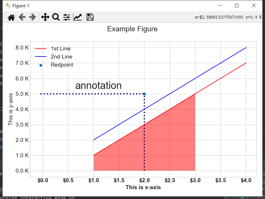
最终效果:
import matplotlib.pyplot as plt
import matplotlib
from matplotlib import ticker
import numpy as np

def set_style(label: str='seaborn-whitegrid'):
    """set style of plt"""
    ## the print statement tells all available style sheets
    # print(plt.style.available)
    plt.style.use(label)


def set_sizes(fig_size:tuple[int,int]=(9, 6), font_tsize:int=10, font_size:int=10):
    """
    set fonts for plt
    https://matplotlib.org/2.0.2/api/pyplot_api.html?highlight=rc#matplotlib.pyplot.rc
    :param fig_size: figure size
    :param font_tsize: figure title size
    :param font_size: font size
    :return:
    """
    # Set the default text font size, weight='bold'
    plt.rc('font', size=font_size)
    # Set the font size for x tick labels
    plt.rc('xtick', labelsize=font_size)
    # Set the font size for y tick labels
    plt.rc('ytick', labelsize=font_size)
    # Set the axes labels font size
    plt.rc('axes', labelsize=font_size)
    # Set the axes title font size
    plt.rc('axes', titlesize=font_size)
    # Set the legend font size
    plt.rc('legend', fontsize=font_size)
    # Set the font size of the figure title
    plt.rc('figure', titlesize=font_tsize)
    # Set the font size of the figure size
    plt.rc('figure', figsize=fig_size)

    # plt.rc('set_major_formatter', set_major_formatter=StrMethodFormatter("${x}"))

def rotate_xticks(plt: matplotlib.pyplot, degrees : float = 45):
    """
    set xtick rotate of plt
    :param plt: matplotlib.pyplot
    :param degrees:
    :return:
    """
    plt.xticks(rotation=degrees)

def set_xaxis_formatter(label:str="${x}"):
    # Format ticks as currency or any prefix (replace $ with your choice)
    ax.xaxis.set_major_formatter(ticker.StrMethodFormatter(label))

    # Other
    # decimal label: "{x:.2f}", 2 decimal
    # ax.xaxis.set_major_formatter(ticker.StrMethodFormatter(label))
    # percentage label: Format as a percentage
    # ax.xaxis.set_major_formatter(ticker.PercentFormatter())

def set_yaxis_formatter(level:int=1000, decimal_label: str='1.1f',level_label:str=' K'):
    # Format thousands e.g 10000 to 10.0K
    ax.yaxis.set_major_formatter(ticker.FuncFormatter(lambda x, pos: format(x / level, decimal_label) + level_label))

def set_annotate(text: str='annotation', xy:tuple[int,int]=(1, 5000), xytext:tuple[int,int]=(1.1, 5500), fontsize: int=30):
    """ add text """
    ax.annotate(text, ha='center', va='center', xy=xy, xytext=xytext, fontsize=fontsize)

def set_scatter(x:float=0.75, y:float=5000, label:str='Redpoint'):
    """set scattter"""
    ax.scatter(x=x, y=y, label=label)

if __name__ == '__main__':
    # -----------------------------------------
    # font size, style
    # -----------------------------------------
    set_style()
    set_sizes(font_tsize=18, font_size=14)

    # -----------------------------------------
    # ax
    # -----------------------------------------
    fig, ax = plt.subplots()
    set_xaxis_formatter()
    set_yaxis_formatter()
    set_annotate(fontsize=25)
    plt.vlines(x=1, ymin=-0.05, ymax=5000, ls=':', lw=3, color='darkblue')
    plt.hlines(y=5000, xmin=-0.05, xmax=1, ls=':', lw=3, color='darkblue')
    set_scatter()


    # -----------------------------------------
    # main
    # -----------------------------------------
    x = np.array([1.0, 2.0, 3, 4])
    y1 = [1000, 3000, 5000, 7000]
    y2 = [2000, 4000, 6000, 8000]

    # x = np.arange(0.0, 4, 0.05)
    # y1 = np.sin(np.pi * x)
    # y2 = np.sin(2 * np.pi * x)

    plt.plot(x, y1, color='red', label='1st Line')
    plt.plot(x, y2, color='blue', label='2nd Line')
    # fill blank
    ax.fill_between(x, y1, facecolor='r', where=x <= 2, alpha=0.5, interpolate=True)

    rotate_xticks(plt, degrees=0)
    plt.suptitle('Example Figure')
    plt.xlabel('This is x-axis', weight='bold')
    plt.xticks(weight='bold')
    plt.ylabel('This is y-axis')
    # https://matplotlib.org/2.0.2/api/legend_api.html?highlight=legend#module-matplotlib.legend
    plt.legend(loc=0)
    plt.tight_layout()
    plt.show()

 浙公网安备 33010602011771号