移动端 css/html (box-flex)自适应、等比布局
移动端 css/html (box-flex)自适应、等比布局
对于移动端自适应的一种布局方式。
<!DOCTYPE html>
<html>

    <head>
        <meta charset="utf-8">
        <meta name="viewport" content="initial-scale=1,minimum-scale=1,maximum-scale=1,user-scalable=no" />
        <title></title>
    </head>
    <style type="text/css">
        .boxcontainer{
            display: box;
            display: -moz-box;
            display: -webkit-box;
            border: 1px solid red;
            height: 32px;
            min-width: 100px;
        }
        .boxcontainer>div{
            box-flex: 1;
            -webkit-box-flex: 1;
            -moz-box-flex: 1;
        }
        .boxcontainer>div>input{
            min-width: 50px;
            width: 100%;
            box-sizing: border-box;
            height: 32px;
            border: 0;
        }
        .boxcontainer>a{
            min-width: 50px;
            display: inline-block;
            border: 1px solid red;
            height: 32px;
            line-height: 28px;
            text-align: center;
        }
    </style>

    <body>

        <div class="boxcontainer">
            <div>
                <input type="text" id="" value="" />
            </div>
            <a href="javsscript:;">搜索</a>

        </div>

    </body>

</html>
展示:
平板

大手机屏幕
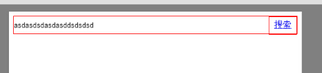
小手机屏幕
本次布局主要是对于
box-sizing: border-box;
和
display: box;
display: -moz-box;
display: -webkit-box;
box-flex: 1;
-webkit-box-flex: 1;
-moz-box-flex: 1;
配合的理解,这样的布局无需担心width:百分比的溢出问题,全贴合边框。
参考链接
http://www.css88.com/book/css/properties/flexible-box/box-flex.htm
如果觉得本文适合您且对您有帮助,请一定记得点推荐哟!

|
作者:
JasNature 出处: http://NatureSex.cnblogs.com 本文版权归作者和博客园共有,欢迎转载,但必须保留此段声明,且在文章页面明显位置给出原文连接。 如果本文有什么不妥或者错误的地方,请您一定要在评论中指出,以免误人子弟!非常感谢您的不吝赐教! | ||

 浙公网安备 33010602011771号