
css汇总
1、居中
parentElement{
    display:flex;/*Flex布局*/
    display: -webkit-flex; /* Safari */
    align-items:center;/*指定垂直居中*/
    justify-content: center;
}
2、文字超宽度省略
.ellipsis {
    overflow: hidden;
    text-overflow: ellipsis;
    white-space: nowrap;
}
// 多行
overflow : hidden;
text-overflow: ellipsis;
display: -webkit-box;
-webkit-line-clamp: 2;
-webkit-box-orient: vertical;
3、图片自适应
max-width: 100%;
max-height: 100%;
4、三角形
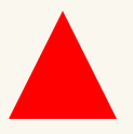
#triangle-up {
    width: 0;
    height: 0;
    border-left: 50px solid transparent;
    border-right: 50px solid transparent;
    border-bottom: 100px solid red;
}
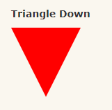
#triangle-down {
    width: 0;
    height: 0;
    border-left: 50px solid transparent;
    border-right: 50px solid transparent;
    border-top: 100px solid red;
}
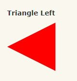
#triangle-left {
    width: 0;
    height: 0;
    border-top: 50px solid transparent;
    border-right: 100px solid red;
    border-bottom: 50px solid transparent;
}
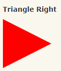
#triangle-right {
    width: 0;
    height: 0;
    border-top: 50px solid transparent;
    border-left: 100px solid red;
    border-bottom: 50px solid transparent;
}
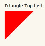
#triangle-topleft {
    width: 0;
    height: 0;
    border-top: 100px solid red;
    border-right: 100px solid transparent;
}
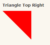
#triangle-topright {
    width: 0;
    height: 0;
    border-top: 100px solid red;
    border-left: 100px solid transparent;

}
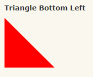
#triangle-bottomleft {
    width: 0;
    height: 0;
    border-bottom: 100px solid red;
    border-right: 100px solid transparent;
}
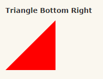
#triangle-bottomright {
    width: 0;
    height: 0;
    border-bottom: 100px solid red;
    border-left: 100px solid transparent;
}
5、字体发光效果
<div class="container">
    <p>xinpureZhu</p>
</div>
body {
    background: #000;
}
.container {
    width: 600px;
    margin: 100px auto 0;
}
p {
    font-family: 'Audiowide';
    text-align: center;
    color: #00a67c;
    font-size: 7em;
    -webkit-transition: all 1.5s ease;
            transition: all 1.5s ease;
}
p:hover {
    color: #fff;
    -webkit-animation: Glow 1.5s ease infinite alternate;
            animation: Glow 1.5s ease infinite alternate;

}
@-webkit-keyframes Glow {
    from {
        text-shadow: 0 0 10px #fff,
                     0 0 20px #fff,
                     0 0 30px #fff,
                     0 0 40px #00a67c,
                     0 0 70px #00a67c,
                     0 0 80px #00a67c,
                     0 0 100px #00a67c,
                     0 0 150px #00a67c;
    }
    to {
        text-shadow: 0 0 5px #fff,
                     0 0 10px #fff,
                     0 0 15px #fff,
                     0 0 20px #00a67c,
                     0 0 35px #00a67c,
                     0 0 40px #00a67c,
                     0 0 50px #00a67c,
                     0 0 75px #00a67c;
    }
}
@keyframes Glow {
    from {
        text-shadow: 0 0 10px #fff,
                     0 0 20px #fff,
                     0 0 30px #fff,
                     0 0 40px #00a67c,
                     0 0 70px #00a67c,
                     0 0 80px #00a67c,
                     0 0 100px #00a67c,
                     0 0 150px #00a67c;
    }
    to {
        text-shadow: 0 0 5px #fff,
                     0 0 10px #fff,
                     0 0 15px #fff,
                     0 0 20px #00a67c,
                     0 0 35px #00a67c,
                     0 0 40px #00a67c,
                     0 0 50px #00a67c,
                     0 0 75px #00a67c;
    }
}
6、背景渐变
linear-gradient(#fff, #333);
linear-gradient(to bottom, #fff, #333);
linear-gradient(to top, #333, #fff);
linear-gradient(180deg, #fff, #333);
linear-gradient(to bottom, #fff 0%, #333 100%);

