动态边框效果-渐变环绕
自己写一个纯 css 有意思的边框真的很难,这篇文章的边框,其实我是不满意的,但通过它来学习 css ,还是有一定作用的。
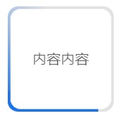
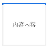
效果图:
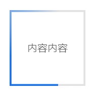
特点:支持圆角,
问题:
调整宽窄的时候,都要调整运动函数,比较麻烦。
说真的,不好看,也不酷
html
<div className={styles.father_box_two}>
  <div className={styles.box_two}>内容内容</div>
</div>
css
::after{} 和 ::before{} 两个伪类,分别实现了一种环绕效果,这里是将他俩结合在一起之后的效果,任何一个单独使用都是可以的。
::after{} 实现的是矩形围绕,但是没有渐变的感觉
::before{} 实现了渐变的效果,但是会有一个切角,不美观
.father_box_two{
  width: 100px;
  height: 100px;
  line-height: 100px;
  // border-radius: 10%;
  overflow: hidden;
  position: relative;
  background-color: rgba(0,0,0,.06);
  .box_two{
    position: absolute;
    top: 0;
    left: 0;
    width: 100%;
    height: 100%;
    transform-origin: center center; // 一中心未基点
    transform: scale(0.95); // 缩小到原来的 95%
    // border-radius: 10%;
    background-color: #ffffff;
    z-index: 1;
  }
  &::after{
    content: "";
    position: absolute;
    display: inline-block;
    background-color: #1a73e8;
    top: 0;
    left: 0;
    width: 100px;
    height: 5px;
    animation: bgmove 5s linear infinite;
    @keyframes bgmove {
      0% {
        top: 0;
        left: 0;
        width: 100px;
        height: 5px;
      }
      25% {
        top: 0;
        left: 0;
        width: 5px;
        height: 100px;
      }
      50% {
        top: 95px;
        left: 0;
        width: 100px;
        height: 5px;
      }
      75% {
        top: 0px;
        left: 95px;
        width: 5px;
        height: 100px;
      }
      100% {
        top: 0;
        left: 0;
        width: 100px;
        height: 5px;
      }
    }
  }

  &::before{
    content: "";
    width: 100%;
    height: 100%;
    position: absolute;
    top: 0px;
    left: 0px;
    transform-origin: center center;
    transform: rotate(30deg) scale(2);
    background: conic-gradient(
      #1a73e8,
      rgba(0,0,0,.06),
      rgba(0,0,0,.06),
      rgba(0,0,0,.06)
    );
    animation: rotate 5s linear infinite;
    @keyframes rotate {
      100% {
        transform: rotate(-330deg) scale(2);
      }
    }
  }
}
还可以利用 clip 属性,剪裁的方式进行,绘制相同效果的环绕边框,此方式无法实现圆角
.border {
  width: 200px;
  height: 200px;
  margin: auto;
  box-shadow: inset 0 0 0 2px #999;
  position: relative;
  overflow: hidden;
  div {
    width: 10px;
    height: 10px;
    position: absolute;
  }

  .content{
    position: absolute;
    width: 196px;
    height: 196px;
    top: 2px;
    left: 2px;
    background-color: #fff;
  }

  &::after {
    content: '';
    position: absolute;
    top: 0;
    left: 0;
    margin: 0%;
    display: inline-block;
    width: 100%;
    height: 100%;

    border: 2px solid #1a73e8;
    /*
    等同于
    box-shadow: inset 0 0 0 2px #1a73e8;
    或者
    outline: 3px solid #1a73e8;
    outline-offset: -3px;
    */

    animation: clipMe 5s linear infinite;
    @keyframes clipMe {
      0%,
      100% {
        clip: rect(0px, 200px, 2px, 0px);
      }

      25% {
        clip: rect(0px, 2px, 200px, 0px);
      }

      50% {
        clip: rect(198px, 200px, 200px, 0px);
      }

      75% {
        clip: rect(0px, 200px, 200px, 198px);
      }
    }
  }

  &::before{
    content: "";
    width: 100%;
    height: 100%;
    position: absolute;
    top: 0px;
    left: 0px;
    transform-origin: center center;
    transform: rotate(30deg) scale(2);
    background: conic-gradient(
      #1a73e8,
      rgba(0,0,0,.06),
      rgba(0,0,0,.06),
      rgba(0,0,0,.06)
    );
    animation: rotate 5s linear infinite;
    @keyframes rotate {
      100% {
        transform: rotate(-330deg) scale(2);
      }
    }
  }
}
