模仿 Antd 写一个年份的时间选择器 V2.0
说明:
版本:V2.0
此文章代码复制不可用,有需要可以留言,或者联系我。
功能介绍:
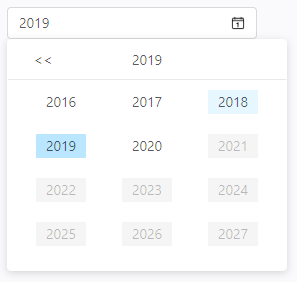
1.可以设置 可选择的时间范围,范围超出部分置灰不可选择。
2.点击空白处默认收起弹窗,也可以在外部通过 open 属性控制。
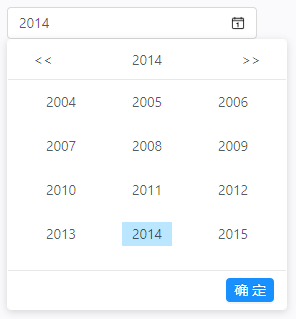
3.按确定按钮后过 onOk 属性返回 一个函数,第一个参数为选择的时间。
4.*新增:用户可以选择是否使用确定按钮。
5.*新增: disabled (禁用状态)、className (设置选择器)、defaultValue(时间为空时的默认显示) 。
6.宽高自动获取父级,最小高度22px,最下宽度90px。
改进方向:
此版本基本满足开发时的各种需要,及突发情况。目前暂无改进计划。
大家若有什么好的建议,我也会采纳,主要是得有时间。😊
吐槽一下:
这是多变态的产品,非得要一套“年份”的时间选择器
效果展示:
js部份:
import React from "react";
import "./YearPicker.less"
import moment from "moment";
import { connect } from "react-redux";
import PropTypes from "prop-types";

class YearPicker extends React.Component {
  constructor(props) {
    super(props)
    this.state = {
      stateOpen: false, // 是否展示弹窗
      year: "", // "2020" 返给用户的时间
      inputValue: "", // input 框显示的内容
      selectYear: moment().format("YYYY"), // 选中的时间
      yearListData: [], // 可选中的年份时间列表
      basePage: 0 // 基准页面
    }
  }

  componentDidMount() {
    const { value, open } = this.props;
    const { basePage, stateOpen } = this.state;
    const data = this.renderList(basePage)
    this.setState({
      selectYear: value ? value : moment().format("YYYY"),
      year: value ? value : "",
      yearListData: data,
      stateOpen: open === undefined ? stateOpen : open
    })
    if (open === undefined) {
      document.addEventListener("click", this.eventFn, true)
    }
  }

  componentWillReceiveProps(nextProps) {
    if (nextProps.value !== this.props.value) {
      this.setState({
        year: nextProps.value
      })
    }
  }

  componentWillUnmount() {
    document.removeEventListener("click", this.eventFn, true)
  }

  eventFn = (ev) => {
     // ...
  }

  renderList = (basePage) => {
     // ...
  }

  onclick = (ev) => {
     // ...
  }

  yearClick = (ev, item, showOk) => {
     // ...
  }

  iconLeftClick = () => {
     // ...
  }

  iconRightClick = () => {
     // ...
  }

  okBut = (ev) => {
     // ...
  }

  textChange = () => {
     // ...
  }

  render() {
    const { year, stateOpen, selectYear, yearListData } = this.state;
    const { startValue, endValue, className, defaultValue, disabled, showOk } = this.props;
    let oneDisplay = "block", twoDisplay = "block";
    if (startValue && yearListData.length && yearListData.includes(startValue)) {
      oneDisplay = "none";
    }
    if (endValue && yearListData.length && yearListData.includes(endValue)) {
      twoDisplay = "none";
    }
    return (
      <div className={`YearPicker ${className} ${disabled ? "disabled-picker" : ""}`} id="YearPicker" onClick={(ev) => { disabled ? console.log("禁用") : this.onclick(ev) }}>
        <div className="begin">
          <input className={year ? "zjl-input" : "zjl-input default_input"} value={year ? year : defaultValue} onChange={() => { this.textChange() }} disabled={disabled} />
          <i className="img" ></i>
        </div>
        <div className="yearChild" style={{ display: stateOpen ? "block" : "none" }}>
          <div className="hearer">
            <span className="left_icon" onClick={this.iconLeftClick} style={{ display: oneDisplay }}>{"<<"}</span>
            <span className="zjl-selectText">{selectYear}</span>
            <span className="right_icon" onClick={this.iconRightClick} style={{ display: twoDisplay }}>{">>"}</span>
          </div>
          <div className="con">
            <ul className="yearBefore">
              {
                yearListData.length > 0 &&
                yearListData.map((item, index) => {
                  return <li key={index}
                    onClick={(+startValue && +startValue <= +item) && (+endValue && +item <= +endValue) ? (ev) => { this.yearClick(ev, item, showOk) } : null}>
                    <span className={(+startValue && +startValue <= +item) && (+endValue && +item <= +endValue) ? selectYear === item ? "beforeli brackgroundYear" : "beforeli" : "beforeli warnnodata"}>
                      {item}
                    </span>
                  </li>
                })
              }
            </ul>
          </div>
          {
            showOk ?
              <div className="zjl-but">
                <span onClick={ev => { this.okBut(ev) }}>确 定</span>
              </div> : null
          }
        </div>
      </div>
    )
  }
}

YearPicker.propTypes = {
  value: PropTypes.string,
  startValue: PropTypes.string,
  endValue: PropTypes.string,
  open: PropTypes.bool,
  disabled: PropTypes.bool,
  onOk: PropTypes.func,
  className: PropTypes.string,
}

YearPicker.defaultProps = {
  showOk: false, // 是否使用确定按钮,默认不使用
  disabled: false, // 组件是否禁用,默认组件可以使用
  defaultValue: "请选择时间", // 默认日期 or 没有日期时的提示语
  value: "", // 日期
  startValue: "1970", // 默认可选择时间范围的起始时间
  endValue: moment().format("YYYY"), // 默认可选择时间范围的结束时间
  open: undefined, // 默认弹窗展示与否不受控
  onOk: () => { console.log(1) }, // 时间切换后的回调
  className: ""
}

export default connect(state => state, {})(YearPicker)
less部份:
.YearPicker{
  width: 100%;
  height: 100%;
  min-height: 22px;
  min-width: 90px;
  box-sizing: border-box;
  margin: 0;
  padding: 0;
  color: rgba(0, 0, 0, 0.65);
  font-size: 14px;
  font-variant: tabular-nums;
  line-height: 1.5;
  list-style: none;
  font-feature-settings: 'tnum';
  position: relative;
  display: inline-block;
  outline: none;
  cursor: text;
  transition: opacity 0.3s;
  .begin{
    position: relative;
    height: 100%;
    .zjl-input{
      text-overflow: ellipsis;
      touch-action: manipulation;
      box-sizing: border-box;
      margin: 0;
      padding: 0;
      font-variant: tabular-nums;
      list-style: none;
      font-feature-settings: 'tnum';
      position: relative;
      display: inline-block;
      width: 100%;
      height: 100%;
      padding: 4px 11px;
      color: rgba(0, 0, 0, 0.65);
      font-size: 14px;
      line-height: 1.5;
      background-color: #fff;
      background-image: none;
      border: 1px solid #d9d9d9;
      border-radius: 4px;
      transition: all 0.3s;
      &:hover{
        border-color: #40a9ff;
        border-right-width: 1px !important;
      }
      &:focus {
        border-color: #40a9ff;
        border-right-width: 1px !important;
        outline: 0;
        box-shadow: 0 0 0 2px rgba(24, 144, 255, 0.2);
      }
    }
    .zjl-input[disabled] {
      color: rgba(0, 0, 0, 0.25);
      background-color: #f5f5f5;
      cursor: not-allowed;
      opacity: 1;
    }
    .default_input{
      color: rgba(0, 0, 0, 0.25);
    }
    .img{
      display: inline-block;
      position: absolute;
      top: 50%;
      right: 12px;
      height: 14px;
      width: 14px;
      margin-top: -7px;
      background: url("../../assets/imgs/日历1.png") no-repeat center;
      background-size: 100% 100%;
      color: rgba(0, 0, 0, 0.25);
      font-size: 14px;
      line-height: 1;
      z-index: 1;
      transition: all 0.3s;
      user-select: none;
    }
  }
  .yearChild{
    box-sizing: border-box;
    margin: 0;
    padding: 0;
    color: rgba(0, 0, 0, 0.65);
    font-variant: tabular-nums;
    line-height: 1.5;
    list-style: none;
    font-feature-settings: 'tnum';
    position: absolute;
    z-index: 1050;
    width: 280px;
    font-size: 14px;
    line-height: 1.5;
    text-align: left;
    list-style: none;
    background-color: #fff;
    background-clip: padding-box;
    border: 1px solid #fff;
    border-radius: 4px;
    outline: none;
    box-shadow: 0 2px 8px rgba(0, 0, 0, 0.15);
    .hearer{
      height: 40px;
      line-height: 40px;
      text-align: center;
      border-bottom: 1px solid #e8e8e8;
      user-select: none;
      white-space: nowrap;
      overflow: hidden;
      position: relative;
      span{
        display: inline-block;
      }
      .left_icon{
        position: absolute;
        z-index: 100;
        top: 0;
        left: 0;
        cursor: pointer;
        width: 30px;
        margin-left: 20px;
        &:hover{
          color: #40a9ff;
        }
      }
      .zjl-selectText{
        text-align: center;
      }
      .right_icon{
        position: absolute;
        z-index: 100;
        top: 0;
        right: 0;
        cursor: pointer;
        width: 30px;
        margin-right: 20px;
        &:hover{
          color: #40a9ff;
        }
      }
    }
    .con{
      width: 100%;
      .yearBefore{
        width: 100%;
        padding: 10px 20px;
        overflow: hidden;
        display: grid;
        grid-gap: 20px;
        grid-template-columns: repeat(3, 1fr);
        // grid-auto-rows: 20px 20px 20px;
        grid-template-areas:
          "h h h"
          "h h h"
          "h h h"
          "h h h";
        li {
          text-align: center;
          font-size: 14px;
          .beforeli{
            display: inline-block;
            cursor: pointer;
            padding: 0 10px;
            height: 24px;
            line-height: 23px;
            &:hover{
              background: #e6f7ff;
            }
          }
          .brackgroundYear{
            background: #bae7ff;
            border-radius: 1px;
            &:hover{
              background: #bae7ff;
            }
          }
          .warnnodata{
            background-color: #f5f5f5;
            color: rgba(0, 0, 0, 0.25);
            cursor: not-allowed;
          }
        }
      }
    }
    .zjl-but{
      position: relative;
      height: auto;
      text-align: right;
      padding: 0 12px;
      line-height: 38px;
      border-top: 1px solid #e8e8e8;
      span{
        position: relative;
        display: inline-block;
        font-weight: 400;
        white-space: nowrap;
        text-align: center;
        background-image: none;
        border: 1px solid transparent;
        box-shadow: 0 2px 0 rgba(0, 0, 0, 0.015);
        cursor: pointer;
        transition: all 0.3s cubic-bezier(0.645, 0.045, 0.355, 1);
        user-select: none;
        touch-action: manipulation;
        height: 32px;
        padding: 0 15px;
        color: #fff;
        background-color: #1890ff;
        border-color: #1890ff;
        text-shadow: 0 -1px 0 rgba(0, 0, 0, 0.12);
        -webkit-box-shadow: 0 2px 0 rgba(0, 0, 0, 0.045);
        box-shadow: 0 2px 0 rgba(0, 0, 0, 0.045);
        height: 24px;
        padding: 0 7px;
        font-size: 14px;
        border-radius: 4px;
        line-height: 22px;
        &:hover{
          color: #fff;
          background-color: #40a9ff;
          border-color: #40a9ff;
        }
      }
    }
  }
}
。
