


flex布局
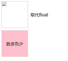
子元素盒子居中,flex属性加在父元素身上,而不是自身
    <div class="imgBox">
      <img src="" alt="" style="width: 100px; height: 100px" />
      <div style="margin: 0 0 0 10px">取代float</div>
    </div>
    <div class="box">
      <div>胜多负少</div>
    </div>

  .imgBox {
    display: flex;
    /* justify-content: center; 水平居中 也可以居左/居右 */
    align-items: center; /* 垂直居中 */
  }
  .box {
    display: flex;
    width: 100px;
    height: 100px;
    background-color: pink;
    margin-top: 10px;
    justify-content: center;
    align-items: center;
  }
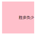
  .box {
    display: flex;
    width: 100px;
    height: 100px;
    background-color: pink;
    margin-top: 10px;
    justify-content: right; /*盒子内的div文字 “胜多负少” 水平居中 也可以居左 justify-content: left;/居右     justify-content: right;*/
    align-items: center;
  }
均分(这种均分间距不会自动隔开)
    <ul>
      <li>1</li>
      <li>2</li>
      <li>3</li>
      <li>4</li>
    </ul>

  ul {
    display: flex;
    width: 500px;
    background-color: red;
    text-align: center;
  }
  li {
    flex: 1;
    background: pink;
  }
  li:not(:last-child) {
    margin-right: 6px;
  }

按比例自适应完全按比例-横向
    <div class="box3">
      <div>1</div>
      <div>2</div>
      <div>3</div>
    </div>

  .box3{width: 400px;display:-webkit-flex;flex-direction:row;}
  .box3 div:nth-of-type(1){flex:1;background-color:red;}
  .box3 div:nth-of-type(2){flex:2;background-color:pink;}
  .box3 div:nth-of-type(3){flex:3;background-color:orange;}

纵向(垂直)均匀分布
   display: flex;
   flex-direction: column;
   justify-content: space-around;
自身居中并且左右散开 就像float 一样 左边 left 右边 right (还可以多个均分间距都是均匀的,例如四个元素)
    display: flex;
    align-items: center;
    justify-content: space-between;
左中右布局
    <div class="box">
      <div class="left">我是左边</div>
      <div class="center">我是中间</div>
      <div class="right">我是右边</div>
    </div>


.box {
  display: flex;
  text-align: center;
}
.left {
  width: 300px;
  background: red;
}
.center {
  flex: 1;
  background: pink;
}
.right {
  width: 200px;
  background: #f40;
}
换行
flex-flow: wrap;
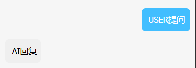
通过 flex-direction: row-reverse X轴反方向及 flex-flow: wrap 换行 处理聊天框样式
<template>
<div style="position: relative; font-size: 32rpx">
<div style="font-size: 32rpx">
<div v-if="selfList.length">
<ul style="margin-left: 20rpx">
<li
v-for="(item, idx) in selfList"
:key="idx"
style="position: relative"
>
<div :class="[item.dialogueType == 'USER' ? 'human' : `bot`]">
<div
:class="item.dialogueType == 'USER' ? 'userBox' : 'boxBox'"
style="position: relative"
>
<div>
<div
v-if="item.dialogueType == 'AI'"
@longpress="longpressUser(item.content)"
>
{{ item.content }}
</div>
<span v-else @longpress="longpressUser(item.content)">
{{ item.content }}
</span>
</div>
</div>
</div>
</li>
</ul>
</div>
</div>
</div>
</template>
<script setup>
import { ref } from "vue";
let selfList = ref([]);
selfList.value = [
  {
    dialogueType: "USER",
    content: "USER提问",
  },
  {
    dialogueType: "AI",
    content: "AI回复",
  },
];
function longpressUser(data) {
  if (data) {
    uni.setClipboardData({
      data,
      success() {
        uni.showToast({
          title: "复制成功",
          icon: "success",
          duration: 1000,
        });
      },
    });
  }
}
</script>
<style lang="scss" scoped>
.human {
  flex-direction: row-reverse;
  display: flex;
  flex-wrap: wrap;
  margin-right: 20rpx;
  line-height: 38rpx;
  margin-left: 25rpx;
}

.userBox {
  background-color: #42beff;
  padding: 15rpx;
  padding-left: 25rpx;
  padding-right: 20rpx;
  font-size: 32rpx;
  line-height: 60rpx;
  border-radius: 15rpx;
  box-sizing: border-box;
  color: #fff;
  margin-top: 30rpx;
}

.bot {
  display: flex;
  flex-wrap: wrap;
  margin-right: 50rpx;
}

.boxBox {
  background-color: #efefef;
  padding: 15rpx;
  padding-left: 25rpx;
  padding-right: 15rpx;
  margin-top: 30rpx;
  font-size: 32rpx;
  line-height: 60rpx;
  border-radius: 15rpx;
}
</style>

 浙公网安备 33010602011771号