
JS获取手机电量,型号,以及充电特效
获取手机电量,型号,以及css实现充电特效
- 获取手机电量相关信息
- 获取手机相关型号信息
- css实现充电特效
获取手机电量相关信息
移动端和PC端皆适用
//获取手机电量信息
// charging: 是否在充电
// chargingTime: 充满电还需要的时间(秒)
// dischargingTime: 电池剩余可用时间(秒)
// level: 剩余电量,最大电量就是1
// onchargingchange: 充电状态改变时触发该监听函数
// onchargingtimechange: 充满还需时间改变时触发该监听函数
// ondischargingtimechange: 电池剩余可用时间改变时触发该监听函数
// onlevelchange: 电量改变时触发该监听函数
let power = {}
navigator.getBattery().then(function (battery) {
power.isCharging = battery.charging
power.level = battery.level
power.needChargingTime = battery.chargingTime
power.elseTime = battery.dischargingTime
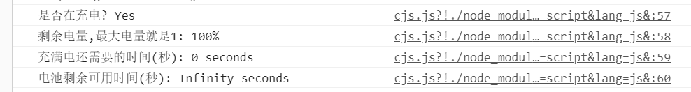
console.log("是否在充电? " + (battery.charging ? "Yes" : "No"));
console.log("剩余电量,最大电量就是1: " + battery.level * 100 + "%");
console.log("充满电还需要的时间(秒): " + battery.chargingTime + " seconds");
console.log("电池剩余可用时间(秒): " + battery.dischargingTime + " seconds");
battery.addEventListener('chargingchange', function () {
console.log("充电状态改变时触发该监听函数? " + (battery.charging ? "Yes" : "No"));
power.isCharging = battery.charging
});
battery.addEventListener('levelchange', function () {
console.log("电量改变时触发该监听函数: " + battery.level * 100 + "%");
power.level = battery.level
});
battery.addEventListener('chargingtimechange', function () {
console.log("充满还需时间改变时触发该监听函数: " + battery.chargingTime + " seconds");
power.needChargingTime = battery.chargingTime
});
battery.addEventListener('dischargingtimechange', function () {
console.log("电池剩余可用时间改变时触发该监听函数: " + battery.dischargingTime + " seconds");
power.elseTime = battery.dischargingTime
});
// console.log(power)
});
获取手机相关型号信息
<script src="https://cdn.jsdelivr.net/npm/mobile-detect@1.4.4/mobile-detect.min.js"></script>
<script>
        //判断数组中是否包含某字符串
        Array.prototype.contains = function (needle) {
            for (i in this) {
                if (this[i].indexOf(needle) > 0)
                    return i;
            }
            return -1;
        }
        var device_type = navigator.userAgent;//获取userAgent信息
        var md = new MobileDetect(device_type);//初始化mobile-detect
        var os = md.os();//获取系统
        var model = "";
        if (os == "iOS") {
            //ios系统的处理
            os = md.os() + md.version("iPhone");
            model = md.mobile();
        } else if (os == "AndroidOS") {
            os = md.os() + md.version("Android");
            var sss = device_type.split(";");
            var i = sss.contains("Build/");
            if (i > -1) {
                model = sss[i].substring(0, sss[i].indexOf("Build/"));
            }
        }
        // alert(model);//打印手机型号
    </script>
css实现充电特效
html部分
<div class="container">
     <div class="box">
         <div class="level"> {{powerInfo.level*100}}%</div> /*电量百分比展示*/
         <div class="circle"> </div>
         <ul class="bubbles">
             <li></li>
             <li></li>
             <li></li>
             <li></li>
             <li></li>
             <li></li>
             <li></li>
             <li></li>
             <li></li>
             <li></li>
             <li></li>
             <li></li>
             <li></li>
             <li></li>
             <li></li>
         </ul>
     </div>
</div>
样式部分
.container {
      transform: scale(.4);
      position: absolute;
      //   width: 300px;
      //   height: 400px;
      width: 100%;
      top: -25px;
      bottom: 0;
      left: 0;
      right: 0;
      margin: auto;

      .box {
        filter: contrast(15) hue-rotate(0);
        width: 100%;
        height: 400px;
        overflow: hidden;
        animation: hueRotate 10s infinite linear;

        .level {
          position: absolute;
          width: 100%;
          height: 100%;
          top: 25%;
          text-align: center;
          font-size: 40px;
          z-index: 10;
          color: #fff;
        }

        .circle {
          position: relative;
          width: 100%;
          height: 300px;
          box-sizing: border-box;
          filter: blur(8px);

          &::after {
            content: "";
            position: absolute;
            top: 40%;
            left: 50%;
            transform: translate(-50%, -50%) rotate(0);
            width: 200px;
            height: 200px;
            background-color: #00ff6f;
            border-radius: 42% 38% 62% 49% / 45%;
            animation: rotate 10s infinite linear;
          }

          &::before {
            content: "";
            position: absolute;
            width: 176px;
            height: 176px;
            top: 40%;
            left: 50%;
            transform: translate(-50%, -50%);
            border-radius: 50%;
            // background-color: #000;
            z-index: 10;
          }
        }

        .bubbles {
          position: absolute;
          left: 50%;
          bottom: 0;
          width: 100px;
          height: 40px;
          transform: translate(-50%, 0);
          border-radius: 100px 100px 0 0;
          background-color: #00ff6f;
          filter: blur(5px);
        }

        li {
          position: absolute;
          border-radius: 50%;
          background: #00ff6f;
        }

        @for $i from 0 through 15 {
          li:nth-child(#{$i}) {
            $width: 15 + random(15) + px;
            left: 15 + random(70) + px;
            top: 50%;
            transform: translate(-50%, -50%);
            width: $width;
            height: $width;
            animation: moveToTop #{random(6) + 3}s ease-in-out -#{random(5000)/1000}s infinite;
          }
        }

        @keyframes rotate {
          50% {
            border-radius: 45% / 42% 38% 58% 49%;
          }

          100% {
            transform: translate(-50%, -50%) rotate(720deg);
          }
        }

        @keyframes moveToTop {
          90% {
            opacity: 1;
          }

          100% {
            opacity: .1;
            transform: translate(-50%, -180px);
          }
        }

        @keyframes hueRotate {
          100% {
            filter: contrast(15) hue-rotate(360deg);
          }
        }
      }
    }
  }

 浙公网安备 33010602011771号