CSS简单入门笔记
CSS
1.什么是CSS
Cascading Style Sheet 层叠级联样式表
CSS:表现(美化网页)
字体,颜色,边距,高度,背景图片,网页定位,网页浮动......
CSS优势
- 内容和表现分离
- 网页结构表现统一,可以实现复用
- 样式十分丰富
- 建议使用独立于HTML的CSS文件
- 利用SEO,容易被搜索引擎收录
CSS的三种导入方式
行内样式、内部样式、外部样式
优先级:就近原则
2.选择器
作用:选择页面上的某一个或某一类元素
2.1基本选择器
- 标签选择器:选择一类标签 标签{}
- 类选择器:选择所有class属性一致的标签,跨标签 .类名{}
- id选择器:全局唯一 #id名{}
优先级:id>class>标签
2.2层次选择器
-
后代选择器:在某个元素的后面,例:
在body 后的所有P标签,body p{}
<!DOCTYPE html> <html lang="en"> <head> <style> body p{ background: aqua; } </style> <meta charset="UTF-8"> <title>Title</title> </head> <body> <p>p1</p> <p>p2</p> <p>p3</p> <ul> <li>l1</li> <li>l2</li> <li>l3</li> <li>l4</li> </ul> </body> </html> -
子选择器:后面一代。body>p{}
-
相邻兄弟选择器:同级,对下不对上。 .class名 + p
-
通用选择器:通用兄弟选择器,当前选中元素的向下的所有兄弟元素。 .class名~p
2.3结构伪类选择器
E:nth-of-type(n)
div:nth-of-type(1){}
/*表示div父级标签下第一个div,n为几就表示第几个*/
2.4属性选择器(常用)
<!DOCTYPE html>
<html lang="en">
<head>
    <style>
        <!--  *=:class所有含有这个词的元素  href^="image":所有href中以image开头的  href&="doc":所有href中以doc结尾的  -->
        a[class*=links]{
            background: aqua;
        }
    </style>

    <meta charset="UTF-8">
    <title>Title</title>
</head>
<body>
<a href="www.baidu.com" class="links item first">1</a>
<a href="image/123.jpg" class="links">2</a>
<a href="image/123.png" class="item">3</a>
<a href="image/123.html" class="item">4</a>
<a href="abc" class="links item">5</a>
<a href="abc.doc" class="links item">6</a>
<a href="iabcd.doc" class="links item">7</a>
<a href="a.pdf" class="links item">8</a>
</body>
</html>
3.美化网页
3.1为什么要美化网页
- 有效的传递页面信息
- 美化网页,页面漂亮,才能吸引用户
- 凸显页面主体
- 提高用户的体验
span标签:重点否的东西,用span套起来
<!DOCTYPE html>
<html lang="en">
<head>
    <style>
        #Lv{
            font-size: 50px;
        }
    </style>
    <meta charset="UTF-8">
    <title>Title</title>
</head>
<body>
欢迎来到Lv学<span id="Lv">Java</span>
</body>
</html>
3.2字体样式
<!DOCTYPE html>
<html lang="en">
<head>
    <style>
        body{
            <!--
        font-family:字体样式
        font-size:字体大小
        font-weight:字体粗细
        color:字体颜色

        -->
            font-family: 楷体;
            font-size: 25px;
            font-weight: bold;
            color: antiquewhite;
        }
    </style>

    <meta charset="UTF-8">
    <title>Title</title>
</head>
<body>
<h1>
    我昂立你发送卡理解和OA鞥搜客你付款拉水电费能理解UI巨额昂
</h1>
</body>
</html>
3.3文本样式
- 颜色 color rgb rgba
- 文本对齐方式 text-align: center;
- 首行缩进 text-indent: 2em;
- 行高 line-height
- 装饰 text-decoration:
- 文本图片对齐
3.4阴影
/*text-shadow:阴影颜色,水平偏移,垂直偏移,阴影半径*/
        #p1{
            text-shadow: #3e5eff -5px 5px 2px;
        }
3.5超链接伪类
/*鼠标悬停状态*/
        a:hover{
            color: blueviolet;
            font-size: 50px;
        }
        /*鼠标按住未释放的状态*/
        a:active{
            color: green;
        }
3.6列表
ul li{
    /*
    list-style
    none:去掉无序列表中的圆点
    circle:空心圆
    decimal:数字
    square:正方形
    */
    list-style=none;
}
3.7背景
<style>
        div{
            height: 500px;
            width: 300px;
            border: 1px solid red;
            background-image: url("../image/a.png");
        /*    默认是平铺的*/
        }
        .div1{
            background-repeat: repeat-x;
        }
        .div2{
            background-repeat: repeat-y;
        }
        .div3{
            background-repeat: no-repeat;
        }
    </style>
h1{
    /*颜色 图片 图片位置 平铺方式*/
    background:red url("../image/a.png") 170px 10px no-repeat;
}
4.盒子模型
4.1边框
border属性
4.2外边距
margin属性
4.3圆角边框
<style>
        div{
            width: 100px;
            height: 100px;
            border: 10px solid red;
            border-radius: 50px 0px 0px 0px;
        }
    </style>
4.4盒子阴影
<style>
        div{
            width: 100px;
            height: 100px;
            border: 10px solid red;
            border-radius: 50px 0px 0px 0px;
            box-shadow: 0px 0px 50px yellow;
        }
    </style>
5.浮动
5.1 标准文档流:
自上而下的顺序结构。
5.2 display
<!--    display
          inline  行内元素
          block   块元素
          inline-block   是块元素,但是保持行内元素的特性,可以内联-->
    <style>
        div{
            width: 100px;
            height: 100px;
            border: 1px solid red;
            display: inline-block;
            margin: 0px;
        }
        span{
            width: 100px;
            height: 100px;
            border: 1px solid red;
            display: inline-block;
        }
5.3 float
<style>
        div{
            margin: 0px;
        }
        #father{
            border: 5px solid yellow;
        }
        #first{
            width: 300px;
            height: 400px;
            border: 1px solid red;
            float: left;
        }
        #sencond{
            width: 200px;
            height: 300px;
            border: 10px solid green;
            float: left;
        }
        #third{
            width: 300px;
            height: 300px;
            border: 1px solid blue;
            float: left;
        }
    </style>
5.4 父级边框塌陷问题
clear
/*
        clear: right; 右侧不允许有浮动元素
        clear: left;  左侧不允许有浮动元素
        clear: both;  两侧不允许有浮动元素
        */
        #first{
            border: 1px solid red;
            float: left;
            display: inline-block;
            clear: both;
        }
解决方案
-
增加父级元素的高度
#father{ border: 5px solid yellow; height: 500px; } -
在后面增加一个空的div,清除浮动
<!DOCTYPE html> <html lang="en"> <head> <meta charset="UTF-8"> <title>Title</title> <style> div{ margin: 0px; } #father{ border: 5px solid yellow; } /* clear: right; 右侧不允许有浮动元素 clear: left; 左侧不允许有浮动元素 clear: both; 两侧不允许有浮动元素 */ #first{ border: 1px solid red; float: left; display: inline-block; clear: right; } #sencond{ border: 10px solid green; float: left; display: inline-block; clear: right; } #third{ border: 1px solid blue; float: left; display: inline-block; clear: right; } .clear{ margin: 0; padding: 0; clear: both; } </style> </head> <body> <div id="father"> <div id="first" ><img src="../image/a.jpg"></div> <div id="sencond"><img src="../image/b.jpg"></div> <div id="third"><img src="../image/c.jpg"></div> <div class="clear"></div> </div> </body> </html> -
overflow
在父级元素中添加overflow: hidden; hidden:隐藏 scroll:滚动条 -
父类添加一个伪类
#father:after{
    content: "";
    display: block;
    clear: both;
}
小结:
-
增加一个空的div(尽量避免)
-
增加父级元素的高度(元素有了固定高度,就会被限制)
-
overflow(简单,下拉的一些场景避免使用)
-
父类添加一个伪类:after(推荐)
写法稍微复杂,但没有副作用
5.5 对比
-
display
方向不可控制
-
float
浮动起来会脱离标准文档流,所以要解决父级边框塌陷问题
6. 定位
6.1 相对定位、
#first{
            height: 100px;
            line-height: 100px;
            border: 1px solid green;
            background: #35805e;
            position: relative;  /*相对定位,上下左右*/
            top: 20px;   /*距离顶部的位置,20是距离顶部的距离加20,-20则是距离顶部的位置减20*/
            left: -10px;
        }
相对定位:position: relative;
相对于原来的位置,进行指定的偏移,它任然在标准文档流中,原来的位置会被保留
top、bottom、left、right
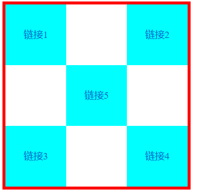
实现方块定位:
<!DOCTYPE html>
<html lang="en">
<head>
    <meta charset="UTF-8">
    <title>Title</title>

    <style>
        .father{
            width: 300px;
            height: 300px;
            border: 5px solid red;
        }
        a{
            width: 100px;
            height: 100px;
            background: aqua;
            display: block;
            text-decoration: none;
            text-align: center;
            line-height: 100px;
        }
        a:hover{
            background: #3e5eff;
        }
        /*#first{*/
        /*    width: 100px;*/
        /*    height: 100px;*/
        /*    background: aqua;*/
        /*    float: left;*/
        /*    clear: right;*/
        /*}*/
        #sencond{
            position: relative;
            left: 200px;
            top: -100px;
        }
        #third{
            position: relative;;
        }
        #fourth{
            position: relative;
            left: 200px;
            top: -100px;
        }
        #fifth{
            position: relative;
            left: 100px;
            top: -300px;
        }
    </style>

</head>
<body>
<div class="father">
    <a id="first" href="">链接1</a>
    <a id="sencond" href="">链接2</a>
    <a id="third" href="">链接3</a>
    <a id="fourth" href="">链接4</a>
    <a id="fifth" href="">链接5</a>
</div>
</body>
</html>
6.2 绝对定位
定位:基于XXX定位,上下左右
- 在父级元素没有定位的情况下,相对于浏览器
- 在父级元素有定位的情况下,相对于父级元素
- 在父级元素的范围内
- 相对于父级元素或浏览器的位置,进行指定的偏移,它不再在标准文档流中,原来的位置不会被保留
 #sencond{
            position: absolute;
            left: 200px;
            top: -100px;
        }
6.3固定定位 fixed
将某一元素固定在某一位置后不论怎么滑动都在同一位置不会改变,像一些网站的导航栏,回到顶部按钮等
 #sencond{
            position: fixed;
            left: 200px;
            top: -100px;
        }
6.4 z-index
z-index:默认是0,最高无限
<!DOCTYPE html>
<html lang="en">
<head>
    <meta charset="UTF-8">
    <title>Title</title>
    <link href="css/p.css" rel="stylesheet" type="text/css">
</head>
<body>
<div class="father">
    <ul>
        <li><img src="../image/a.jpg"></li>
        <li class="tipText">Lv学CSS</li>
        <li class="tip_bg"></li>
        <li>2020年7月</li>
        <li>地点:家中</li>
    </ul>
</div>
</body>
</html>
.father{
    width: 177px;
    height: 245px;
    font-size: 12px;
    overflow: hidden;
    border: 5px solid red;
    line-height: 25px;
}
ul,li{
    margin: 0px;
    padding: 0px;
    list-style: none;
}
father ul{
/*    父级元素相对定位*/
    position: relative;
}
.tipText,.tip_bg{
    width: 177px;
    height: 25px;
    position: absolute;
    top: 200px;
}
.tipText{
    color: white;
    /*z-index: 999;*/
}
.tip_bg{
    background: black;
    opacity: 0.5;   /*背景透明度*/
}

 浙公网安备 33010602011771号