MAUI 布局Layout Grid
Grid是一种布局,它将子级组织成行和列,这些行和列可以有成比例或绝对大小。 默认情况下,Grid 包含一行和一列。 此外, Grid 可用作包含其他子布局的父布局。
Grid的主要特点:
灵活的行和列定义:可以通过指定行和列的数量以及它们的大小和比例来自由定义Grid的结构。
自适应宽度和高度:可以根据需要动态调整单元格的大小。
内边距和边框:可以为网格和单元格添加内边距和边框,以更好地控制它们的外观。
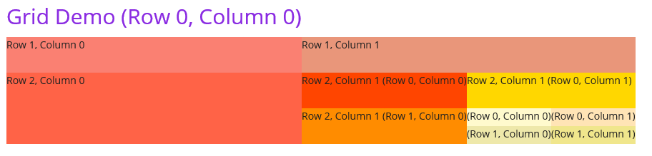
下面的例子中,我完成了一个嵌套网格。最外部的网格为三行两列,中间层的网格为两行两列,最内层的网格为两行两列。
<Grid>
    <Grid.RowDefinitions>
        <RowDefinition Height="50" />
        <RowDefinition Height="50" />
        <RowDefinition Height="100" />
    </Grid.RowDefinitions>
    <Grid.ColumnDefinitions>
        <ColumnDefinition Width="Auto" />
        <ColumnDefinition Width="Auto"/>
    </Grid.ColumnDefinitions>
    <Label Grid.Row="0" Grid.Column="0" Style="{StaticResource TitleLabel}" HorizontalOptions="Center" Text="Grid Demo (Row 0, Column 0)"></Label>
    <Label Grid.Row="1" Grid.Column="0" BackgroundColor="#FA8072" Text="Row 1, Column 0" />
    <Label Grid.Row="1" Grid.Column="1" BackgroundColor="#E9967A" Text="Row 1, Column 1" />
    <Label Grid.Row="2" Grid.Column="0" BackgroundColor="#FF6347" Text="Row 2, Column 0" />
    <Grid Grid.Row="2" Grid.Column="1">
        <Grid.RowDefinitions>
            <RowDefinition Height="50" />
            <RowDefinition Height="50" />
        </Grid.RowDefinitions>
        <Grid.ColumnDefinitions>
            <ColumnDefinition Width="Auto" />
            <ColumnDefinition Width="Auto"/>
        </Grid.ColumnDefinitions>
        <Label Grid.Row="0" Grid.Column="0" BackgroundColor="#FF4500" Text="Row 2, Column 1 (Row 0, Column 0)"></Label>
        <Label Grid.Row="0" Grid.Column="1" BackgroundColor="#FFD700" Text="Row 2, Column 1 (Row 0, Column 1)"></Label>
        <Label Grid.Row="1" Grid.Column="0" BackgroundColor="#FF8C00" Text="Row 2, Column 1 (Row 1, Column 0)"></Label>
        <Grid Grid.Row="1" Grid.Column="1" RowDefinitions="25,25" ColumnDefinitions="Auto,Auto">
            <Label Grid.Row="0" Grid.Column="0" BackgroundColor="#FFFACD" Text="(Row 0, Column 0)"></Label>
            <Label Grid.Row="0" Grid.Column="1" BackgroundColor="#FFE4B5" Text="(Row 0, Column 1)"></Label>
            <Label Grid.Row="1" Grid.Column="0" BackgroundColor="#EEE8AA" Text="(Row 1, Column 0)"></Label>
            <Label Grid.Row="1" Grid.Column="1" BackgroundColor="#F0E68C" Text="(Row 1, Column 1)"></Label>
        </Grid>
    </Grid>
</Grid>
效果如图:
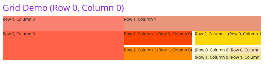
我们可以为网格之间添加间距:
<Grid Grid.Row="2" Grid.Column="1" ColumnSpacing="10" RowSpacing="5">
...
</Grid>
效果如图:
我们可以简化行和列的定义到一行代码:
<Grid Grid.Row="1" Grid.Column="1" RowDefinitions="25,25" ColumnDefinitions="Auto,Auto">
...
</Grid>
上面的RowDefinitions="25,25" ColumnDefinitions="Auto,Auto"完成了下面的定义:
<Grid.RowDefinitions>
    <RowDefinition Height="25" />
    <RowDefinition Height="25" />
</Grid.RowDefinitions>
<Grid.ColumnDefinitions>
    <ColumnDefinition Width="Auto" />
    <ColumnDefinition Width="Auto"/>
</Grid.ColumnDefinitions>
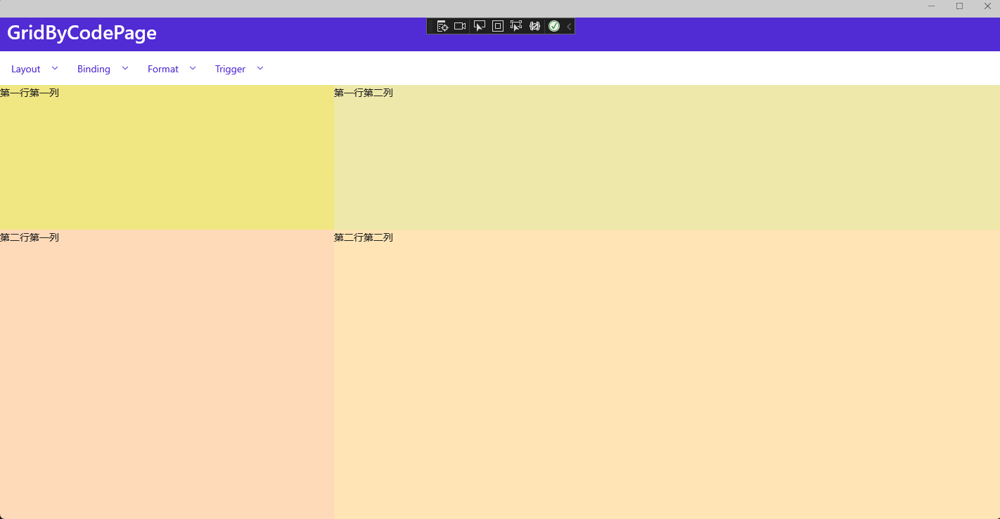
我们也可以通过C#代码完成Grid布局的定义:
var grid = new Grid();

//定义两个列,第一个列宽度为1*,第二个列宽度为2*
grid.ColumnDefinitions.Add(new ColumnDefinition() { Width = new GridLength(1, GridUnitType.Star) });
grid.ColumnDefinitions.Add(new ColumnDefinition() { Width = new GridLength(2, GridUnitType.Star) });

//定义两个行,第一个行高度为1*,第二个行高度为2*
grid.RowDefinitions.Add(new RowDefinition() { Height = new GridLength(1, GridUnitType.Star) });
grid.RowDefinitions.Add(new RowDefinition() { Height = new GridLength(2, GridUnitType.Star) });

//添加四个单元格
grid.Add(new Label() { Text = "第一行第一列", BackgroundColor = Color.FromRgb(240, 230, 130) }, 0, 0); //第一行第一列
grid.Add(new Label() { Text = "第一行第二列", BackgroundColor = Color.FromRgb(238, 232, 170) }, 1, 0); //第一行第二列
grid.Add(new Label() { Text = "第二行第一列", BackgroundColor = Color.FromRgb(255, 218, 185) }, 0, 1); //第二行第一列
grid.Add(new Label() { Text = "第二行第二列", BackgroundColor = Color.FromRgb(255, 228, 181) }, 1, 1); //第二行第二列

Content = grid;
在上面的代码中,我们创建了一个2x2的Grid,其中第一列的宽度为第二列的一半,第一行的高度为第二行的一半。我们添加了四个标签元素,每个标签元素放置在单独的单元格中。
效果如图:
示例代码
参考资料
学习技术最好的文档就是【官方文档】,没有之一。
还有学习资料【Microsoft Learn】、【CSharp Learn】、【My Note】。
如果,你认为阅读这篇博客让你有些收获,不妨点击一下右下角的【推荐】按钮。
如果,你希望更容易地发现我的新博客,不妨点击一下【关注】。

 浙公网安备 33010602011771号