css - 09FLEX 弹性盒模型

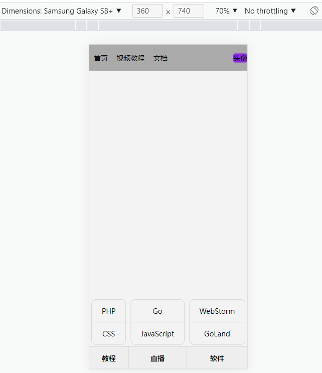
<!doctype html> <html lang="en"> <head> <meta charset="UTF-8"> <meta name="viewport" content="width=device-width, user-scalable=no, initial-scale=1.0, maximum-scale=1.0, minimum-scale=1.0"> <meta http-equiv="X-UA-Compatible" content="ie=edge"> <title>FLEX 弹性盒模型</title> <style> /**********************对弹性容器进行规则设置整体控制子弹性元素**************************************/ /*弹性盒子里面会放弹性元素,我们为弹性盒子定义的规则会影响里面的弹性元素*/ /*flex-flow: row wrap; 水平方向的轴是主轴,换行后垂直方向的轴是水平交叉轴*/ /*flex-flow: column wrap; 垂直方向的轴是主轴,换行后水平方向的轴是垂直交叉轴*/ /*主轴*/ /*水平主轴(row),垂直主轴(column)*/ /*justify-content用于控制元素在主轴上的排列方式*/ /*flex-start 元素紧靠主轴起点*/ /*flex-end 元素紧靠主轴终点*/ /*center 元素从弹性容器中心开始*/ /*space-between 第一个元素靠起点,最后一个元素靠终点,余下元素平均分配空间*/ /*space-around 每个元素两侧的间隔相等。所以,元素之间的间隔比元素与容器的边距的间隔大一倍*/ /*space-evenly 元素间距离平均分配*/ /*交叉轴*/ /*水平交叉轴(row),垂直交叉轴(column)*/ /*align-items用于控制容器元素在交叉轴上的排列方式,适用于单行显示的弹性容器*/ /*stretch 元素被拉伸以适应容器(默认值);水平交叉轴,元素不能设置高;垂直交叉轴,元素不能设置宽;*/ /*center 元素位于容器的中心*/ /*flex-start 元素位于容器的交叉轴开头*/ /*flex-end 元素位于容器的交叉轴结尾*/ /*align-content只适用于多行显示的弹性容器,用于控制行(而不是元素)在交叉轴上的排列方式*/ /*stretch 多行元素被拉伸以适应容器(默认值);水平交叉轴,元素不能设置高;垂直交叉轴,元素不能设置宽;*/ /*flex-start 多行元素紧靠交叉轴起点*/ /*flex-end 多行元素紧靠交叉轴终点*/ /*center 多行元素从弹性容器中心开始*/ /*space-between 第一行元素靠起点,最后一行元素靠终点,余下行元素平均分配空间*/ /*space-around 每个行元素两侧的间隔相等。所以,行元素之间的间隔比行元素与容器的边距的间隔大一倍*/ /*space-evenly 多行元素间距离平均分配*/ /*弹性盒模型内的弹性元素挤在一起,通过box-sizing: border-box;固定弹性元素盒子的大小,再通过padding将弹性元素之 间分隔。*/ html { padding: 0; margin: 0; } /*1.声明弹性盒子的几种方式*/ /*块级盒子,定义宽、子元素自动撑开高*/ /*article {*/ /* display: flex;*/ /* background-color: black;*/ /* width: 50%;*/ /*}*/ /*行级块盒子,定义高,子元素自动撑开宽*/ /*article {*/ /* display: inline-flex;*/ /* background-color: black;*/ /* height: 400px;*/ /*}*/ /*2.改变弹性元素方向*/ /*body {*/ /* padding-left: 100px;*/ /* padding-top: 100px;*/ /*}*/ /*article {*/ /* border: 5px solid blueviolet;*/ /* width: 500px;*/ /* display: flex;*/ /* !*改变弹性元素的方向为行排列(默认)*!*/ /* !*flex-direction: row;*!*/ /* !*flex-direction: row-reverse;*!*/ /* !*改变弹性元素的方向为竖排列*!*/ /* !*flex-direction: column;*!*/ /* flex-direction: column-reverse;*/ /*}*/ /*article div {*/ /* width: 100px;*/ /* height: 100px;*/ /* background-color: red;*/ /* margin: 10px;*/ /* font-size: 20px;*/ /*}*/ /*3. 控制弹性元素溢出换行处理*/ /*body {*/ /* padding-left: 100px;*/ /* padding-top: 100px;*/ /*}*/ /*article {*/ /* border: 5px solid silver;*/ /* !*改变弹性盒子宽度为200px小于所有弹性元素宽度300px,导致弹性盒子装不下弹性元素,*/ /* 默认收缩弹性元素*!*/ /* width: 200px;*/ /* !*弹性盒子装不下弹性元素时弹性元素换行*!*/ /* !*flex-wrap: wrap;*!*/ /* flex-wrap: wrap-reverse;*/ /* display: flex;*/ /* flex-direction: row;*/ /* !*flex-direction: row; flex-wrap: wrap; <=> flex-flow: row wrap*!*/ /*}*/ /*article div {*/ /* !*每个div盒子的大小控制在100px * 100px*!*/ /* width: 100px;*/ /* height: 100px;*/ /* background-color: blueviolet;*/ /* background-clip: content-box;*/ /* padding: 10px;*/ /* box-sizing: border-box;*/ /* font-size: 20px;*/ /* color: white;*/ /*}*/ /*4.主轴与交叉轴*/ /*body {*/ /* padding-left: 100px;*/ /* padding-top: 100px;*/ /*}*/ /*article {*/ /* border: 5px solid silver;*/ /* width: 200px;*/ /* display: flex;*/ /* !*水平方向的轴是主轴,换行后垂直方向的轴是水平交叉轴*!*/ /* flex-flow: row wrap;*/ /* !*垂直方向的轴是主轴,换行后水平方向的轴是垂直交叉轴*!*/ /* !*height: 200px;*!*/ /* !*flex-flow: column wrap;*!*/ /*}*/ /*article div {*/ /* width: 100px;*/ /* height: 100px;*/ /* background-color: blueviolet;*/ /* background-clip: content-box;*/ /* padding: 10px;*/ /* box-sizing: border-box;*/ /* font-size: 20px;*/ /* color: white;*/ /*}*/ /*5.主轴元素的多种排列方式*/ /*这里以水平主轴为例,垂直主轴同理*/ /*body {*/ /* padding-left: 100px;*/ /* padding-top: 100px;*/ /*}*/ /*article {*/ /* border: 5px solid silver;*/ /* width: 500px;*/ /* display: flex;*/ /* flex-direction: row;*/ /* !*弹性元素对齐到水平主轴的开始*!*/ /* !*justify-content: flex-start;*!*/ /* !*弹性元素对齐到水平主轴的末尾*!*/ /* !*justify-content: flex-end;*!*/ /* !*注意: 设置flex-direction: row-reverse;时水平主轴的开始和结尾反转*!*/ /* !*弹性元素在水平主轴上居中*!*/ /* !*justify-content: center;*!*/ /* !*弹性元素在水平主轴上平均分配*!*/ /* justify-content: space-evenly;*/ /*}*/ /*article div {*/ /* width: 100px;*/ /* height: 100px;*/ /* background-color: blueviolet;*/ /* background-clip: content-box;*/ /* padding: 10px;*/ /* box-sizing: border-box;*/ /* font-size: 20px;*/ /* color: white;*/ /*}*/ /*6.交叉轴元素的多种排列方式*/ /*这里以水平交叉轴为例、垂直交叉轴同理*/ /*body {*/ /* padding-left: 100px;*/ /* padding-top: 100px;*/ /*}*/ /*article {*/ /* border: 5px solid silver;*/ /* width: 400px;*/ /* height: 400px;*/ /* display: flex;*/ /* flex-direction: row;*/ /* flex-wrap: wrap;*/ /* !*弹性元素对齐到水平交叉轴的开始*!*/ /* !*align-items: flex-start;*!*/ /* !*弹性元素对齐到水平交叉轴的末尾*!*/ /* !*align-items: flex-end;*!*/ /* !*注意: 设置flex-wrap: wrap-reverse;时水平交叉轴的开始和结尾反转*!*/ /* !*弹性元素对齐到水平交叉轴的中心*!*/ /* !*align-items: center;*!*/ /* !*弹性元素在水平交叉轴上拉伸*!*/ /* !*align-items: stretch;*!*/ /* !*弹性元素在水平主轴和水平交叉轴上居中*!*/ /* align-items: center;*/ /* justify-content: center;*/ /*}*/ /*article div {*/ /* width: 100px;*/ /* !*弹性元素在水平交叉轴上拉伸时需要注释掉此行,因为该元素的权重较高*!*/ /* height: 100px;*/ /* background-color: blueviolet;*/ /* background-clip: content-box;*/ /* padding: 10px;*/ /* box-sizing: border-box;*/ /* font-size: 20px;*/ /* color: white;*/ /*}*/ /*7.多行元素在交叉轴的排列方式*/ /*这里以水平交叉轴为例、垂直交叉轴同理*/ /*body {*/ /* padding-left: 100px;*/ /* padding-top: 100px;*/ /*}*/ /*article {*/ /* border: 5px solid silver;*/ /* width: 200px;*/ /* height: 400px;*/ /* display: flex;*/ /* flex-direction: row;*/ /* flex-wrap: wrap;*/ /* !*多行元素在水平交叉轴的开始处*!*/ /* !*align-content: flex-start;*!*/ /* !*多行元素在水平交叉轴的结尾处*!*/ /* !*align-content: flex-end;*!*/ /* !*多行元素在水平交叉轴的中心*!*/ /* align-content: center;*/ /* !*多行元素间距离平均分配*!*/ /* !*align-content: space-evenly;*!*/ /*}*/ /*article div {*/ /* width: 100px;*/ /* height: 100px;*/ /* background-color: blueviolet;*/ /* background-clip: content-box;*/ /* padding: 10px;*/ /* box-sizing: border-box;*/ /* font-size: 20px;*/ /* color: white;*/ /*}*/ /*8.弹性布局操作文本节点*/ /*这里以水平主轴为例,垂直主轴同理*/ /*文本节点也在弹性布局操作范围内。*/ /*body {*/ /* padding-left: 100px;*/ /* padding-top: 100px;*/ /*}*/ /*article {*/ /* border: 5px solid silver;*/ /* width: 500px;*/ /* height: 500px;*/ /* display: flex;*/ /* flex-direction: row;*/ /* align-items: center;*/ /* justify-content: space-between;*/ /*}*/ /**********************对弹性容器内的弹性元素单独设置规则**************************************/ /*1.弹性元素交叉轴控制*/ /*这里以水平交叉轴为例、垂直交叉轴同理*/ /*body {*/ /* padding-left: 100px;*/ /* padding-top: 100px;*/ /*}*/ /*article {*/ /* border: 5px solid silver;*/ /* width: 400px;*/ /* height: 400px;*/ /* display: flex;*/ /* flex-direction: row;*/ /* flex-wrap: wrap;*/ /* align-items: flex-end;*/ /*}*/ /*!*控制单个元素*!*/ /*article div:nth-of-type(1) {*/ /* !*第一个弹性元素对齐到水平交叉轴的开始处*!*/ /* !*align-self: flex-start;*!*/ /* !*第一个弹性元素对齐到水平交叉轴的结尾处*!*/ /* !*align-self: flex-end;*!*/ /* !*第一个弹性元素对齐到水平交叉轴的中间*!*/ /* !*align-self: center;*!*/ /* !*第一个弹性元素在水平交叉轴上拉伸,由于拉伸不能设置高度,所以将弹性元素的高度设置为auto*!*/ /* align-self: stretch;*/ /* height: auto;*/ /*}*/ /*article div {*/ /* width: 100px;*/ /* height: 100px;*/ /* background-color: blueviolet;*/ /* background-clip: content-box;*/ /* padding: 10px;*/ /* box-sizing: border-box;*/ /* font-size: 20px;*/ /* color: white;*/ /*}*/ /*2.主轴元素可用空间分配*/ /*这里以水平主轴为例,垂直主轴同理*/ /*body {*/ /* padding-left: 100px;*/ /* padding-top: 100px;*/ /*}*/ /*article {*/ /* border: 5px solid silver;*/ /* width: 500px;*/ /* display: flex;*/ /* flex-direction: row;*/ /* justify-content: flex-start;*/ /*}*/ /*article div:nth-of-type(1){*/ /* !*第一个弹性元素不占可用空间平均等份,弹性元素大小保持不变*!*/ /* flex-grow: 0;*/ /*}*/ /*article div:nth-of-type(2){*/ /* !*第二个弹性元素占可用空间平均1等份*!*/ /* flex-grow: 1;*/ /*}*/ /*article div:nth-of-type(3){*/ /* !*第三个弹性元素占可用空间平均2等份*!*/ /* flex-grow: 2;*/ /*}*/ /*article div {*/ /* !*每一个弹性元素占可用空间平均1等份*!*/ /* !*flex-grow: 1;*!*/ /* width: 100px;*/ /* height: 100px;*/ /* background-color: blueviolet;*/ /* background-clip: content-box;*/ /* padding: 10px;*/ /* box-sizing: border-box;*/ /* font-size: 20px;*/ /* color: white;*/ /*}*/ /*3.布局小米移动端页面结构*/ /*body {*/ /* height: 100vh;*/ /* display: flex;*/ /* flex-direction: column;*/ /* justify-content: space-between;*/ /*}*/ /*header {*/ /* height: 60px;*/ /* background-color: blueviolet;*/ /*}*/ /*main {*/ /* flex-grow: 1;*/ /* background-color: #ccc;*/ /*}*/ /*footer {*/ /* height: 60px;*/ /* background-color: #383881;*/ /*}*/ /*4.主轴元素动态缩小的处理技巧*/ /*这里以水平主轴为例,垂直主轴同理*/ /*body {*/ /* padding-left: 100px;*/ /* padding-top: 100px;*/ /*}*/ /*article {*/ /* border: 5px solid silver;*/ /* !*弹性盒子空间不足且不设置换行时里面的弹性元素默认会缩小*!*/ /* width: 200px;*/ /* display: flex;*/ /* flex-direction: row;*/ /* justify-content: flex-start;*/ /*}*/ /*article div:nth-of-type(1) {*/ /* !*第1个弹性元素比例不缩小*!*/ /* flex-shrink: 0;*/ /*}*/ /*article div:nth-of-type(2) {*/ /* !*第2个弹性元素比例缩小一倍*!*/ /* flex-shrink: 1;*/ /*}*/ /*article div:nth-of-type(3) {*/ /* !*第3个弹性元素比例缩小2倍*!*/ /* flex-shrink: 2;*/ /*}*/ /*article div {*/ /* !*弹性盒子里的所有弹性元素都不缩小,弹性元素溢出弹性盒子*!*/ /* !*flex-shrink: 0;*!*/ /* width: 100px;*/ /* height: 100px;*/ /* background-color: blueviolet;*/ /* background-clip: content-box;*/ /* padding: 10px;*/ /* box-sizing: border-box;*/ /* font-size: 20px;*/ /* color: white;*/ /*}*/ /*5.主轴的基准尺寸的定义*/ /*这里以水平主轴为例,垂直主轴同理*/ /*body {*/ /* padding-left: 100px;*/ /* padding-top: 100px;*/ /*}*/ /*article {*/ /* border: 5px solid silver;*/ /* width: 500px;*/ /* display: flex;*/ /* flex-direction: row;*/ /* justify-content: flex-start;*/ /*}*/ /*article div {*/ /* !*主轴基准尺寸的优先级大于弹性元素的宽度(row)或高度(column)*!*/ /* flex-basis: 100px;*/ /* !*width: 100px;*!*/ /* flex-grow: 1;*/ /* height: 100px;*/ /* background-color: blueviolet;*/ /* background-clip: content-box;*/ /* padding: 10px;*/ /* box-sizing: border-box;*/ /* font-size: 20px;*/ /* color: white;*/ /*}*/ /*补充: 组合属性 flex-grow: 1; 主轴弹性元素放大比例,用于将弹性盒子的可用空间,分配给弹性元素。 flex-shrink: 2; 主轴弹性元素缩小比例,与 flex-grow 相反 flex-shrink 是在弹性盒子装不下元素时定义的缩小值。 flex-basis: 100px; 主轴基准尺寸,flex-basis 属性定义了在分配多余空间之前,项目占据的主轴空间(main size)。 上面3行可以设置为: flex: 1 2 100px; */ /*6.主轴控制弹性元素的排序*/ /*这里以水平主轴为例,垂直主轴同理*/ /*body {*/ /* padding-left: 100px;*/ /* padding-top: 100px;*/ /*}*/ /*article {*/ /* border: 5px solid silver;*/ /* width: 500px;*/ /* display: flex;*/ /* flex-direction: row;*/ /* justify-content: flex-start;*/ /*}*/ /*!*order用于控制弹性元素的位置,默认为 order:0 数值越小越在前面,可以负数或整数。*!*/ /*article div:nth-of-type(1) {*/ /* order: 3*/ /*}*/ /*article div:nth-of-type(2) {*/ /* order: 2*/ /*}*/ /*article div:nth-of-type(3) {*/ /* order: 1*/ /*}*/ /*article div {*/ /* width: 100px;*/ /* height: 100px;*/ /* background-color: blueviolet;*/ /* background-clip: content-box;*/ /* padding: 10px;*/ /* box-sizing: border-box;*/ /* font-size: 20px;*/ /* color: white;*/ /*}*/ /*7.定位元素在弹性布局中的表现*/ /*绝对定位的弹性元素不参与弹性布局,相对定位可以*/ /*这里以水平主轴为例,垂直主轴同理*/ /*body {*/ /* padding-left: 100px;*/ /* padding-top: 100px;*/ /*}*/ /*article {*/ /* border: 5px solid silver;*/ /* width: 500px;*/ /* display: flex;*/ /* flex-direction: row;*/ /* justify-content: flex-start;*/ /* !*父级设置相对定位*!*/ /* position: relative;*/ /*}*/ /*article div:nth-of-type(1) {*/ /* !*第1个弹性元素设置绝对定位,丢失空间位,第2个弹性元素占据第一个弹性元素的位置*!*/ /* !*background-color: blue;*!*/ /* !*position: absolute;*!*/ /* !*第1个弹性元素设置相对定位,不丢失空间位,对后面的弹性元素不产生影响*!*/ /* background-color: blue;*/ /* position: relative;*/ /* left: 400px;*/ /* top: 120px;*/ /*}*/ /*article div {*/ /* width: 100px;*/ /* height: 100px;*/ /* background-color: blueviolet;*/ /* background-clip: content-box;*/ /* padding: 10px;*/ /* box-sizing: border-box;*/ /* font-size: 20px;*/ /* color: white;*/ /*}*/ /**********************flex弹性盒模型使用案例**************************************/ /*弹性盒模型内的任何弹性元素都可以使用弹性来布局*/ /*1.弹性布局移动端通用菜单、多级菜单的弹性布局*/ * { padding: 0; margin: 0; } body { height: 100vh; display: flex; flex-direction: column; } main { flex-grow: 1; background-color: #f3f3f3; } footer { height: 50px; background-color: #eee; display: flex; flex-direction: row; justify-content: space-between; border-top: solid 1px #ccc; border-bottom: solid 1px #ccc; } footer section { flex-grow: 1; border-right: 1px solid #ccc; display: flex; flex-direction: column-reverse; } footer section:last-child { border-right: none; } footer section h4 { /*border: solid 1px red;*/ flex: 1 0 50px; display: flex; flex-direction: column; justify-content: center; text-align: center; cursor: pointer; } footer section ul { display: flex; flex-direction: column; border: solid 1px #ccc; text-align: center; /*margin-bottom: 5px;*/ border-radius: 10px; margin: 5px; } footer section ul li { flex: 1 0 50px; display: flex; flex-direction: column; justify-content: center; border-bottom: solid 1px #ccc; cursor: pointer; } footer section ul li:last-child { border-bottom: none; } /*footer section ul {*/ /* display: none;*/ /*}*/ /*footer section:hover ul {*/ /* display: block;*/ /*}*/ nav { height: 60px; background-color: #aaa; box-shadow: 0 0 5px rgba(0, 0, 0, 0.5); /*margin: 0 auto;*/ display: flex; flex-direction: row; } nav ul { list-style: none; display: flex; flex-direction: row; align-items: center; } nav ul:nth-of-type(1) { display: flex; flex-direction: row; margin-right: auto; } nav ul:nth-of-type(1)>li { margin: 0 10px; } nav ul:nth-of-type(2)>li { background-color: blueviolet; border-radius: 5px; } </style> </head> <body> <!----------------------------对弹性容器进行规则设置整体控制子弹性元素--------------------------------------> <!--1.声明弹性盒子的几种方式--> <!--<article>--> <!-- <div>html</div>--> <!-- <div>css</div>--> <!-- <div>go</div>--> <!--</article>--> <!--2.改变弹性元素方向--> <!--<article>--> <!-- <div>1</div>--> <!-- <div>2</div>--> <!-- <div>3</div>--> <!--</article>--> <!--3. 控制弹性元素溢出换行处理--> <!--<article>--> <!-- <div>1</div>--> <!-- <div>2</div>--> <!-- <div>3</div>--> <!--</article>--> <!--4.主轴与交叉轴--> <!--<article>--> <!-- <div>1</div>--> <!-- <div>2</div>--> <!-- <div>3</div>--> <!--</article>--> <!--5.主轴元素的多种排列方式--> <!--<article>--> <!-- <div>1</div>--> <!-- <div>2</div>--> <!-- <div>3</div>--> <!--</article>--> <!--6.交叉轴元素的多种排列方式--> <!--<article>--> <!-- <div>1</div>--> <!-- <div>2</div>--> <!-- <div>3</div>--> <!--</article>--> <!--7.多行元素在交叉轴的排列方式--> <!--<article>--> <!-- <div>1</div>--> <!-- <div>2</div>--> <!-- <div>3</div>--> <!-- <div>4</div>--> <!-- <div>5</div>--> <!--</article>--> <!--8.弹性布局操作文本节点--> <!--<article>--> <!-- go语言--> <!-- <span>html超文本标记语言</span>--> <!-- css层叠样式表--> <!--</article>--> <!----------------------------对弹性容器内的弹性元素单独设置规则--------------------------------------> <!--1.弹性元素交叉轴控制--> <!--<article>--> <!-- <div>1</div>--> <!-- <div>2</div>--> <!-- <div>3</div>--> <!--</article>--> <!--2.主轴元素可用空间分配--> <!--<article>--> <!-- <div>1</div>--> <!-- <div>2</div>--> <!-- <div>3</div>--> <!--</article>--> <!--3.布局小米移动端页面结构--> <!--<header></header>--> <!--<main></main>--> <!--<footer></footer>--> <!--4.主轴元素动态缩小的处理技巧--> <!--<article>--> <!-- <div>1</div>--> <!-- <div>2</div>--> <!-- <div>3</div>--> <!--</article>--> <!--5.主轴的基准尺寸的定义--> <!--<article>--> <!-- <div>1</div>--> <!-- <div>2</div>--> <!-- <div>3</div>--> <!--</article>--> <!--6.主轴控制弹性元素的排序--> <!--<article>--> <!-- <div>1</div>--> <!-- <div>2</div>--> <!-- <div>3</div>--> <!--</article>--> <!--7.定位元素在弹性布局中的表现--> <!--<article>--> <!-- <div>1</div>--> <!-- <div>2</div>--> <!-- <div>3</div>--> <!--</article>--> <!-----------------------------flex弹性盒模型使用案例-------------------------------------> <!--1.弹性布局移动端通用菜单、多级菜单的弹性布局--> <nav> <ul> <li>首页</li> <li>视频教程</li> <li>文档</li> </ul> <ul> <li>头像</li> </ul> </nav> <main></main> <footer> <section> <h4>教程</h4> <ul> <li>PHP</li> <li>CSS</li> </ul> </section> <section> <h4>直播</h4> <ul> <li>Go</li> <li>JavaScript</li> </ul> </section> <section> <h4>软件</h4> <ul> <li>WebStorm</li> <li>GoLand</li> </ul> </section> </footer> </body> </html>
弹性布局移动端通用菜单、多级菜单的弹性布局
分类:
Css

.JPG)


【推荐】国内首个AI IDE,深度理解中文开发场景,立即下载体验Trae
【推荐】编程新体验,更懂你的AI,立即体验豆包MarsCode编程助手
【推荐】抖音旗下AI助手豆包,你的智能百科全书,全免费不限次数
【推荐】轻量又高性能的 SSH 工具 IShell:AI 加持,快人一步
· 无需6万激活码!GitHub神秘组织3小时极速复刻Manus,手把手教你使用OpenManus搭建本
· C#/.NET/.NET Core优秀项目和框架2025年2月简报
· 葡萄城 AI 搜索升级:DeepSeek 加持,客户体验更智能
· 什么是nginx的强缓存和协商缓存
· 一文读懂知识蒸馏