
python 中条形图绘制
一、条形图绘制参数详解
1、bar(left, height, width=0.8, bottom=None, color=None, edgecolor=None, linewidth=None, tick_label=None, xerr=None, yerr=None, label = None, ecolor=None, align, log=False, **kwargs)
- x:传递数值序列,指定条形图中x轴上的刻度值
- height:传递数值序列,指定条形图y轴上的高度
- width:指定条形图的宽度,默认为0.8
- bottom:用于绘制堆叠条形图
- color:指定条形图的填充色
- edgecolor:指定条形图的边框色
- linewidth:指定条形图边框的宽度,如果指定为0,表示不绘制边框
- tick_label:指定条形图的刻度标签
- xerr:如果参数不为None,表示在条形图的基础上添加误差棒
- yerr:参数含义同xerr
- label:指定条形图的标签,一般用以添加图例
- ecolor:指定条形图误差棒的颜色align:指定x轴刻度标签的对齐方式,默认为center,表示刻度标签居中对齐,如果设置为edge,则表示在每个条形的左下角呈现刻度标签
- log:bool类型参数,是否对坐标轴进行log变换,默认为False
- **kwargs:关键字参数,用于对条形图进行其他设置,如透明度等
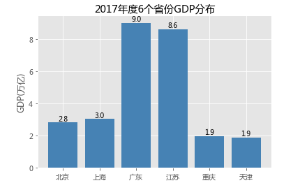
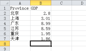
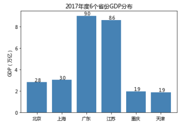
 1 # 条形图的绘制--垂直条形图
 2 # 读入数据
 3 GDP = pd.read_excel('Province GDP 2017.xlsx')
 4 '''
 5 Province    GDP
 6 北京    2.8
 7 上海    3.01
 8 广东    8.99
 9 江苏    8.59
10 重庆    1.95
11 天津    1.86
12 '''
13 # 设置绘图风格(不妨使用R语言中的ggplot2风格)
14 plt.style.use('ggplot')
15 # 绘制条形图
16 plt.bar(x = range(GDP.shape[0]), # 指定条形图x轴的刻度值
17         height = GDP.GDP, # 指定条形图y轴的数值
18         tick_label = GDP.Province, # 指定条形图x轴的刻度标签
19         color = 'steelblue', # 指定条形图的填充色
20         width = 0.8
21        )
22 # 添加y轴的标签
23 plt.ylabel('GDP(万亿)')
24 # 添加条形图的标题
25 plt.title('2017年度6个省份GDP分布')
26 # 为每个条形图添加数值标签
27 for x,y in enumerate(GDP.GDP):
28     plt.text(x,y+0.1,'%s' %round(y,1),ha='center')
29 # 显示图形
30 plt.show()

②https://matplotlib.org/api/_as_gen/matplotlib.pyplot.barh.html
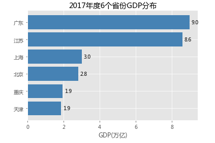
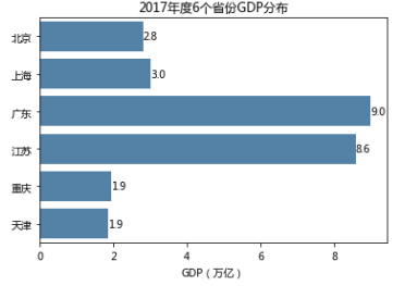
 1 # 条形图的绘制--水平条形图
 2 # 对读入的数据作升序排序
 3 GDP.sort_values(by = 'GDP', inplace = True)
 4 # 绘制条形图
 5 plt.barh(y = range(GDP.shape[0]), # 指定条形图y轴的刻度值
 6         width = GDP.GDP, # 指定条形图x轴的数值
 7         tick_label = GDP.Province, # 指定条形图y轴的刻度标签
 8         color = 'steelblue', # 指定条形图的填充色
 9        )
10 # 添加x轴的标签
11 plt.xlabel('GDP(万亿)')
12 # 添加条形图的标题
13 plt.title('2017年度6个省份GDP分布')
14 # 为每个条形图添加数值标签
15 for y,x in enumerate(GDP.GDP):
16     plt.text(x+0.1,y,'%s' %round(x,1),va='center')
17 # 显示图形
18 plt.show()
③绘制堆叠条形图
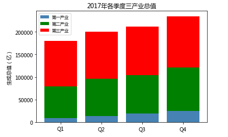
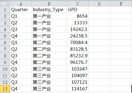
 1 import pandas as pd
 2 import matplotlib.pyplot as plt
 3 # 条形图的绘制--堆叠条形图
 4 # 读入数据
 5 Industry_GDP = pd.read_excel('Industry_GDP.xlsx')
 6 # 取出四个不同的季度标签,用作堆叠条形图x轴的刻度标签
 7 Quarters = Industry_GDP.Quarter.unique()
 8 # 取出第一产业的四季度值
 9 Industry1 = Industry_GDP.GPD[Industry_GDP.Industry_Type == '第一产业']
10 # 重新设置行索引
11 Industry1.index = range(len(Quarters))
12 # 取出第二产业的四季度值
13 Industry2 = Industry_GDP.GPD[Industry_GDP.Industry_Type == '第二产业']
14 # 重新设置行索引
15 Industry2.index = range(len(Quarters))
16 # 取出第三产业的四季度值
17 Industry3 = Industry_GDP.GPD[Industry_GDP.Industry_Type == '第三产业']
18
19 # 绘制堆叠条形图
20 # 中文乱码和坐标轴负号的处理
21 plt.rcParams['font.sans-serif'] = ['Microsoft YaHei']
22 plt.rcParams['axes.unicode_minus'] = False
23 # 各季度下第一产业的条形图
24 plt.bar(x = range(len(Quarters)), height=Industry1, color = 'steelblue', label = '第一产业', tick_label = Quarters)
25 # 各季度下第二产业的条形图
26 plt.bar(x = range(len(Quarters)), height=Industry2, bottom = Industry1, color = 'green', label = '第二产业')
27 # 各季度下第三产业的条形图
28 plt.bar(x = range(len(Quarters)), height=Industry3, bottom = Industry1  + Industry2, color = 'red', label = '第三产业')
29 # 添加y轴标签
30 plt.ylabel('生成总值(亿)')
31 # 添加图形标题
32 plt.title('2017年各季度三产业总值')
33 # 显示各产业的图例
34 plt.legend(loc =2,fontsize = 'small')
35 # 显示图形
36 plt.show()
④水平交错条形图
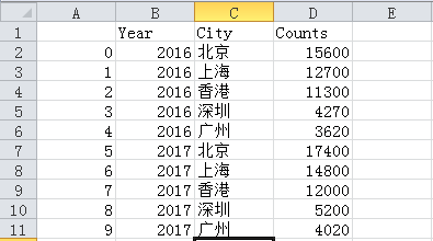
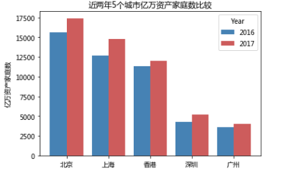
 1 # 条形图的绘制--水平交错条形图
 2 # 导入第三方模块
 3 import matplotlib.pyplot as plt
 4 import numpy as np
 5 import pandas as pd
 6 # 读入数据
 7 HuRun = pd.read_excel('HuRun.xlsx')
 8 # 取出城市名称
 9 Cities = HuRun.City.unique()
10 # 取出2016年各城市亿万资产家庭数
11 Counts2016 = HuRun.Counts[HuRun.Year == 2016]
12 # 取出2017年各城市亿万资产家庭数
13 Counts2017 = HuRun.Counts[HuRun.Year == 2017]
14
15 # 绘制水平交错条形图
16 bar_width = 0.4
17 plt.bar(x = np.arange(len(Cities)), height = Counts2016, label = '2016', color = 'steelblue', width = bar_width)
18 plt.bar(x = np.arange(len(Cities))+bar_width, height = Counts2017, label = '2017', color = 'indianred', width = bar_width)
19 # 添加刻度标签(向右偏移0.225)
20 plt.xticks(np.arange(5)+0.2, Cities)
21 # 添加y轴标签
22 plt.ylabel('亿万资产家庭数')
23 # 添加图形标题
24 plt.title('近两年5个城市亿万资产家庭数比较')
25 # 添加图例
26 plt.legend()
27 # 显示图形
28 plt.show()

二、
①
 1 # Pandas模块之垂直或水平条形图
 2 # 读入数据
 3 GDP = pd.read_excel('Province GDP 2017.xlsx')
 4 # 绘图(此时的数据集在前文已经按各省GDP做过升序处理)
 5 GDP.GDP.plot(kind = 'bar', width = 0.8, rot = 0, color = 'steelblue', title = '2017年度6个省份GDP分布')
 6 # 添加y轴标签
 7 plt.ylabel('GDP(万亿)')
 8 # 添加x轴刻度标签
 9 plt.xticks(range(len(GDP.Province)), #指定刻度标签的位置
10            GDP.Province # 指出具体的刻度标签值
11           )
12 # 为每个条形图添加数值标签
13 for x,y in enumerate(GDP.GDP):
14     plt.text(x-0.1,y+0.2,'%s' %round(y,1),va='center')
15 # 显示图形
16 plt.show()
②
 1 # Pandas模块之水平交错条形图
 2 HuRun = pd.read_excel('HuRun.xlsx')
 3 HuRun_reshape = HuRun.pivot_table(index = 'City', columns='Year', values='Counts').reset_index()
 4 # 对数据集降序排序
 5 HuRun_reshape.sort_values(by = 2016, ascending = False, inplace = True)
 6 HuRun_reshape.plot(x = 'City', y = [2016,2017], kind = 'bar', color = ['steelblue', 'indianred'],
 7                    rot = 0, # 用于旋转x轴刻度标签的角度,0表示水平显示刻度标签
 8                    width = 0.8, title = '近两年5个城市亿万资产家庭数比较')
 9 # 添加y轴标签
10 plt.ylabel('亿万资产家庭数')
11 plt.xlabel('')
12 plt.show()
③
 1 # seaborn模块之垂直或水平条形图
 2 # 导入第三方模块
 3 import seaborn as sns
 4
 5 # 读入数据
 6 GDP = pd.read_excel('Province GDP 2017.xlsx')
 7 sns.barplot(y = 'Province', # 指定条形图x轴的数据
 8             x = 'GDP', # 指定条形图y轴的数据
 9             data = GDP, # 指定需要绘图的数据集
10             color = 'steelblue', # 指定条形图的填充色
11             orient = 'horizontal' # 将条形图水平显示
12            )
13 # 重新设置x轴和y轴的标签
14 plt.xlabel('GDP(万亿)')
15 plt.ylabel('')
16 # 添加图形的标题
17 plt.title('2017年度6个省份GDP分布')
18 # 为每个条形图添加数值标签
19 for y,x in enumerate(GDP.GDP):
20     plt.text(x,y,'%s' %round(x,1),va='center')
21 # 显示图形
22 plt.show()
④
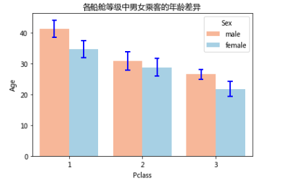
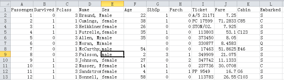
 1 # 读入数据
 2 Titanic = pd.read_csv('titanic_train.csv')
 3 # 绘制水平交错条形图
 4 sns.barplot(x = 'Pclass', # 指定x轴数据
 5             y = 'Age', # 指定y轴数据
 6             hue = 'Sex', # 指定分组数据
 7             data = Titanic, # 指定绘图数据集
 8             palette = 'RdBu', # 指定男女性别的不同颜色
 9             errcolor = 'blue', # 指定误差棒的颜色
10             errwidth=2, # 指定误差棒的线宽
11             saturation = 1, # 指定颜色的透明度,这里设置为无透明度
12             capsize = 0.05 # 指定误差棒两端线条的宽度
13            )
14 # 添加图形标题
15 plt.title('各船舱等级中男女乘客的年龄差异')
16 # 显示图形
17 plt.show()


 浙公网安备 33010602011771号