
animation—延迟和持续时间
animation: moveToRight .75s 6s linear infinite ;
animation: moveToRight -.75s 1.5s linear infinite;
当动画有两个参数时,
若是两个都是正整数,第一个是持续的时间,第二个是动画延迟时间;
若第一个是负数,则取该时间的绝对值视为延迟时间,第二个为持续时间。
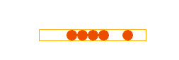
虽然延迟动画为负数时可以取其绝对值为延迟时间,但负数有它存在的用意。如下动画,一刷新就会有一轮明显的白圈,那是在动画没有开始时元素的正常状态,在设置延迟时间为负数时就不会出现这样效果。

transform-origin: 0 25px;/* 这个属性决定环绕园大小 */

以上结论来自于研究该案例:https://github.com/huruji/loading 所得,感谢大佬无私分享。


<!DOCTYPE html>
<html lang="en">
<head>
    <meta charset="UTF-8">
    <title>Title</title>
    <style>
        div {
            position: relative;
            padding: 80px;
            background-color: #ffaa00;
        }

        span {
            position: absolute;
            width: 50px;
            height: 50px;
            border-radius: 50%;
            background: transparent;
            border: 2px solid #fff;
        }

        /*  */
        span:nth-child(1) {
            animation: loader6 .8s cubic-bezier(0.21, 0.53, 0.56, 0.8) .24s infinite;
            /*animation: loader6 .8s cubic-bezier(0.21, 0.53, 0.56, 0.8) -.24s infinite;*/
        }
        span:nth-child(2) {
            animation: loader6 .8s cubic-bezier(0.21, 0.53, 0.56, 0.8) .12s infinite;
            /*animation: loader6 .8s cubic-bezier(0.21, 0.53, 0.56, 0.8) -.12s infinite;*/
        }
        span:nth-child(3) {
            animation: loader6 .8s cubic-bezier(0.21, 0.53, 0.56, 0.8) 0s infinite;
        }
        @keyframes loader6 {
            0% {-webkit-transform: scale(0.1);opacity: 0.1;}
            20% {-webkit-transform: scale(0.5);opacity: 1;}
            100% {-webkit-transform: scale(1);opacity: 0.5;}
        }
    </style>
</head>
<body>
    <div>
        <span></span>
        <span></span>
        <span></span>
    </div>
</body>
</html>
<!DOCTYPE html>
<html lang="en">
<head>
    <meta charset="UTF-8">
    <title>Title</title>
    <style>
        body {padding: 100px}
        .loader {
            width: 150px;
            font-size: 0;
            text-align: center;
            border: 1px solid #ffaa00;
        }
        span {
            display: inline-block;
            width: 15px;
            height: 15px;
            background-color: #EB4E01;
            border-radius: 50%;
        }

        span:first-child {
            animation: moveToLeft infinite 1.5s linear;
        }

        span:last-child {
            /*
            animation: moveToRight infinite .75s 6s linear;
            当动画有两个参数时,若是两个都是正整数,第一个是持续的时间,第二个是动画延迟时间;
            若第一个是负数,则取该时间的绝对值视为延迟时间,第二个为持续时间
            */
            /*
            也可:为什么是 .75s 呢,因为当动画在 50% 时其实可以看成一个来回结束,这个来回结束在总持续时间占一半。
            animation: moveToRight 1.5s .75s linear infinite;
            */
            animation: moveToRight -.75s linear 1.5s infinite;
        }

        @keyframes moveToLeft {
            0% {transform: translateX(0)}
            25% {transform: translateX(-30px)}
            50% {transform: translateX(0)}
            100% {transform: translateX(0)}
        }
        @keyframes moveToRight {
            0% {transform: translateX(0)}
            25% {transform: translateX(30px)}
            50% {transform: translateX(0)}
            100% {transform: translateX(0)}
        }
    </style>
</head>
<body>
<div class="loader">
    <span></span>
    <span></span>
    <span></span>
    <span></span>
    <span></span>
</div>
</body>
</html>
