css自定义省略实例2
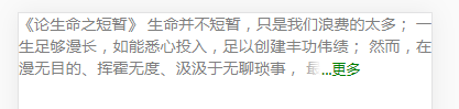
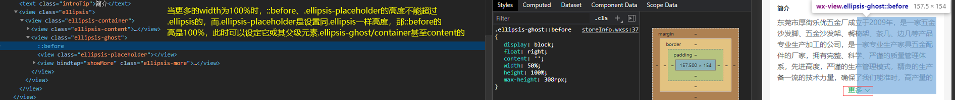
<!DOCTYPE html>
<html lang="en">
<head>
    <meta charset="UTF-8">
    <meta name="viewport" content="width=device-width, initial-scale=1, minimum-scale=1, maximum-scale=1"/>
    <title>自适应</title>
    <style>
        * {padding: 0; margin: 0; box-sizing: border-box; -webkit-tap-highlight-color: transparent;}
        html,body {
            width: 100%;
            min-width: 320px;
            max-width: 540px;
            margin: 0 auto;
        }
        html {font-size: 13.333333333333333vw}
        @media screen and (max-width: 320px) {
            html {font-size: 50px}
        }
        @media screen and (min-width: 540px) {
            html {font-size: 70px}
        }

        .forHidden {
            overflow: hidden;
            width: 100%;
            max-height: 1.2rem;
            line-height: .4rem;
        }

        .forAutoHeight {
            position: relative;
        }

        .content {
            width: 100%;
            color: #7f7f7f;
            font-size: .28rem;
            text-align: justify;
        }

        .forGhost {
            position: absolute;
            z-index: 1;
            top: 0;
            left: 50%;
            width: 100%;
            height: 100%;
        }

        .forGhost:before {
            display: block;
            float: right;
            content: '';
            width: 50%;
            height: 100%;
        }
        .placeholder {
            float: right;
            width: 50%;
            /*这里的height为什么不是1.2rem,因为在自适应情况下,可能会有部分误差,所以这个值要大于最外层元素的max-height*/
            height: 1.3rem;
        }
        .ellipsisMore {
            display: block;
            float: right;
            width: 2.4rem;
            height: .4rem;
            padding-left: .4rem;
            margin-top: -.48rem;   /*第一个浮动元素的高度刚好是可见高度,超出被裁剪,所以当更多按钮位于第二个浮动元素后面时,需要往上移,和最后一个段落平齐*/
            line-height: .4rem;
            color: green;
            text-decoration: none;
            font-size: .26rem;
            /*一个文字被遮住部分会有些突兀,可设置遮罩背景部分透明以表达过渡效果*/
            background:linear-gradient(90deg, transparent 2%, #fff 16%, #FFF 0);
        }

        /*利用:target伪元素实现加载更多效果(不足是如果页面有滚动,定位会将段落定位到页面顶端*/
        .forHidden:target { max-height: none; }
        .forHidden:target .ellipsisMore { display: none; }
    </style>
</head>
<body>
     <div id="forHidden" class="forHidden">
         <div class="forAutoHeight">
             <div class="content">
                 《论生命之短暂》
                 生命并不短暂,只是我们浪费的太多;
                 一生足够漫长,如能悉心投入,足以创建丰功伟绩;
                 然而,在漫无目的、挥霍无度、汲汲于无聊琐事,
                 最终陷入万劫不复的终极之时,我们才会幡然大悟。
             </div>
             <div class="forGhost">
                 <div class="placeholder"></div>
                 <a href="#forHidden" class="ellipsisMore" target="_self">...更多</a>
             </div>
         </div>
     </div>
</body>
</html>