viewport布局
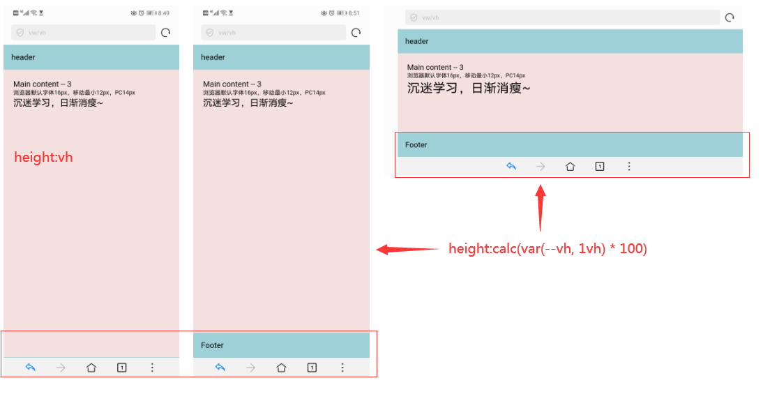
1、viewport实例
<!DOCTYPE html>

<html xmlns="http://www.w3.org/1999/xhtml">
<head>
    <meta name="viewport" content="width=device-width, initial-scale=1.0, maximum-scale=1.0, user-scalable=0" />
    <title>vw/vh</title>
    <style>
        * {
            box-sizing: border-box;
            margin: 0;padding: 0;
        }

        body {
            display: flex;
            flex-direction: column;
            justify-content: center;
            height: 100vh;  /* 回退设置,如果浏览器不支持calc()和var(); */
            height: calc(var(--vh, 1vh) * 100); /* 如果浏览器器不支持var(--vh)写法,则可以看成calc(1vh * 100);如果支持,则是calc(var(--vh) * 100); */
        }

        header, main, footer {
            padding: 1rem;
        }

        header, footer {background: #9ed0d7}

        main {
            overflow-y: scroll;
            -webkit-flex-grow: 1;
            flex-grow:1;
            padding: 20px;
            background: #f5e0e0;
        }

        div {
            height: 1000px;
            font-size: inherit;
        }

        div p:nth-child(1) {

        }
        div p:nth-child(2) {
            font-size: 12px;
        }
        div p:nth-child(3) {
            /*font-size: 12px + 2vw;*/
            font-size: calc(12px + 2vw); /* 375px下,字体大小为19.5px */
        }

    </style>
</head>
<body>
    <header>header</header>
    <main>
        <div>
            <p>Main content -- 3</p>
            <p>浏览器默认字体16px,移动最小12px,PC14px</p>
            <p>沉迷学习,日渐消瘦~</p>
        </div>
    </main>
    <footer>Footer</footer>
   <script>
       window.onload = function () {
           // 得到视口高度,乘以1%得到一个vh单位的值(不支持以1%代替0.01),这里只是一个单位vh的占比。
           var vh = window.innerHeight * 0.01;

           // 将‘--vh’设置为文档根元素的一个属性,值为(innerHeight / 100)px
           //vw:只是占页面宽度的百分比值,比如,375px的宽度,1vw就是3.75px
           document.documentElement.style.setProperty('--vh', vh + 'px');
       }
   </script>
</body>
</html>