浮动布局
一、理解
当元素添加了浮动后,元素就会脱离文档流,按照指定方向发生移动,遇到父级边界或者相邻的浮动元素就会停下来,同时会影响后面的元素的排版
脱离文档流: 元素相当于漂浮起来,不会占据页面中的空间
文档流:文档中可显示对象在排列时所占用的空间
二、如何浮动
给需要浮动的元素添加 float 属性
| 属性 | 值 |
|---|---|
| float | ① 默认值是none,元素不会产生浮动 ② left 元素左浮动 ③ right 元素右浮动 ④ inherit 继承父元素的值 |
三、浮动特性
1、元素添加浮动后,脱离文档流
同时会影响后面的元素,但不影响前面的元素
正常情况下:
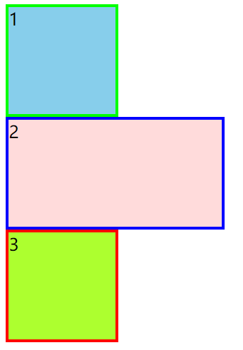
当只给第二个盒子添加浮动,发现只影响了后面的元素
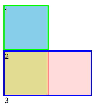
点击查看代码
<!DOCTYPE html>
<html lang="en">

<head>
    <meta charset="UTF-8">
    <meta http-equiv="X-UA-Compatible" content="IE=edge">
    <meta name="viewport" content="width=device-width, initial-scale=1.0">
    <title>浮动的特性</title>
    <style>
        .box {
            width: 300px;
            height: 200px;
        }

        .box1 {
            width: 100px;
            height: 100px;
            border: 3px solid rgb(0, 255, 0);
            background-color: skyblue;
        }

        .box2 {
            width: 200px;
            height: 100px;
            border: 3px solid blue;
            background-color: rgba(255, 200, 200, 0.648);
            float: left;
        }

        .box .box3 {
            width: 100px;
            height: 100px;
            border: 3px solid rgb(255, 0, 0);
            background-color: greenyellow;
        }
    </style>
</head>

<body>
    <div class="box">
        <div class="box1">1</div>
        <div class="box2">2</div>
        <div class="box3">3</div>
    </div>
</body>

</html>
2、父元素的宽度不够会换行显示
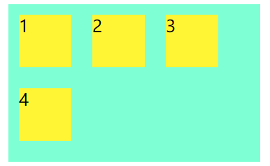
点击查看代码
<!DOCTYPE html>
<html lang="en">

<head>
    <meta charset="UTF-8">
    <meta http-equiv="X-UA-Compatible" content="IE=edge">
    <meta name="viewport" content="width=device-width, initial-scale=1.0">
    <title>Document</title>
    <style>
        .box {
            width: 240px;
            height: 150px;
            background-color: aquamarine;
        }

        .box .main {
            width: 50px;
            height: 50px;
            background-color: rgb(255, 245, 52);
            float: left;
            margin: 10px;
        }
    </style>
</head>

<body>
    <div class="box">
        <div class="main">1</div>
        <div class="main">2</div>
        <div class="main">3</div>
        <div class="main">4</div>
    </div>
</body>

</html>
3、浮动的顺序贴靠特性
子元素会按顺序进行贴靠,如果没有足够空间,会寻找兄弟元素
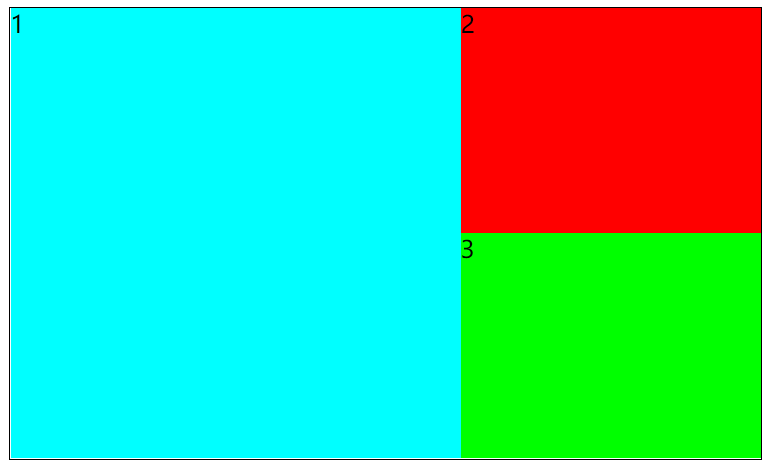
点击查看代码
<!DOCTYPE html>
<html lang="en">

<head>
    <meta charset="UTF-8">
    <meta http-equiv="X-UA-Compatible" content="IE=edge">
    <meta name="viewport" content="width=device-width, initial-scale=1.0">
    <title>Document</title>
    <style>
        .box {
            width: 500px;
            height: 300px;
            border: 1px solid #000;
        }

        .box .main1 {
            width: 300px;
            height: 300px;
            background-color: rgb(0, 255, 255);
            float: left;
        }

        .box .main2 {
            width: 200px;
            height: 150px;
            background-color: rgb(255, 0, 0);
            float: left;
        }

        .box .main3 {
            width: 200px;
            height: 150px;
            background-color: rgb(0, 255, 0);
            float: left;
        }
    </style>
</head>

<body>
    <div class="box">
        <div class="main1">1</div>
        <div class="main2">2</div>
        <div class="main3">3</div>
    </div>
</body>

</html>
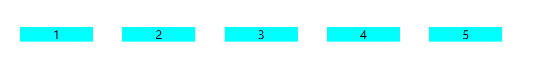
4、元素浮动后,具有行内块级元素特性
1、浮动的元素不再区分块级元素和行内元素,已经脱离了标准文档流
2、span a 标签等也可以设置宽高
点击查看代码
<!DOCTYPE html>
<html lang="en">

<head>
    <meta charset="UTF-8">
    <meta http-equiv="X-UA-Compatible" content="IE=edge">
    <meta name="viewport" content="width=device-width, initial-scale=1.0">
    <title>Document</title>
    <style>
        span {
            margin: 20px;
            width: 100px;
            height: 20px;
            background-color: rgb(0, 255, 255);
            text-align: center;
            float: left;
        }
    </style>
</head>

<body>
    <span>1</span>
    <span>2</span>
    <span>3</span>
    <span>4</span>
    <span>5</span>
</body>

</html>
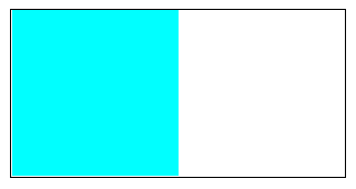
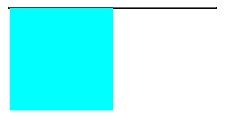
5、浮动的元素会使父元素的高度塌陷
给子元素添加浮动后,子元素不会占据页面空间,会给父级元素在没有设置高度的时侯,造成高度塌陷
没有浮动前
添加浮动后
点击查看代码
<!DOCTYPE html>
<html lang="en">

<head>
    <meta charset="UTF-8">
    <meta http-equiv="X-UA-Compatible" content="IE=edge">
    <meta name="viewport" content="width=device-width, initial-scale=1.0">
    <title>Document</title>
    <style>
        .box {
            width: 200px;
            border: 1px solid #000;
        }

        .main {
            width: 100px;
            height: 100px;
            background-color: rgb(0, 255, 255);
            float: left;
        }
    </style>
</head>

<body>
    <div class="box">
        <div class="main"></div>
    </div>
</body>

</html>
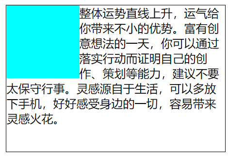
6、浮动对文字产生环绕
点击查看代码
<!DOCTYPE html>
<html lang="en">

<head>
    <meta charset="UTF-8">
    <meta http-equiv="X-UA-Compatible" content="IE=edge">
    <meta name="viewport" content="width=device-width, initial-scale=1.0">
    <title>Document</title>
    <style>
        .box {
            width: 300px;
            height: 200px;
            border: 1px solid #000;
        }

        .main {
            width: 100px;
            height: 100px;
            background-color: rgb(0, 255, 255);
            float: left;
        }
    </style>
</head>

<body>
    <div class="box">
        <div class="main"></div>
        整体运势直线上升,运气给你带来不小的优势。富有创意想法的一天,你可以通过落实行动而证明自己的创作、策划等能力,建议不要太保守行事。灵感源自于生活,可以多放下手机,好好感受身边的一切,容易带来灵感火花。
    </div>
</body>

</html>
7、用浮动实现网页布局
参考京东 小米 淘宝官网
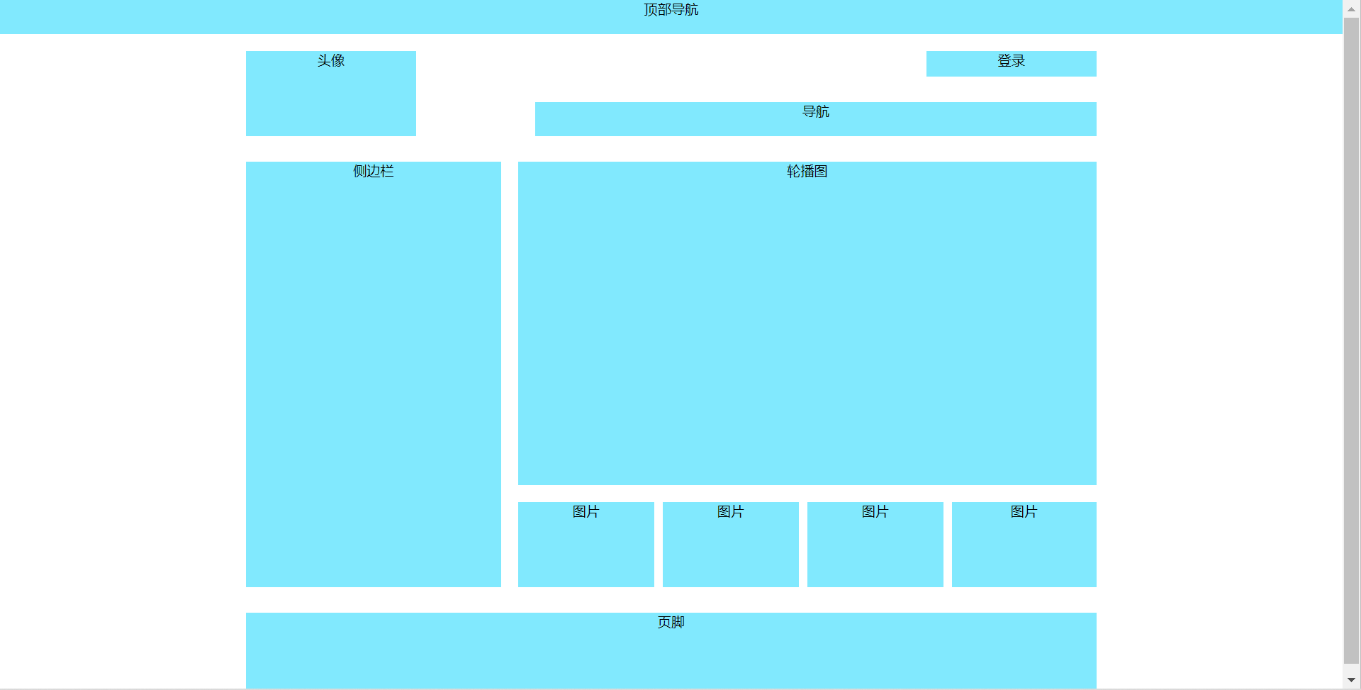
点击查看代码
<!DOCTYPE html>
<html lang="en">

<head>
    <meta charset="UTF-8">
    <meta http-equiv="X-UA-Compatible" content="IE=edge">
    <meta name="viewport" content="width=device-width, initial-scale=1.0">
    <title>使用浮动实现网页布局</title>
    <style>
        * {
            margin: 0;
            padding: 0;
            text-align: center;
        }

        .topbar {
            width: 100%;
            height: 40px;
            background-color: rgb(129, 233, 254);
        }

        header {
            width: 1000px;
            height: 100px;
            margin: 20px auto 0;
        }

        header .logo {
            width: 200px;
            height: 100px;
            background-color: rgb(129, 233, 254);
            float: left;
        }

        header .login {
            width: 200px;
            height: 30px;
            background-color: rgb(129, 233, 254);
            float: right;
        }

        header .top-nav {
            margin-top: 30px;
            width: 660px;
            height: 40px;
            background-color: rgb(129, 233, 254);
            float: right;
        }

        main {
            width: 1000px;
            height: 500px;
            margin: 30px auto;
        }

        main aside.ad {
            width: 300px;
            height: 500px;
            background-color: rgb(129, 233, 254);
            float: left;
        }

        main article {
            width: 680px;
            height: 500px;
            float: right;
        }

        main article .banner {
            width: 680px;
            height: 380px;
            background-color: rgb(129, 233, 254);
        }

        main article .pics {
            width: 680px;
            height: 100px;
            margin-top: 20px;
        }

        main article .pics ul {
            list-style: none;
        }

        main article .pics ul li {
            width: 160px;
            height: 100px;
            background-color: rgb(129, 233, 254);
            float: left;
            margin-right: 10px;
        }

        main article .pics ul li:last-child {
            width: 170px;
            margin-right: 0;
        }

        footer {
            width: 1000px;
            height: 100px;
            background-color: rgb(129, 233, 254);
            margin: 0 auto;
        }
    </style>
</head>

<body>
    <!-- topbar start -->
    <div class="topbar">顶部导航</div>
    <!-- end topbar -->

    <!-- header start -->
    <header>
        <div class="logo">头像</div>
        <div class="login">登录</div>
        <nav class="top-nav">导航</nav>
    </header>
    <!-- end header -->

    <!-- main start -->
    <main>
        <aside class="ad">侧边栏</aside>
        <article>
            <div class="banner">轮播图</div>
            <div class="pics">
                <ul>
                    <li>图片</li>
                    <li>图片</li>
                    <li>图片</li>
                    <li>图片</li>
                </ul>
            </div>
        </article>
    </main>
    <!-- end main -->

    <!-- footer start -->
    <footer>页脚</footer>
    <!-- end foorer -->
</body>

</html>

 浙公网安备 33010602011771号