[]如何正确设计登录表单
转自:15 Tips for Better Signup / Login UX
翻译工具:彩云小译
--------------------------
15 Tips for Better Signup / Login UX
Erik D. Kennedy · Published Jun 22, 2021
2021年6月22日
OK, I hate long intros, so: this is a checklist of some of the most important UX tips for creating usable signup and login forms. It’s based on my experience looking at hundreds of beginning designer login flows, thanks to my courses Learn UI Design and Learn UX Design.
好吧,我讨厌冗长的介绍,所以: 这是一个清单,列出了创建可用的注册和登录表单的一些最重要的用户体验技巧。这是基于我的经验,看了数以百计的初始设计师登录流,感谢我的课程学习 UI 设计和学习用户体验设计。
Let’s get started.
我们开始吧。
1. Autofocus on the first field
1. 自动对焦第一个字段
Ironically, the fundamental rule of interaction design is: remove interaction. Remove clicks, remove reading, remove waiting, remove thinking.
具有讽刺意味的是,交互设计的基本原则是: 删除交互。删除点击,删除阅读,删除等待,删除思考。
An easy example: if you know that literally 95% of people opening a signup form will immediately click into the first field, save them the trouble and auto-focus on it.
一个简单的例子: 如果你知道95% 的人打开一个注册表单会立即点击第一个字段,省了他们的麻烦和自动对焦。
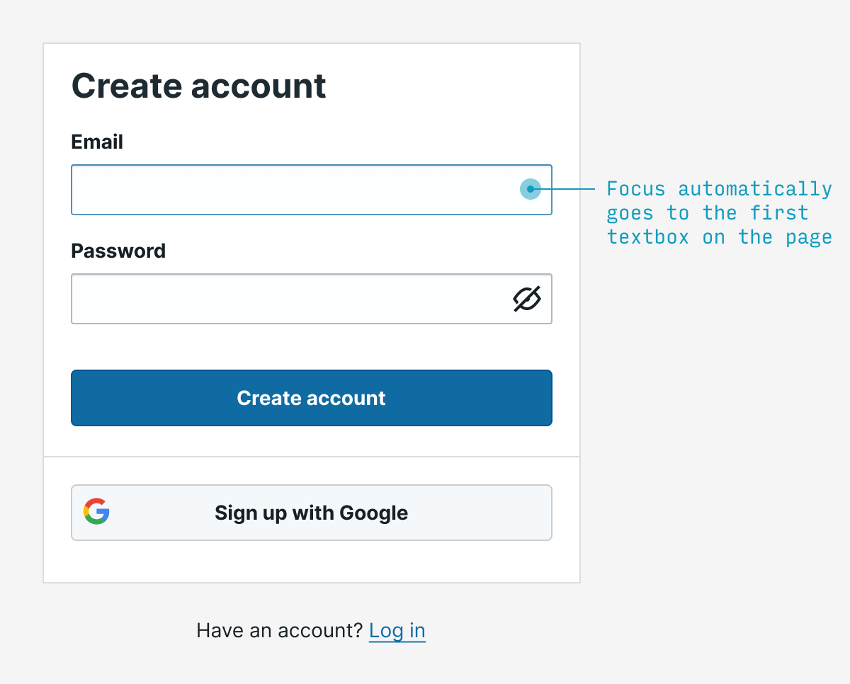
(Note that autofocusing can be a jarring to users using screenreaders, so it’s worth testing this experience 👍)
(请注意,使用屏幕阅读器时,自动对焦可能会让用户感到不适,因此值得测试这种体验)
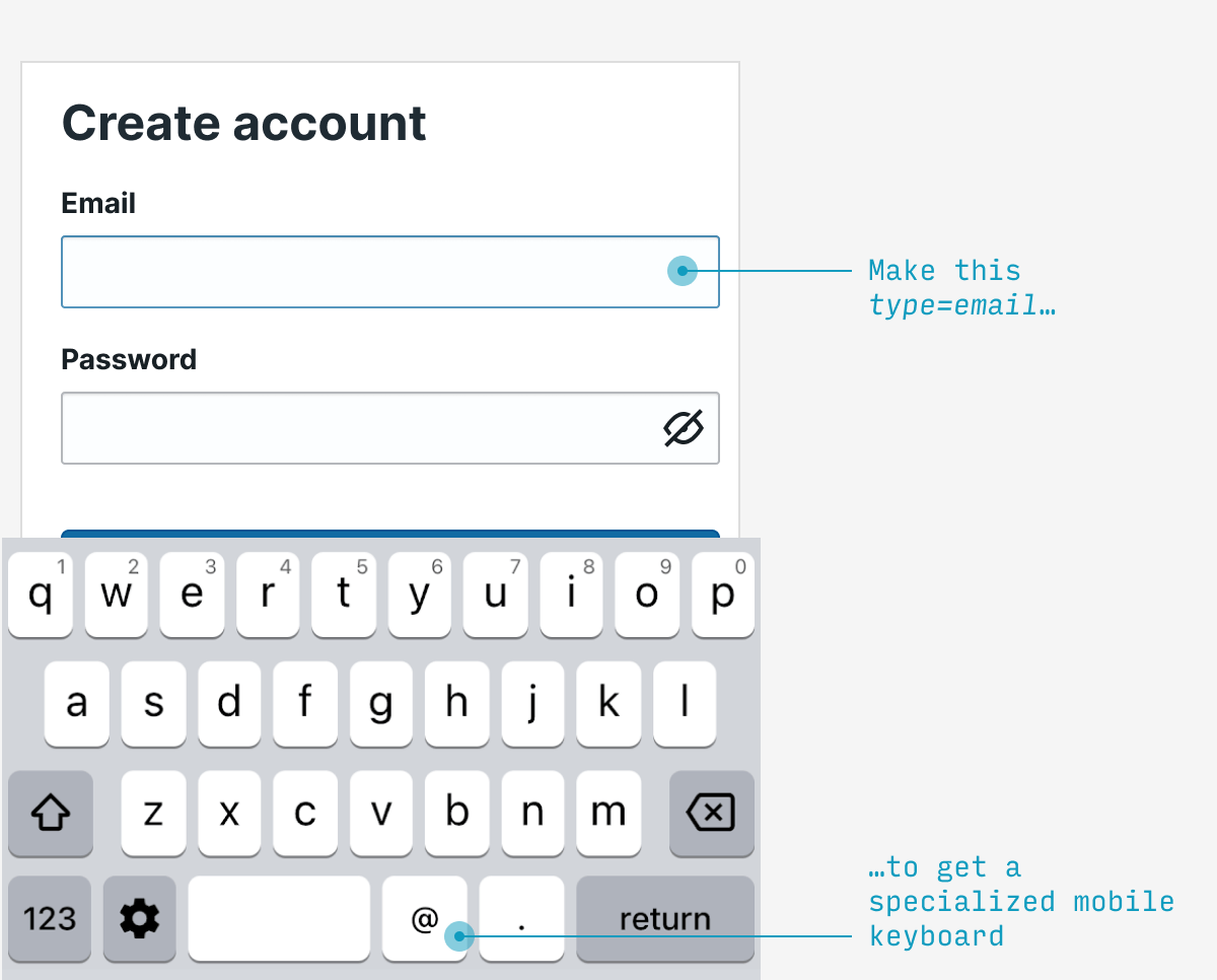
2. Use specialized mobile keyboards
2. 使用专门的移动键盘
The only things certain in life are (a) death and (b) email addresses have an “@” and a “.” in them. Fortunately, mobile phones have specialized email entry keyboards showing those characters – but you must label your textbox type=email in HTML. This is such a simple change to make mobile users’ lives easier.
生活中唯一确定的事情是(a)死亡和(b)电子邮件地址有一个“@”和一个“”在里面。幸运的是,移动电话有专门的电子邮件输入键盘显示这些字符-但你必须标记你的文本框类型 = HTML 电子邮件。这是一个非常简单的改变,让手机用户的生活变得更加轻松。
Note: also applies to telephone numbers (type=tel), URLs (type=url), and numbers (type=num) in your signup flow.
注意: 也适用于您注册流程中的电话号码(type = tel)、 url (type = url)和数字(type = num)。
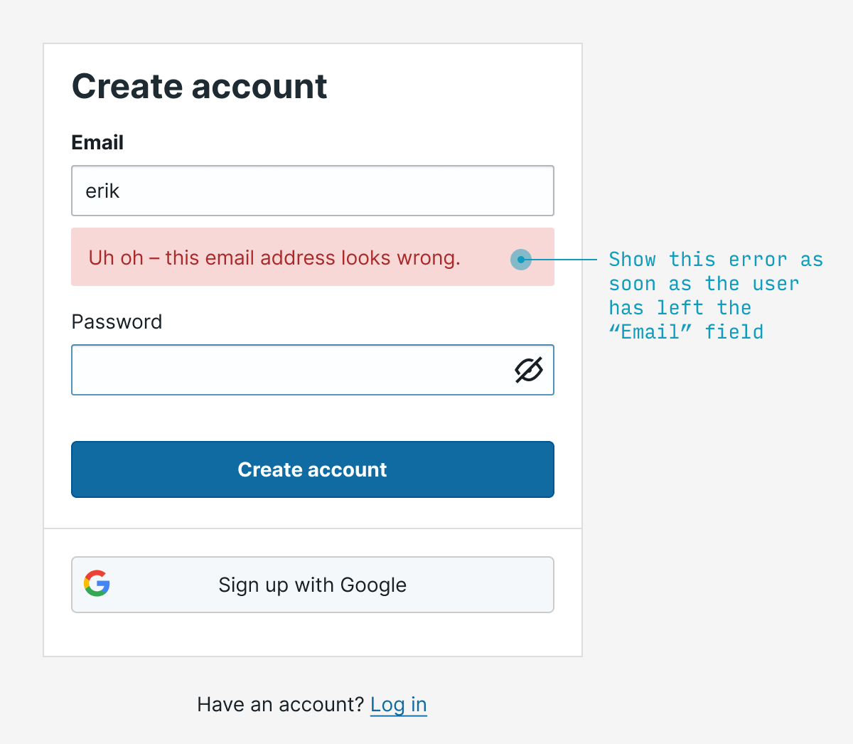
3. Validate fields immediately
3. 立即验证字段
Rather than waiting for the user to fill out the entire form before you point out any errors, let them know as soon as your system can tell there’s an error. For something like email, it makes sense to validate on blur (that is, when they focus on another field).
与其等待用户填写整个表单才指出任何错误,不如在系统发现错误时马上告诉他们。对于电子邮件这样的东西,验证 blur 是有意义的(也就是说,当他们关注另一个领域时)。
Typically I’d try to catch both blank as well as invalid email addresses.
通常情况下,我会尝试捕捉空白和无效的电子邮件地址。
4. Make labels clickable
4. 让标签可以点击
Every single labelled text input you ever create should have clickable labels. It’s a wonder this isn’t done by HTML by default, but simply add the input element inside its respective label element and you’re good to go. Not only does this (a) allow me to absentmindedly click the label to start typing, but (b) it also helps me if my clumsy finger accidentally misses the textbox by a bit.
你创建的每一个带标签的文本输入都应该有可点击的标签。这是一个奇迹,默认情况下这不是由 HTML 完成的,而是简单地将 input 元素添加到其各自的 label 元素中,就可以了。这不仅让我可以心不在焉地点击标签开始打字,而且如果我笨拙的手指不小心错过了一点文本框,这也会对我有帮助。
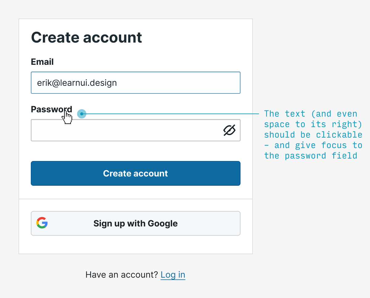
(Accessibility tip ☝️ – screen readers don’t play nicely with input inside label – so also wrap the text describing the input in a separate span with a unique id, then add aria-labelledby="my-unique-id" to the input 👍)
(可访问性提示 something-屏幕阅读器不能很好地处理标签内的输入——所以还要用一个惟一的 id 将描述输入的文本封装在单独的跨度中,然后将 aria-labelledby = “ my-unique-id”添加到输入中)
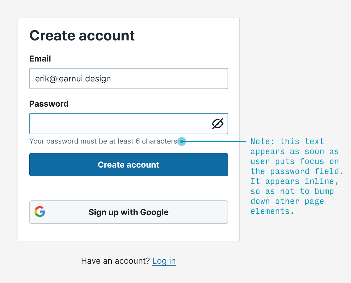
5. Show password requirements when users are choosing a password
5. 在用户选择密码时显示密码要求
No user should have to guess at what the password requirements are. Show them when they’re relevant (P.S. And remove them when they’re not).
用户无需猜测密码要求是什么。当它们是相关的时候展示它们(附注: 当它们不是相关的时候移除它们)。
6. Let users see their password
6. 让用户看到他们的密码
Allowing users to view the password they’ve entered will prevent thorny UX issues with choosing a password they didn’t mean to – while also being less onerous than requiring them to type it twice.
允许用户查看他们输入的密码可以避免选择一个他们并不想要的密码所带来的棘手的用户体验问题,同时也比要求他们输入两次要轻松一些。
(That being said, the latter method is still far better than nothing)
(话虽如此,后一种方法仍然比什么都没有好得多)

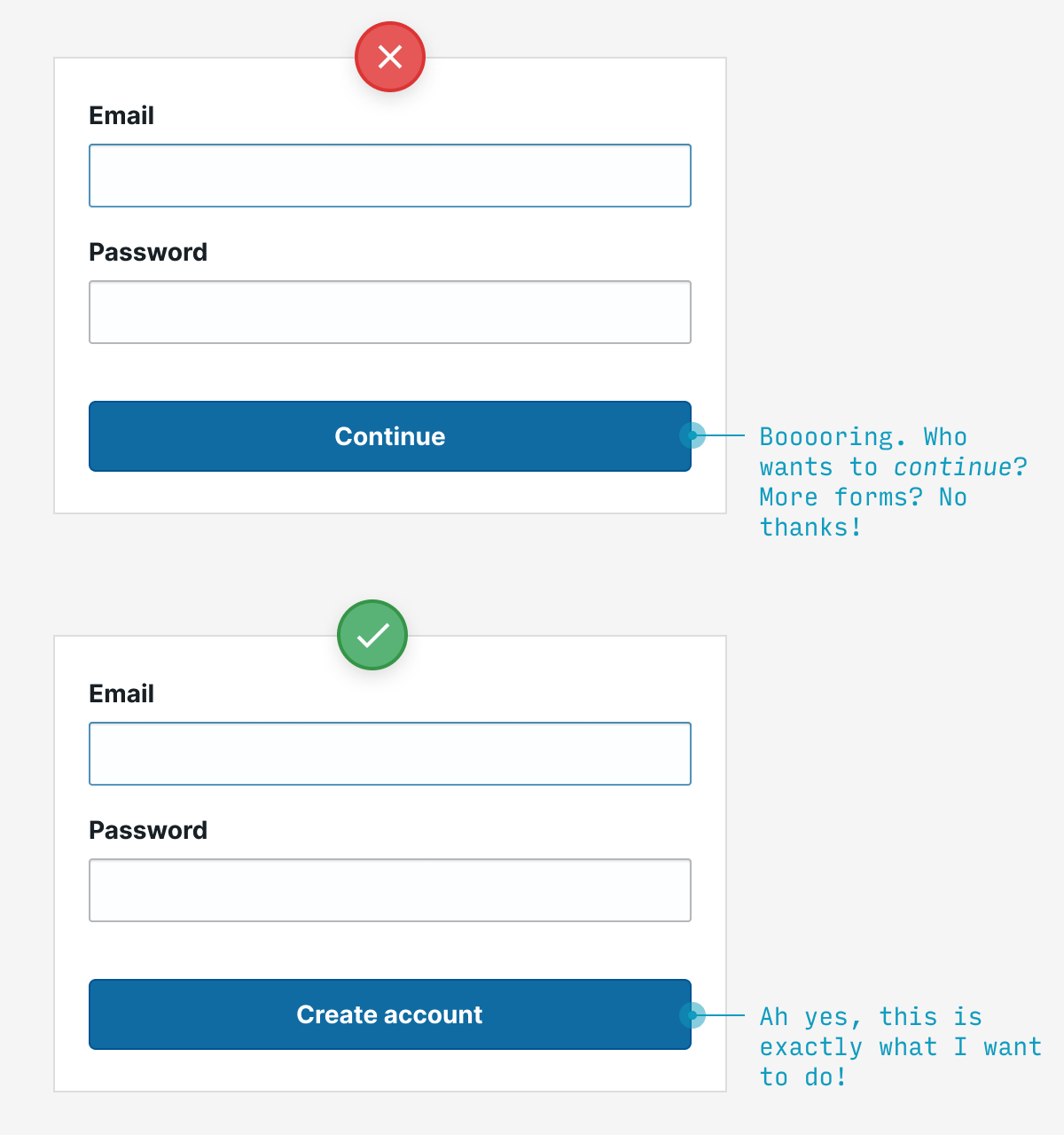
7. Use button text to expose the value waiting for users on the other side
7. 使用按钮文本暴露等待另一端用户的价值
The labels on your buttons are an opportunity – to tempt your users to click through, of course. If you label them with boring, non-descript stuff (e.g. “Continue”, “Submit”), well, yaaaawn.
你的按钮上的标签是一个机会——当然是吸引你的用户点击。如果你给他们贴上无聊、毫无特色的标签(比如“继续”、“提交”) ,那么,哈哈哈。
But ask yourself: what value awaits a user on the other side? Is it getting my free account set up? Am I 30 seconds away from experiencing the future of work! Tell me, dang it!
但是问问你自己: 在另一边等待用户的是什么价值?我的免费账户是不是建立起来了?我离体验未来的工作只有30秒了吗!告诉我,该死的!
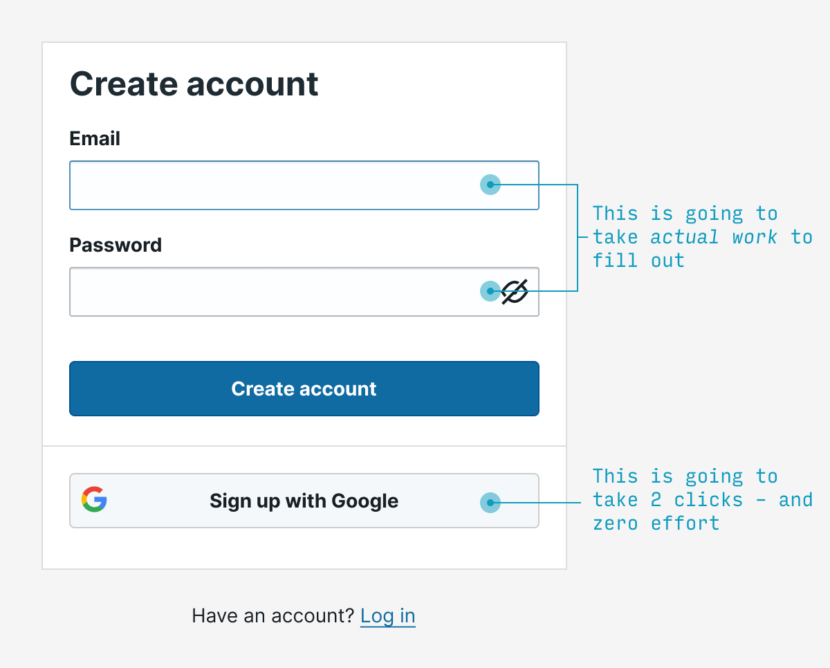
8. Allow for single sign-on
8. 允许单点登录
Why force users to pick yet another username and password to deal with for our hum-drum little service? What if – and hear me out on this – we allowed them to use an existing name and password? Like their Gmail account or twitter handle!
为什么要强迫用户为我们的小服务选择另一个用户名和密码呢?如果我们允许他们使用现有的名称和密码,那会怎么样?喜欢他们的 Gmail 账号或者 twitter 账号!
Crazy, right?
很疯狂,对吧?
But that’s exactly what we can all be doing. And unless you have very specific reasons not to, it’s highly recommended.
但这正是我们所能做的。除非你有非常具体的理由不这样做,这是强烈推荐的。
(Now sites just need to remind users when they’ve already clicked this option)
(现在网站只需要提醒用户,当他们已经点击这个选项)
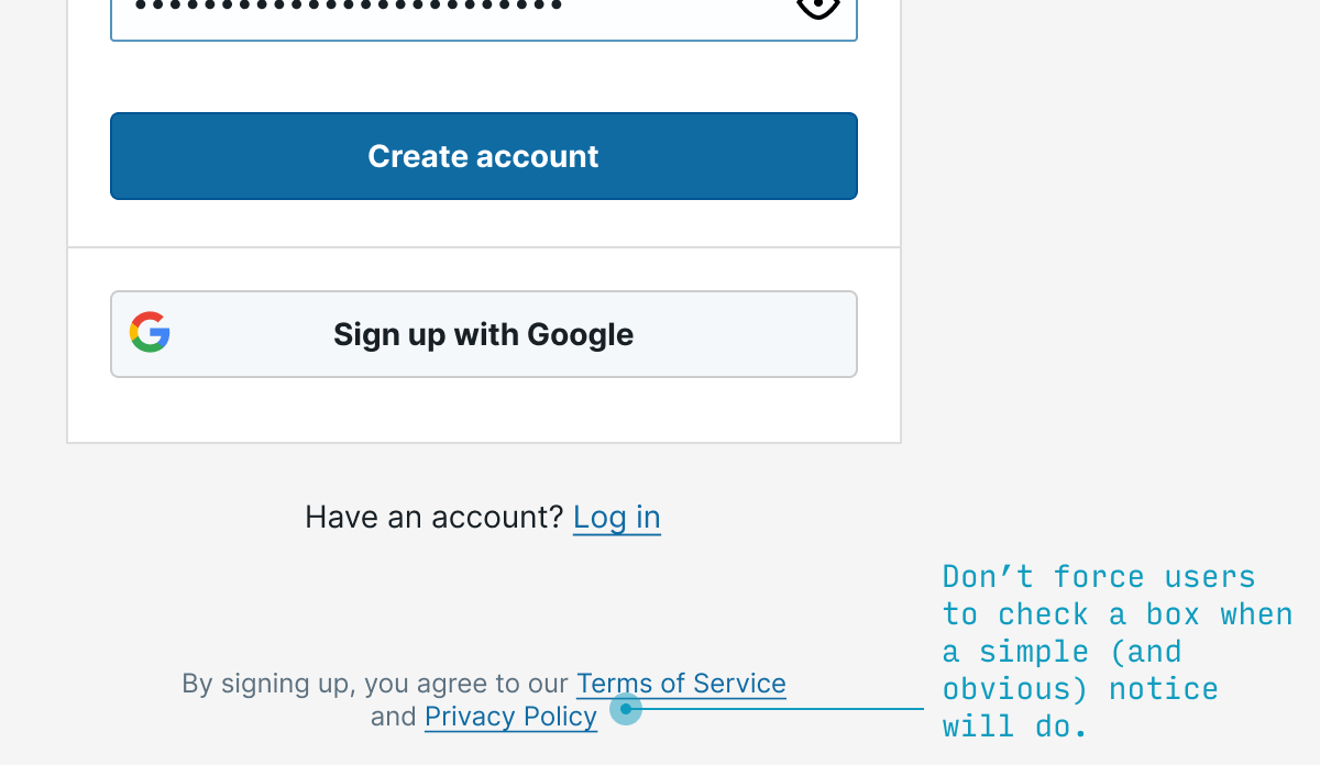
9. Save a click by notifying users they agree to the terms of service (not requiring their explicit permission)
9. 通过通知用户他们同意服务条款(不需要他们的明确许可)来保存点击
OK, so first thing’s first: this isn’t legal everywhere. The EU, for instance, requires that sites require their users to explicitly check a box saying they agree to the site’s terms. My opinion? Privacy theater, and bad UX to boot. Save users a click – when you’re allowed.
首先,这并不是所有地方都是合法的。例如,欧盟要求网站要求用户明确地勾选一个框,表明他们同意网站的条款。我的意见?隐私剧场,糟糕的用户体验。在允许的情况下为用户保存一次点击。
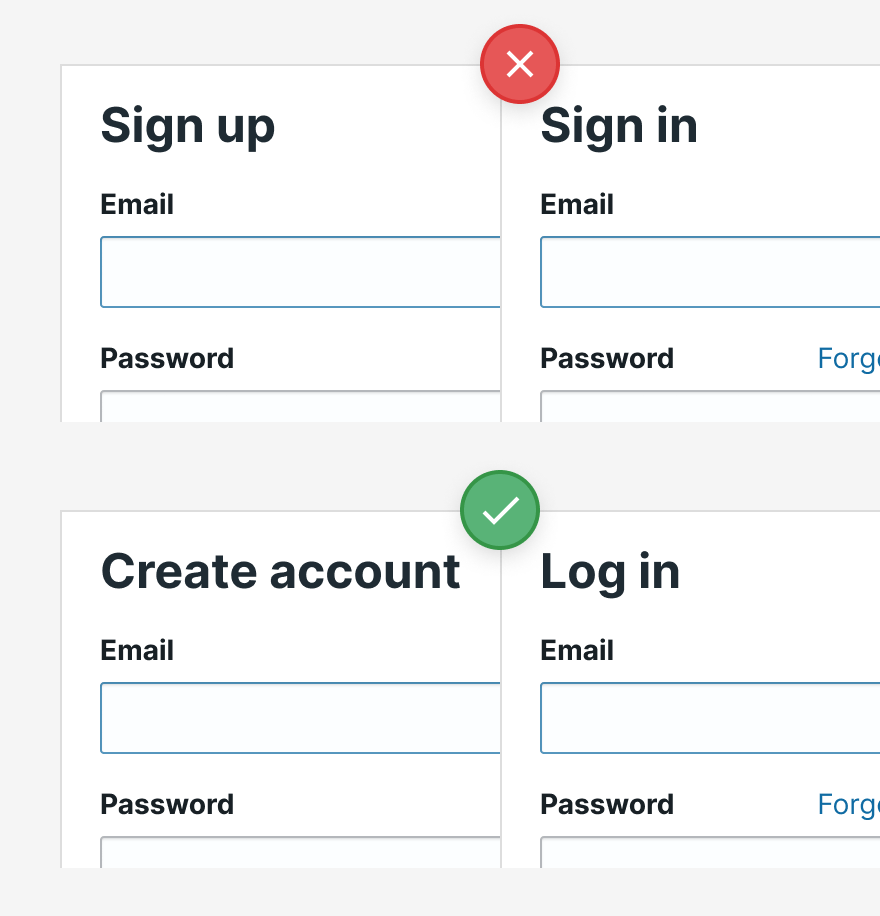
10. Use different terms for “sign in” and “sign up”
10. 对”登录”和”注册”使用不同的术语
You want your sign-in to be so simple, the village idiot could still complete it half asleep without thinking.
你希望你的登录过程简单,村里的白痴还是可以不假思索地半睡半醒地完成。
To those ends, don’t use, say, “Sign in” and “Sign up” – which requires me to think for half a second whether I want “in” or “up”.
为了达到这些目的,不要使用诸如“登录”和“注册”之类的词语——这需要我花半秒钟的时间来思考我是想“加入”还是“加入”。
Instead, go with options like “Register” vs. “Sign in”, or other pairs of options that are more than 2 letters apart. It may only save your users a half a second, but if you wouldn’t save them half a second now, it’s not looking good for the rest of your app 😬.
相反,使用诸如“ Register”和“ Sign in”之类的选项,或者其他相隔超过两个字母的选项对。它可能只为你的用户节省半秒钟,但是如果你现在不能为他们节省半秒钟,那么对于你的应用程序的其他部分来说,它看起来就不那么好了。
11. Allow easy switching between “sign in” and “sign up”
11. 允许在“登录”和“注册”之间轻松切换
In the case that someone does click the wrong option, you want it to be dead simple for them to switch from registration and logging in – and vice versa.
如果有人点击了错误的选项,你希望他们从注册和登录切换到非常简单,反之亦然。
Most commonly, this is displayed as a link (not a button – a mistake beginning designers make weirdly often) located at the bottom of the form.
最常见的情况是,在表单的底部显示一个链接(而不是一个按钮——这是开始设计时经常犯的错误)。

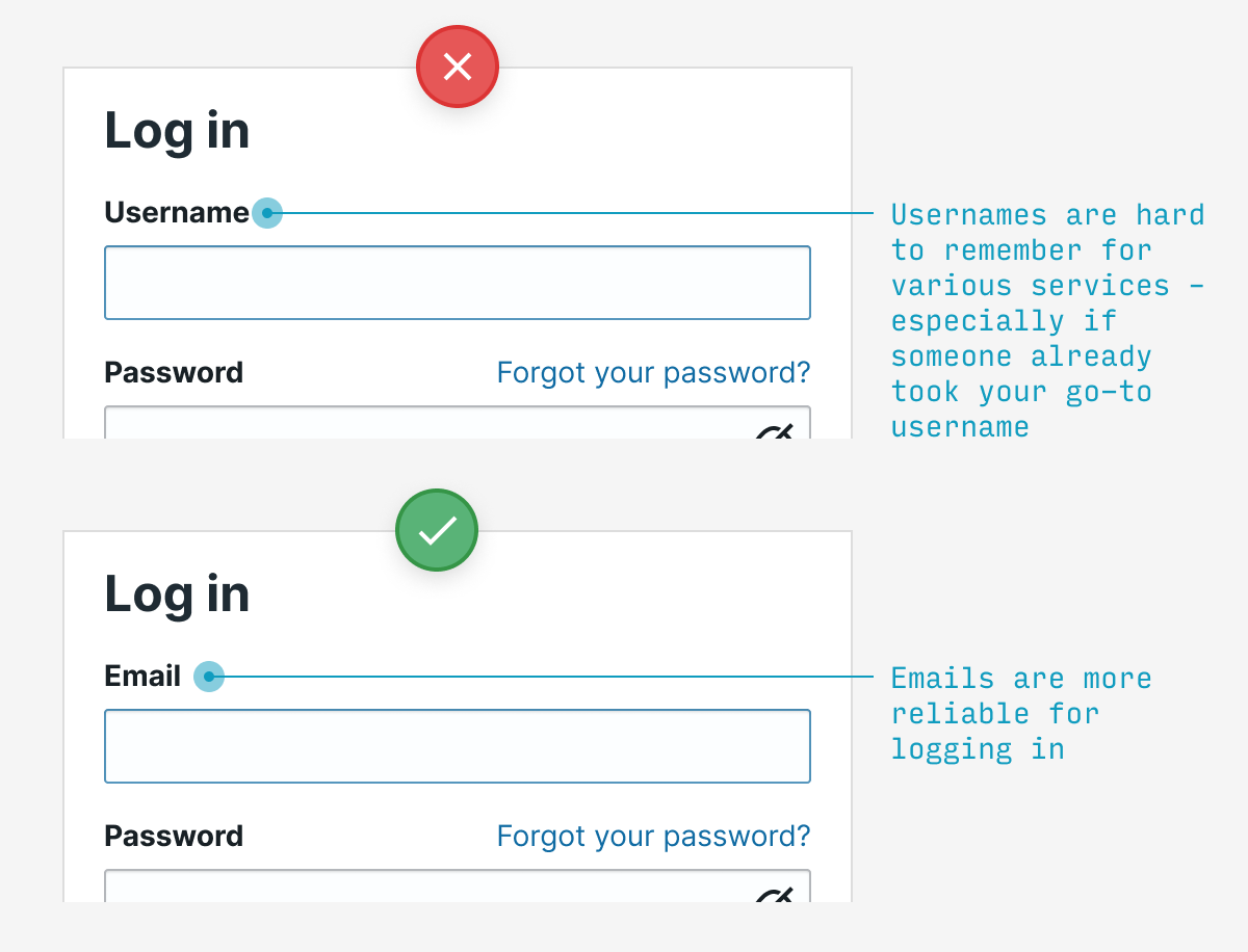
12. Log in with email, not username
12. 用电子邮件登录,而不是用户名
Usernames are tough to remember for every individual service, and you may have been forced to pick something besides your usual. Emails are a much easier way to log in.
用户名对于每个服务来说都很难记住,而且你可能不得不选择一些你平时不用的名字。电子邮件是一个更容易的登录方式。
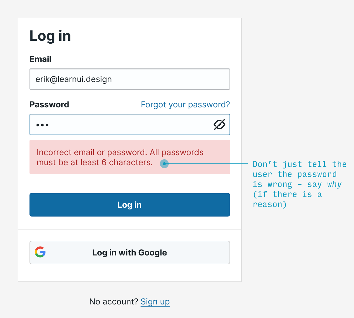
13. If the user guesses an invalid password, say why it’s invalid
13. 如果用户猜测一个无效的密码,说明为什么无效
If the user guesses a password that’s both (a) wrong and (b) doesn’t meet the password requirements, say which requirement the password failed to meet. Much more useful than saying “incorrect password”, but not giving the user a clue as to how they might fix it.
如果用户猜测的密码(a)错误,(b)不符合密码要求,请说明密码未能满足哪个要求。比说“错误的密码”有用得多,但是不告诉用户如何修复它。
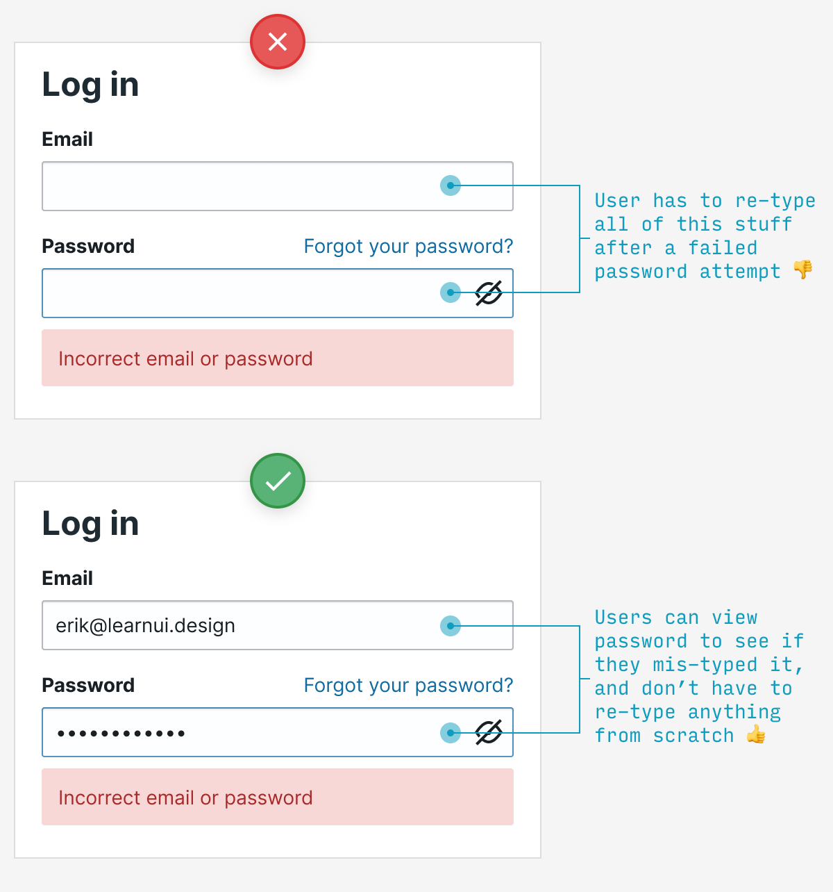
14. Remember typed values between password attempts
14. 记住在尝试密码时输入的值
If the user enters their password unsuccessfully, they should not have to type their email again. In fact, if you allow them to see their password, don’t erase that either – they may want to check to see if they made a typo.
如果用户输入密码没有成功,他们就不必再次输入电子邮件。事实上,如果你允许他们看到自己的密码,也不要擦除它们——他们可能想检查看看是否打错了。
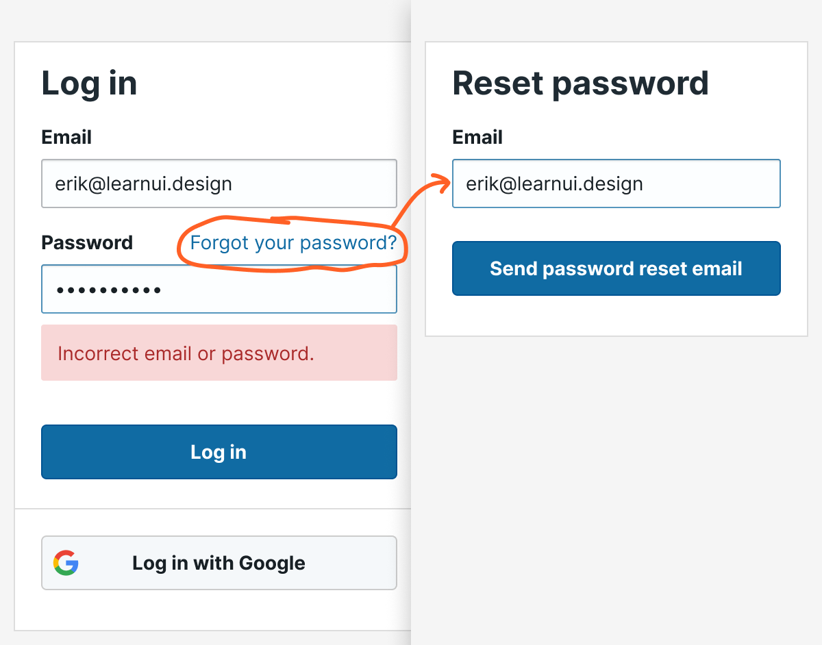
15. The “reset password” screen should remember which email you already entered
15. “重置密码”屏幕应该记住你已经输入的电子邮件
Far too often, if you click “Forgot password”, you’ll be forced to re-enter an email you typed just 30 seconds before. By the time the user has exhausted their guesses at their password and wants to reset, don’t pester them for information you already know.
很多时候,如果你点击“忘记密码”,你会被迫重新输入你刚刚输入了30秒的电子邮件。当用户猜完密码并想要重新设置密码时,不要纠缠他们以获取你已经知道的信息。
Other signup UX questions?
其他注册用户体验的问题?
Having looked at hundreds of signup flows from beginning designers, these tips address some of the most frequent problems I see. Implement all of them, and you’ll have a login UX that feels, well, as noticeable as air.
在看过数以百计的初级设计师的注册流程之后,这些技巧解决了我看到的一些最常见的问题。实现所有这些,你将拥有一个登录用户体验,感觉就像空气一样引人注目。
Remember: no one came to your app to log in. Heck, they probably didn’t even come to use your app for its own sake. In all likelihood, unless your app is for entertainment, most users probably want to use it to achieve a specific goal as quickly as possible, then get on with their life.
记住: 没有人登录你的应用程序。见鬼,他们可能根本就不是为了使用你的应用而来的。很有可能,除非你的应用程序是为了娱乐,否则大多数用户可能希望用它来尽快实现一个特定的目标,然后继续他们的生活。
As good UX designers, let’s honor our users’ impatience and make this stuff as simple as possible.
作为优秀的用户体验设计师,让我们尊重用户的不耐烦,让这些东西尽可能简单。
本文来自博客园,作者:泥烟,CSDN同名, 转载请注明原文链接:https://www.cnblogs.com/Knight02/p/15799151.html

 浙公网安备 33010602011771号