
echart 3D 柱状堆叠图
先上成品图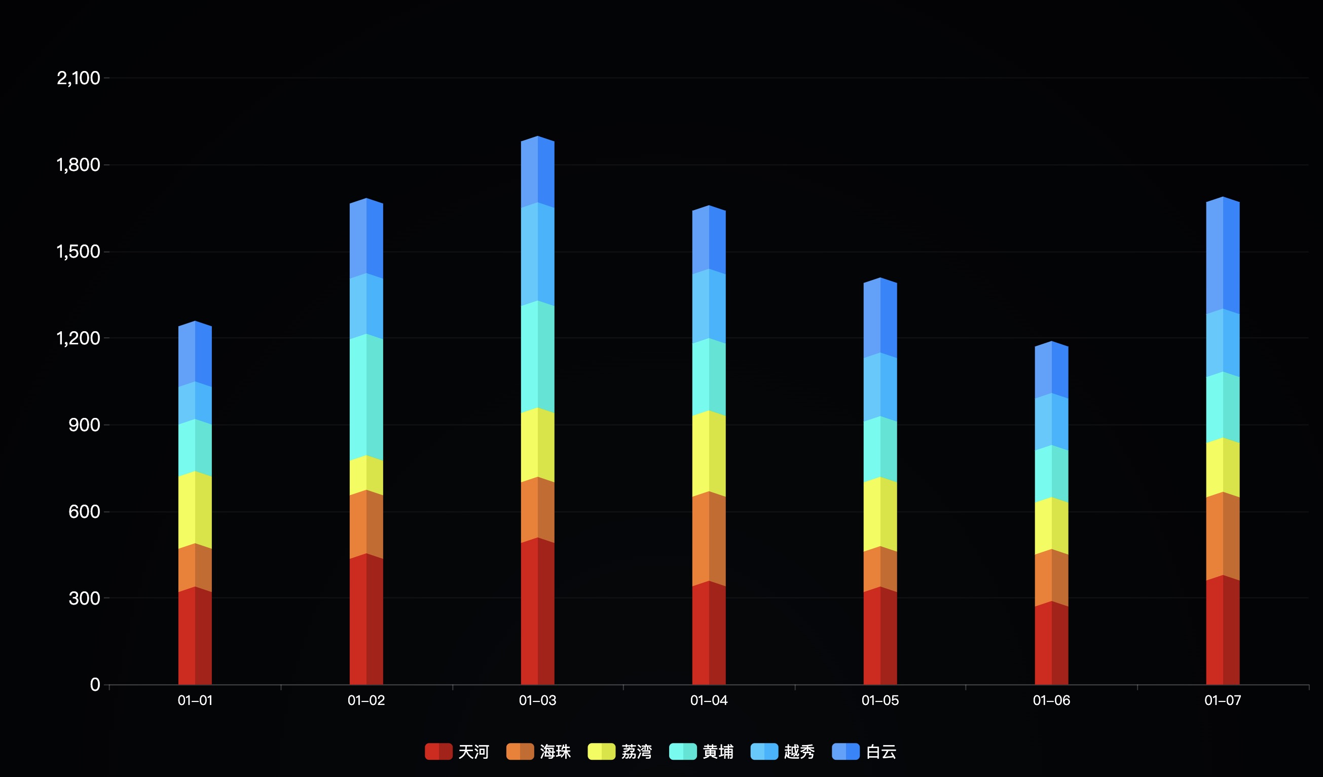
先准备一组mock数据
    // mock 数据
const dataArr = {
    xdata: ['01-01', '01-02', '01-03', '01-04', '01-05', '01-06', '01-07'],
    result: [
        { name: '天河', data: [320, 435, 490, 340, 320, 270, 360] },
        { name: '海珠', data: [150, 220, 210, 310, 140, 180, 288] },
        { name: '荔湾', data: [250, 120, 240, 280, 240, 180, 188] },
        { name: '黄埔', data: [180, 420, 370, 250, 210, 180, 228] },
        { name: '越秀', data: [130, 210, 340, 240, 220, 180, 218] },
        { name: '白云', data: [210, 260, 230, 220, 260, 180, 388] },
    ]
}
然后把基础配置配置上
// tooltip
const tooltip = { trigger: "axis" }

// legend
const legend = {
    data: dataArr.result.map(item => item.name),
    textStyle: { fontSize: 14, color: '#fff'},
    itemWidth: 25,
    itemHeight: 15,
    itemGap: 15,
    bottom: '5%',
    // 禁止点击
    selectedMode:false,
}
// grid
const grid = { top: '10%', left: '10%', right: '3%', bottom: '15%'}

// xAxis
const xAxis = {
    axisTick: { show: true },
    axisLine: { lineStyle: { color: 'rgba(255,255,255, .2)' } },
    axisLabel: { textStyle: { fontSize: 12, color: '#fff'  }, },
    data: dataArr.xdata
}

// yAxis
const yAxis = [{
    splitLine: { lineStyle: { color: 'rgba(255,255,255, .05)' } },
    axisLine: { show: false, },
    axisLabel: { textStyle: { fontSize: 16, color: '#fff' } }
}]
最后就是重点的 series 了,实现原理也简单。就是给柱状图的颜色,在中间改成有色差的渐变色,再给头部底部加上一个菱形,形成错位视觉效果。
// 循环生成每个头部菱形
const diamondData = dataArr.result.reduce((pre, cur, index) => {
    pre[index] = cur.data.map((el, id) => el + ( pre[index - 1] ? pre[index - 1][id] : 0))
    return pre
}, [])

// 定义好颜色 color
const color = [
    [{ offset: 0, color: "#dc0707", }, { offset: 0.5, color: "#dc0707", }, { offset: 0.5, color: "#af0808", }, { offset: 1, color: "#af0808", }],
    [{ offset: 0, color: "#f67c20", }, { offset: 0.5, color: "#f67c20", }, { offset: 0.5, color: "#cc681e", }, { offset: 1, color: "#cc681e", }],
    [{ offset: 0, color: "#efff37", }, { offset: 0.5, color: "#efff37", }, { offset: 0.5, color: "#d5e700", }, { offset: 1, color: "#d5e700", }],
    [{ offset: 0, color: "#32ffee", }, { offset: 0.5, color: "#32ffee", }, { offset: 0.5, color: "#00e8d5", }, { offset: 1, color: "#00e8d5", }],
    [{ offset: 0, color: "#46c9ff", }, { offset: 0.5, color: "#46c9ff", }, { offset: 0.5, color: "#00b4ff", }, { offset: 1, color: "#00b4ff", }],
    [{ offset: 0, color: "#54a0ff", }, { offset: 0.5, color: "#54a0ff", }, { offset: 0.5, color: "#1f83ff", }, { offset: 1, color: "#1f83ff", }],
]

// 循环生成series配置
let series = dataArr.result.reduce((p, c, i, array) => {
    p.push({
        z: i + 1,
        stack: '总量',
        type: 'bar',
        name: c.name,
        barGap: '-100%',
        barWidth: 30,
        data: c.data,
        itemStyle:{ color: { type: 'linear', x: 0, x2: 1, y: 0, y2: 0, colorStops: color[i] } },
    },{
        z: i + 10,
        type: 'pictorialBar',
        symbolPosition: 'end',
        symbol: 'diamond',
        symbolOffset: [0, '-50%'],
        symbolSize: [30, 10],
        data: diamondData[i],
        itemStyle: { color: { type: 'linear', x: 0, x2: 1, y: 0, y2: 0, colorStops: color[i] } },
        tooltip: { show: false },
    })

    return p
}, [])
最后渲染
// 渲染
const option = { tooltip, xAxis, yAxis, series, grid, legend, backgroundColor:'rgba(0, 0, 0, .8)' }

myChart.setOption(option);
完。

 浙公网安备 33010602011771号