

1、开发可视化图表使用的技术栈:Echarts 框架的 Python 包 —— pyecharts
2、官方网站: pyecharts - A Python Echarts Plotting Library built with love.
3、官方画廊: 中文简介 - Document (pyecharts.org)
安装 pyecharts包:pip install pyecharts
一、构建各类图表所创建的对象
构建折线图:
from pyecharts.charts import Line line = Line()
构建地图:
from pyecharts.charts import Map map = Map()
构建柱状图
from pyecharts.charts import Bar bar = Bar()
二、使用 pyecharts 制作折线图
import json # 导入 Line 功能对象构建折线图对象 from pyecharts.charts import Line # 构建 Map 地图对象 from pyecharts.charts import Map # 构建 Bar 柱状图对象 from pyecharts.charts import Bar # 标题选项所有的可配置的选项所在包 from pyecharts.options import * # 创建作图对象 line = Line() # 添加图像对象的 x 轴的数据,传入的是一个列表 line.add_xaxis(["上海", "北京", "南京", "深圳"]) # 添加图像对象 y 轴的数据,数据值以字典/列表的形式传入 line.add_yaxis("GDP", [10, 30, 50, 70]) # pyecharts 模块的全局配置 # 全局配置选项可以通过 set_global_opts 方法做以设置 line.set_global_opts( # 设置图表标题 title_opts=TitleOpts( title="折线图", # 图表名称标题 pos_left="center", # 标题距离最左边的距离 pos_bottom="1%" # 距离底部有多远 ), legend_opts=LegendOpts(is_show=True), # 设置图表的图例 toolbox_opts=ToolboxOpts(is_show=True), # 设置图表的工具箱 visualmap_opts=VisualMapOpts(is_show=True) # 视觉映射 ) # 调用 render 方法生成图像 line.render()
示例代码:
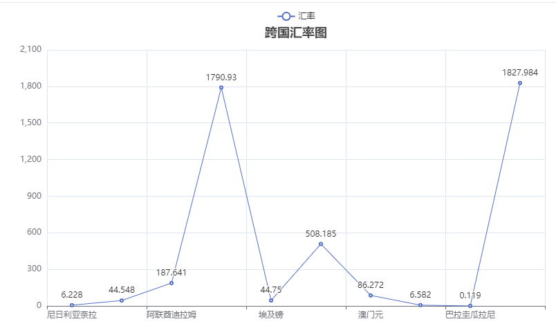
import json # 导入 Line 功能对象构建折线图对象 from pyecharts.charts import Line # 构建 Map 地图对象 from pyecharts.charts import Map # 构建 Bar 柱状图对象 from pyecharts.charts import Bar # 标题选项所有的可配置的选项所在包 from pyecharts.options import * def makeChart(): # 读取json文件 jsData = open(r"C:\Users\Admin\Desktop\fsdownload\curName.json", "r", encoding="UTF-8") number = jsData.read() jsData.close() # 使用 json.loads() 方法,将 json 数据转换为 Python 中的列表 list pydata = json.loads(number) rate = [] # 存放汇率 country = [] # 存放国家信息 for data in pydata: for t in range(len(data)): rate.append(data[t]["rate"]) country.append(data[t]["country"]) # 创建折线图对象 line = Line() # 设置x轴数据 line.add_xaxis(country[:10]) # 设置 y 轴数据 line.add_yaxis(series_name="汇率", y_axis=rate[:10], ) # 设置全局配置项 line.set_global_opts(title_opts=TitleOpts(title="跨国汇率图", pos_left="center", pos_bottom="90%")) # 生成图表 line.render(path="rate.html") if __name__ == '__main__': makeChart()
示例代码图像:
三、构建地图
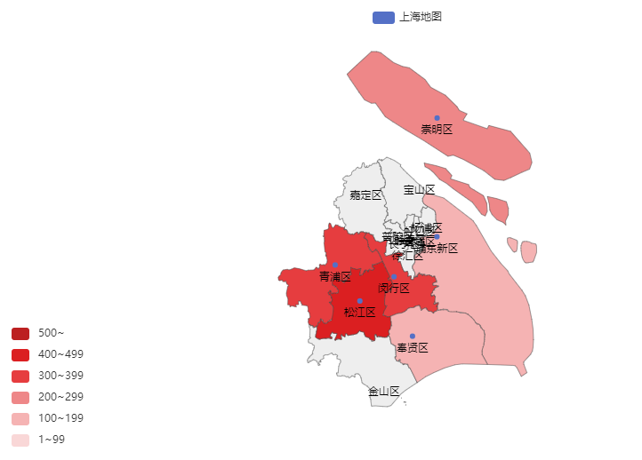
import json # 导入 Line 功能对象构建折线图对象 from pyecharts.charts import Line # 构建 Map 地图对象 from pyecharts.charts import Map # 构建 Bar 柱状图对象 from pyecharts.charts import Bar # 标题选项所有的可配置的选项所在包 from pyecharts.options import * def mapChart(): # 构建地图对象 map = Map() data = [ ("浦东新区", 150), ("崇明区", 250), ("青浦区", 350), ("松江区", 450), ("闵行区", 350), ("奉贤区", 150) ] # 添加数据到地图中 map.add(series_name="上海地图", # 地图名称 data_pair=data, # 地图数据 maptype="上海") # 地图类型,默认为 "china" # 设置地图的全局选项 map.set_global_opts(visualmap_opts=VisualMapOpts( is_show=True, # 是否展示图例颜色 is_piecewise=True, # 是否开启手动设置范围 # 手动进行颜色范围设置 pieces=[{"min": 1, "max": 99, "label": "1~99", "color": "#f9d7d7"}, {"min": 100, "max": 199, "label": "100~199", "color": "#f5b3b3"}, {"min": 200, "max": 299, "label": "200~299", "color": "#ee8788"}, {"min": 300, "max": 399, "label": "300~399", "color": "#e63d3f"}, {"min": 400, "max": 499, "label": "400~499", "color": "#db1f21"}, {"min": 500, "label": "500~", "color": "#bc2021"} ] )) # 进行绘图操作 map.render("shanghaiMap.html")
示例代码结果图表:
四、构建动态柱状图
import json # 导入 Line 功能对象构建折线图对象 from pyecharts.charts import Line # 构建 Map 地图对象 from pyecharts.charts import Map # 构建 Bar 柱状图对象 from pyecharts.charts import Bar # 标题选项所有的可配置的选项所在包 from pyecharts.options import * def barChart(): # 获取示例数据 country = [] rate = [] number = readJsonDate(file_name) pydata = json.loads(number) # pydata = pydata[:5] for data in pydata: for dat in range(len(data)): if data[dat]["rate"] > 1000: country.append(data[dat]["country"]) rate.append(data[dat]["rate"]) # 创建图表 bar = Bar() # 添加坐标轴数据 bar.add_xaxis(country) # label_opts 参数:将数值显示在柱状图的位置 bar.add_yaxis("rate", rate, label_opts=LabelOpts(position="right")) # 翻转 x 轴和 y 轴 bar.reversal_axis() # 绘制图表 bar.render("bar.html")
示例代码结果图表:

完整代码:
import json # 导入 Line 功能对象构建折线图对象 from pyecharts.charts import Line # 构建 Map 地图对象 from pyecharts.charts import Map # 构建 Bar 柱状图对象 from pyecharts.charts import Bar # 标题选项所有的可配置的选项所在包 from pyecharts.options import * file_name = r"C:\Users\Admin\Desktop\fsdownload\curName.json" def readJsonDate(file_name): # 读取json文件 json_data = open(file_name, "r", encoding="UTF-8") number = json_data.read() json_data.close() return number def lineChart(): number = readJsonDate(file_name) # 使用 json.loads() 方法,将 json 数据转换为 Python 中的列表 list pydata = json.loads(number) rate = [] # 存放汇率 country = [] # 存放国家信息 for data in pydata: for t in range(len(data)): rate.append(data[t]["rate"]) country.append(data[t]["country"]) # 创建折线图对象 line = Line() # 设置x轴数据 line.add_xaxis(country[:10]) # 设置 y 轴数据 line.add_yaxis(series_name="汇率", y_axis=rate[:10], ) # 设置全局配置项 line.set_global_opts(title_opts=TitleOpts(title="跨国汇率图", pos_left="center", pos_bottom="90%")) # 生成图表 line.render(path="rate.html") def mapChart(): # 构建地图对象 map = Map() data = [ ("浦东新区", 150), ("崇明区", 250), ("青浦区", 350), ("松江区", 450), ("闵行区", 350), ("奉贤区", 150) ] # 添加数据到地图中 map.add(series_name="上海地图", # 地图名称 data_pair=data, # 地图数据 maptype="上海") # 地图类型,默认为 "china" # 设置地图的全局选项 map.set_global_opts(visualmap_opts=VisualMapOpts( is_show=True, # 是否展示图例颜色 is_piecewise=True, # 是否开启手动设置范围 # 手动进行颜色范围设置 pieces=[{"min": 1, "max": 99, "label": "1~99", "color": "#f9d7d7"}, {"min": 100, "max": 199, "label": "100~199", "color": "#f5b3b3"}, {"min": 200, "max": 299, "label": "200~299", "color": "#ee8788"}, {"min": 300, "max": 399, "label": "300~399", "color": "#e63d3f"}, {"min": 400, "max": 499, "label": "400~499", "color": "#db1f21"}, {"min": 500, "label": "500~", "color": "#bc2021"} ] )) # 进行绘图操作 map.render("shanghaiMap.html") def barChart(): # 获取示例数据 country = [] rate = [] number = readJsonDate(file_name) pydata = json.loads(number) # pydata = pydata[:5] for data in pydata: for dat in range(len(data)): if data[dat]["rate"] > 1000: country.append(data[dat]["country"]) rate.append(data[dat]["rate"]) # 创建图表 bar = Bar() # 添加坐标轴数据 bar.add_xaxis(country) # label_opts 参数:将数值显示在柱状图的位置 bar.add_yaxis("rate", rate, label_opts=LabelOpts(position="right")) # 翻转 x 轴和 y 轴 bar.reversal_axis() # 绘制图表 bar.render("bar.html") if __name__ == '__main__': lineChart() mapChart() barChart()
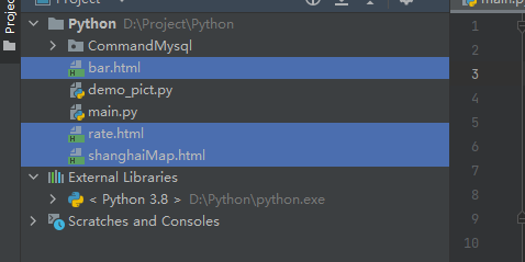
在代码正确执行完毕之后,会在当前文件夹路径中生成三个对应的html文件:
以上内容仅为个人学习记录使用。
如有转载,请附有原文出处链接。
合集:
Python


【推荐】国内首个AI IDE,深度理解中文开发场景,立即下载体验Trae
【推荐】编程新体验,更懂你的AI,立即体验豆包MarsCode编程助手
【推荐】抖音旗下AI助手豆包,你的智能百科全书,全免费不限次数
【推荐】轻量又高性能的 SSH 工具 IShell:AI 加持,快人一步
· 无需6万激活码!GitHub神秘组织3小时极速复刻Manus,手把手教你使用OpenManus搭建本
· C#/.NET/.NET Core优秀项目和框架2025年2月简报
· Manus爆火,是硬核还是营销?
· 终于写完轮子一部分:tcp代理 了,记录一下
· 【杭电多校比赛记录】2025“钉耙编程”中国大学生算法设计春季联赛(1)