

css 常用代码片段
css 常用代码片段
隐藏滚动条或更改滚动条样式
/*css主要部分的样式*//*定义滚动条宽高及背景,宽高分别对应横竖滚动条的尺寸*/
::-webkit-scrollbar {
    width: 10px; /*对垂直流动条有效*/
    height: 10px; /*对水平流动条有效*/
}

/*定义滚动条的轨道颜色、内阴影及圆角*/
::-webkit-scrollbar-track{
    -webkit-box-shadow: inset 0 0 6px rgba(0,0,0,.3);
    background-color: rosybrown;
    border-radius: 3px;
}

/*定义滑块颜色、内阴影及圆角*/
::-webkit-scrollbar-thumb{
    border-radius: 7px;
    -webkit-box-shadow: inset 0 0 6px rgba(0,0,0,.3);
    background-color: #E8E8E8;
}

/*定义两端按钮的样式*/
::-webkit-scrollbar-button {
    background-color:cyan;
}

/*定义右下角汇合处的样式*/
::-webkit-scrollbar-corner {
    background:khaki;
}
检测横屏竖屏
第一种:
window.addEventListener("resize", () => {
    if (window.orientation === 180 || window.orientation === 0) {
        console.log('竖屏')
    };
    if (window.orientation === 90 || window.orientation === -90 ){
        console.log('横屏')
    }
})
第二种:
@media screen and (orientation: portrait) {
  /*竖屏样式代码*/
}
@media screen and (orientation: landscape) {
  /*横屏样式代码.*/
}
移动响应式设置
<meta name="viewport" content="width=device-width,initial-scale=1,minimum-scale=1,maximum-scale=1,user-scalable=no,viewport-fit=cover">
单位适配:
不考虑兼容性:
/* 基于UI width=750px DPR=2的页面 */
html {
    font-size: calc(100vw / 7.5);
}
考虑兼容性:
/* 基于UI width=375px DPR=2的页面 */
!function(e, t) {
    var n = t.documentElement,
        d = e.devicePixelRatio || 1;

    function i() {
        var e = n.clientWidth / 3.75;
        n.style.fontSize = e + "px"
    }
    if (function e() {
        t.body ? t.body.style.fontSize = "16px" : t.addEventListener("DOMContentLoaded", e)
    }(), i(), e.addEventListener("resize", i), e.addEventListener("pageshow", function(e) {
        e.persisted && i()
    }), 2 <= d) {
        var o = t.createElement("body"),
            a = t.createElement("div");
        a.style.border = ".5px solid transparent", o.appendChild(a), n.appendChild(o), 1 === a.offsetHeight && n.classList.add("hairlines"), n.removeChild(o)
    }
}(window, document)
/* 基于UI width=750px DPR=2的页面 */
function AutoResponse(width = 750) {
    const target = document.documentElement;
    if (target.clientWidth >= 600) {
        target.style.fontSize = "80px";
    } else {
        target.style.fontSize = target.clientWidth / width * 100 + "px";
    }
}

AutoResponse();
点击元素禁止产生背景或边框
-webkit-tap-highlight-color: rgba(0,0,0,0);
禁止长按链接与图片弹出菜单
-webkit-touch-callout: none;
禁止用户选中文字
-webkit-user-select:none;
user-select: none;
取消 input 输入时,英文首字母的默认大写
<input autocapitalize="off" autocorrect="off" />
视频全屏播放
<video x-webkit-airplay="true" webkit-playsinline="true" preload="auto" autoplay src=""></video>
开启硬件加速
transform: translate3d(0,0,0);
怎么让 Chrome 支持小于 12px 的文字?
-webkit-text-size-adjust:none;
文字超出隐藏并显示省略号
单行省略
.ell {
  width:200rpx;
  white-space: nowrap;
  overflow: hidden;
  text-overflow: ellipsis;
}
多行省略
word-break: break-all;
display: -webkit-box;
-webkit-line-clamp: 2;
-webkit-box-orient: vertical;
overflow: hidden;
控制div内的元素自动换行
word-wrap: break-word;
word-break: break-all;
重置浏览器样式
/*! normalize.css v8.0.1 | MIT License | github.com/necolas/normalize.css */

/* Document
   ========================================================================== */

/**
 * 1. Correct the line height in all browsers.
 * 2. Prevent adjustments of font size after orientation changes in iOS.
 */

html {
  line-height: 1.15; /* 1 */
  -webkit-text-size-adjust: 100%; /* 2 */
}

/* Sections
   ========================================================================== */

/**
 * Remove the margin in all browsers.
 */

body {
  margin: 0;
}

/**
 * Render the `main` element consistently in IE.
 */

main {
  display: block;
}

/**
 * Correct the font size and margin on `h1` elements within `section` and
 * `article` contexts in Chrome, Firefox, and Safari.
 */

h1 {
  font-size: 2em;
  margin: 0.67em 0;
}

/* Grouping content
   ========================================================================== */

/**
 * 1. Add the correct box sizing in Firefox.
 * 2. Show the overflow in Edge and IE.
 */

hr {
  box-sizing: content-box; /* 1 */
  height: 0; /* 1 */
  overflow: visible; /* 2 */
}

/**
 * 1. Correct the inheritance and scaling of font size in all browsers.
 * 2. Correct the odd `em` font sizing in all browsers.
 */

pre {
  font-family: monospace, monospace; /* 1 */
  font-size: 1em; /* 2 */
}

/* Text-level semantics
   ========================================================================== */

/**
 * Remove the gray background on active links in IE 10.
 */

a {
  background-color: transparent;
}

/**
 * 1. Remove the bottom border in Chrome 57-
 * 2. Add the correct text decoration in Chrome, Edge, IE, Opera, and Safari.
 */

abbr[title] {
  border-bottom: none; /* 1 */
  text-decoration: underline; /* 2 */
  text-decoration: underline dotted; /* 2 */
}

/**
 * Add the correct font weight in Chrome, Edge, and Safari.
 */

b,
strong {
  font-weight: bolder;
}

/**
 * 1. Correct the inheritance and scaling of font size in all browsers.
 * 2. Correct the odd `em` font sizing in all browsers.
 */

code,
kbd,
samp {
  font-family: monospace, monospace; /* 1 */
  font-size: 1em; /* 2 */
}

/**
 * Add the correct font size in all browsers.
 */

small {
  font-size: 80%;
}

/**
 * Prevent `sub` and `sup` elements from affecting the line height in
 * all browsers.
 */

sub,
sup {
  font-size: 75%;
  line-height: 0;
  position: relative;
  vertical-align: baseline;
}

sub {
  bottom: -0.25em;
}

sup {
  top: -0.5em;
}

/* Embedded content
   ========================================================================== */

/**
 * Remove the border on images inside links in IE 10.
 */

img {
  border-style: none;
}

/* Forms
   ========================================================================== */

/**
 * 1. Change the font styles in all browsers.
 * 2. Remove the margin in Firefox and Safari.
 */

button,
input,
optgroup,
select,
textarea {
  font-family: inherit; /* 1 */
  font-size: 100%; /* 1 */
  line-height: 1.15; /* 1 */
  margin: 0; /* 2 */
}

/**
 * Show the overflow in IE.
 * 1. Show the overflow in Edge.
 */

button,
input { /* 1 */
  overflow: visible;
}

/**
 * Remove the inheritance of text transform in Edge, Firefox, and IE.
 * 1. Remove the inheritance of text transform in Firefox.
 */

button,
select { /* 1 */
  text-transform: none;
}

/**
 * Correct the inability to style clickable types in iOS and Safari.
 */

button,
[type="button"],
[type="reset"],
[type="submit"] {
  -webkit-appearance: button;
}

/**
 * Remove the inner border and padding in Firefox.
 */

button::-moz-focus-inner,
[type="button"]::-moz-focus-inner,
[type="reset"]::-moz-focus-inner,
[type="submit"]::-moz-focus-inner {
  border-style: none;
  padding: 0;
}

/**
 * Restore the focus styles unset by the previous rule.
 */

button:-moz-focusring,
[type="button"]:-moz-focusring,
[type="reset"]:-moz-focusring,
[type="submit"]:-moz-focusring {
  outline: 1px dotted ButtonText;
}

/**
 * Correct the padding in Firefox.
 */

fieldset {
  padding: 0.35em 0.75em 0.625em;
}

/**
 * 1. Correct the text wrapping in Edge and IE.
 * 2. Correct the color inheritance from `fieldset` elements in IE.
 * 3. Remove the padding so developers are not caught out when they zero out
 *    `fieldset` elements in all browsers.
 */

legend {
  box-sizing: border-box; /* 1 */
  color: inherit; /* 2 */
  display: table; /* 1 */
  max-width: 100%; /* 1 */
  padding: 0; /* 3 */
  white-space: normal; /* 1 */
}

/**
 * Add the correct vertical alignment in Chrome, Firefox, and Opera.
 */

progress {
  vertical-align: baseline;
}

/**
 * Remove the default vertical scrollbar in IE 10+.
 */

textarea {
  overflow: auto;
}

/**
 * 1. Add the correct box sizing in IE 10.
 * 2. Remove the padding in IE 10.
 */

[type="checkbox"],
[type="radio"] {
  box-sizing: border-box; /* 1 */
  padding: 0; /* 2 */
}

/**
 * Correct the cursor style of increment and decrement buttons in Chrome.
 */

[type="number"]::-webkit-inner-spin-button,
[type="number"]::-webkit-outer-spin-button {
  height: auto;
}

/**
 * 1. Correct the odd appearance in Chrome and Safari.
 * 2. Correct the outline style in Safari.
 */

[type="search"] {
  -webkit-appearance: textfield; /* 1 */
  outline-offset: -2px; /* 2 */
}

/**
 * Remove the inner padding in Chrome and Safari on macOS.
 */

[type="search"]::-webkit-search-decoration {
  -webkit-appearance: none;
}

/**
 * 1. Correct the inability to style clickable types in iOS and Safari.
 * 2. Change font properties to `inherit` in Safari.
 */

::-webkit-file-upload-button {
  -webkit-appearance: button; /* 1 */
  font: inherit; /* 2 */
}

/* Interactive
   ========================================================================== */

/*
 * Add the correct display in Edge, IE 10+, and Firefox.
 */

details {
  display: block;
}

/*
 * Add the correct display in all browsers.
 */

summary {
  display: list-item;
}

/* Misc
   ========================================================================== */

/**
 * Add the correct display in IE 10+.
 */

template {
  display: none;
}

/**
 * Add the correct display in IE 10.
 */

[hidden] {
  display: none;
}
文字下沉效果
<p>恭喜你中了88元红包!</p>
<a href="javascript:" class="btn verticle-mode">领</a>
.btn {
    display: inline-block;
    color: #a78252;
    background-color: #ddc390;
    width: 85px; height: 85px;
    line-height: 85px;
    border: 6px solid #ddc390;
    border-radius: 50%;
    box-shadow: inset 0 0 0 1px #d6b681, 0 1px, 0 2px, 0 3px, 0 4px;
    text-align: center;
    -webkit-transition: border-color .25s, background-color .25s;
    transition: border-color .25s, background-color .25s;
    font-size: 42px;
    cursor: pointer;
}
.btn:active {
    text-indent: 2px;
}

.verticle-mode {
    writing-mode: tb-rl;
    -webkit-writing-mode: vertical-rl;
    writing-mode: vertical-rl;
}
文字字符不被选中
article {
  -webkit-user-select: none;
  -moz-user-select: none;
  -ms-user-select: none;
  user-select: none;
  cursor: default;
}
outline与镂空效果
<div class="crop-box">
    <h4>剪裁(仅演示移动)</h4>
    <div class="crop">
        <div id="cropArea" class="crop-area"></div>
        <img src="1.jpg">
    </div>
</div>
<div class="preview-box">
    <h4>预览</h4>
    <div class="preview">
        <img id="previewImg" src="1.jpg">
    </div>
</div>
.crop-box,
.preview-box {
    display: inline-block;
    vertical-align: top;
}
.crop,
.preview {
    position: relative;
    overflow: hidden;
}
.crop-area,
.preview {
    width: 80px; height: 80px;
}
.crop-area {
    position: absolute;
    left: 88px; top: 56px;
    outline: 256px solid #000;
    outline: 256px solid rgba(0,0,0,.5);
    background: url(about:blank);
    background: linear-gradient(to top, transparent, transparent);
    filter: alpha(opacity=50);
    cursor: move;
}
:root .crop-area {
    filter: none;
}
.crop img,
.preview img {
    display: block;
    width: 256px; height: 192px;
}
.preview img {
    position: absolute;
    left: -88px; top: -56px;
}
var elCropArea = $('#cropArea');
var elPreviewImg = $('#previewImg');

var data = {};

elCropArea.on('mousedown', function (event) {
    data = {
        moving: true,
        left: elCropArea.position().left,
        top: elCropArea.position().top,
        x: event.pageX,
        y: event.pageY
    };
});
$(document).on({
    mousemove: function (event) {
        if (data.moving) {
            event.preventDefault();
            // 移动距离
            var moveX = event.pageX - data.x;
            var moveY = event.pageY - data.y;

            // 目标坐标
            var left = data.left + moveX;
            var top = data.top + moveY;

            // 边界判断
            if (left < 0) {
                left = 0;
            } else if (left + 80 > 256) {
                left = 176;
            }
            if (top < 0) {
                top = 0;
            } else if (top + 80 > 192) {
                top = 112;
            }

            // 重定位
            elCropArea.css({
                left: left,
                top: top
            });
            elPreviewImg.css({
                left: -1 * left,
                top: -1 * top
            });
        }
    },
    mouseup: function () {
        data.moving = false;
    }
});
white-space:nowrap与水平列表切换
<div id="box" class="box">
  <ul>
    <li><img src="1.jpg"></li>
    <li><img src="1.jpg"></li>
    <li><img src="1.jpg"></li>
  </ul>
  <a id="prev" class="btn btn-prev">往前</a>
  <a href="javascript:" id="next" class="btn btn-next">往后</a>
</div>
.box {
  width: 300px;
  height: 100px;
  margin: 30px auto;
  position: relative;
  overflow: hidden;
}
.box > ul {
  position: absolute; left: 0;
  transition: left .2s;
  white-space: nowrap;
}
.box > ul > li {
  display: inline-block;
}
.box img {
  width: 128px;
  height: 96px;
}
.btn {
  position: absolute;
  font-size: 12px;
  background: white;
  padding: 2px 5px;
  top: 40px;
}
.btn {
  opacity: .95;
  color: #999;
}
.btn[href] {
  color: #333;
}
.btn-prev {
  left: 0;
}
.btn-next {
  right: 0;
}
var elePrev = document.getElementById('prev'),
  eleNext = document.getElementById('next');

var eleBox = document.getElementById('box');
var eleUl = eleBox.querySelector('ul');

if (elePrev && eleNext && eleBox && eleUl) {
  var maxX = eleBox.clientWidth - eleBox.scrollWidth;

  elePrev.onclick = function () {
    var href = elePrev.getAttribute('href');
    if (href) {
      eleUl.style.left = '0px';
      elePrev.removeAttribute('href');
      eleNext.setAttribute('href', 'javascript:');
    }
  };
  eleNext.onclick = function () {
    var href = eleNext.getAttribute('href');
    if (href) {
      eleUl.style.left = maxX + 'px';
      eleNext.removeAttribute('href');
      elePrev.setAttribute('href', 'javascript:');
    }
  };
}
文字飞入效果
不适用于IE浏览器
<div class="title">我是标题文字内容</div>
.title {
  width: 8em;
  margin: auto;
  white-space: nowrap;
  animation: textIn 1s both;
}
@keyframes textIn {
  0% {
    opacity: 0;
    letter-spacing: -200px;
  }
  60% {
    letter-spacing: 5px;
  }
  100% {
    opacity: 1;
    letter-spacing: 0;
  }
}
使用系统字体
网页字体会跟随使用设备的系统默认字体改变
html { font: menu; }
body { font-size: 16px; }
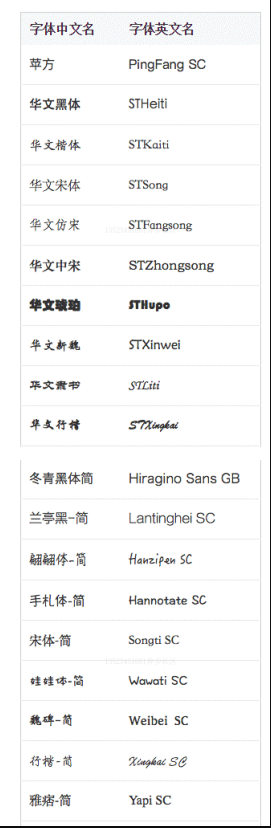
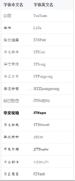
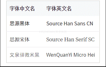
css 常用字体
弹窗蒙层显示隐藏
// 显示
var widthBar = 17, root = document.documentElement;
if (typeof window.innerWidth == 'number') {
   widthBar = window.innerWidth - root.clientWidth;
}
root.style.overflow = 'hidden';
root.style.borderRight = widthBar + 'px solid transparent';
//隐藏
var root = document.documentElement;
root.style.overflow = '';
root.style.borderRight = '';
text-align实现的右外侧定位效果
<div class="constr">
    <div class="alignright">
        <span class="follow">
            <img src="circle.png">
            <img src="backtop.png">
        </span>
    </div>
</div>
.constr {
    width: 80%;
    margin: auto;
    background-color: #f0f3f9;
}
.alignright {
    height: 0;
    text-align: right;
    overflow: hidden;
}
.alignright:before {
    content: "\2002";
}

.follow {
    position: fixed;
    bottom: 100px;
    z-index: 1;
}
.follow > img {
    display: block;
    margin: 10px;
}
focus锚点定位和overflow的选项卡切换效果
<div class="box">
    <div class="list"><input id="one" readonly>1</div>
    <div class="list"><input id="two" readonly>2</div>
    <div class="list"><input id="three" readonly>3</div>
    <div class="list"><input id="four" readonly>4</div>
</div>
<div class="link">
    <label class="click" for="one">1</label>
    <label class="click" for="two">2</label>
    <label class="click" for="three">3</label>
    <label class="click" for="four">4</label>
</div>
.box {
    width: 20em;
    height: 10em;
    border: 1px solid #ddd;
    overflow: hidden;
}
.list {
    height: 100%;
    background: #ddd;
    text-align: center;
    position: relative;
}
.list > input {
  position: absolute; top:0;
  height: 100%; width: 1px;
  border:0; padding: 0; margin: 0;
  clip: rect(0 0 0 0);
}
$('label.click').removeAttr('for').on('click', function() {
  $('.box').scrollTop(xxx);  'xxx'表示滚动数值
});
设置input 的placeholder的字体样式
input::-webkit-input-placeholder {    /* Chrome/Opera/Safari */
    color: red;
}
input::-moz-placeholder { /* Firefox 19+ */
    color: red;
}
input:-ms-input-placeholder { /* IE 10+ */
    color: red;
}
input:-moz-placeholder { /* Firefox 18- */
    color: red;
}
设置input聚焦时的样式
input:focus {
  background-color: red;
}
取消input的边框
input{
  border: none;
  outline: none;
}
表格边框合并
table,tr,td{border: 1px solid #333;}
table{
  border-collapse: collapse;
}
自定义滚动槽
::-webkit-scrollbar {   /* 血槽宽度 */
  width: 8px; height: 8px;
}
::-webkit-scrollbar-thumb {   /* 拖动条 */
  background-color: rgba(0,0,0,.3);
  border-radius: 6px;
}
::-webkit-scrollbar-track {   /* 背景槽 */
  background-color: #ddd;
  border-radius: 6px;
}
页面滚动条不发生晃动技巧
html {
  overflow-y: scroll;  /* for IE8 */
}
:root {
  overflow-y: auto;
  overflow-x: hidden;
}
:root body {
  position: absolute;
}
body {
  width: 100vw;
  overflow: hidden;
}
基于vertical-align的纯CSS定位弹框
改变浏览器尺寸,或者修改内容尺寸可以发现弹框永远居中
<div class="container">
    <div class="dialog">
        <div class="content">内容占位</div>
    </div>
</div>
.container {
    position: fixed;
    top: 0; right: 0; bottom: 0; left: 0;
    /* for IE8 */
    background: url(data:image/png;base64,iVB...g==);
    /* for IE9+ */
    background: rgba(0,0,0,.5), none;
    text-align: center;
    white-space: nowrap;
    z-index: 99;
}
.container:after {
    content: "";
    display: inline-block;
    height: 100%;
    vertical-align: middle;
}
.dialog {
    display: inline-block;
    vertical-align: middle;
    border-radius: 6px;
    background-color: #fff;
    text-align: left;
    white-space: normal;
}
小图标对齐
<div class="box">
    <h4>1. 空标签后面跟随文本</h4>
    <p><i class="icon icon-delete"></i>删除</p>
    <h4>2. 标签里面有“删除”文本</h4>
    <p><i class="icon icon-delete">删除</i>随便什么文字</p>
    <h4>3. 字号变大</h4>
    <p class="large">
        <i class="icon icon-delete"></i>删除
    </p>
    <p class="large">
        <i class="icon icon-delete">删除</i>随便什么文字
    </p>
</div>
.box {
    line-height: 20px;
}
.icon {
    display: inline-block;
    width:20px; height:20px;
    white-space: nowrap;
    letter-spacing: -1em;
    text-indent: -999em;
}
.icon:before {
    content:'\3000';
}
.icon-delete {
    background: url(delete.png) no-repeat center;
}

.large {
    font-size: 20px;
}
小三角图标垂直居中
zhangxinxu<i class="icon-arrow"></i>
.icon-arrow {
  display: inline-block;
  width: 20px;
  height: 1ex;
  background: url(/images/5/arrow.png) no-repeat center;
}
等腰三角形
div {
  width: 0;
  border: 10px solid;
  border-color: #f30 transparent transparent;
}
加号上传按钮
<a href class="add" title="继续上传">
  添加图片
</a>
.add {
    display: inline-block;
    width: 76px; height: 76px;
    color: #ccc;
    border: 2px dashed;
    text-indent: -12em;
    transition: color .25s;
    position: relative;
    overflow: hidden;
}
.add:hover {
    color: #34538b;
}
.add::before, .add::after {
    content: '';
    position: absolute;
    top: 50%;
    left: 50%;
}
.add::before {
    width: 20px;
    border-top: 4px solid;
    margin: -2px 0 0 -10px;
}
.add::after {
    height: 20px;
    border-left: 4px solid;
    margin: -10px 0 0 -2px;
}
列表两端对齐效果
不考虑IE8:
li:nth-of-type(3n) {
   margin-right: 0;
}
IE8:
ul {
   margin-right: -20px;
}
ul > li {
   float: left;
   width: 100px;
   margin-right: 20px;
}
css实现双层圆点
效果图:
10倍大小模拟
.icon-dot {
   display: inline-block;
   width: 100px; height: 100px;
   padding: 10px;
   border: 10px solid;
   border-radius: 50%;
   background-color: currentColor;
   background-clip: content-box;
}
css实现三道杠(分类图标)
效果图:

10倍大小模拟
.icon-menu {
   display: inline-block;
   width: 140px; height: 10px;
   padding: 35px 0;
   border-top: 10px solid;
   border-bottom: 10px solid;
   background-color: currentColor;
   background-clip: content-box;
}
第二种方式:
.icon-menu {
  width: 120px;
  height: 20px;
  border-top: 60px double;
  border-bottom: 20px solid;
}
模拟button按钮
节选自《css世界》4.2.3节,可在所有浏览器下按钮高度都是40像素。
<button id="btn"></button>
<label for="btn">按钮</label>
button {
  position: absolute;
  clip: rect(0 0 0 0);
}
label {
  display: inline-block;
  line-height: 20px;
  padding: 10px;
}
button按钮火狐浏览器控制padding
button::-moz-focus-inner {
  padding: 0;
}
ie7浏览器button按钮控制
button { overflow: visible; }
占位图
<img>
img {
  visibility: hidden;
  }
img[src] {
  visibility: visible;
}

img {
  display: inline-block;
  width: 200px;
  height: 150px;
}
<img>
图片alt展示
img::after {
  /* 生成alt信息 */
  content: attr(alt);
  /* 尺寸和定位 */
  position: absolute;
  bottom: 0;
  width: 100%;
  background-color: rgba(0,0,0,.5);
  transform: translateY(100%);
  /* 来点过渡动画效果 */
  transition: transform .2s; }
  img:hover::after {
    /* alt信息显示 */
    transform: translateY(0);
}
宽高定比图
.box {
  padding: 10% 50%;
  position: relative;
}
.box > img {
  position: absolute;
  width: 100%;
  height: 100%;
  left: 0;
  top: 0;
}
管道符
a + a:before {
   content: "";
   font-size: 0;
   padding: 10px 3px 1px;
   margin-left: 6px;
   border-left: 1px solid gray;
}
<a href="">登录</a><a href="">注册</a>
闭合符号
.ask:before {
  content:'提问:“';
  }
.answer:before {
content:'回答:“';
}
.ask:after,
.answer:after {
content: '”';
}
加载loading
正在加载中<dot>...</dot>
dot {
display: inline-block;
height: 1em;
line-height: 1;
text-align: left;
vertical-align: -.25em;
overflow: hidden;
}
dot::before {
display: block;
content: '...\A..\A.';
white-space: pre-wrap;
animation: dot 3s infinite step-start both;
}
@keyframes dot {
33% { transform: translateY(-2em); }
66% { transform: translateY(-1em); }
}
reset.css
重置浏览器默认样式
其中touch-action: manipulation;主要用来解决移动端 300ms 延迟问题。以前可以使用 fastclick 插件解决此问题, 之后可以直接使用此属性解决该问题,更加方便。
@charset "utf-8";
html {
  touch-action: manipulation;
  background-color: #fff;
  color: #000;
  font-size: 12px;
}
body,
ul,
ol,
dl,
dd,
h1,
h2,
h3,
h4,
h5,
h6,
figure,
form,
fieldset,
legend,
input,
textarea,
button,
p,
blockquote,
th,
td,
pre,
xmp {
  margin: 0;
  padding: 0;
}
body,
input,
textarea,
button,
select,
pre,
xmp,
tt,
code,
kbd,
samp {
  line-height: 1.5;
  font-family: tahoma, arial, 'Hiragino Sans GB', simsun, sans-serif;
}
h1,
h2,
h3,
h4,
h5,
h6,
small,
big,
input,
textarea,
button,
select {
  font-size: 100%;
}
h1,
h2,
h3,
h4,
h5,
h6 {
  font-family: tahoma, arial, 'Hiragino Sans GB', '微软雅黑', simsun, sans-serif;
}
h1,
h2,
h3,
h4,
h5,
h6,
b,
strong {
  font-weight: normal;
}
address,
cite,
dfn,
em,
i,
optgroup,
var {
  font-style: normal;
}
table {
  border-collapse: collapse;
  border-spacing: 0;
  text-align: left;
}
caption,
th {
  text-align: inherit;
}
ul,
ol,
menu {
  list-style: none;
}
fieldset,
img {
  border: 0;
}
img,
object,
input,
textarea,
button,
select {
  vertical-align: middle;
}
article,
aside,
footer,
header,
section,
nav,
figure,
figcaption,
hgroup,
details,
menu {
  display: block;
}
audio,
canvas,
video {
  display: inline-block;
  *display: inline;
  *zoom: 1;
}
blockquote:before,
blockquote:after,
q:before,
q:after {
  content: '\0020';
}
textarea {
  overflow: auto;
  resize: vertical;
}
input,
textarea,
button,
select,
a {
  outline: 0 none;
  border: none;
}
button::-moz-focus-inner,
input::-moz-focus-inner {
  padding: 0;
  border: 0;
}
mark {
  background-color: transparent;
}
a,
ins,
s,
u,
del {
  text-decoration: none;
}
sup,
sub {
  vertical-align: baseline;
}
html {
  overflow-x: hidden;
  height: 100%;
  font-size: 50px;
  -webkit-tap-highlight-color: transparent;
}
body {
  font-family: Arial, 'Microsoft Yahei', 'Helvetica Neue', Helvetica, sans-serif;
  color: #333;
  font-size: 0.28em;
  line-height: 1;
  -webkit-text-size-adjust: none;
}
hr {
  height: 0.02rem;
  margin: 0.1rem 0;
  border: medium none;
  border-top: 0.02rem solid #cacaca;
}
a {
  color: #25a4bb;
  text-decoration: none;
}
img {
  display: inline-block;
}
border.css(解决移动端 1px 问题)
由于某些机型分辨率过高,会导致 1px 变成 2-多 px 像素的问题,引用 bordercss 解决
@charset "utf-8";
.border,
.border-top,
.border-right,
.border-bottom,
.border-left,
.border-topbottom,
.border-rightleft,
.border-topleft,
.border-rightbottom,
.border-topright,
.border-bottomleft {
  position: relative;
}
.border::before,
.border-top::before,
.border-right::before,
.border-bottom::before,
.border-left::before,
.border-topbottom::before,
.border-topbottom::after,
.border-rightleft::before,
.border-rightleft::after,
.border-topleft::before,
.border-topleft::after,
.border-rightbottom::before,
.border-rightbottom::after,
.border-topright::before,
.border-topright::after,
.border-bottomleft::before,
.border-bottomleft::after {
  content: '\0020';
  overflow: hidden;
  position: absolute;
}
/* border
 * 因,边框是由伪元素区域遮盖在父级
 * 故,子级若有交互,需要对子级设置
 * 定位 及 z轴
 */
.border::before {
  box-sizing: border-box;
  top: 0;
  left: 0;
  height: 100%;
  width: 100%;
  border: 1px solid #eaeaea;
  transform-origin: 0 0;
}
.border-top::before,
.border-bottom::before,
.border-topbottom::before,
.border-topbottom::after,
.border-topleft::before,
.border-rightbottom::after,
.border-topright::before,
.border-bottomleft::before {
  left: 0;
  width: 100%;
  height: 1px;
}
.border-right::before,
.border-left::before,
.border-rightleft::before,
.border-rightleft::after,
.border-topleft::after,
.border-rightbottom::before,
.border-topright::after,
.border-bottomleft::after {
  top: 0;
  width: 1px;
  height: 100%;
}
.border-top::before,
.border-topbottom::before,
.border-topleft::before,
.border-topright::before {
  border-top: 1px solid #eaeaea;
  transform-origin: 0 0;
}
.border-right::before,
.border-rightbottom::before,
.border-rightleft::before,
.border-topright::after {
  border-right: 1px solid #eaeaea;
  transform-origin: 100% 0;
}
.border-bottom::before,
.border-topbottom::after,
.border-rightbottom::after,
.border-bottomleft::before {
  border-bottom: 1px solid #eaeaea;
  transform-origin: 0 100%;
}
.border-left::before,
.border-topleft::after,
.border-rightleft::after,
.border-bottomleft::after {
  border-left: 1px solid #eaeaea;
  transform-origin: 0 0;
}
.border-top::before,
.border-topbottom::before,
.border-topleft::before,
.border-topright::before {
  top: 0;
}
.border-right::before,
.border-rightleft::after,
.border-rightbottom::before,
.border-topright::after {
  right: 0;
}
.border-bottom::before,
.border-topbottom::after,
.border-rightbottom::after,
.border-bottomleft::after {
  bottom: 0;
}
.border-left::before,
.border-rightleft::before,
.border-topleft::after,
.border-bottomleft::before {
  left: 0;
}
@media (max--moz-device-pixel-ratio: 1.49),
  (-webkit-max-device-pixel-ratio: 1.49),
  (max-device-pixel-ratio: 1.49),
  (max-resolution: 143dpi),
  (max-resolution: 1.49dppx) {
  /* 默认值,无需重置 */
}
@media (min--moz-device-pixel-ratio: 1.5) and (max--moz-device-pixel-ratio: 2.49),
  (-webkit-min-device-pixel-ratio: 1.5) and (-webkit-max-device-pixel-ratio: 2.49),
  (min-device-pixel-ratio: 1.5) and (max-device-pixel-ratio: 2.49),
  (min-resolution: 144dpi) and (max-resolution: 239dpi),
  (min-resolution: 1.5dppx) and (max-resolution: 2.49dppx) {
  .border::before {
    width: 200%;
    height: 200%;
    transform: scale(0.5);
  }
  .border-top::before,
  .border-bottom::before,
  .border-topbottom::before,
  .border-topbottom::after,
  .border-topleft::before,
  .border-rightbottom::after,
  .border-topright::before,
  .border-bottomleft::before {
    transform: scaleY(0.5);
  }
  .border-right::before,
  .border-left::before,
  .border-rightleft::before,
  .border-rightleft::after,
  .border-topleft::after,
  .border-rightbottom::before,
  .border-topright::after,
  .border-bottomleft::after {
    transform: scaleX(0.5);
  }
}
@media (min--moz-device-pixel-ratio: 2.5),
  (-webkit-min-device-pixel-ratio: 2.5),
  (min-device-pixel-ratio: 2.5),
  (min-resolution: 240dpi),
  (min-resolution: 2.5dppx) {
  .border::before {
    width: 300%;
    height: 300%;
    transform: scale(0.33333);
  }
  .border-top::before,
  .border-bottom::before,
  .border-topbottom::before,
  .border-topbottom::after,
  .border-topleft::before,
  .border-rightbottom::after,
  .border-topright::before,
  .border-bottomleft::before {
    transform: scaleY(0.33333);
  }
  .border-right::before,
  .border-left::before,
  .border-rightleft::before,
  .border-rightleft::after,
  .border-topleft::after,
  .border-rightbottom::before,
  .border-topright::after,
  .border-bottomleft::after {
    transform: scaleX(0.33333);
  }
}
图片等比例自动缩放
img {
  width: auto;
  height: auto;
  max-width: 100%;
  max-height: 100%;
}
css 实现宽高比例一致的图形
可防止图片抖动
div {
  width: 100%;
  height: 0;
  overflow: hidden;
  padding-bottom: 26.7%;
}
css 实现定宽高比
.div1 {
  width: 100px;
  background: red;
  border: 1px solid #000000;
  display: flex;
}
.div1:after {
  content: '';
  padding-top: 100%;
}
清除浮动
::: tip 提醒
.fix 应该用在包含浮动子元素的父级元素上,不要滥用
:::
.fix:after {
  content: '';
  display: table;
  clear: both;
}
//兼容ie6,7
.fix {
  *zoom: 1;
}
透明border妙用
当我们有控制点击的图标时, 可以使用 border 透明色增加点击区域, 比 padding 增加区域效果更好,不会撑开间距,造成定位不准的问题。
min-height妙用
min-height初始值为auto 可以用来设置大一些来做动画效果
inline-block的bug
使用inline-block会使父元素高度不正常,要慎用!!!
可以给父元素添加font-size:0解决,或者使用用float或者flex布局.
CSS布局
单侧固定
左侧使用width+float 右侧使用padding-left
水平居中
-
父元素设置
text-align: center;, 子元素设置display: inline-block;。- 优点:兼容性好
- 缺点:
text-align: center;具有继承性,导致子元素的文本也是居中显示。
-
子元素设置
margin: 0 auto;。- 只要对子元素进行设置就可以实现水平方向局中布局效果
- 如果子元素脱离文档流,导致
margin属性的值无效。
-
父元素设置
position: relative;,子元素设置position: absolute;left: 50%;transform: translateX(-50%);- 优点:父元素是否脱离文档流,不影响子元素水平居中效果。
- 缺点:
transform属性是 CSS3 新增属性, 浏览器支持情况不好
-
父元素设置
display: flex;justify-content: center;。- 优点: 布局简单, 只需在父元素进行设置
- 缺点: 浏览器支持情况不好
垂直居中
-
父元素设置
display: table-cell;vertical-align: middle;。- 优点: 浏览器兼容性比较好
- 缺点:
vertical-align: middle;, 导致父元素的文本也是居中显示。
-
父元素设置
position: relative;, 子元素设置position: absolute;top: 50%;transform: translateY(-50%);- 优点:父元素是否脱离文档流,不影响子元素垂直居中效果。
- 缺点:
transform属性是 CSS3 新增属性, 浏览器支持情况不好
-
父元素设置
display: flex;align-items: center;- 优点: 布局简单, 只需在父元素进行设置
- 缺点: 浏览器支持情况不好
水平垂直居中布局
-
父元素设置
display: table-cell;vertical-align: middle;, 子元素设置margin: 0 auto;- 缺点:如果子元素脱离文档流,导致
margin属性的值无效。vertical-align: middle;, 导致父元素的文本也是居中显示。 - 优点: 兼容性好
- 缺点:如果子元素脱离文档流,导致
-
父元素设置
position: relative;,子元素设置position: absolute;top: 50%;left: 50%;transform: translate(-50%,-50%);- 优点: 父元素是否脱离文档流,不影响子元素垂直居中效果。
- 缺点: 浏览器支持情况不好
多列布局
左边定宽右边自适应
- float
两列代码:
    .left,
    .right {
      height: 50px;
    }
    .left {
      float: left;
      width: 100px;
      background: #ecdaec;
    }
    .right {
      float: right;
      width: calc(100% - 100px) ;
      background: #8080ff;
    }
  </style>
  <div class="left">1</div>
  <div class="right">2</div>
三列代码:
  <style>
    .left,
    .right,
    .center {
      height: 50px;
    }
    .left {
      float: left;
      width: 100px;
      background: #ecdaec;
    }
    .center{
      float: left;
      width: 150px;
      background: #009e0d;
    }
    .right {
      float: right;
      width: calc(100% - 250px) ;
      background: #8080ff;
    }
  </style>
  <div class="left">1</div>
  <div class="center">2</div>
  <div class="right">3</div>
优点:
- 实现方式简单
缺点:
- 浏览器兼容性不好
- 由于子元素脱离文档流会导致父元素没有高度
- float + overflow
两列代码:
    .left,
    .right {
      height: 50px;
    }
    .left {
      float: left;
      width: 100px;
      background: #ecdaec;
    }
    .right {
      background: #8080ff;
      overflow: hidden;
    }
  </style>
  <div class="left">1</div>
  <div class="right">2</div>
三列代码:
  <style>
    .left,
    .right,
    .center {
      height: 50px;
    }
    .left {
      float: left;
      width: 100px;
      background: #ecdaec;
    }
    .center{
      float: left;
      width: 150px;
      background: #800080;
    }
    .right {
      background: #8080ff;
      overflow: hidden;
    }
  </style>
  <div class="left">1</div>
  <div class="center">2</div>
  <div class="right">3</div>
优点:
- 实现简单
缺点:
- 使自适应元素开启了 overflow:hidden
- table 值相关
两列代码:
  <style>
    .box{
      display: table;
      table-layout: fixed;/* 列宽由表格宽度和列宽度设定。处理双边框 */
      width: 100%;
    }
    .left,
    .right {
      display: table-cell;
      height: 50px;
    }
    .left {
      width: 100px;
      background: #ecdaec;
    }
    .right {
      background: #8080ff;
    }
  </style>
  <div class="box">
    <div class="left">1</div>
    <div class="right">2</div>
  </div>
三列代码:
  <style>
    .box{
      display: table;
      table-layout: fixed;/* 列宽由表格宽度和列宽度设定。 */
      width: 100%;
    }
    .left,
    .right,
    .center {
      display: table-cell;
      height: 50px;
    }
    .left {
      width: 100px;
      background: #ecdaec;
    }
    .center{
      width: 150px;
      background: #ff0080;
    }
    .right {
      background: #8080ff;
    }
  </style>
  <div class="box">
    <div class="left">1</div>
    <div class="center">2</div>
    <div class="right">3</div>
  </div>
优点:
- 浏览器兼容性好
缺点:
所有元素的 display 属性设置为 table 相关值, 受到相应制约。(单元格自动分配空间, 双边框, 一个单元格增加高度其它单元格也会增加高度)
圣杯布局(三行三列布局)
 <body>
    <style type="text/css">
        * {
            margin: 0;
            padding: 0;
        }

        body {
            min-width: 700px;
        }

        .header,
        .footer {
            float: left;
            width: 100%;
            background: #ddd;
            height: 40px;
            line-height: 40px;
            text-align: center;
        }

        .container {
            padding: 0 220px 0 200px;
        }

        .left,
        .middle,
        .right {
            position: relative;
            float: left;
            min-height: 300px;
        }

        .left {
            margin-left: -100%;
            left: -200px;
            width: 200px;
            background: #f00;
        }

        .right {
            margin-left: -220px;
            right: -220px;
            width: 220px;
            background: #30a457;
        }

        .middle {
            width: 100%;
            background: #1a5acd;
        }
    </style>
    <div class="header">
        <h4>header</h4>
    </div>
    <div class="container">
        <div class="middle">
            <h4>middle</h4>
            <p>
                这是页面的主体内容 这是页面的主体内容 这是页面的主体内容 这是页面的主体内容 这是页面的主体内容 这是页面的主体内容 这是页面的主体内容 这是页面的主体内容
            </p>
        </div>
        <div class="left">
            <h4>left</h4>
            <p>
                这是页面的左边 这是页面的左边 这是页面的左边 这是页面的左边 这是页面的左边 这是页面的左边
            </p>
        </div>
        <div class="right">
            <h4>right</h4>
            <p>
                这是页面的右边 这是页面的右边 这是页面的右边 这是页面的右边
            </p>
        </div>
    </div>
    <div class="footer">
        <h4>footer</h4>
    </div>
</body>
双飞翼布局
    <style type="text/css">
        * {
            margin: 0;
            padding: 0;
        }

        body {
            min-width: 700px;
        }

        .header,
        .footer {
            border: 1px solid #333;
            background: #ddd;
            text-align: center;
            height: 40px;
            line-height: 40px;
        }

        .sub,
        .main,
        .extra {
            float: left;
            min-height: 130px;
        }

        .sub {
            margin-left: -100%;
            width: 200px;
            background: #f00;
        }

        .extra {
            margin-left: -220px;
            width: 220px;
            background: #1a5acd;
        }

        .main {
            width: 100%;
        }

        .main-inner {
            margin-left: 200px;
            margin-right: 220px;
            min-height: 130px;
            background: #30a457;
            word-break: break-all;
        }

        .footer {
            clear: both;
        }
    </style>
    <div class="header">
        <h4>header</h4>
    </div>
    <div class="main">
        <div class="main-inner">
            <h4>main</h4>
            <p>
                这是页面的主体内容
                这是页面的主体内容
                这是页面的主体内容
                这是页面的主体内容
                这是页面的主体内容
                这是页面的主体内容
                这是页面的主体内容
                这是页面的主体内容
            </p>
        </div>
    </div>
    <div class="sub">
        <h4>sub</h4>
        <p>
            这是页面的左边
            这是页面的左边
            这是页面的左边
            这是页面的左边
            这是页面的左边
            这是页面的左边
        </p>
    </div>

    <div class="extra">
        <h4>extra</h4>
        <p>
            这是页面的右边
            这是页面的右边
            这是页面的右边
            这是页面的右边
        </p>
    </div>
    <div class="footer">
        <h4>footer</h4>
    </div>
等分布局
float
  <style>
    .parent-fix {
      overflow: hidden;
    }

    #parent {
      height: 300px;

      margin-left: -10px;
    }

    .col1,
    .col2,
    .col3,
    .col4 {
      height: 300px;
      width: 25%;
      float: left;

      box-sizing: border-box;

      padding-left: 10px;
    }

    .inner {
      height: 300px;
    }

    .col1 .inner {
      background-color: hotpink;
    }

    .col2 .inner {
      background-color: lightblue;
    }

    .col3 .inner {
      background-color: green;
    }

    .col4 .inner {
      background-color: yellow;
    }
  </style>
  <div class="parent-fix">
    <!-- 作为父级容器 -->
    <div id="parent">
      <div class="col1">
        <div class="inner"></div>
      </div>
      <div class="col2">
        <div class="inner"></div>
      </div>
      <div class="col3">
        <div class="inner"></div>
      </div>
      <div class="col4">
        <div class="inner"></div>
      </div>
    </div>
  </div>
table
  <style>
    #parent-fix {
      overflow: hidden;
    }

    #parent {
      width: 1434px;
      /* <table> */
      display: table;

      margin-left: -10px;
    }

    .col1,
    .col2,
    .col3,
    .col4 {
      height: 300px;

      display: table-cell;

      box-sizing: border-box;
      padding-left: 10px;
    }

    .inner {
      height: 300px;
    }

    .col1 .inner {
      background-color: hotpink;
    }

    .col2 .inner {
      background-color: lightblue;
    }

    .col3 .inner {
      background-color: green;
    }

    .col4 .inner {
      background-color: yellow;
    }
  </style>
  <div id="parent-fix">
    <!-- 作为父级容器 -->
    <div id="parent">
      <div class="col1">
        <div class="inner"></div>
      </div>
      <div class="col2">
        <div class="inner"></div>
      </div>
      <div class="col3">
        <div class="inner"></div>
      </div>
      <div class="col4">
        <div class="inner"></div>
      </div>
    </div>
  </div>
等高布局
方式1 padding+margin (适合多栏)
<div id="colLeft" class="column-left">
    <h4>正方观点</h4>
    <p>观点1</p>
</div>
<div id="colRight" class="column-right">
    <h4>反方观点</h4>
    <p>观点1</p>
</div>

<input type="button" id="leftMore" value="更多正方观点">
<input type="button" id="rightMore" value="更多反方观点">
.column-left,
.column-right {
    margin-bottom: -9999px;
    padding-bottom: 9999px;
}
.column-left {
    background-color: #34538b;
}
.column-right {
    background-color: #cd0000;
}
:::tip
如果项目无须兼容IE6、IE7,推荐使用 table-cell 实现等高布局。
:::
方式2:border方式(适合2-3栏)
此方法与用 margin+padding 实现的等高布局相比更加稳健,不会出现锚点定位带来的问题,但同样它也是有局限性的。
首先,由于 border 不支持百分比宽度,因此,适给至少一栏是定宽的布局。当然,如果不考虑IE8浏览器,可以试试使用 vw单位,其可实现近似的百分比宽度效果。
其次,等高布局的栏目有限制。因为一个元素的边框数目是有限的,基本上, border等高布局只能满足2 ~ 3栏的情况,除非正好是比例的,那还可以使用border-style:double实现最多7栏布局, 但这只是理论上而已。所以,一旦等高布局栏目过多,则建议使用
table-cell等高布局或者margin负值等高布局。
<div class="box">
  <nav>
    <h3 class="nav">导航1</h3>
  </nav>
  <section>
    <div class="module">模块1</div>
  </section>
</div>

<input type="button" id="navMore" value="更多导航">
<input type="button" id="moduleMore" value="更多模块">
/* 导航背景区border创建 */
.box {
  border-left: 150px solid #333;
  background-color: #f0f3f9;
}
/* 清除浮动影响,不能使用overflow:hidden */
.box:after {
  content: "";
  display: block;
  clear: both;
}
/* 布局主结构 */
.box > nav {
  width: 150px;
  margin-left: -150px;
  float: left;
}
.box > section {
    overflow: hidden;
}
/* 导航列表和模块列表 */
.nav {
    line-height: 40px;
    color: #fff;
}
.module {
    line-height: 40px;
}
margin与一栏定宽的两栏自适应布局
<h4>左侧固定</h4>
<div class="box box-left">
    <img src="1.jpg" class="img">
    <p>DOM文档流中,图片定宽在左侧,文字内容在右侧,和视觉呈现的前后顺序一致。</p>
</div>

<h4>右侧固定-DOM顺序相反</h4>
<div class="box box-right">
    <img src="1.jpg" class="img">
    <p>DOM文档流中,图片定宽在左侧,视觉上却在右侧,顺序表现不一致。</p>
</div>

<h4>右侧固定-DOM顺序和视觉一致</h4>
<div class="box box-right-same">
    <div class="full">
        <p>DOM文档流中,图片定宽在右侧,视觉呈现也在右侧,顺便表现此时一致。</p>
    </div>
    <img src="1.jpg" class="img">
</div>
.box {
    overflow: hidden;
}
.img {
    width: 128px; height: 96px;
}
/* 左浮动 */
.box-left > img {
    float: left;
}
.box-left > p {
    margin-left: 140px;
}
/* 右浮动,但图片DOM在前 */
.box-right > img {
    float: right;
}
.box-right > p {
    margin-right: 140px;
}
/* 右浮动,图片DOM在后,和视觉表现一致 */
.box-right-same > .full {
    width: 100%;
    float: left;
}
.box-right-same > .full > p {
    margin-right: 140px;
}
.box-right-same > img {
    float: left;
    margin-left: -128px;
}
CSS3多列布局
  <style>
    #parent,
    #parent2,
    #parent3 {
      /* column-count: 4;
      column-width: 300px; */

      columns: 4 300px;

      column-gap: 20px;

      /* column-rule-width: 5px;
      column-rule-color: tomato;
      column-rule-style: double; */

      column-rule: 5px tomato double;
    }

    .col1,
    .col2,
    .col3,
    .col4,
    .col5 {
      height: 300px;
    }

    .col1,
    .col6 {
      background-color: hotpink;
    }

    .col2,
    .col7 {
      background-color: lightblue;
    }

    .col3.col8 {
      background-color: green;
    }

    .col4,
    .col9 {
      background-color: yellow;
    }

    .col5 {
      background-color: tomato;

      column-span: all;
    }

    .col6,
    .col7,
    .col8,
    .col9 {
      column-fill: balance;
    }
  </style>
  <!-- 作为父级容器 -->
  <div id="parent">
    <div class="col1"></div>
    <div class="col2"></div>
    <div class="col3"></div>
    <div class="col4"></div>
  </div>
  <div id="parent2">
    <div class="col5"></div>
  </div>
  <div id="parent3">
    <div class="col6">Lorem ipsum dolor sit amet consectetur adipisicing elit. Cum possimus aliquid nostrum provident
      est esse necessitatibus mollitia error, tempore voluptate nobis odio alias, ab animi reprehenderit repellat
      perferendis voluptas rerum!</div>
    <div class="col7">Lorem ipsum dolor sit, amet consectetur adipisicing elit. A, quibusdam vel! Provident consequatur
      voluptates quibusdam consectetur architecto! Ut eaque aspernatur quibusdam incidunt nobis ipsam quidem, quod
      ullam, velit officia necessitatibus!
    </div>
    <div class="col8">Lorem ipsum dolor sit amet consectetur adipisicing elit. Facilis dicta officia porro error
      suscipit. Nostrum, deleniti laborum. Sed odit, nemo, ducimus dolores rem reprehenderit soluta ipsam nesciunt id
      unde accusamus.</div>
    <div class="col9">imooc</div>
  </div>
全屏布局
  <style>
    html,
    body {
      margin: 0;
      overflow: hidden;
    }

    header {
      height: 100px;

      position: fixed;
      top: 0;
      left: 0;
      right: 0;

      background-color: lightgray;
    }

    .content {
      position: fixed;
      left: 0;
      right: 0;
      top: 100px;
      bottom: 100px;

      overflow: auto;

      background-color: lightblue;
    }

    .content .left {
      width: 300px;
      height: 100%;

      position: fixed;
      left: 0;
      top: 100px;
      bottom: 100px;

      background-color: lightcoral;
    }

    .content .right {
      height: 1000px;
      margin-left: 300px;
      background-color: greenyellow;
    }

    footer {
      height: 100px;

      position: fixed;
      bottom: 0;
      left: 0;
      right: 0;

      background-color: lightslategray;
    }
  </style>
  <header></header>
  <div class="content">
    <div class="left"></div>
    <div class="right"></div>
  </div>
  <footer></footer>


【推荐】国内首个AI IDE,深度理解中文开发场景,立即下载体验Trae
【推荐】编程新体验,更懂你的AI,立即体验豆包MarsCode编程助手
【推荐】抖音旗下AI助手豆包,你的智能百科全书,全免费不限次数
【推荐】轻量又高性能的 SSH 工具 IShell:AI 加持,快人一步
· TypeScript + Deepseek 打造卜卦网站:技术与玄学的结合
· 阿里巴巴 QwQ-32B真的超越了 DeepSeek R-1吗?
· 【译】Visual Studio 中新的强大生产力特性
· 10年+ .NET Coder 心语 ── 封装的思维:从隐藏、稳定开始理解其本质意义
· 【设计模式】告别冗长if-else语句:使用策略模式优化代码结构