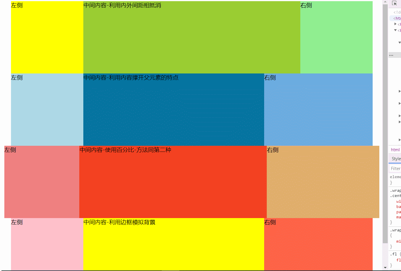
3种方法多列等高布局思路--小技巧
    (1)利用内外间距相抵消,为父元素设置overflow:hidden;实现
        每一列使用padding值撑开背景色;并且每一列使用padding撑开的多余的占位让margin负值抵消;
        父级盒设置溢出隐藏
        优点:结构简单,兼容所有浏览器
        缺点:伪等高,需要合理控制margin和padding值

    (2)利用内容撑开父元素的特点,为每一列添加对应的容器,进行相互嵌套,并在每个容器中添加背景颜色
        三个嵌套的div负责背景,三列放在最内侧的div盒子中;
        通过相对定位,分配三列的背景的位置;
        通过margin负值,将内容移到对应的背景的位置;
        父元素设置溢出隐藏
        优缺点:扩展性好,可以实现自适应,结构嵌套复杂

    (3)利用边框模拟背景,实现等高的显示效果
        左、右边框颜色、内容背景分别负责三列的背景颜色;
        通过margin值,同步列的位置
        特点:扩展性差,三列+的布局不适用
示例
<!DOCTYPE html>
<html lang="en">
<head>
    <meta charset="UTF-8">
    <title>等高布局</title>
    <style>
        .fl{
            float: left;
        }
        .fr{
            float: right;
        }
        .clearfix{
            *zoom: 1;
        }
        .clearfix::after{
            content: "";
            display: block;
            clear: both;
        }

        .wrap1{
            width: 1000px;
            margin: 0 auto;
            overflow: hidden;
        }
        .wrap1>div{
            min-height: 200px;
        }
        .wrap1 .left{
            width: 200px;
            background: yellow;

            padding-bottom: 1000000px;
            margin-bottom: -1000000px;
        }
        .wrap1 .center{
            width: 600px;
            background: yellowgreen;

            padding-bottom: 1000000px;
            margin-bottom: -1000000px;
        }
        .wrap1 .right{
            width: 200px;
            background: lightgreen;

            padding-bottom: 1000000px;
            margin-bottom: -1000000px;
        }

        .wrap2{
            width: 1000px;
            margin: 0 auto;

            overflow: hidden;
        }
        .wrap2 .col1{
            width: 100%;
            background: lightblue;
         }
         .wrap2 .col2{
             width: 100%;
             background: #0674a0;

             position: relative;
             left: 200px;
         }
         .wrap2 .col3{
             width: 100%;
             background:rgb(108, 172, 224);

             position: relative;
             left: 500px;
         }
         .wrap2 .col3>div{
             min-height: 200px;
         }
         .wrap2 .col3 .left{
             width: 200px;

             margin-left: -700px;
         }
         .wrap2 .col3 .center{
             width: 500px;

             margin-left: -500px;
         }
         .wrap2 .col3 .right{
             width: 300px;
         }
         .wrap3{
            /* width: 1000px;
            margin: 0 auto; */

            overflow: hidden;
        }
        .wrap3 .col1{
            width: 100%;
            background: lightcoral;
         }
         .wrap3 .col2{
             width: 100%;
             background: #f34121;

             position: relative;
             left: 20%;
         }
         .wrap3 .col3{
             width: 100%;
             background:rgb(224, 174, 108);

             position: relative;
             left: 50%;
         }
         .wrap3 .col3>div{
             min-height: 200px;
         }
         .wrap3 .col3 .left{
             width: 20%;

             margin-left: -70%;
         }
         .wrap3 .col3 .center{
             width: 50%;

             margin-left: -50%;
         }
         .wrap3 .col3 .right{
             width: 30%;
         }

         .wrap4{
             width: 500px;
             background: yellow;
             border-left: 200px solid pink;
             border-right: 300px solid tomato;
             margin: 0 auto;
         }
         .wrap4>div{
             min-height: 200px;
         }
         .wrap4 .left{
             width: 200px;

             margin-left: -200px;
         }
         .wrap4 .center{
             width: 500px;
         }
         .wrap4 .right{
             width: 300px;
             margin-right: -300px;
         }
    </style>
</head>
<body>
    <!-- 利用内外间距相抵消,为父元素设置overflow:hidden;实现 -->
    <div class="wrap1 clearfix">
        <div class="left fl">左侧</div>
        <div class="center fl">中间内容-利用内外间距相抵消</div>
        <div class="right fl">右侧</div>
    </div>
    <!-- 利用内容撑开父元素的特点,为每一列添加对应的容器,进行相互嵌套,并在每个容器中添加背景颜色: -->
    <div class="wrap2">
        <div class="col1">
            <div class="col2">
                <div class="col3 clearfix">
                    <div class="left fl">左侧</div>
                    <div class="center fl">中间内容-利用内容撑开父元素的特点</div>
                    <div class="right fl">右侧</div>
                </div>
            </div>
        </div>
    </div>
<!-- 改写自适应:使用百分比 -->
    <div class="wrap3">
        <div class="col1">
            <div class="col2">
                <div class="col3 clearfix">
                    <div class="left fl">左侧</div>
                    <div class="center fl">中间内容-使用百分比-方法同第二种</div>
                    <div class="right fl">右侧</div>
                </div>
            </div>
        </div>
    </div>

    <!-- 利用边框模拟背景,实现等高的显示效果 -->
    <div class="wrap4 clearfix">
        <div class="left fl">左侧</div>
        <div class="center fl">中间内容-利用边框模拟背景</div>
        <div class="right fl">右侧</div>
    </div>
</body>
</html>
本文来自博客园,作者:JackieDYH,转载请注明原文链接:https://www.cnblogs.com/JackieDYH/p/17634903.html


【推荐】国内首个AI IDE,深度理解中文开发场景,立即下载体验Trae
【推荐】编程新体验,更懂你的AI,立即体验豆包MarsCode编程助手
【推荐】抖音旗下AI助手豆包,你的智能百科全书,全免费不限次数
【推荐】轻量又高性能的 SSH 工具 IShell:AI 加持,快人一步
· AI与.NET技术实操系列:基于图像分类模型对图像进行分类
· go语言实现终端里的倒计时
· 如何编写易于单元测试的代码
· 10年+ .NET Coder 心语,封装的思维:从隐藏、稳定开始理解其本质意义
· .NET Core 中如何实现缓存的预热?
· 分享一个免费、快速、无限量使用的满血 DeepSeek R1 模型,支持深度思考和联网搜索!
· 25岁的心里话
· 基于 Docker 搭建 FRP 内网穿透开源项目(很简单哒)
· ollama系列01:轻松3步本地部署deepseek,普通电脑可用
· 按钮权限的设计及实现