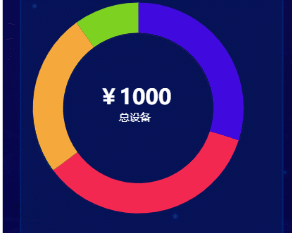
vue中使用echars环形图中间添加总计效果,鼠标悬浮切换
示例代码
<template>
  <div class="box">
    <div id="cate" ref="cate"></div>
  </div>
</template>

<script>
export default {
  data() {
    return {
      data: [
        { value: 300, name: "公共区域设备" },
        { value: 350, name: "消防设备" },
        { value: 250, name: "出入口设备" },
        { value: 100, name: "防洪防漏设备" }
      ]
    };
  },
  mounted() {
    this.setCate(this.data);
  },
  methods: {
    setCate(data) {
      let myChart  = this.$echarts.init(this.$refs.cate);
      let dataName = [];
      let total = 0;
      this.data.forEach(res => {
        dataName.push(res.name);
        total += parseFloat(res.value) * 10000;
      });
      total = total / 10000;
      let option = {
        title: {
          zlevel: 0,
          text: ["{value|" + total + "}", "{name|总设备}"].join("\n"),
          rich: {
            value: {
              color: "#fff",
              fontSize: 24,
              fontWeight: "bold",
              lineHeight: 24
            },
            name: {
              color: "#fff",
              lineHeight: 24
            }
          },
          top: "center",
          left: "120",
          textAlign: "center",
          textStyle: {
            rich: {
              value: {
                color: "#fff",
                fontSize: 24,
                fontWeight: "bold",
                lineHeight: 24
              },
              name: {
                color: "#fff",
                lineHeight: 24
              }
            }
          }
        },
        tooltip: {
          // 悬停指示
          trigger: "item",
          formatter: "{b}: {c} ({d}%)"
        },
        // legend: {
        //   orient: "vertical",
        //   x: "right",
        //   data: dataName,
        //   itemGap: 30,
        //   top: "middle",
        //   align: "left",
        //   icon: "circle",
        //   formatter: function(name) {
        //     return name;
        //   }
        // },
        series: [
          {
            name: "访问来源",
            type: "pie",
            radius: ["55%", "80%"],
            center: ["50%", "50%"],
            stillShowZeroSum: false,
            avoidLabelOverlap: false,
            zlevel: 1,
            label: {
              normal: {
                padding: [16,16,16,16],
                backgroundColor: "#061256",
                show: false,
                position: "center",
                formatter: ["{value|{c}}", "{name|{b}}"].join("\n"),
                rich: {
                  value: {
                    color: "#fff",
                    fontSize: 24,
                    fontWeight: "bold",
                    lineHeight: 24
                  },
                  name: {
                    color: "#fff",
                    lineHeight: 24
                  }
                }
              },
              emphasis: {
                show: true,
                textStyle: {
                  fontSize: "18",
                  fontWeight: "bold"
                }
              }
            },
            data
          }
        ],
        color: ["#410ADF", "#F42850", "#F6A93B", "#7ED321", "#282828"]
      };
      myChart .setOption(option);
    }
  }
};
</script>

<style scoped>
#cate {
  width: 4.4rem;
  height: 4.4rem;
}
</style>
本文来自博客园,作者:JackieDYH,转载请注明原文链接:https://www.cnblogs.com/JackieDYH/p/17634460.html


【推荐】国内首个AI IDE,深度理解中文开发场景,立即下载体验Trae
【推荐】编程新体验,更懂你的AI,立即体验豆包MarsCode编程助手
【推荐】抖音旗下AI助手豆包,你的智能百科全书,全免费不限次数
【推荐】轻量又高性能的 SSH 工具 IShell:AI 加持,快人一步
· 分享一个免费、快速、无限量使用的满血 DeepSeek R1 模型,支持深度思考和联网搜索!
· 25岁的心里话
· 基于 Docker 搭建 FRP 内网穿透开源项目(很简单哒)
· ollama系列01:轻松3步本地部署deepseek,普通电脑可用
· 按钮权限的设计及实现