Vue-60分钟快速入门篇-下篇
概述
上一篇我们重点介绍了组件的创建、注册和使用,熟练这几个步骤将有助于深入组件的开发。另外,在子组件中定义props,可以让父组件的数据传递下来,这就好比子组件告诉父组件:“嘿,老哥,我开通了一个驿站,你把东西放到驿站我就可以拿到了。”
今天我们将着重介绍slot和父子组件之间的访问和通信,slot是一个非常有用的东西,它相当于一个内容插槽,它是我们重用组件的基础。Vue的事件系统独立于原生的DOM事件,它用于组件之间的通信。
本文的主要内容如下:
- 组件的编译作用域
- 在组件template中使用<slot>标签作为内容插槽
- 使用$children, $refs, $parent 实现父子组件之间的实例访问
- 在子组件中,使用$dispatch向父组件派发事件;在父组件中,使用$broadcast向子组件传播事件
- 结合这些基础知识,我们一步一步实现一个CURD的示例
注意:以下示例的组件模板都定义在<template>标签中,然而IE不支持<template>标签,这使得在IE中<template>标签中的内容会显示出来。解决办法——隐藏<template>标签
template{
	display: none;
}个浏览器对<template>标签的支持情况,请参见:官网介绍
编译作用域
尽管使用组件就像使用一般的HTML元素一样,但它毕竟不是标准的HTML元素,为了让浏览器能够识别它,组件会被解析为标准的HTML片段,然后将组件的标签替换为该HTML片段
<div id="app">
<my-component>
</my-component>
</div>
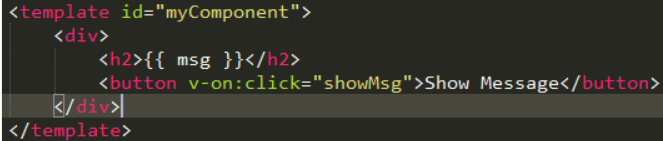
<template id="myComponent">
<div>
<h2>{{ msg }}</h2>
<button v-on:click="showMsg">Show Message</button>
</div>
</template>
<script src="js/vue.js"></script>
<script>
new Vue({
el: '#app',
components: {
'my-component': {
template: '#myComponent',
data: function() {
return {
msg: 'This is a component!'
}
},
methods: {
showMsg: function() {
alert(this.msg)
}
}
}
}
})这段代码定义了一个my-component组件,<my-component><my-component>不是标准的HTML元素,浏览器是不理解这个元素的。
那么Vue是如何让浏览器理解<my-component><my-component>标签的呢?下图供参考
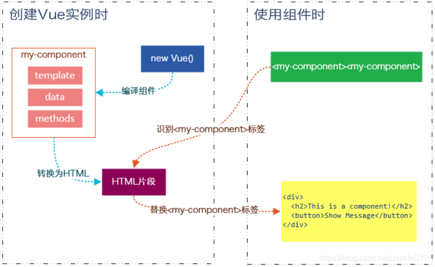
在创建一个Vue实例时,除了将它挂载到某个HTML元素下,还要编译组件,将组件转换为HTML片段。
除此之外,Vue实例还会识别其所挂载的元素下的<my-component>标签,然后将<my-component>标签替换为HTML片段。实际上浏览器仍然是不理解<my-component>标签的,我们可以通过查看源码了解到这一点。
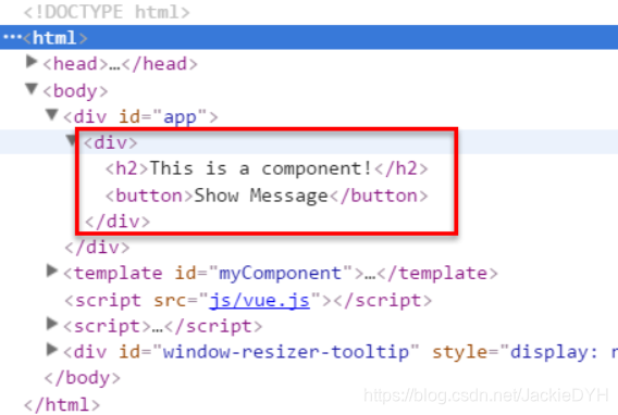
组件在使用前,经过编译已经被转换为HTML片段了,组件是有一个作用域的,那么组件的作用域是什么呢?
你可以将它理解为组件模板包含的HTML片段,组件模板内容之外就不是组件的作用域了。
例如,my-component组件的作用域只是下面这个小片段
组件的模板是在其作用域内编译的,那么组件选项对象中的数据也应该是在组件模板中使用的。
考虑下面的代码,在Vue实例和组件的data选项中分别追加一个display属性
new Vue({
	el: '#app',
	data: {
		display: true
	},
	components: {
		'my-component': {
			template: '#myComponent',
			data: function() {
				return {
					msg: 'This is a component!',
					display: false
				}
			},
			methods: {
				showMsg: function() {
					alert(this.msg)
				}
			}
		}
	}
})
然后在my-component标签上使用指令
v-show="display",这个display数据是来源于Vue实例,还是my-component组件呢?
<div id="app">
	<my-component v-show="display">
	</my-component>
</div>
答案是Vue实例。
至此,我们应该认识到组件的作用域是独立的:
父组件模板的内容在父组件作用域内编译;子组件模板的内容在子组件作用域内编译
通俗地讲,在子组件中定义的数据,只能用在子组件的模板。在父组件中定义的数据,只能用在父组件的模板。如果父组件的数据要在子组件中使用,则需要子组件定义props。
使用Slot
为了让组件可以组合,我们需要一种方式来混合父组件的内容与子组件自己的模板。这个处理称为内容分发,Vue.js 实现了一个内容分发 API,使用特殊的 <slot> 元素作为原始内容的插槽。
如果不理解这段话,可以先跳过,你只要知道<slot>元素是一个内容插槽
单个Slot
下面的代码在定义my-component组件的模板时,指定了一个<slot></slot>元素。
<div id="app">
	<my-component>
		<h1>Hello Vue.js!</h1>
	</my-component>

	<my-component>
	</my-component>
</div>
<template id="myComponent">
	<div class="content">
		<h2>This is a component!</h2>
		<slot>如果没有分发内容,则显示slot中的内容</slot>
		<p>Say something...</p>
	</div>
</template>
<script src="js/vue.js"></script>
<script>
	Vue.component('my-component', {
		template: '#myComponent'
	})

	new Vue({
		el: '#app'
	})
</script>
第一个<my-component>标签有一段分发内容
<h1>Hello Vue.js!</h1>,渲染组件时显示了这段内容
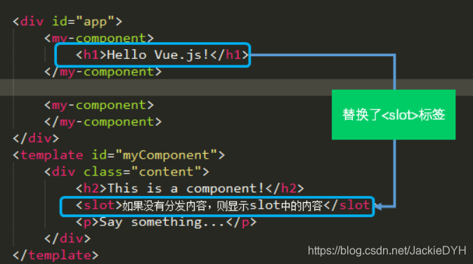
第二个<my-component>标签则没有,渲染组件时则显示了slot标签中的内容
<!DOCTYPE html>
<html>

	<head>
		<meta charset="UTF-8">
		<title></title>
		<style type="text/css">
			.content {
				margin: 30px auto;
				max-width: 480px;
				border: 1px solid #ccc;
			}

			#myComponent{
				display: none;
			}
		</style>
	</head>

	<body>

		<div id="app">
			<my-component>
				<h1>Hello Vue.js!</h1>
			</my-component>

			<my-component>
			</my-component>
		</div>
		<template id="myComponent">
			<div class="content">
				<h2>This is a component!</h2>
				<slot>如果没有分发内容,则显示slot中的内容</slot>
				<p>Say something...</p>
			</div>
		</template>
		<script src="js/vue.js"></script>
		<script>
			Vue.component('my-component', {
				template: '#myComponent'
			})

			new Vue({
				el: '#app'
			})
		</script>
	</body>

</html>
指定名称的slot
上面这个示例是一个匿名slot,它只能表示一个插槽。如果需要多个内容插槽,则可以为slot元素指定name属性。
多个slot一起使用时,会非常有用。例如,对话框是HTML常用的一种交互方式。
在不同的运用场景下,对话框的头部、主体内容、底部可能是不一样的。

这时,使用不同名称的slot就能轻易解决这个问题了
<template id="dialog-template">
	<div class="dialogs">
		<div class="dialog" v-bind:class="{ 'dialog-active': show }">
			<div class="dialog-content">
				<div class="close rotate">
					<span class="iconfont icon-close" @click="close"></span>
				</div>
				<slot name="header"></slot>
				<slot name="body"></slot>
				<slot name="footer"></slot>
			</div>
		</div>
		<div class="dialog-overlay"></div>
	</div>
</template>

<script src="js/vue.js"></script>
<script>
	Vue.component('modal-dialog', {
		template: '#dialog-template',
		props: ['show'],
		methods: {
			close: function() {
				this.show = false
			}
		}
	})

	new Vue({
		el: '#app',
		data: {
			show: false
		},
		methods: {
			openDialog: function() {
				this.show = true
			},
			closeDialog: function() {
				this.show = false
			}
		}
	})
</script>
在定义modal-dialog组件的template时,我们使用了3个slot,它们的name特性分别是header、body和footer。
在<modal-dialog>标签下,分别为三个元素指定slot特性:
<div id="app">
	<modal-dialog v-bind:show.sync="show">

		<header class="dialog-header" slot="header">
			<h1 class="dialog-title">提示信息</h1>
		</header>

		<div class="dialog-body" slot="body">
			<p>你想在对话框中放什么内容都可以!</p>
			<p>你可以放一段文字,也可以放一些表单,或者是一些图片。</p>
		</div>

		<footer class="dialog-footer" slot="footer">
			<button class="btn" @click="closeDialog">关闭</button>
		</footer>
	</modal-dialog>

	<button class="btn btn-open" @click="openDialog">打开对话框</button>
</div>
对话框的标题内容、主体内容、底部内容,完全由我们自定义,而且这些内容就是一些简单的HTML元素!
<!DOCTYPE html>
<html>

	<head>
		<meta charset="UTF-8">
		<title></title>
		<link rel="stylesheet" href="fonts/iconfont.css" />
		<style>
			* {
				font-family: simhei, Helvetica, Arial, sans-serif;
			}

			#dialog-template{
				display: none;
			}

			.btn {
				display: inline-block;
				border: 0;
				box-sizing: border-box;
				background: #cb4a70;
				color: #fff;
				font-size: 1.5em;
				border-radius: .1em;
				line-height: 2em;
				padding: 0 1em;
				transition: .4s ease-out;
				border: 1px solid #cb4a70;
				outline: 0;
				text-decoration: none;
			}

			.btn:hover,
			.btn:focus {
				background: #fff;
				color: #cb4a70;
				cursor: pointer;
				transition: .15s ease-in;
			}

			.btn-open {
				position: absolute;
				top: 50%;
				left: 50%;
				-webkit-transform: translate(-50%, -50%);
				-ms-transform: translate(-50%, -50%);
				-o-transform: translate(-50%, -50%);
				transform: translate(-50%, -50%);
			}

			.dialog {
				width: 480px;
				position: fixed;
				left: 50%;
				top: 2em;
				transform: translateX(-50%);
				z-index: 2000;
				visibility: hidden;
				backface-visibility: hidden;
				perspective: 1300px;
			}

			.dialog-active {
				visibility: visible;
			}

			.dialog-active .dialog-content {
				position: relative;
				opacity: 1;
				transform: rotateY(0);
			}

			.dialog-active ~ .dialog-overlay {
				opacity: 1;
				visibility: visible;
			}

			.dialog-content {
				border-radius: 3px;
				background: #fff;
				overflow: hidden;
				box-shadow: 0 10px 20px rgba(0, 0, 0, 0.1);
				transition: .5s ease-in-out;
				opacity: 0;
				transform-style: preserve-3d;
				transform: rotateY(-70deg);
			}

			.dialog-header {
				background: #cb4a70;
				color: #fff;
			}

			.dialog-title {
				margin: 0;
				font-size: 2em;
				text-align: center;
				font-weight: 200;
				line-height: 2em;
			}

			.dialog-body {
				padding: 2em;
			}

			.dialog-footer {
				margin: 0 2em;
				padding: 2em 0;
				text-align: right;
				border-top: 1px solid rgba(0, 0, 0, 0.1);
			}

			.dialog-overlay {
				content: "";
				position: fixed;
				visibility: hidden;
				top: 0;
				left: 0;
				right: 0;
				bottom: 0;
				z-index: 1000;
				opacity: 0;
				background: rgba(0, 0, 0, 0.5);
				transition: all .6s;
			}

			.close {
				display: inline-block;
				width: 2rem;
				height: 2rem;
				position: absolute;
				top: .5rem;
				right: .5rem;
				transition: .8s ease all;
				-moz-transition: .8s ease all;
				-webkit-transition: .8s ease all;
				border: none;
				border-radius: 3px;
				color: #333;
				text-decoration: none;
				box-sizing: border-box;
				-webkit-box-sizing: border-box;
			}

			.close:hover {
				transition: .8s ease all;
				-moz-transition: .8s ease all;
				-webkit-transition: .8s ease all;
			}

			.close .iconfont {
				font-size: 2rem;
				color: #fff;
			}

			.rotate {
				cursor: pointer;
			}

			.rotate:hover {
				transform: rotate(360deg);
				-moz-transform: rotate(360deg);
				-webkit-transform: rotate(360deg);
				transition: transform 1.0s ease all;
				-moz-transition: -moz-transform 1.0s ease all;
				-webkit-transition: -webkit-transform 1.0s ease all;
			}
		</style>
	</head>

	<body>
		<div id="app">
			<modal-dialog v-bind:show.sync="show">

				<header class="dialog-header" slot="header">
					<h1 class="dialog-title">提示信息</h1>
				</header>

				<div class="dialog-body" slot="body">
					<p>你想在对话框中放什么内容都可以!</p>
					<p>你可以放一段文字,也可以放一些表单,或者是一些图片。</p>
				</div>

				<footer class="dialog-footer" slot="footer">
					<button class="btn" @click="closeDialog">关闭</button>
				</footer>
			</modal-dialog>

			<button class="btn btn-open" @click="openDialog">打开对话框</button>
		</div>

		<template id="dialog-template">
			<div class="dialogs">
				<div class="dialog" v-bind:class="{ 'dialog-active': show }">
					<div class="dialog-content">
						<div class="close rotate">
							<span class="iconfont icon-close" @click="close"></span>
						</div>
						<slot name="header"></slot>
						<slot name="body"></slot>
						<slot name="footer"></slot>
					</div>
				</div>
				<div class="dialog-overlay"></div>
			</div>
		</template>

		<script src="js/vue.js"></script>
		<script>
			Vue.component('modal-dialog', {
				template: '#dialog-template',
				props: ['show'],
				methods: {
					close: function() {
						this.show = false
					}
				}
			})

			new Vue({
				el: '#app',
				data: {
					show: false
				},
				methods: {
					openDialog: function() {
						this.show = true
					},
					closeDialog: function() {
						this.show = false
					}
				}
			})
		</script>
	</body>

</html>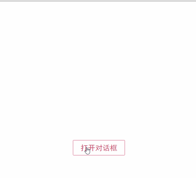
如果需要定制对话框的样式,我们只需要在<modal-dialog>上追加一个v-bind指令,让它绑定一个class
<modal-dialog v-bind:show.sync="show" v-bind:class="dialogClass">然后修改一下Vue实例,在data选项中追加一个dialogClass属性,然后修改openDialog()方法
new Vue({
	el: '#app',
	data: {
		show: false,
		dialogClass: 'dialog-info'
	},
	methods: {
		openDialog: function(dialogClass) {
			this.show = true
			this.dialogClass = dialogClass
		},
		closeDialog: function() {
			this.show = false
		}
	}
})
<!DOCTYPE html>
<html>
<head>
<meta charset="UTF-8">
<title></title>
<link rel="stylesheet" href="fonts/iconfont.css" />
<style>
* {
font-family: simhei, Helvetica, Arial, sans-serif;
}
#dialog-template{
display: none;
}
button {
display: inline-block;
border: 0;
box-sizing: border-box;
color: #fff;
font-size: 1em;
border-radius: .1em;
line-height: 2em;
padding: 0 1em;
transition: .4s ease-out;
outline: 0;
text-decoration: none;
}
button:hover,
button:focus {
opacity: 0.5;
cursor: pointer;
transition: .15s ease-in;
}
.btn-group{
margin: 200px auto;
width: 640px;
}
.btn-info{
background: #0090d3;
}
.btn-success{
background: #00cc66;
}
.btn-warning{
background: #f0ad4e;
}
.btn-error{
background: #d9534f;
}
.dialog {
width: 480px;
position: fixed;
left: 50%;
top: 2em;
transform: translateX(-50%);
z-index: 2000;
visibility: hidden;
backface-visibility: hidden;
perspective: 1300px;
}
.dialog-active {
visibility: visible;
}
.dialog-active .dialog-content {
position: relative;
opacity: 1;
transform: rotateY(0);
}
.dialog-active ~ .dialog-overlay {
opacity: 1;
visibility: visible;
}
.dialog-content {
border-radius: 3px;
background: #fff;
overflow: hidden;
box-shadow: 0 10px 20px rgba(0, 0, 0, 0.1);
transition: .5s ease-in-out;
opacity: 0;
transform-style: preserve-3d;
transform: rotateY(-70deg);
}
.dialog-header {
color: #fff;
}
.dialog-title {
margin: 0;
font-size: 2em;
text-align: center;
font-weight: 200;
line-height: 2em;
}
.dialog-body {
padding: 2em;
}
.dialog-footer {
margin: 0 2em;
padding: 2em 0;
text-align: right;
border-top: 1px solid rgba(0, 0, 0, 0.1);
}
.dialog-overlay {
content: "";
position: fixed;
visibility: hidden;
top: 0;
left: 0;
right: 0;
bottom: 0;
z-index: 1000;
opacity: 0;
background: rgba(0, 0, 0, 0.5);
transition: all .6s;
}
.dialog-info .dialog-header,.dialog-info button {
background-color: #0090d3;
}
.dialog-success .dialog-header,.dialog-success button {
background-color: #00cc66;
}
.dialog-warning .dialog-header,.dialog-warning button {
background-color: #f0ad4e;
}
.dialog-error .dialog-header,.dialog-error button {
background-color: #d9534f;
}
.close {
display: inline-block;
width: 2rem;
height: 2rem;
position: absolute;
top: .5rem;
right: .5rem;
transition: .8s ease all;
-moz-transition: .8s ease all;
-webkit-transition: .8s ease all;
border: none;
border-radius: 3px;
color: #333;
text-decoration: none;
box-sizing: border-box;
-webkit-box-sizing: border-box;
}
.close:hover {
transition: .8s ease all;
-moz-transition: .8s ease all;
-webkit-transition: .8s ease all;
}
.close .iconfont {
font-size: 2rem;
color: #fff;
}
.rotate {
cursor: pointer;
}
.rotate:hover {
transform: rotate(360deg);
-moz-transform: rotate(360deg);
-webkit-transform: rotate(360deg);
transition: transform 1.0s ease all;
-moz-transition: -moz-transform 1.0s ease all;
-webkit-transition: -webkit-transform 1.0s ease all;
}
</style>
</head>
<body>
<div id="app">
<modal-dialog v-bind:show.sync="show" v-bind:class="dialogClass">
<header class="dialog-header" slot="header">
<h1 class="dialog-title">提示信息</h1>
</header>
<div class="dialog-body" slot="body">
<p>你想在对话框中放什么内容都可以!</p>
<p>你可以放一段文字,也可以放一些表单,或者是一些图片。</p>
</div>
<footer class="dialog-footer" slot="footer">
<button @click="closeDialog">关闭</button>
</footer>
</modal-dialog>
<div class="btn-group">
<button class="btn-info" @click="openDialog('dialog-info')">提示信息对话框</button>
<button class="btn-success" @click="openDialog('dialog-success')">提示成功对话框</button>
<button class="btn-warning" @click="openDialog('dialog-warning')">提示警告对话框</button>
<button class="btn-error" @click="openDialog('dialog-error')">提示错误对话框</button>
</div>
</div>
<template id="dialog-template">
<div class="dialogs">
<div class="dialog" v-bind:class="{ 'dialog-active': show }">
<div class="dialog-content">
<div class="close rotate">
<span class="iconfont icon-close" @click="close"></span>
</div>
<slot name="header"></slot>
<slot name="body"></slot>
<slot name="footer"></slot>
</div>
</div>
<div class="dialog-overlay"></div>
</div>
</template>
<script src="js/vue.js"></script>
<script>
Vue.component('modal-dialog', {
template: '#dialog-template',
props: ['show'],
methods: {
close: function() {
this.show = false
}
}
})
new Vue({
el: '#app',
data: {
show: false,
dialogClass: 'dialog-info'
},
methods: {
openDialog: function(dialogClass) {
this.show = true
this.dialogClass = dialogClass
},
closeDialog: function() {
this.show = false
}
}
})
</script>
</body>
</html>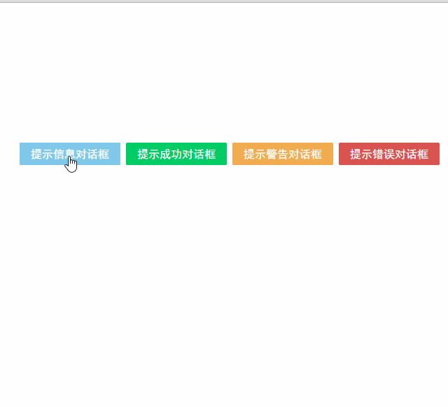
虽然我们在modal-dialog组件中定义了3个slot,但是在页面中使用它时,并不用每次都指定这3个slot。
比如,有时候我们可能只需要header和body:
<modal-dialog v-bind:show.sync="show" v-bind:class="dialogClass">
	<header class="dialog-header" slot="header">
		<h1 class="dialog-title">提示信息</h1>
	</header>

	<div class="dialog-body" slot="body">
		<p>你想在对话框中放什么内容都可以!</p>
		<p>你可以放一段文字,也可以放一些表单,或者是一些图片。</p>
	</div>
</modal-dialog>
现在看到的对话框是没有底部的,只有标题和主体内容
<!DOCTYPE html>
<html>

	<head>
		<meta charset="UTF-8">
		<title></title>
		<link rel="stylesheet" href="fonts/iconfont.css" />
		<style>
			* {
				font-family: simhei, Helvetica, Arial, sans-serif;
			}

			#dialog-template{
				display: none;
			}

			button {
				display: inline-block;
				border: 0;
				box-sizing: border-box;
				color: #fff;
				font-size: 1em;
				border-radius: .1em;
				line-height: 2em;
				padding: 0 1em;
				transition: .4s ease-out;
				outline: 0;
				text-decoration: none;
			}

			button:hover,
			button:focus {
				opacity: 0.5;
				cursor: pointer;
				transition: .15s ease-in;
			}

			.btn-group{
				margin: 200px auto;
				width: 640px;
			}

			.btn-info{
				background: #0090d3;
			}

			.btn-success{
				background: #00cc66;
			}

			.btn-warning{
				background: #f0ad4e;
			}

			.btn-error{
				background: #d9534f;
			}

			.dialog {
				width: 480px;
				position: fixed;
				left: 50%;
				top: 2em;
				transform: translateX(-50%);
				z-index: 2000;
				visibility: hidden;
				backface-visibility: hidden;
				perspective: 1300px;
			}

			.dialog-active {
				visibility: visible;
			}

			.dialog-active .dialog-content {
				position: relative;
				opacity: 1;
				transform: rotateY(0);
			}

			.dialog-active ~ .dialog-overlay {
				opacity: 1;
				visibility: visible;
			}

			.dialog-content {
				border-radius: 3px;
				background: #fff;
				overflow: hidden;
				box-shadow: 0 10px 20px rgba(0, 0, 0, 0.1);
				transition: .5s ease-in-out;
				opacity: 0;
				transform-style: preserve-3d;
				transform: rotateY(-70deg);
			}

			.dialog-header {
				color: #fff;
			}

			.dialog-title {
				margin: 0;
				font-size: 2em;
				text-align: center;
				font-weight: 200;
				line-height: 2em;
			}

			.dialog-body {
				padding: 2em;
			}

			.dialog-footer {
				margin: 0 2em;
				padding: 2em 0;
				text-align: right;
				border-top: 1px solid rgba(0, 0, 0, 0.1);
			}

			.dialog-overlay {
				content: "";
				position: fixed;
				visibility: hidden;
				top: 0;
				left: 0;
				right: 0;
				bottom: 0;
				z-index: 1000;
				opacity: 0;
				background: rgba(0, 0, 0, 0.5);
				transition: all .6s;
			}

			.dialog-info .dialog-header,.dialog-info button {
				background-color: #0090d3;
			}

			.dialog-success .dialog-header,.dialog-success button {
				background-color: #00cc66;
			}

			.dialog-warning .dialog-header,.dialog-warning button {
				background-color: #f0ad4e;
			}

			.dialog-error .dialog-header,.dialog-error button {
				background-color: #d9534f;
			}

			.close {
				display: inline-block;
				width: 2rem;
				height: 2rem;
				position: absolute;
				top: .5rem;
				right: .5rem;
				transition: .8s ease all;
				-moz-transition: .8s ease all;
				-webkit-transition: .8s ease all;
				border: none;
				border-radius: 3px;
				color: #333;
				text-decoration: none;
				box-sizing: border-box;
				-webkit-box-sizing: border-box;
			}

			.close:hover {
				transition: .8s ease all;
				-moz-transition: .8s ease all;
				-webkit-transition: .8s ease all;
			}

			.close .iconfont {
				font-size: 2rem;
				color: #fff;
			}

			.rotate {
				cursor: pointer;
			}

			.rotate:hover {
				transform: rotate(360deg);
				-moz-transform: rotate(360deg);
				-webkit-transform: rotate(360deg);
				transition: transform 1.0s ease all;
				-moz-transition: -moz-transform 1.0s ease all;
				-webkit-transition: -webkit-transform 1.0s ease all;
			}
		</style>
	</head>

	<body>
		<div id="app">
			<modal-dialog v-bind:show.sync="show" v-bind:class="dialogClass">

				<header class="dialog-header" slot="header">
					<h1 class="dialog-title">提示信息</h1>
				</header>

				<div class="dialog-body" slot="body">
					<p>你想在对话框中放什么内容都可以!</p>
					<p>你可以放一段文字,也可以放一些表单,或者是一些图片。</p>
				</div>

			</modal-dialog>

			<div class="btn-group">
				<button class="btn-info" @click="openDialog('dialog-info')">提示信息对话框</button>
				<button class="btn-success" @click="openDialog('dialog-success')">提示成功对话框</button>
				<button class="btn-warning" @click="openDialog('dialog-warning')">提示警告对话框</button>
				<button class="btn-error" @click="openDialog('dialog-error')">提示错误对话框</button>
			</div>

		</div>

		<template id="dialog-template">
			<div class="dialogs">
				<div class="dialog" v-bind:class="{ 'dialog-active': show }">
					<div class="dialog-content">
						<div class="close rotate">
							<span class="iconfont icon-close" @click="close"></span>
						</div>
						<slot name="header"></slot>
						<slot name="body"></slot>
						<slot name="footer"></slot>
					</div>
				</div>
				<div class="dialog-overlay"></div>
			</div>
		</template>

		<script src="js/vue.js"></script>
		<script>
			Vue.component('modal-dialog', {
				template: '#dialog-template',
				props: ['show'],
				methods: {
					close: function() {
						this.show = false
					}
				}
			})

			new Vue({
				el: '#app',
				data: {
					show: false,
					dialogClass: 'dialog-info'
				},
				methods: {
					openDialog: function(dialogClass) {
						this.show = true
						this.dialogClass = dialogClass
					},
					closeDialog: function() {
						this.show = false
					}
				}
			})
		</script>
	</body>

</html>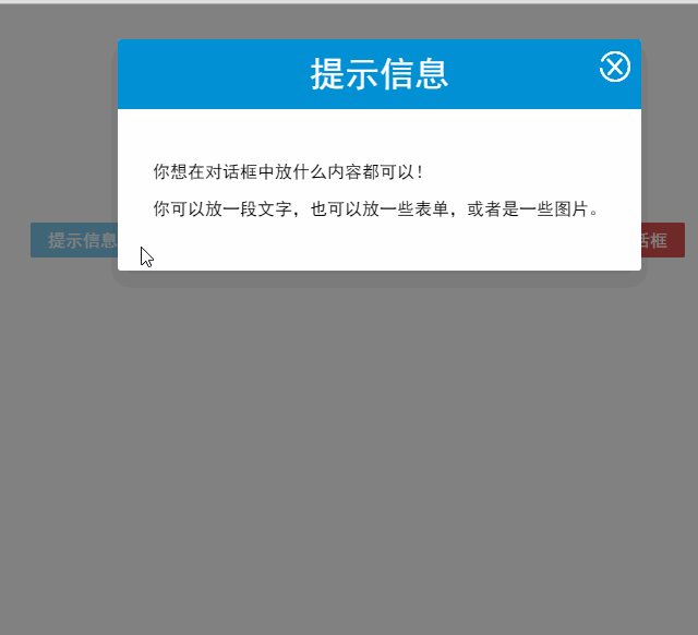
多个slot同时使用的场景还有很多,例如:用户的注册、登录、找回密码等这些表单集合,也可以用一个组件来完成
父子组件之间的访问
有时候我们需要父组件访问子组件,子组件访问父组件,或者是子组件访问根组件。
针对这几种情况,Vue.js都提供了相应的API:
- 父组件访问子组件:使用
$children或$refs- 子组件访问父组件:使用
$parent- 子组件访问根组件:使用
$root
$children示例
下面这段代码定义了3个组件:父组件parent-component,两个子组件child-component1和child-component2。
在父组件中,通过
this.$children可以访问子组件。this.$children是一个数组,它包含所有子组件的实例。
<div id="app">
	<parent-component></parent-component>
</div>

<template id="parent-component">
	<child-component1></child-component1>
	<child-component2></child-component2>
	<button v-on:click="showChildComponentData">显示子组件的数据</button>
</template>

<template id="child-component1">
	<h2>This is child component 1</h2>
</template>

<template id="child-component2">
	<h2>This is child component 2</h2>
</template>

<script src="js/vue.js"></script>
<script>
	Vue.component('parent-component', {
		template: '#parent-component',
		components: {
			'child-component1': {
				template: '#child-component1',
				data: function() {
					return {
						msg: 'child component 111111'
					}
				}
			},
			'child-component2': {
				template: '#child-component2',
				data: function() {
					return {
						msg: 'child component 222222'
					}
				}
			}
		},
		methods: {
			showChildComponentData: function() {
				for (var i = 0; i < this.$children.length; i++) {
					alert(this.$children[i].msg)
				}
			}
		}
	})

	new Vue({
		el: '#app'
	})
</script>
<!DOCTYPE html>
<html>
<head>
<meta charset="UTF-8">
<title></title>
<style>
#app{
max-width: 640px;
margin: 50px auto;
}
#parent-component, #child-component1, #child-component2{
display: none;
}
</style>
</head>
<body>
<div id="app">
<parent-component></parent-component>
</div>
<template id="parent-component">
<child-component1></child-component1>
<child-component2></child-component2>
<button v-on:click="showChildComponentData">显示子组件的数据</button>
</template>
<template id="child-component1">
<h2>This is child component 1</h2>
</template>
<template id="child-component2">
<h2>This is child component 2</h2>
</template>
<script src="js/vue.js"></script>
<script>
Vue.component('parent-component', {
template: '#parent-component',
components: {
'child-component1': {
template: '#child-component1',
data: function() {
return {
msg: 'child component 111111'
}
}
},
'child-component2': {
template: '#child-component2',
data: function() {
return {
msg: 'child component 222222'
}
}
}
},
methods: {
showChildComponentData: function() {
for (var i = 0; i < this.$children.length; i++) {
alert(this.$children[i].msg)
}
}
}
})
new Vue({
el: '#app'
})
</script>
</body>
</html>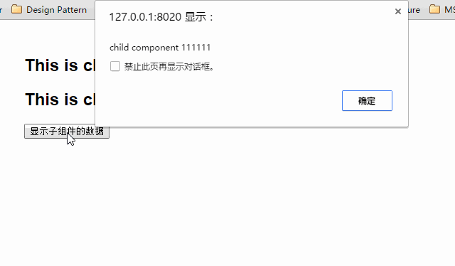
$refs示例
组件个数较多时,我们难以记住各个组件的顺序和位置,通过序号访问子组件不是很方便。
在子组件上使用v-ref指令,可以给子组件指定一个索引ID
<template id="parent-component">
	<child-component1 v-ref:cc1></child-component1>
	<child-component2 v-ref:cc2></child-component2>
	<button v-on:click="showChildComponentData">显示子组件的数据</button>
</template>在父组件中,则通过$refs.索引ID访问子组件的实例:
showChildComponentData: function() {
	alert(this.$refs.cc1.msg);
	alert(this.$refs.cc2.msg);
}
$parent示例
下面这段代码定义了两个组件:child-component和它的父组件parent-component。
在子组件中,通过this.$parent可以访问到父组件的实例
<!DOCTYPE html>
<html>

	<head>
		<meta charset="UTF-8">
		<title></title>
		<style>
			#app {
				max-width: 640px;
				margin: 50px auto;
			}

			#parent-component, #child-component{
				display: none;
			}
		</style>
	</head>

	<body>

		<div id="app">
			<parent-component></parent-component>
		</div>

		<template id="parent-component">
			<child-component></child-component>
		</template>

		<template id="child-component">
			<h2>This is a child component</h2>
			<button v-on:click="showParentComponentData">显示父组件的数据</button>
		</template>

		<script src="js/vue.js"></script>
		<script>
			Vue.component('parent-component', {
				template: '#parent-component',
				components: {
					'child-component': {
						template: '#child-component',
						methods: {
							showParentComponentData: function() {
								alert(this.$parent.msg)
							}
						}
					}
				},
				data: function() {
					return {
						msg: 'parent component message'
					}
				}
			})
			new Vue({
				el: '#app'
			})
		</script>

	</body>

</html>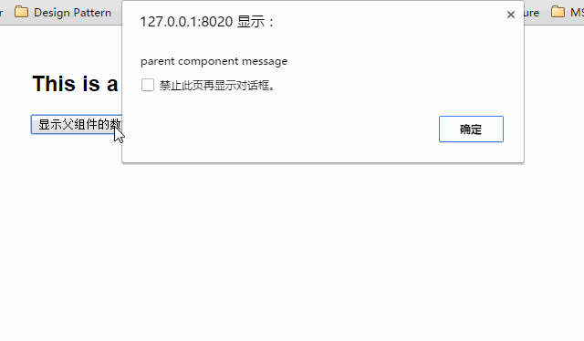
注意:尽管可以访问父链上任意的实例,不过子组件应当避免直接依赖父组件的数据,尽量显式地使用 props 传递数据。另外,在子组件中修改父组件的状态是非常糟糕的做法,因为:
1.这让父组件与子组件紧密地耦合;
2. 只看父组件,很难理解父组件的状态。因为它可能被任意子组件修改!理想情况下,只有组件自己能修改它的状态。
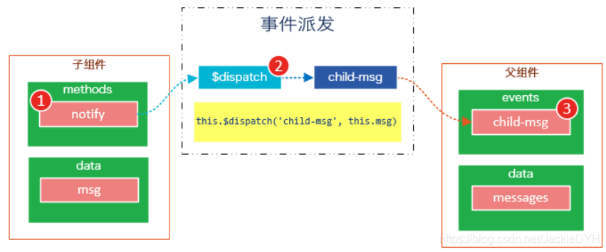
自定义事件
有时候我们希望触发父组件的某个事件时,可以通知到子组件;触发子组件的某个事件时,可以通知到父组件。
Vue 实例实现了一个自定义事件接口,用于在组件树中通信。这个事件系统独立于原生 DOM 事件,用法也不同。每个 Vue 实例都是一个事件触发器:
- 使用
$on()监听事件;- 使用
$emit()在它上面触发事件;- 使用
$dispatch()派发事件,事件沿着父链冒泡;- 使用
$broadcast()广播事件,事件向下传导给所有的后代。
派发事件
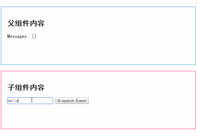
下面这段代码是一个简单的事件派发处理
<!DOCTYPE html>
<html>

	<head>
		<meta charset="UTF-8">
		<title></title>
		<style>
			* {
				font-family: simhei;
			}

			#app {
				max-width: 640px;
				margin: 50px auto;
			}

			#child-component{
				display: none;
			}

			.parent-content,
			.child-content {
				height: 150px;
				padding: 20px;
			}

			.parent-content {
				border: 1px solid #0090D3;
				margin-bottom: 20px;
			}

			.child-content {
				border: 1px solid #ff0066;
			}
		</style>
	</head>

	<body>

		<div id="app">
			<div class="parent-content">
				<h2>父组件内容</h2>
				<p>Messages: {{ messages | json }}</p>
			</div>

			<child-component></child-component>
		</div>

		<template id="child-component">
			<div class="child-content">
				<h2>子组件内容</h2>
				<input v-model="msg" />
				<button v-on:click="notify">Dispatch Event</button>
			</div>
		</template>

		<script src="js/vue.js"></script>
		<script>
			// 注册子组件
			Vue.component('child-component', {
				template: '#child-component',
				data: function() {
					return {
						msg: ''
					}
				},
				methods: {
					notify: function() {
						if (this.msg.trim()) {
							this.$dispatch('child-msg', this.msg)
							this.msg = ''
						}
					}
				}
			})

			// 初始化父组件
			new Vue({
				el: '#app',
				data: {
					messages: []
				},
				events: {
					'child-msg': function(msg) {
						this.messages.push(msg)
					}
				}
			})
		</script>
	</body>

</html>
我们将这个示例分为几个步骤解读:
- 子组件的button元素绑定了click事件,该事件指向
notify方法- 子组件的
notify方法在处理时,调用了$dispatch,将事件派发到父组件的child-msg事件,并给该该事件提供了一个msg参数- 父组件的events选项中定义了
child-msg事件,父组件接收到子组件的派发后,调用child-msg事件。
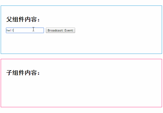
广播事件
下面这段代码是一个简单的事件广播处理
<!DOCTYPE html>
<html>

	<head>
		<meta charset="UTF-8">
		<title></title>
		<style>

			*{
				font-family: simhei;
			}
			#app {
				max-width: 640px;
				margin: 50px auto;
			}

			#child-component{
				display: none;
			}

			.parent-content,
			.child-content {
				height: 150px;
				padding: 20px;
			}

			.parent-content {
				border: 1px solid #0090D3;
				margin-bottom: 20px;
			}

			.child-content {
				border: 1px solid #ff0066;
			}
		</style>
	</head>

	<body>

		<div id="app">
			<div class="parent-content">
				<h2>父组件内容:</h2>
				<input v-model="msg" />
				<button v-on:click="notify">Broadcast Event</button>
			</div>

			<child-component></child-component>
		</div>

		<template id="child-component">
			<div class="child-content">
				<h2>子组件内容:</h2>
				<ul>
					<li v-for="item in messages">
						父组件录入了信息:{{ item }}
					</li>
				</ul>
			</div>

		</template>

		<script src="js/vue.js"></script>
		<script>
			// 注册子组件
			Vue.component('child-component', {
					template: '#child-component',
					data: function() {
						return {
							messages: []
						}
					},
					events: {
						'parent-msg': function(msg) {
							this.messages.push(msg)
						}
					}
				})
				// 初始化父组件
			new Vue({
				el: '#app',
				data: {
					msg: ''
				},
				methods: {
					notify: function() {
						if (this.msg.trim()) {
							this.$broadcast('parent-msg', this.msg)
						}
					}
				}
			})
		</script>
	</body>

</html>
我们将这个示例分为几个步骤解读:
- 父组件的button元素绑定了click事件,该事件指向
notify方法- 父组件的
notify方法在处理时,调用了$broadcast,将事件派发到子组件的parent-msg事件,并给该该事件提供了一个msg参数- 子组件的events选项中定义了
parent-msg事件,子组件接收到父组件的广播后,调用parent-msg事件

CURD示例
Vue.js组件的API来源于三部分——prop,slot和事件。
- prop 允许外部环境传递数据给组件;
- 事件 允许组件触发外部环境的 action;
- slot 允许外部环境插入内容到组件的视图结构内。
至此,这三部分我都已经介绍完了,接下来我就用这些知识来教大家一步一步完成一个CURD示例
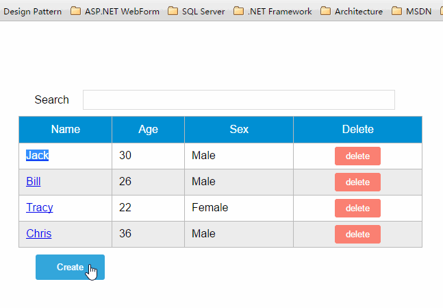
第1步——创建表格组件,添加查询和删除功能
创建表格组件,添加过滤,数据删除功能
<div id="app">
	<div class="container">
		<div class="form-group">
			<label>Search</label>
			<input type="text" class="search-input" v-model="searchQuery" />
		</div>

	</div>
	<div class="container">
		<simple-grid :data-list="people" :columns="columns" :search-key="searchQuery">
		</simple-grid>
	</div>
</div>

<template id="grid-template">
	<table>
		<thead>
			<tr>
				<th v-for="col in columns">
					{{ col.name | capitalize}}
				</th>
				<th>
					Delete
				</th>
			</tr>
		</thead>
		<tbody>
			<tr v-for="(index,entry) in dataList | filterBy searchKey">
				<td v-for="col in columns">
					{{entry[col.name]}}
				</td>
				<td class="text-center">
					<button @click="deleteItem(index)">delete</button>
				</td>
			</tr>
		</tbody>
	</table>
</template>

<script src="../js/vue.js"></script>
<script>
	Vue.component('simple-grid', {
		template: '#grid-template',
		props: ['dataList', 'columns', 'searchKey'],
		methods: {
			deleteItem: function(index) {
				this.dataList.splice(index, 1);
			},
		}
	})

	var demo = new Vue({
		el: '#app',
		data: {
			searchQuery: '',
			columns: [{
				name: 'name'
			}, {
				name: 'age'
			}, {
				name: 'sex'
			}],
			people: [{
				name: 'Jack',
				age: 30,
				sex: 'Male'
			}, {
				name: 'Bill',
				age: 26,
				sex: 'Male'
			}, {
				name: 'Tracy',
				age: 22,
				sex: 'Female'
			}, {
				name: 'Chris',
				age: 36,
				sex: 'Male'
			}]
		}
	})
</script>![20[3]](https://img-blog.csdnimg.cn/img_convert/928906e765b7a61bfe69c3b0999dfc56.gif)
<!DOCTYPE html>
<html>

	<head>
		<meta charset="UTF-8">
		<title></title>
		<link rel="stylesheet" href="style.css" />
		<style>
			/*
			 * 由于IE不支持<template>标签,所以template标签中的内容在IE下会直接显示出来。
			 * 将模板设为隐藏即可解决这个问题,template标签各浏览器支持请参考:http://caniuse.com/#feat=template
			 */
			#grid-template{
				display: none;
			}
		</style>
	</head>

	<body>
		<div id="app">
			<div class="container">
				<div class="form-group">
					<label>Search</label>
					<input type="text" class="search-input" v-model="searchQuery" />
				</div>

			</div>
			<div class="container">
				<simple-grid :data-list="people" :columns="columns" :search-key="searchQuery">
				</simple-grid>
			</div>
		</div>

		<template id="grid-template">
			<table>
				<thead>
					<tr>
						<th v-for="col in columns">
							{{ col.name | capitalize}}
						</th>
						<th>
							Delete
						</th>
					</tr>
				</thead>
				<tbody>
					<tr v-for="(index,entry) in dataList | filterBy searchKey">
						<td v-for="col in columns">
							{{entry[col.name]}}
						</td>
						<td class="text-center">
							<button class="btn-danger" @click="deleteItem(entry)">delete</button>
						</td>
					</tr>
				</tbody>
			</table>
		</template>

		<script src="../js/vue.js"></script>
		<script>
			Vue.component('simple-grid', {
				template: '#grid-template',
				props: ['dataList', 'columns', 'searchKey'],

				methods: {
					deleteItem: function(entry) {

						var data = this.dataList
						data.forEach(function(item, i){
							if(item === entry){
								data.splice(i, 1)
								return
							}
						})
					},
				}
			})

			var demo = new Vue({
				el: '#app',
				data: {
					searchQuery: '',
					columns: [{
						name: 'name'
					}, {
						name: 'age'
					}, {
						name: 'sex'
					}],
					people: [{
						name: 'Jack',
						age: 30,
						sex: 'Male'
					}, {
						name: 'Bill',
						age: 26,
						sex: 'Male'
					}, {
						name: 'Tracy',
						age: 22,
						sex: 'Female'
					}, {
						name: 'Chris',
						age: 36,
						sex: 'Male'
					}]
				}
			})
		</script>

	</body>

</html>
使用知识点
1. 使用Vue.component语法糖
Vue.component是创建并注册组件的语法糖,使用Vue.component注册的组件是全局的。
2. 使用prop将父组件数据传递给子组件
#app元素是父组件,simple-grid是子组件。
在simple-grid组件中定义选项
props: ['dataList', 'columns', 'searchKey']
在#app下使用<simple-grid :data-list="people" :columns="columns" :search-key="searchQuery">将数据传递给simple-grid组件3. 使用过滤器
{{ col.name | capitalize}}使用了capitalize过滤器,将字符串的首字母转换为大写后输出。filterBy filterKey使用了filterBy过滤器,根据指定条件过滤数组元素,filterBy返回过滤后的数组。4. 使用数组索引别名
数组默认的索引名称为
$index,v-for="(index,entry) in dataList使用了数组索引别名。
括号中的第一个参数index是$index的别名,第二个参数是遍历的数组元素。5. 使用了v-bind和v-on指令的缩写
<simple-grid :data-list="people" :columns="columns" :search-key="searchQuery">使用了v-bind指令的缩写。:data-list是v-bind:data-list的缩写,:columns是v-bind:columns的缩写,:search-key是v-bind:search-key的缩写。
<button @click="deleteItem(index)">delete</button>使用了v-on指令的缩写,@click是v-on:click的缩写。
第2步——创建对话框组件
表格数据的添加和修改,我们使用模态对话框来实现。
模态对话框有两种模式,新建模式和修改模式,分别用于新建一条数据和修改指定的数据。
由于对话框的内容来源于具体的数据,所以我们可以考虑将对话框作为simple-grid组件的一个子组件。modal-dialog组件的模板内容:
<template id="dialog-template">
	<div class="dialogs">
		<div class="dialog" v-bind:class="{ 'dialog-active': show }">
			<div class="dialog-content">
				<header class="dialog-header">
					<h1 class="dialog-title">{{ title }}</h1>
				</header>
				<footer class="dialog-footer">
					<div class="form-group">
						<label></label>
						<button v-on:click="save">Save</button>
						<button v-on:click="close">Close</button>
					</div>
				</footer>
			</div>
		</div>
		<div class="dialog-overlay"></div>
	</div>
</template>
modal-dialog组件在simple-grid组件中注册
Vue.component('simple-grid', {
	// ...已省略
	data: function() {
		return {
			mode: 0,
			item: {}
			titie: ''
		}
	},
	components: {
		'modal-dialog': {
			template: '#dialog-template',
			data: function() {
				return {
					// 对话框默认是不显示的
					show: false
				}
			},
			/*
			 * mode = 1是新增数据模式,mode = 2是修改数据模式
			 * title表示对话框的标题内容
			 * fields表示对话框要显示的数据字段数组
			 * item是由simple-dialog传下来,用于绑定表单字段的
			 */
			props: ['mode', 'title', 'fields', 'item'],
			methods: {
				close: function() {
					this.show = false
				},
				save: function() {

				}
			}
		}
	}
	// ...已省略
})
由于modal-dialog组件是simple-grid的子组件,所以它应该在simple-grid的template中使用
<template id="grid-template">
	<!--...前面的内容已省略	-->
	<modal-dialog :mode="mode" :title="title" :fields="columns" :item="item">
	</modal-dialog>
	<!--...后面的内容已省略	-->
</template>
modal-dialog组件的props选项,追加了3个元素:
- title表示对话框的标题内容
- fields表示对话框要显示的数据字段数组
- item用于绑定表单字段,它是一个对象
注意:由于modal-dialog是一个子组件,它仅用于simple-grid组件的新增或修改模式,所以modal-dialog的template没有使用<slot>元素
使用知识点
1. 使用组件的局部注册
modal-dialog组件没有使用Vue.component进行全局注册,使用simple-grid组件components选项实现了局部注册。
2. 使用组件的data选项
组件的data选项必须以函数的方式返回。
第3步——实现数据新建功能
<!DOCTYPE html>
<html>

	<head>
		<meta charset="UTF-8">
		<title></title>
		<link rel="stylesheet" href="style.css" />
		<style>
			/*
			 * 由于IE不支持<template>标签,所以template标签中的内容在IE下会直接显示出来。
			 * 将模板设为隐藏即可解决这个问题,template标签各浏览器支持请参考:http://caniuse.com/#feat=template
			 */
			#grid-template, #dialog-template{
				display: none;
			}
		</style>
	</head>

	<body>
		<div id="app">
			<div class="container">
				<div class="form-group">
					<label>Search</label>
					<input type="text" class="search-input" v-model="searchQuery" />
				</div>

			</div>
			<div class="container">
				<simple-grid :data-list="people" :columns="columns" :search-key="searchQuery">
				</simple-grid>
			</div>
		</div>

		<template id="grid-template">
			<table>
				<thead>
					<tr>
						<th v-for="col in columns">
							{{ col.name | capitalize}}
						</th>
						<th>
							Delete
						</th>
					</tr>
				</thead>
				<tbody>
					<tr v-for="(index,entry) in dataList | filterBy searchKey">
						<td v-for="col in columns">
							{{entry[col.name]}}
						</td>
						<td class="text-center">
							<button class="btn-danger" @click="deleteItem(entry)">delete</button>
						</td>
					</tr>
				</tbody>
			</table>
			<div class="container">
				<button @click="openNewItemDialog('Create New Item')">Create</button>
			</div>

			<modal-dialog :mode="mode" :title="title" :fields="columns" :item="item" v-on:create-item="createItem">
			</modal-dialog>

		</template>

		<template id="dialog-template">
			<div class="dialogs">
				<div class="dialog" v-bind:class="{ 'dialog-active': show }">
					<div class="dialog-content">
						<header class="dialog-header">
							<h1 class="dialog-title">{{ title }}</h1>
						</header>
						<div class="dialog-body">
							<div v-for="field in fields" class="form-group">
								<label>{{ field.name }}</label>
								<select v-if="field.dataSource" v-model="item[field.name]">
									<option v-for="opt in field.dataSource" :value="opt">{{ opt }}</option>
								</select>
								<input v-else type="text" v-model="item[field.name]">
							</div>
						</div>
						<footer class="dialog-footer">
							<div class="form-group">
								<label></label>
								<button class="btn-save" v-on:click="save">Save</button>
								<button class="btn-close" v-on:click="close">Close</button>
							</div>
						</footer>
					</div>
				</div>
				<div class="dialog-overlay"></div>
			</div>
		</template>

		<script src="../js/vue.js"></script>
		<script>
			Vue.component('simple-grid', {
				template: '#grid-template',
				data: function() {
					return {
						mode: 0,
						title: '',
						item: {}
					}
				},
				props: ['dataList', 'columns', 'searchKey'],
				methods: {

					openNewItemDialog: function(title) {
						// 对话框的标题
						this.title = title
							// mode = 1表示新建模式
						this.mode = 1
							// 初始化this.item
						this.item = {}
							// 广播事件,showDialog是modal-dialog组件的一个方法,传入参数true表示显示对话框
						this.$broadcast('showDialog', true)
					},
					createItem: function() {
						// 将item追加到dataList
						this.dataList.push(this.item)
							// 广播事件,传入参数false表示隐藏对话框
						this.$broadcast('showDialog', false)
							// 新建完数据后,重置item对象
						this.item = {}
					},
					deleteItem: function(entry) {
						var data = this.dataList
						data.forEach(function(item, i) {
							if(item === entry) {
								data.splice(i, 1)
								return
							}
						})
					}
				},
				components: {
					'modal-dialog': {
						template: '#dialog-template',
						data: function() {
							return {
								// 对话框默认是不显示的
								show: false
							}
						},
						/*
						 * mode = 1是新增数据模式,mode = 2是修改数据模式
						 * title表示对话框的标题内容
						 * fields表示对话框要显示的数据字段数组
						 * item是由simple-dialog传下来,用于绑定表单字段的
						 */
						props: ['mode', 'title', 'fields', 'item'],
						methods: {
							close: function() {
								this.show = false
							},
							save: function() {
								if (this.mode === 1) //新建模式
									this.$dispatch('create-item')
							}
						},
						events: {
							'showDialog': function(show) {
								this.show = show
							}
						}
					}
				}
			})

			var demo = new Vue({
				el: '#app',
				data: {
					searchQuery: '',
					columns: [{
						name: 'name',
						isKey: true
					}, {
						name: 'age'
					}, {
						name: 'sex',
						dataSource: ['Male', 'Female']
					}],
					people: [{
						name: 'Jack',
						age: 30,
						sex: 'Male'
					}, {
						name: 'Bill',
						age: 26,
						sex: 'Male'
					}, {
						name: 'Tracy',
						age: 22,
						sex: 'Female'
					}, {
						name: 'Chris',
						age: 36,
						sex: 'Male'
					}]
				}
			})
		</script>

	</body>

</html>
1. 修改Vue实例的data选项的columns:
var demo = new Vue({
	// ...已省略
	columns: [{
			name: 'name',
			isKey: true
		}, {
			name: 'age'
		}, {
			name: 'sex',
			dataSource: ['Male', 'Female']
		}]
	// ...已省略
})
为'name'列追加一个isKey属性,并设置为true,表示该列为主键列。
为'sex'列追加一个dataSoruce属性,并设置为['Male', 'Female'],表示新增或修改数据时选择性别的下拉框数据源。
2. 修改modal-dialog的template:
<template id="dialog-template">
	<div class="dialogs">
		<div class="dialog" v-bind:class="{ 'dialog-active': show }">
			<div class="dialog-content">
				<header class="dialog-header">
						<h1 class="dialog-title">{{ title }}</h1>
				</header>

				<div v-for="field in fields" class="form-group" >
						<label>{{ field.name }}</label>
						<select v-if="field.dataSource" v-model="item[field.name]">
							<option v-for="opt in field.dataSource" :value="opt">{{ opt }}</option>
						</select>
						<input v-else type="text" v-model="item[field.name]">
				</div>

				<footer class="form-group">
					<label></label>
					<button v-on:click="save">Save</button>
					<button v-on:click="close">Close</button>
				</footer>
			</div>
		</div>
		<div class="dialog-overlay"></div>
	</div>
</template>
在modal-dialog组件的模板中遍历fields,然后显示field的名称。
在渲染表单时,根据是否有dataSource判定表单是下拉框还是文本框。
(由于示例较为简陋,所以只提供了input和select两种表单类型)注意modal-dialog组件的fields是由Vue实例传递给simple-grid,然后再由simple-grid传递过来的。

3. 修改simple-grid的template
<template id="grid-template">
	<!--...已省略	-->
	<div class="container">
		<button class="btn" @click="openNewItemDialog('Create new item')">Create</button>
	</div>

	<modal-dialog :mode="mode" :title="title" :fields="columns" :item="item" v-on:create-item="createItem">
	</modal-dialog>
</template>
添加一个Create按钮,绑定click事件到
openNewItemDiaolog()方法,该方法用于打开modal-dialog组件,并将模式设置为新建模式。
在<modal-dialog>标签上给sample-grid绑定一个自定义事件create-item,后面在$dispatch派发事件时会用到。
4. 修改simple-grid的methods选项
Vue.component('simple-grid', {
	// ...已省略
	methods: {

		openNewItemDialog: function(title) {
			// 对话框的标题
			this.title = title
			// mode = 1表示新建模式
			this.mode = 1
			// 初始化this.item
			this.item = {}
			// 广播事件,showDialog是modal-dialog组件的一个方法,传入参数true表示显示对话框
			this.$broadcast('showDialog', true)
		},
		createItem: function() {
			// 将item追加到dataList
			this.dataList.push(this.item)
			// 广播事件,传入参数false表示隐藏对话框
			this.$broadcast('showDialog', false)
			// 新建完数据后,重置item对象
			this.item = {}
		},
		deleteItem: function(index) {
			this.dataList.splice(index, 1);
		},
	},
	// ...已省略
})
追加了两个方法:
opeNewItemDialog和createItem方法。
opeNewItemDialog方法用于打开对话框,this.$broadcast('showDialog', true)调用子组件modal-dialog的showDialog事件,传入参数true表示显示对话框。
createItem方法用于保存新建的数据,this.$broadcast('showDialog', false)调用子组件modal-dialog的showDialog事件,传入参数false表示隐藏对话框。
5. 修改modal-grid的methods和events选项
Vue.component('simple-grid', {
    // ...已省略
    components: {
        'modal-dialog': {
            // ...已省略
            methods: {
                close: function() {
                    this.show = false
                },
                save: function() {
                    //新建模式
                    if (this.mode === 1){
                        // 使用$dispatch调用simple-grid的create-item方法
                        this.$dispatch('create-item')
                    }
                }
            },
            events: {
                // 显示或隐藏对话框
                'showDialog': function(show) {
                    this.show = show
                }
            }
        }
    }
    // ...已省略
})
修改methods选项的
save方法,由于保存按钮是在子组件modal-dialog中的,而createItem方法是在父组件simple-grid中的,所以这里使用this.$dispatch('create-item')派发到父组件的自定义事件create-item。追加events选项,添加showDialog事件,用于显示或隐藏对话框。
请将4和5结合起来看,我们既用到了
$broadcast广播事件,又用到了$dispatch派发事件。
下面这幅图有助于理解simple-grid和modal-dialog组件之间的通信:

create-item是一个自定义事件,由子组件modal-dialog调用this.$dispatch('create-item')派发到自定义事件create-item,自定义事件create-item是绑定在父组件simple-grid上的,该事件会执行createItem方法。
第4步——实现数据修改功能
<!DOCTYPE html>
<html>
<head>
<meta charset="UTF-8">
<title></title>
<link rel="stylesheet" href="style.css" />
<style>
/*
* 由于IE不支持<template>标签,所以template标签中的内容在IE下会直接显示出来。
* 将模板设为隐藏即可解决这个问题,template标签各浏览器支持请参考:http://caniuse.com/#feat=template
*/
#grid-template,
#dialog-template {
display: none;
}
</style>
</head>
<body>
<div id="app">
<div class="container">
<div class="form-group">
<label>Search</label>
<input type="text" class="search-input" v-model="searchQuery" />
</div>
</div>
<div class="container">
<simple-grid :data-list="people" :columns="columns" :search-key="searchQuery">
</simple-grid>
</div>
</div>
<template id="grid-template">
<table>
<thead>
<tr>
<th v-for="col in columns">
{{ col.name | capitalize}}
</th>
<th>
Delete
</th>
</tr>
</thead>
<tbody>
<tr v-for="(index,entry) in dataList | filterBy searchKey">
<td v-for="col in columns">
<span v-if="col.isKey"><a href="javascript:void(0)" @click="openEditItemDialog(entry[col.name])">{{entry[col.name]}}</a></span>
<span v-else>{{entry[col.name]}}</span>
</td>
<td class="text-center">
<button class="btn-danger" @click="deleteItem(entry)">delete</button>
</td>
</tr>
</tbody>
</table>
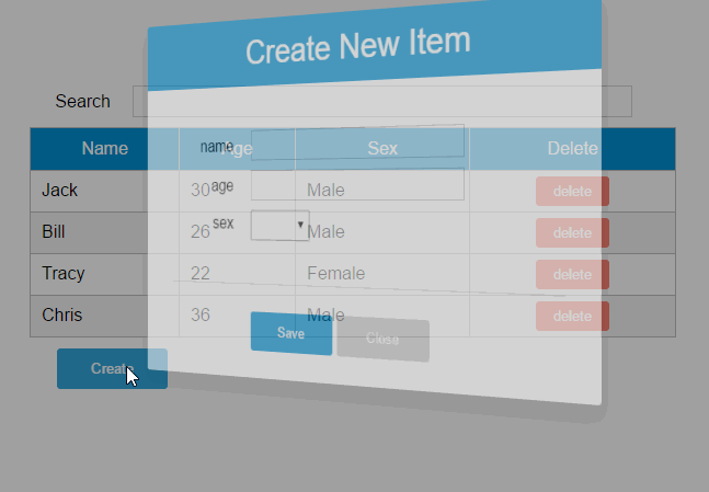
<div class="container">
<button @click="openNewItemDialog('Create New Item')">Create</button>
</div>
<modal-dialog :mode="mode" :title="title" :item="item" :fields="columns" v-on:create-item="createItem" v-on:update-item="updateItem">
</modal-dialog>
</template>
<template id="dialog-template">
<div class="dialogs">
<div class="dialog" v-bind:class="{ 'dialog-active': show }">
<div class="dialog-content">
<header class="dialog-header">
<h1 class="dialog-title">{{ title }}</h1>
</header>
<div class="dialog-body">
<div v-for="field in fields" class="form-group">
<label>{{ field.name }}</label>
<select v-if="field.dataSource" v-model="item[field.name]" :disabled="mode === 2 && field.isKey">
<option v-for="opt in field.dataSource" :value="opt">{{ opt }}</option>
</select>
<input v-else type="text" v-model="item[field.name]" :disabled="mode === 2 && field.isKey">
</div>
</div>
<footer class="dialog-footer">
<div class="form-group">
<label></label>
<button class="btn-save" v-on:click="save">Save</button>
<button class="btn-close" v-on:click="close">Close</button>
</div>
</footer>
</div>
</div>
<div class="dialog-overlay"></div>
</div>
</template>
<script src="../js/vue.js"></script>
<script>
Vue.component('simple-grid', {
template: '#grid-template',
props: ['dataList', 'columns', 'searchKey'],
data: function() {
return {
mode: 0,
title: '',
keyColumn: '',
item: {}
}
},
ready: function() {
for(var i = 0; i < this.columns.length; i++) {
if(this.columns[i].isKey) {
this.keyColumn = this.columns[i]['name']
break;
}
}
},
methods: {
openNewItemDialog: function(title) {
// 对话框的标题
this.title = title
// mode = 1表示新建模式
this.mode = 1
// 初始化this.item
this.item = {}
// 广播事件,showDialog是modal-dialog组件的一个方法,传入参数true表示显示对话框
this.$broadcast('showDialog', true)
},
openEditItemDialog: function(key) {
// 根据主键查找当前修改的数据
var currentItem = this.findItemByKey(key)
// 对话框的标题
this.title = 'Edit Item - ' + key
// mode = 2表示修改模式
this.mode = 2
// 初始化this.item
this.item = {}
// 将选中的数据拷贝到this.item
this.item = this.initItemForUpdate(currentItem)
// 广播事件,传入参数true表示显示对话框
this.$broadcast('showDialog', true)
},
// 弹出修改数据的对话框时,使用对象的深拷贝
initItemForUpdate: function(p) {
var c = c || {};
for(var i in p) {
// 属性i是否为p对象的自有属性
if(p.hasOwnProperty(i)) {
if(typeof p[i] === 'object') {
c[i] = Array.isArray(p[i]) ? [] : {}
deepCopy(p[i], c[i])
} else {
// 属性是基础类型时,直接拷贝
c[i] = p[i]
}
}
}
return c;
},
findItemByKey: function(key) {
var keyColumn = this.keyColumn
for(var i = 0; i < this.dataList.length; i++) {
if(this.dataList[i][keyColumn] === key) {
return this.dataList[i]
}
}
},
createItem: function() {
// 将item追加到dataList
this.dataList.push(this.item)
// 广播事件,传入参数false表示隐藏对话框
this.$broadcast('showDialog', false)
// 新建完数据后,重置item对象
this.item = {}
},
updateItem: function() {
// 获取主键列
var keyColumn = this.keyColumn
for(var i = 0; i < this.dataList.length; i++) {
// 根据主键查找要修改的数据,然后将this.item数据更新到this.dataList[i]
if(this.dataList[i][keyColumn] === this.item[keyColumn]) {
for(var j in this.item) {
this.dataList[i][j] = this.item[j]
}
break;
}
}
// 广播事件,传入参数false表示隐藏对话框
this.$broadcast('showDialog', false)
// 修改完数据后,重置item对象
this.item = {}
},
deleteItem: function(entry) {
var data = this.dataList
data.forEach(function(item, i) {
if(item === entry) {
data.splice(i, 1)
return
}
})
}
},
components: {
'modal-dialog': {
template: '#dialog-template',
data: function() {
return {
// 对话框默认是不显示的
show: false
}
},
/*
* mode = 1是新增数据模式,mode = 2是修改数据模式
* title表示对话框的标题内容
* fields表示对话框要显示的数据字段数组
* item是由simple-dialog传下来,用于绑定表单字段的
*/
props: ['mode', 'title', 'fields', 'item'],
methods: {
close: function() {
this.show = false
},
save: function() {
//新建模式
if(this.mode === 1) {
// 使用$dispatch调用simple-grid的create-item事件
this.$dispatch('create-item')
} else if(this.mode === 2) {
// 使用$dispatch调用simple-grid的update-item事件
this.$dispatch('update-item')
}
}
},
events: {
'showDialog': function(show) {
this.show = show
}
}
}
}
})
var demo = new Vue({
el: '#app',
data: {
searchQuery: '',
columns: [{
name: 'name',
isKey: true
}, {
name: 'age'
}, {
name: 'sex',
dataSource: ['Male', 'Female']
}],
people: [{
name: 'Jack',
age: 30,
sex: 'Male'
}, {
name: 'Bill',
age: 26,
sex: 'Male'
}, {
name: 'Tracy',
age: 22,
sex: 'Female'
}, {
name: 'Chris',
age: 36,
sex: 'Male'
}]
}
})
</script>
</body>
</html>1. 修改sample-grid的template
<template id="grid-template">
<!--...已省略-->
<tbody>
<tr v-for="(index,entry) in dataList | filterBy searchKey">
<td v-for="col in columns">
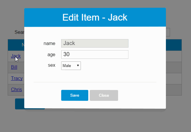
<span v-if="col.isKey"><a href="javascript:void(0)" @click="openEditItemDialog(index, 'Edit item ' + entry[col.name])">{{entry[col.name]}}</a></span>
<span v-else>{{entry[col.name]}}</span>
</td>
</tr>
</tbody>
<!--...已省略-->
<modal-dialog
:mode="mode"
:title="title"
:item="item"
:fields="columns"
v-on:create-item="createItem"
v-on:update-item="updateItem">
</modal-dialog>
</template>遍历列表数据时,使用v-if指令判断当前列是否为主键列,如果是主键列,则给主键列添加链接,然后给链接绑定click事件,click事件用于打开修改数据的对话框。
在<modal-dialog>标签上,给sample-grid绑定自定义事件update-item,update-item事件指向sample-grid的方法updateItem。
2. 修改modal-dialog的template
<div v-for="field in fields" class="form-group">
	<label>{{ field.name }}</label>
	<select v-if="field.dataSource" v-model="item[field.name]" :disabled="mode === 2 && field.isKey">
			<option v-for="opt in field.dataSource" :value="opt">{{ opt }}</option>
	</select>
	<input v-else type="text" v-model="item[field.name]" :disabled="mode === 2 && field.isKey">
</div>
在修改模式下(mode = 2),如果当前字段是主键字段,则禁止修改
3. 修改sample-grid的methods选项
// 弹出修改数据的对话框时,使用对象的深拷贝
initItemForUpdate: function(p) {
	var c = c || {};
	for (var i in p) {
		// 属性i是否为p对象的自有属性
		if (p.hasOwnProperty(i)) {
			if (typeof p[i] === 'object') {
				c[i] = Array.isArray(p[i]) ? [] : {}
				deepCopy(p[i], c[i])
			} else {
				// 属性是基础类型时,直接拷贝
				c[i] = p[i]
			}
		}
	}
	return c;
},
findItemByKey: function(key){
	var keyColumn = this.keyColumn
	for(var i = 0; i < this.dataList.length; i++){
		if(this.dataList[i][keyColumn] === key){
			return this.dataList[i]
		}
	}
},
createItem: function() {
	// 将item追加到dataList
	this.dataList.push(this.item)
	// 广播事件,传入参数false表示隐藏对话框
	this.$broadcast('showDialog', false)
	// 新建完数据后,重置item对象
	this.item = {}
},
updateItem: function() {
	// 获取主键列
	var keyColumn = this.keyColumn

	for (var i = 0; i < this.dataList.length; i++) {
		// 根据主键查找要修改的数据,然后将this.item数据更新到this.dataList[i]
		if (this.dataList[i][keyColumn] === this.item[keyColumn]) {
			for (var j in this.item) {
				this.dataList[i][j] = this.item[j]
			}
			break;
		}
	}
	// 广播事件,传入参数false表示隐藏对话框
	this.$broadcast('showDialog', false)
	// 修改完数据后,重置item对象
	this.item = {}
}
追加的内容:调用内置的ready()函数,openEditDialog、updateItem、findItemByKey和initItemForUpdate方法。
ready()函数会在编译结束和$el第一次插入文档之后调用,你可以将其理解为jQuery中的document.ready()。
在ready()函数中,初始化keyColumn,keyColumn表示主键列,调用updateItem方法时,会根据主键数据找到dataList中匹配的元素。
opeEditItemDialog方法用于打开对话框,this.$broadcast('showDialog', true)调用子组件modal-dialog的showDialog事件,传入参数true表示显示对话框。
ready()函数没有特别的业务逻辑,主要是获取主键列,调用updateItem方法时,会根据主键数据找到dataList中匹配的元素。
updateItem方法用于保存修改的数据,this.$broadcast('showDialog', false)调用子组件modal-dialog的showDialog事件,传入参数false表示隐藏对话框。
initItemForUpdate方法用于将选中的数据this.dataList[index]深拷贝到this.item。为什么要使用深拷贝呢?因为this.dataList[index]是一个引用对象,它有一些属性也是引用类型的,如果使用浅拷贝可能得到一些超出预期的效果。

4.修改modal-dialog的methods选项
save: function() {
	//新建模式
	if (this.mode === 1) {
		// 使用$dispatch调用simple-grid的create-item事件
		this.$dispatch('create-item')
	}else if(this.mode === 2){
		// 使用$dispatch调用simple-grid的update-item事件
		this.$dispatch('update-item')
	}
}
修改methods选项中的save方法,this.mode === 2时,将事件派发到父组件的
update-item事件。
第5步——修改数据新建功能
<!DOCTYPE html>
<html>

	<head>
		<meta charset="UTF-8">
		<title></title>
		<link rel="stylesheet" href="style.css" />
		<style>
			/*
			 * 由于IE不支持<template>标签,所以template标签中的内容在IE下会直接显示出来。
			 * 将模板设为隐藏即可解决这个问题,template标签各浏览器支持请参考:http://caniuse.com/#feat=template
			 */

			#grid-template,
			#dialog-template {
				display: none;
			}
		</style>
	</head>

	<body>
		<div id="app">
			<div class="container">
				<div class="form-group">
					<label>Search</label>
					<input type="text" class="search-input" v-model="searchQuery" />
				</div>

			</div>
			<div class="container">
				<simple-grid :data-list="people" :columns="columns" :search-key="searchQuery">
				</simple-grid>
			</div>
		</div>

		<template id="grid-template">
			<table>
				<thead>
					<tr>
						<th v-for="col in columns">
							{{ col.name | capitalize}}
						</th>
						<th>
							Delete
						</th>
					</tr>
				</thead>
				<tbody>
					<tr v-for="(index,entry) in dataList | filterBy searchKey">
						<td v-for="col in columns">
							<span v-if="col.isKey"><a href="javascript:void(0)" @click="openEditItemDialog(entry[col.name])">{{entry[col.name]}}</a></span>
							<span v-else>{{entry[col.name]}}</span>
						</td>
						<td class="text-center">
							<button class="btn-danger" @click="deleteItem(entry)">delete</button>
						</td>
					</tr>
				</tbody>
			</table>
			<div class="container">
				<button class="btn" @click="openNewItemDialog('Create New Item')">Create</button>
			</div>

			<modal-dialog :mode="mode" :title="title" :item="item" :fields="columns" v-on:create-item="createItem" v-on:update-item="updateItem">
			</modal-dialog>

		</template>

		<template id="dialog-template">
			<div class="dialogs">
				<div class="dialog" v-bind:class="{ 'dialog-active': show }">
					<div class="dialog-content">
						<header class="dialog-header">
							<h1 class="dialog-title">{{ title }}</h1>
						</header>
						<div class="dialog-body">
							<div v-for="field in fields" class="form-group">
								<label>{{ field.name }}</label>
								<select v-if="field.dataSource" v-model="item[field.name]" :disabled="mode === 2 && field.isKey">
									<option v-for="opt in field.dataSource" :value="opt">{{ opt }}</option>
								</select>
								<input v-else type="text" v-model="item[field.name]" :disabled="mode === 2 && field.isKey">
							</div>
						</div>
						<footer class="dialog-footer">
							<div class="form-group">
								<label></label>
								<button class="btn-save" v-on:click="save">Save</button>
								<button class="btn-close" v-on:click="close">Close</button>
							</div>
						</footer>
					</div>
				</div>
				<div class="dialog-overlay"></div>
			</div>
		</template>

		<script src="../js/vue.js"></script>
		<script>
			Vue.component('simple-grid', {
				template: '#grid-template',
				props: ['dataList', 'columns', 'searchKey'],
				data: function() {
					return {
						mode: 0,
						title: '',
						keyColumn: '',
						item: {}
					}
				},
				ready: function() {
					for(var i = 0; i < this.columns.length; i++) {
						if(this.columns[i].isKey) {
							this.keyColumn = this.columns[i]['name']
							break;
						}
					}
				},
				methods: {
					openNewItemDialog: function(title) {
						// 对话框的标题
						this.title = title
						// mode = 1表示新建模式
						this.mode = 1
						// 初始化this.item
						this.item = {}
						// 广播事件,showDialog是modal-dialog组件的一个方法,传入参数true表示显示对话框
						this.$broadcast('showDialog', true)
					},
					openEditItemDialog: function(key) {
						// 根据主键查找当前修改的数据
						var currentItem = this.findItemByKey(key)
						// 对话框的标题
						this.title = 'Edit Item - ' + key
						// mode = 2表示修改模式
						this.mode = 2
						// 将选中的数据拷贝到this.item
						this.item = this.initItemForUpdate(currentItem)
						// 广播事件,传入参数true表示显示对话框
						this.$broadcast('showDialog', true)
					},
					// 弹出修改数据的对话框时,使用对象的深拷贝
					initItemForUpdate(p, c) {
						c = c || {};
						for(var i in p) {
							// 属性i是否为p对象的自有属性
							if(p.hasOwnProperty(i)) {
								// 属性i是否为复杂类型
								if(typeof p[i] === 'object') {
									// 如果p[i]是数组,则创建一个新数组
									// 如果p[i]是普通对象,则创建一个新对象
									c[i] = Array.isArray(p[i]) ? [] : {};
									// 递归拷贝复杂类型的属性
									this.initItemForUpdate(p[i], c[i]);
								} else {
									// 属性是基础类型时,直接拷贝
									c[i] = p[i];
								}
							}
						}
						return c;
					},
					findItemByKey: function(key) {
						var keyColumn = this.keyColumn
						for(var i = 0; i < this.dataList.length; i++) {
							if(this.dataList[i][keyColumn] === key) {
								return this.dataList[i]
							}
						}
					},
					itemExists: function() {
						var keyColumn = this.keyColumn
						for(var i = 0; i < this.dataList.length; i++) {
							if(this.item[keyColumn] === this.dataList[i][keyColumn])
								return true;
						}
						return false;
					},
					createItem: function() {
						var keyColumn = this.keyColumn
						if(!this.itemExists()) {
							// 将item追加到dataList
							this.dataList.push(this.item)
							// 广播事件,传入参数false表示隐藏对话框
							this.$broadcast('showDialog', false)
							// 新建完数据后,重置item对象
							this.item = {}
						} else {
							alert(keyColumn + ' "' + this.item[keyColumn] + '" is already exists')
						}

					},
					updateItem: function() {

						// 获取主键列
						var keyColumn = this.keyColumn

						for(var i = 0; i < this.dataList.length; i++) {
							// 根据主键查找要修改的数据,然后将this.item数据更新到this.dataList[i]
							if(this.dataList[i][keyColumn] === this.item[keyColumn]) {
								for(var j in this.item) {
									this.dataList[i][j] = this.item[j]
								}
								break;
							}
						}
						// 广播事件,传入参数false表示隐藏对话框
						this.$broadcast('showDialog', false)
							// 修改完数据后,重置item对象
						this.item = {}
					},
					deleteItem: function(entry) {
						var data = this.dataList
						data.forEach(function(item, i) {
							if(item === entry) {
								data.splice(i, 1)
								return
							}
						})
					}
				},
				components: {
					'modal-dialog': {
						template: '#dialog-template',
						data: function() {
							return {
								// 对话框默认是不显示的
								show: false
							}
						},
						/*
						 * mode = 1是新增数据模式,mode = 2是修改数据模式
						 * title表示对话框的标题内容
						 * fields表示对话框要显示的数据字段数组
						 * item是由simple-dialog传下来,用于绑定表单字段的
						 */
						props: ['mode', 'title', 'fields', 'item'],
						methods: {
							close: function() {
								this.show = false
							},
							save: function() {
								if(this.mode === 1) {
									// 使用$dispatch调用simple-grid的create-item事件
									this.$dispatch('create-item')
								} else if(this.mode === 2) {
									// 使用$dispatch调用simple-grid的update-item事件
									this.$dispatch('update-item')
								}
							}
						},
						events: {
							'showDialog': function(show) {
								this.show = show
							}
						}
					}
				}
			})

			var demo = new Vue({
				el: '#app',
				data: {
					searchQuery: '',
					columns: [{
						name: 'name',
						isKey: true
					}, {
						name: 'age'
					}, {
						name: 'sex',
						dataSource: ['Male', 'Female']
					}],
					people: [{
						name: 'Jack',
						age: 30,
						sex: 'Male'
					}, {
						name: 'Bill',
						age: 26,
						sex: 'Male'
					}, {
						name: 'Tracy',
						age: 22,
						sex: 'Female'
					}, {
						name: 'Chris',
						age: 36,
						sex: 'Male'
					}]
				}
			})
		</script>

	</body>

</html>
修改sample-grid的methods选项,追加itemExists方法,然后修改createItem方法。
itemExists: function(keyColumn) {
	for (var i = 0; i < this.dataList.length; i++) {
		if (this.item[keyColumn] === this.dataList[i][keyColumn])
			return true;
	}
	return false;
},
createItem: function() {
	var keyColumn = this.getKeyColumn()
	if (!this.itemExists(keyColumn)) {
		// 将item追加到dataList
		this.dataList.push(this.item)
		// 广播事件,传入参数false表示隐藏对话框
		this.$broadcast('showDialog', false)
		// 新建完数据后,重置item对象
		this.item = {}
	} else {
		alert(keyColumn + ' "' + this.item[keyColumn] + '" is already exists')
	}

}
由于主键列数据是不能重复的,所以在新增数据时需要判断主键列数据是否已经存在
组件的API主要来源于以下三部分:
- prop 允许外部环境传递数据给组件;
- 事件 允许组件触发外部环境的 action;
- slot 允许外部环境插入内容到组件的视图结构内。

本文来自博客园,作者:JackieDYH,转载请注明原文链接:https://www.cnblogs.com/JackieDYH/p/17634389.html


【推荐】国内首个AI IDE,深度理解中文开发场景,立即下载体验Trae
【推荐】编程新体验,更懂你的AI,立即体验豆包MarsCode编程助手
【推荐】抖音旗下AI助手豆包,你的智能百科全书,全免费不限次数
【推荐】轻量又高性能的 SSH 工具 IShell:AI 加持,快人一步
· AI与.NET技术实操系列:基于图像分类模型对图像进行分类
· go语言实现终端里的倒计时
· 如何编写易于单元测试的代码
· 10年+ .NET Coder 心语,封装的思维:从隐藏、稳定开始理解其本质意义
· .NET Core 中如何实现缓存的预热?
· 分享一个免费、快速、无限量使用的满血 DeepSeek R1 模型,支持深度思考和联网搜索!
· 25岁的心里话
· 基于 Docker 搭建 FRP 内网穿透开源项目(很简单哒)
· ollama系列01:轻松3步本地部署deepseek,普通电脑可用
· 按钮权限的设计及实现