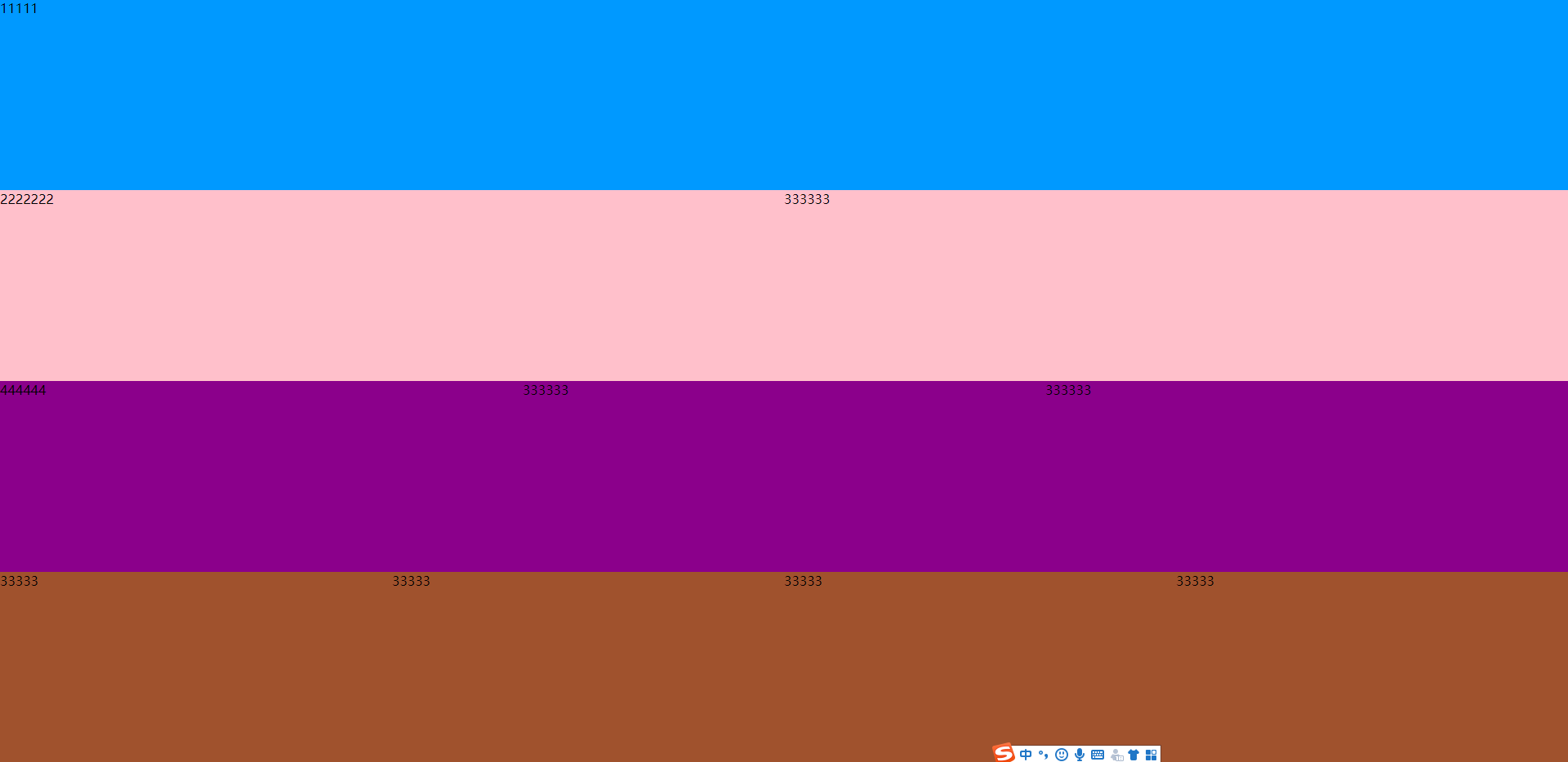
js一屏显示--动态分配每个区域的高度
在mouted中去获取页面的高度(clientHeight) 然后给每个区域动态分配值
对于页面一屏显示这个问题
你首先看看自己用的电脑的分辨率 用js动态获取
然后看看ui图是否是跟你的获取电脑的分辨率尺寸一致
如果一致的,你就可以按照UI图来,
如果不是,你就要微调上下间距
对应一屏展示 不可能所有的分辨率都是一屏展示的,
所以你要选择某些主流的屏 一屏显示就可以了 其他不好兼容的就让它产生滚动条。
<!DOCTYPE html>
<html>
    <head>
        <meta charset="utf-8">
        <title></title>
        <!-- 引入样式 -->
        <link rel="stylesheet" href="https://unpkg.com/element-ui/lib/theme-chalk/index.css">
        <!-- 引入组件库 -->
        <script src="https://cdn.jsdelivr.net/npm/vue@2.5.16/dist/vue.min.js"></script>
        <!-- 引入Vue -->
        <script src="https://unpkg.com/element-ui/lib/index.js"></script>
        <style>
        html,body{
            height: 100%;
            width: 100%;
            margin: 0;
        }

   .el-row {
    padding: 0;
    &:last-child {
      margin-bottom: 0;
    }
  }
  .el-col {
    border-radius: 4px;
  }

  .grid-content {
    border-radius: 4px;
  }

  .aa,.bb,.cc,.dd{

  }
  .aa{
      background: #0099FF;
  }
   .bb{
        background: #FFC0CB;
  }
   .cc{
        background: darkmagenta;
  }
   .dd{
        background: sienna;
  }

  #app{
      height: 100%;
  }

        </style>
    </head>
    <body>

        <div id="app">

            <el-row class="aa" id="fullheight1">
                <el-col :span="24">
                    <div class="grid-content bg-purple-dark">11111</div>
                </el-col>
            </el-row>

            <el-row class="bb" id="fullheight2">
                <el-col :span="12">
                    <div class="grid-content bg-purple">2222222</div>
                </el-col>
                <el-col :span="12">
                    <div class="grid-content bg-purple-light">333333</div>
                </el-col>
            </el-row>

            <el-row class="cc" id="fullheight3">
                <el-col :span="8">
                    <div class="grid-content bg-purple">444444</div>
                </el-col>
                <el-col :span="8">
                    <div class="grid-content bg-purple-light">333333</div>
                </el-col>
                <el-col :span="8">
                    <div class="grid-content bg-purple">333333</div>
                </el-col>
            </el-row>

            <el-row class="dd" id="fullheight4">
                <el-col :span="6">
                    <div class="grid-content bg-purple">33333</div>
                </el-col>
                <el-col :span="6">
                    <div class="grid-content bg-purple-light">33333</div>
                </el-col>
                <el-col :span="6">
                    <div class="grid-content bg-purple">33333</div>
                </el-col>
                <el-col :span="6">
                    <div class="grid-content bg-purple-light">33333</div>
                </el-col>
            </el-row>

        </div>

    </body>
    <script>
        new Vue({
            el: '#app',
            data() {
                return {
                    pingheight:""
                };
            },

            mounted(){
              this.pingheight=document.documentElement.clientHeight;//获取屏幕的高度
              document.getElementById("fullheight1").style.height=Math.floor(this.pingheight/4)+"px";
              document.getElementById("fullheight2").style.height=Math.floor(this.pingheight/4)+"px";
              document.getElementById("fullheight3").style.height=Math.floor(this.pingheight/4)+"px";
              document.getElementById("fullheight4").style.height=Math.floor(this.pingheight/4)+"px";
            },

        })
    </script>
遇见问题,这是你成长的机会,如果你能够解决,这就是收获。
作者:晚来南风晚相识
出处:https://www.cnblogs.com/IwishIcould/

 本文版权归作者所有,欢迎转载,未经作者同意须保留此段声明,在文章页面明显位置给出原文连接
如果文中有什么错误,欢迎指出。以免更多的人被误导。
出处:https://www.cnblogs.com/IwishIcould/
想问问题,打赏了卑微的博主,求求你备注一下的扣扣或者微信;这样我好联系你;(っ•̀ω•́)っ✎⁾⁾!
如果觉得这篇文章对你有小小的帮助的话,记得在右下角点个“推荐”哦,或者关注博主,在此感谢!
万水千山总是情,打赏5毛买辣条行不行,所以如果你心情还比较高兴,也是可以扫码打赏博主(っ•̀ω•́)っ✎⁾⁾!
想问问题,打赏了卑微的博主,求求你备注一下的扣扣或者微信;这样我好联系你;(っ•̀ω•́)っ✎⁾⁾!

支付宝

微信
如果文中有什么错误,欢迎指出。以免更多的人被误导。

 浙公网安备 33010602011771号