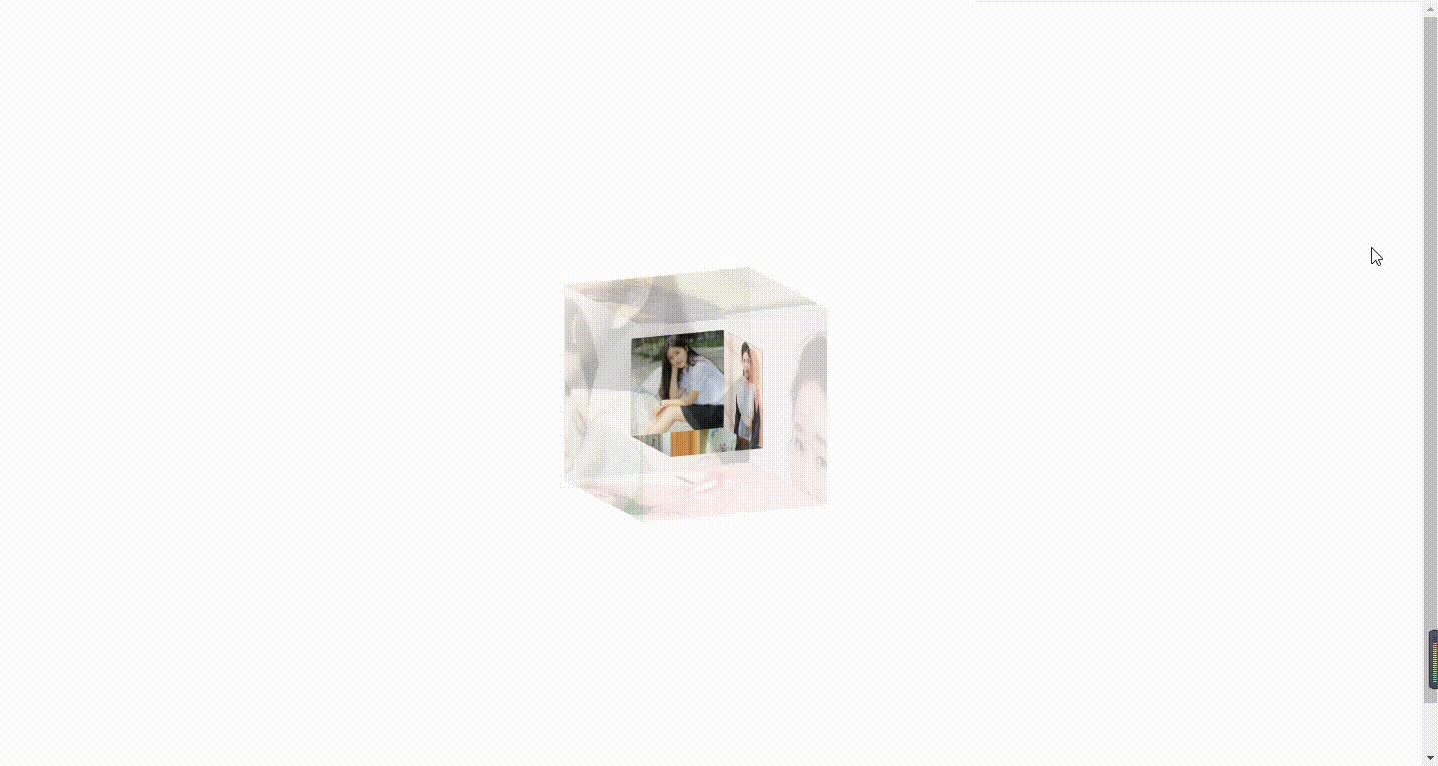
旋转相册———节日相册、女友相册


效果图:


步骤:

1.创建一个文件夹
2.文件夹有三个文件:css代码 、 img照片 、 html代码
3.规范:css文件夹里面文件命名style.css
4.注意照片命名:见下面


CSS代码部分:

@charset "utf-8";
*{
margin:0;
padding:0;
}
body{

/*background: url(../img/preview.png) ;*/
max-width: 100%;
min-width: 100%;
height: 100%;
background-size: cover;
background-repeat: no-repeat;
background-attachment: fixed;
background-size:100% 100%;
position: absolute;
margin-left: auto;
margin-right: auto;
}
li{
list-style: none;
}
.box{
width:200px;
height:200px;
background-size: cover;
background-repeat: no-repeat;
background-attachment: fixed;
background-size:100% 100%;
position: absolute;
margin-left: 42%;
margin-top: 22%;
-webkit-transform-style:preserve-3d;
-webkit-transform:rotateX(13deg);
-webkit-animation:move 5s linear infinite;
}
.minbox{
width:100px;
height:100px;
position: absolute;
left:50px;
top:30px;
-webkit-transform-style:preserve-3d;
}
.minbox li{
width:100px;
height:100px;
position: absolute;
left:0;
top:0;
}
.minbox li:nth-child(1){
background: url(../img/01.jpg) no-repeat 0 0;
-webkit-transform:translateZ(50px);
}
.minbox li:nth-child(2){
background: url(../img/02.jpg) no-repeat 0 0;
-webkit-transform:rotateX(180deg) translateZ(50px);
}
.minbox li:nth-child(3){
background: url(../img/03.png) no-repeat 0 0;
-webkit-transform:rotateX(-90deg) translateZ(50px);
}
.minbox li:nth-child(4){
background: url(../img/04.jpg) no-repeat 0 0;
-webkit-transform:rotateX(90deg) translateZ(50px);
}
.minbox li:nth-child(5){
background: url(../img/05.jpg) no-repeat 0 0;
-webkit-transform:rotateY(-90deg) translateZ(50px);
}
.minbox li:nth-child(6){
background: url(../img/06.jpg) no-repeat 0 0;
-webkit-transform:rotateY(90deg) translateZ(50px);
}
.maxbox li:nth-child(1){
background: url(../img/1.jpg) no-repeat 0 0;
-webkit-transform:translateZ(50px);
}
.maxbox li:nth-child(2){
background: url(../img/2.jpg) no-repeat 0 0;
-webkit-transform:translateZ(50px);
}
.maxbox li:nth-child(3){
background: url(../img/3.jpg) no-repeat 0 0;
-webkit-transform:rotateX(-90deg) translateZ(50px);
}
.maxbox li:nth-child(4){
background: url(../img/4.jpg) no-repeat 0 0;
-webkit-transform:rotateX(90deg) translateZ(50px);
}
.maxbox li:nth-child(5){
background: url(../img/5.jpg) no-repeat 0 0;
-webkit-transform:rotateY(-90deg) translateZ(50px);
}
.maxbox li:nth-child(6){
background: url(../img/6.jpg) no-repeat 0 0;
-webkit-transform:rotateY(90deg) translateZ(50px);
}
.maxbox{
width: 800px;
height: 400px;
position: absolute;
left: 0;
top: -20px;
-webkit-transform-style: preserve-3d;

}
.maxbox li{
width: 200px;
height: 200px;
background: #fff;
border:1px solid #ccc;
position: absolute;
left: 0;
top: 0;
opacity: 0.2;
-webkit-transition:all 1s ease;
}
.maxbox li:nth-child(1){
-webkit-transform:translateZ(100px);
}
.maxbox li:nth-child(2){
-webkit-transform:rotateX(180deg) translateZ(100px);
}
.maxbox li:nth-child(3){
-webkit-transform:rotateX(-90deg) translateZ(100px);
}
.maxbox li:nth-child(4){
-webkit-transform:rotateX(90deg) translateZ(100px);
}
.maxbox li:nth-child(5){
-webkit-transform:rotateY(-90deg) translateZ(100px);
}
.maxbox li:nth-child(6){
-webkit-transform:rotateY(90deg) translateZ(100px);
}
.box:hover ol li:nth-child(1){
-webkit-transform:translateZ(300px);
width: 400px;
height: 400px;
opacity: 0.8;
left: -100px;
top: -100px;
}
.box:hover ol li:nth-child(2){
-webkit-transform:rotateX(180deg) translateZ(300px);
width: 400px;
height: 400px;
opacity: 0.8;
left: -100px;
top: -100px;
}
.box:hover ol li:nth-child(3){
-webkit-transform:rotateX(-90deg) translateZ(300px);
width: 400px;
height: 400px;
opacity: 0.8;
left: -100px;
top: -100px;
}
.box:hover ol li:nth-child(4){
-webkit-transform:rotateX(90deg) translateZ(300px);
width: 400px;
height: 400px;
opacity: 0.8;
left: -100px;
top: -100px;
}
.box:hover ol li:nth-child(5){
-webkit-transform:rotateY(-90deg) translateZ(300px);
width: 400px;
height: 400px;
opacity: 0.8;
left: -100px;
top: -100px;
}
.box:hover ol li:nth-child(6){
-webkit-transform:rotateY(90deg) translateZ(300px);
width: 400px;
height: 400px;
opacity: 0.8;
left: -100px;
top: -100px;
}
@keyframes move{
0%{
-webkit-transform: rotateX(13deg) rotateY(0deg);
}
100%{
-webkit-transform:rotateX(13deg) rotateY(360deg);
}
}


HTML代码部分:

<!DOCTYPE html>
<html lang="en">
<head>
<meta charset="UTF-8">
<title></title>

<link type="text/css" href="css/style.css" rel="stylesheet" />

</head>
<body>

<div class="box">
<ul class="minbox">
<li></li>
<li></li>
<li></li>
<li></li>
<li></li>
<li></li>
</ul>
<ol class="maxbox">
<li></li>
<li></li>
<li></li>
<li></li>
<li></li>
<li></li>
</ol>
</div>
</body>
</html>


img文件夹:存储照片

说明:设计总共12张照片翻转播放,分大小两个立方体,各6张照片

命名:

外层大照片 :1.jpg 、 2.jpg 、... ... ... 6.jpg

内层小照片:01.jpg 、02.jpg ... ... ... 06.jpg

注意:修改照片大小———大照片像素400 * 400 ;小照片像素 100 *100


附:win10修改图片像素

点击图片右键 --- 编辑!打开画图工具~


文件夹内部:


posted @ 2021-07-21 23:11  wKingy  阅读(267)  评论(0编辑  收藏  举报