WPF 10天修炼 第七天- WPF资源、样式、控件模板
WPF资源
对象资源
WPF允许在XAML标记的任意位置定义资源。比如在特定的控件、窗口或应用程序级别定义资源,WPF资源系统提供的对象资源有如下好处:
1、 高效:使用对象资源可以在一个地方定义而在多个地方使用,这使得WPF代码可重用一些对象信息。
2、 可维护:可以将一些设置信息放置在一个中心位置,并在多个地方使用。如果需要进行更改时,只需要在中心位置进行更改,方便代码的维护工作。
3、 可适应性:当确定的信息从应用程序中分离出来放在资源中,就可以动态地被改变。例如可以基于用户的偏好设置当前语言来更改信息。
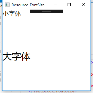
下面是一个在Grid级别的资源,设置textblock的字体大小。
|
1
2
3
4
5
6
7
8
9
10
11
12
13
14
15
16
17
18
19
20
21
22
23
24
25
26
27
28
29
30
31
32
|
<Window x:Class="WPFDemo.Resource_FontSize" xmlns="http://schemas.microsoft.com/winfx/2006/xaml/presentation" xmlns:x="http://schemas.microsoft.com/winfx/2006/xaml" xmlns:d="http://schemas.microsoft.com/expression/blend/2008" xmlns:mc="http://schemas.openxmlformats.org/markup-compatibility/2006" xmlns:local="clr-namespace:WPFDemo" xmlns:s="clr-namespace:System;assembly=mscorlib" mc:Ignorable="d" Title="Resource_FontSize" Height="300" Width="300" > <Grid ShowGridLines="True"> <Grid.RowDefinitions> <RowDefinition /> <RowDefinition /> </Grid.RowDefinitions> <!---Grid级别的资源--> <Grid.Resources> <s:Double x:Key="SmallSize" >20</s:Double> <s:Double x:Key="LargeSize">30</s:Double> </Grid.Resources> <TextBlock Text="小字体" Grid.Row="0"> <TextBlock.FontSize> <StaticResource ResourceKey="SmallSize" /> </TextBlock.FontSize> </TextBlock> <TextBlock Text="大字体" Grid.Row="1"> <TextBlock.FontSize> <StaticResource ResourceKey="LargeSize" /> </TextBlock.FontSize> </TextBlock> </Grid></Window> |
静态资源
静态资源就是上面使用StaticResource标记引用的资源。这种资源一旦被创建就不会被改变。静态资源必须先定义资源,否则会抛出异常。
应用程序资源
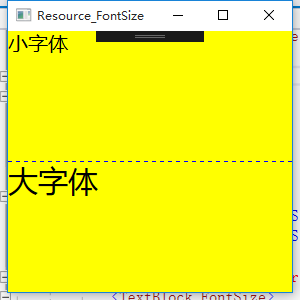
应用程序的资源作用域覆盖整个WPF应用程序,WPF将按照元素、窗口、应用程序、系统资源的顺序进行资源查找。当新建一个WPF项目时,在APP.xaml中会自动添加<Application.Resources>标签,可以在标签内添加应用程序级别的资源。
定义BackgroundColor系统资源
|
1
2
3
4
5
6
7
8
9
10
|
<Application x:Class="WPFDemo.App" xmlns="http://schemas.microsoft.com/winfx/2006/xaml/presentation" xmlns:x="http://schemas.microsoft.com/winfx/2006/xaml" StartupUri="Resource-FontSize.xaml" > <Application.Resources> <SolidColorBrush x:Key="BackgroundColor" Color="Yellow"> </SolidColorBrush> </Application.Resources></Application> |
调用BackgrouundColor资源
在Window标签添加引用 Background="{StaticResource BackgroundColor}"
|
1
2
3
4
5
6
7
8
9
10
11
12
13
14
15
16
17
18
19
20
21
22
23
24
25
26
27
28
29
30
31
32
33
|
<Window x:Class="WPFDemo.Resource_FontSize" xmlns="http://schemas.microsoft.com/winfx/2006/xaml/presentation" xmlns:x="http://schemas.microsoft.com/winfx/2006/xaml" xmlns:d="http://schemas.microsoft.com/expression/blend/2008" xmlns:mc="http://schemas.openxmlformats.org/markup-compatibility/2006" xmlns:local="clr-namespace:WPFDemo" xmlns:s="clr-namespace:System;assembly=mscorlib" mc:Ignorable="d" Title="Resource_FontSize" Height="300" Width="300" Background="{StaticResource BackgroundColor}" > <Grid ShowGridLines="True"> <Grid.RowDefinitions> <RowDefinition /> <RowDefinition /> </Grid.RowDefinitions> <!---Grid级别的资源--> <Grid.Resources> <s:Double x:Key="SmallSize" >20</s:Double> <s:Double x:Key="LargeSize">30</s:Double> </Grid.Resources> <TextBlock Text="小字体" Grid.Row="0"> <TextBlock.FontSize> <StaticResource ResourceKey="SmallSize" /> </TextBlock.FontSize> </TextBlock> <TextBlock Text="大字体" Grid.Row="1"> <TextBlock.FontSize> <StaticResource ResourceKey="LargeSize" /> </TextBlock.FontSize> </TextBlock> </Grid></Window> |
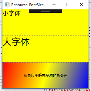
使用资源字典组织资源
可以在一个单独的XAML文件中定义资源,然后该资源可以在多个项目进行共享。独立的资源文件使用ResourceDictionary作为根元素。该XAML文件除了用于存储资源外,不能做任何其他的工作。
下面定义一个线性渐变的背景色
1、 首先新建WPF资源文件添加资源内容
2、 将资源文件设置生成操作位Page以确保资源被作为BAML文件编译。也可以将其指定为Reesource,这种方式将内嵌在程序集中,不被编译,运行时编译,性能开支较大。
3、为了使用该资源,需要将其合并到应用程序资源集合中,可以合并到指定窗口资源集合,但是通常合并到应用程序级别的集合。
新建WPF资源文件并添加内容
|
1
2
3
4
5
6
7
8
9
10
11
12
|
<ResourceDictionary xmlns="http://schemas.microsoft.com/winfx/2006/xaml/presentation" xmlns:x="http://schemas.microsoft.com/winfx/2006/xaml" xmlns:local="clr-namespace:WPFDemo"> <!--定义渐变的背景色--> <LinearGradientBrush x:Key="brushLinear"> <LinearGradientBrush.GradientStops> <GradientStop Color="Red" Offset="0" /> <GradientStop Color="Yellow" Offset="0.5" /> <GradientStop Color="Blue" Offset="1" /> </LinearGradientBrush.GradientStops> </LinearGradientBrush></ResourceDictionary> |
将资源文件合并到应用程序资源中
|
1
2
3
4
5
6
7
8
9
10
11
12
13
14
|
<Application x:Class="WPFDemo.App" xmlns="http://schemas.microsoft.com/winfx/2006/xaml/presentation" xmlns:x="http://schemas.microsoft.com/winfx/2006/xaml" StartupUri="Resource-FontSize.xaml" > <Application.Resources> <ResourceDictionary> <SolidColorBrush x:Key="BackgroundColor" Color="Yellow"></SolidColorBrush> <ResourceDictionary.MergedDictionaries> <ResourceDictionary Source="DictionaryDemo.xaml" /> </ResourceDictionary.MergedDictionaries> </ResourceDictionary> </Application.Resources></Application> |
在上面的例子中增加一个button按钮将其背景颜色设置为渐变
|
1
2
3
4
5
6
7
8
9
10
11
12
13
14
15
16
17
18
19
20
21
22
23
24
25
26
27
28
29
30
31
32
33
34
35
36
37
38
39
|
<Window x:Class="WPFDemo.Resource_FontSize" xmlns="http://schemas.microsoft.com/winfx/2006/xaml/presentation" xmlns:x="http://schemas.microsoft.com/winfx/2006/xaml" xmlns:d="http://schemas.microsoft.com/expression/blend/2008" xmlns:mc="http://schemas.openxmlformats.org/markup-compatibility/2006" xmlns:local="clr-namespace:WPFDemo" xmlns:s="clr-namespace:System;assembly=mscorlib" mc:Ignorable="d" Title="Resource_FontSize" Height="300" Width="300" Background="{StaticResource BackgroundColor}" > <Grid ShowGridLines="True"> <Grid.RowDefinitions> <RowDefinition /> <RowDefinition /> <RowDefinition /> </Grid.RowDefinitions> <!---Grid级别的资源--> <Grid.Resources> <s:Double x:Key="SmallSize" >20</s:Double> <s:Double x:Key="LargeSize">30</s:Double> </Grid.Resources> <TextBlock Text="小字体" Grid.Row="0"> <TextBlock.FontSize> <StaticResource ResourceKey="SmallSize" /> </TextBlock.FontSize> </TextBlock> <TextBlock Text="大字体" Grid.Row="1"> <TextBlock.FontSize> <StaticResource ResourceKey="LargeSize" /> </TextBlock.FontSize> </TextBlock> <Button Grid.Row="2" Content="我是应用静态资源的渐变色"> <Button.Background> <StaticResource ResourceKey="brushLinear" /> </Button.Background> </Button> </Grid></Window> |
WPF样式
样式是WPF中功能强大的特性,样式基于资源,但是比资源提供了更多重用代码特性。样式与资源相比,提供了额外的好处来使XAML更具可重用性和扩展性。假设在UI中有几个button控件。需要提供3中不同的显示风格。例如不同的FontSize ,FontFamily 和FontWeight 3个属性。此时可能会考虑使用资源的办法,使用该资源可以完成该功能,但是如果每个属性设置3中资源,将会有9中资源出现。在这里使用WPF的样式功能可以轻松解决这些问题。
样式设置优先级:
|
优先级 |
描述 |
|
元素(高) |
元素本身定义的属性具有最高的优先级 |
|
样式(中) |
在样式中定义的相同属性 |
|
父元素(低) |
从视觉树的父元素中继承下来的属性 |
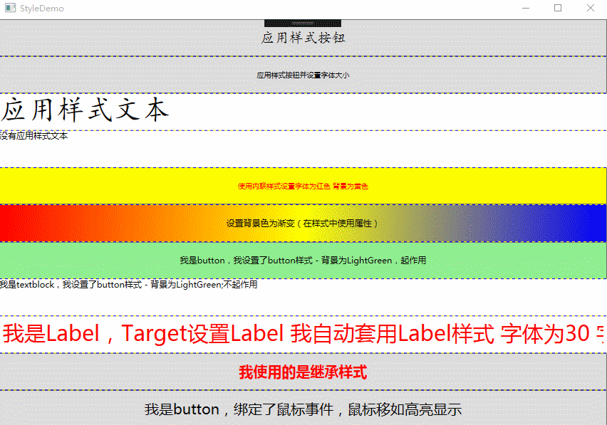
下面实例中会将样式的各种用法都涉及到:主要包括基本的样式、内联样式、在样式中设置属性的复杂应用、根据指定类型自动应用样式。
|
1
2
3
4
5
6
7
8
9
10
11
12
13
14
15
16
17
18
19
20
21
22
23
24
25
26
27
28
29
30
31
32
33
34
35
36
37
38
39
40
41
42
43
44
45
46
47
48
49
50
51
52
53
54
55
56
57
58
59
60
61
62
63
64
65
66
67
68
69
70
71
72
73
74
75
76
77
78
79
80
81
82
83
84
85
86
87
88
|
<Window x:Class="WPFDemo.StyleDemo" xmlns="http://schemas.microsoft.com/winfx/2006/xaml/presentation" xmlns:x="http://schemas.microsoft.com/winfx/2006/xaml" xmlns:d="http://schemas.microsoft.com/expression/blend/2008" xmlns:mc="http://schemas.openxmlformats.org/markup-compatibility/2006" xmlns:local="clr-namespace:WPFDemo" mc:Ignorable="d" Title="StyleDemo" Height="300" Width="300"> <Window.Resources> <!--基本样式 button 按钮样式--> <Style x:Key="ButtonStyle"> <Setter Property="Control.FontFamily" Value="楷体"></Setter> <Setter Property="Control.FontSize" Value="20"></Setter> </Style> <!--基本样式 Textblock样式--> <Style x:Key="TextBlockStyle"> <Setter Property="Control.FontFamily" Value="楷体"></Setter> <Setter Property="Control.FontSize" Value="40"></Setter> </Style> <!--仅限Button使用--> <Style x:Key="buttonBackgroundColor"> <Setter Property="Button.Background" Value="LightGreen"></Setter> </Style> <!--使用TargetType指定样式使用的控件类型 自动套用样式--> <Style TargetType="{x:Type Label}"> <Setter Property="Foreground" Value="Red"></Setter> <Setter Property="FontSize" Value="30"></Setter> </Style> <!--控件基类样式--> <Style x:Key="BaseStyle"> <Setter Property="Control.FontSize" Value="20"></Setter> </Style> <!--继承BaseStyle--> <Style x:Key="BaseButtonSyle" BasedOn="{StaticResource BaseStyle}"> <Setter Property="Control.Foreground" Value="Red"></Setter> <Setter Property="Control.FontWeight" Value="Bold"></Setter> </Style> </Window.Resources> <Grid ShowGridLines="True"> <Grid.RowDefinitions> <RowDefinition /> <RowDefinition /> <RowDefinition /> <RowDefinition /> <RowDefinition /> <RowDefinition /> <RowDefinition /> <RowDefinition /> <RowDefinition /> <RowDefinition /> </Grid.RowDefinitions> <Button Grid.Row="0" Content="应用样式按钮" Style="{StaticResource ButtonStyle}"></Button> <Button Grid.Row="1" FontSize="10" Content="应用样式按钮并设置字体大小" ></Button> <TextBlock Grid.Row="2" Text="应用样式文本" Style="{StaticResource TextBlockStyle}"></TextBlock> <TextBlock Grid.Row="3" Text="没有应用样式文本" ></TextBlock> <Button Grid.Row="4" FontSize="10" Content="使用内联样式设置字体为红色 背景为黄色" > <!--内联样式--> <Button.Style> <Style> <Setter Property="Control.Foreground" Value="Red"></Setter> <Setter Property="Control.Background" Value="Yellow"></Setter> </Style> </Button.Style> </Button> <Button Grid.Row="5" Content="设置背景色为渐变(在样式中使用属性)"> <!--样式中使用属性--> <Button.Style> <Style> <Setter Property="Button.Background"> <Setter.Value> <LinearGradientBrush StartPoint="0,0" EndPoint="1,1"> <LinearGradientBrush.GradientStops> <GradientStop Color="Red" Offset="0"/> <GradientStop Color="Yellow" Offset="0.5"/> <GradientStop Color="Blue" Offset="1"/> </LinearGradientBrush.GradientStops> </LinearGradientBrush> </Setter.Value> </Setter> </Style> </Button.Style> </Button> <Button Grid.Row="6" Content="我是button,我设置了button样式 - 背景为LightGreen,起作用" Style="{StaticResource buttonBackgroundColor}"></Button> <TextBlock Grid.Row="7" Text="我是textblock,我设置了button样式 - 背景为LightGreen;不起作用" Style="{StaticResource buttonBackgroundColor}"></TextBlock> <Label Grid.Row="8" Content="我是Label,Target设置Label 我自动套用Label样式 字体为30 字体为红色"></Label> <Button Grid.Row="9" Style="{StaticResource BaseButtonSyle}" Content="我使用的是继承样式"></Button> </Grid></Window> |
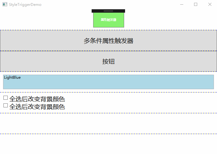
样式触发器
Style类提供了Triggers集合,每个样式可以有多个触发器,每个触发器是一个派生自System.Windows.TriggerBase类的实例。在WPF中,继承自TriggerBase的触发器有下面的类型(属性触发器、数据触发器、事件触发器):
1、Trigger:简单触发器,该触发器检查特定的依赖的属性的值是否发生变化来使用Setter改变样式。
2、MultiTrigger:类似于简单触发器,但是组合了多个条件,所有的条件必须被满足才会改变样式。
3、DataTrigger:与简单触发器类似,该触发器与数据绑定一起运行。但是该触发器是检测任何绑定的数据是否发生变化。
4、MultiDataTrigger:组合了多个DataTrigger。
5、EventTrigger:这是最常用的触发器,当某个事件触发时来改变样式。
在触发器中如果多个触发器修改相同的属性,则最后触发的触发器优先。
|
1
2
3
4
5
6
7
8
9
10
11
12
13
14
15
16
17
18
19
20
21
22
23
24
25
26
27
28
29
30
31
32
33
34
35
36
37
38
39
40
41
42
43
44
45
46
47
48
49
50
51
52
53
54
55
56
57
58
59
60
61
62
63
64
65
66
67
68
69
70
71
72
73
74
75
76
77
78
79
80
81
82
83
84
85
86
87
88
89
90
91
92
93
94
95
96
97
98
99
100
101
102
103
104
105
106
107
108
109
110
111
|
<Window x:Class="WPFDemo.StyleTriggerDemo" xmlns="http://schemas.microsoft.com/winfx/2006/xaml/presentation" xmlns:x="http://schemas.microsoft.com/winfx/2006/xaml" xmlns:d="http://schemas.microsoft.com/expression/blend/2008" xmlns:mc="http://schemas.openxmlformats.org/markup-compatibility/2006" xmlns:local="clr-namespace:WPFDemo" mc:Ignorable="d" Title="StyleTriggerDemo" Height="300" Width="300"> <Window.Resources> <!--属性触发器 按下鼠标后字体增大 按钮旋转20度--> <Style x:Key="buttonStyle" TargetType="{x:Type Button}"> <Style.Triggers> <Trigger Property="IsPressed" Value="True"> <Setter Property="RenderTransform"> <Setter.Value> <RotateTransform Angle="20" /> </Setter.Value> </Setter> <Setter Property="Foreground" Value="Black"/> <Setter Property="FontSize" Value="20"></Setter> </Trigger> </Style.Triggers> <Setter Property="FontSize" Value="10"></Setter> <Setter Property="Foreground" Value="White"/> <Setter Property="Background" Value="#FF87F16F"/> <Setter Property="Width" Value="100"></Setter> <Setter Property="Height" Value="50" /> </Style> <!--多条件属性触发器 鼠标经过时显示字体颜色为黄色;鼠标按下并且字体为20时设置字体颜色为红色--> <Style x:Key="buttonStyle-Multi" TargetType="{x:Type Button}"> <Setter Property="FontSize" Value="20" /> <Style.Triggers> <Trigger Property="IsMouseOver" Value="True"> <Setter Property="Foreground" Value="Yellow" /> </Trigger> <MultiTrigger> <MultiTrigger.Conditions> <Condition Property="IsPressed" Value="True"/> <Condition Property="FontSize" Value="20"/> </MultiTrigger.Conditions> <MultiTrigger.Setters> <Setter Property="Foreground" Value="Red"></Setter> </MultiTrigger.Setters> </MultiTrigger> </Style.Triggers> </Style> <!--事件触发器--> <Style x:Key="buttonClickStyle"> <Setter Property="Control.FontSize" Value="20"></Setter> <!--定义事件触发器--> <Style.Triggers> <EventTrigger RoutedEvent="Button.Click"> <BeginStoryboard> <Storyboard> <DoubleAnimation Storyboard.TargetProperty="Opacity" From="0.1" To="1" Duration="0:0:2"></DoubleAnimation> </Storyboard> </BeginStoryboard> </EventTrigger> </Style.Triggers> </Style> <!--数据触发器--> <Style x:Key="DataTextTrigger"> <!---将控件的背景色设置为文本框中输入的颜色--> <Setter Property="Control.Background" Value="{Binding RelativeSource={RelativeSource Self},Path=Text}"></Setter> <Style.Triggers> <!--当文本中输入的字符超过20时,则文本框的Enable为false--> <DataTrigger Binding="{Binding RelativeSource={RelativeSource Self},Path=Text.Length}" Value="20"> <Setter Property="Control.IsEnabled" Value="False"></Setter> </DataTrigger> </Style.Triggers> </Style> <!--多条件数据触发器--> <Style x:Key="DataTextTrigger-Multi"> <Setter Property="Control.FontSize" Value="20"></Setter> <Setter Property="Control.Margin" Value="10" ></Setter> <Style.Triggers> <MultiDataTrigger> <MultiDataTrigger.Conditions> <Condition Binding="{Binding ElementName=cb1,Path=IsChecked}" Value="True"></Condition> <Condition Binding="{Binding ElementName=cb2,Path=IsChecked}" Value="True"></Condition> </MultiDataTrigger.Conditions> <MultiDataTrigger.Setters> <Setter Property="Control.Background" Value="Red"></Setter> </MultiDataTrigger.Setters> </MultiDataTrigger> </Style.Triggers> </Style> </Window.Resources> <Grid ShowGridLines="True"> <Grid.RowDefinitions> <RowDefinition /> <RowDefinition /> <RowDefinition /> <RowDefinition /> <RowDefinition /> <RowDefinition /> <RowDefinition /> </Grid.RowDefinitions> <Button Grid.Row="0" Name="but" Style="{StaticResource buttonStyle}" Content="属性触发器"/> <Button Grid.Row="1" Style="{StaticResource buttonStyle-Multi}" Content="多条件属性触发器"/> <Button Grid.Row="2" Content="按钮" Style="{StaticResource buttonClickStyle}"></Button> <TextBox Grid.Row="3" Margin="10" Style="{StaticResource DataTextTrigger}" Text="LightBlue"></TextBox> <StackPanel Grid.Row="4" Name="panel1" Style="{StaticResource DataTextTrigger-Multi}"> <CheckBox Name="cb1" >全选后改变背景颜色</CheckBox> <CheckBox Name="cb2" >全选后改变背景颜色</CheckBox> </StackPanel> </Grid></Window> |
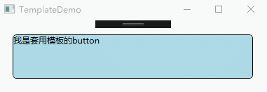
控件模板
在WPF中,每个控件都有一个默认的控件模板,用于定义控件的基本外观和行为。WPF使用ControlTemplate定义控件的外观,每个控件都有一个Template的属性。默认情况下。控件通过该属性获取呈现的外观,通过更改ControlTemplate,可以为控件定义一个新的样式
|
1
2
3
4
5
6
7
8
9
10
11
12
13
14
15
16
17
18
19
20
21
22
23
24
25
26
27
28
29
30
31
32
33
34
35
36
37
38
|
<Window x:Class="WPFDemo.TemplateDemo" xmlns="http://schemas.microsoft.com/winfx/2006/xaml/presentation" xmlns:x="http://schemas.microsoft.com/winfx/2006/xaml" xmlns:d="http://schemas.microsoft.com/expression/blend/2008" xmlns:mc="http://schemas.openxmlformats.org/markup-compatibility/2006" xmlns:local="clr-namespace:WPFDemo" mc:Ignorable="d" Title="TemplateDemo" Height="300" Width="300"> <Window.Resources> <ControlTemplate x:Key="ButtomTemplate" TargetType="{x:Type Button}"> <Border Name="Border" BorderBrush="{TemplateBinding Foreground}" BorderThickness="{TemplateBinding BorderThickness}" CornerRadius="5" Background="{TemplateBinding Background}" TextBlock.Foreground="{TemplateBinding Foreground}" Margin="{TemplateBinding Margin}"> <ContentPresenter RecognizesAccessKey="True" HorizontalAlignment="{TemplateBinding HorizontalAlignment}" VerticalAlignment="{TemplateBinding VerticalAlignment}"> </ContentPresenter> </Border> <!--设置模板触发器--> <ControlTemplate.Triggers> <Trigger Property="IsMouseOver" Value="True"> <Setter TargetName="Border" Property="Background" Value="Red"></Setter> </Trigger> <Trigger Property="IsPressed" Value="True"> <Setter TargetName="Border" Property="Background" Value="Yellow"></Setter> </Trigger> </ControlTemplate.Triggers> </ControlTemplate> </Window.Resources> <Grid> <Button Template="{StaticResource ButtomTemplate}" Margin="10" Background="LightBlue" Content="我是套用模板的button"></Button> </Grid></Window> |

 浙公网安备 33010602011771号