WPF系列-CheckBox
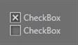
自定义样式1
效果:

代码:
        <!--
            CheckBox的样式
        -->
        <Style TargetType="{x:Type CheckBox}">
            <Setter Property="OverridesDefaultStyle" Value="True"/>
            <Setter Property="FocusVisualStyle" Value="{StaticResource FocusStyle}"/>
            <Setter Property="SnapsToDevicePixels" Value="True"/>
            <Setter Property="Foreground" Value="White"/>
            <Setter Property="FontSize" Value="16"/>
            <Setter Property="Template">
                <Setter.Value>
                    <ControlTemplate TargetType="{x:Type CheckBox}">
                        <BulletDecorator FlowDirection="LeftToRight" VerticalAlignment="Center">
                            <BulletDecorator.Bullet>
                                <Border x:Name="bd"
                                        BorderThickness="1"
                                        BorderBrush="Red"
                                        MinHeight="15"
                                        MinWidth="15"
                                        VerticalAlignment="Center">
                                    <Border.Background>
                                        <LinearGradientBrush StartPoint="0,0"
                                                             EndPoint="1,1">
                                            <GradientStop Color="LightGray" Offset="0.2"/>
                                            <GradientStop Color="White" Offset="1"/>
                                        </LinearGradientBrush>
                                    </Border.Background>
                                    <Path x:Name="cp" Width="12" Height="12"
                                          Stroke="Blue"
                                          StrokeThickness="3"/>
                                </Border>
                            </BulletDecorator.Bullet>
                            <ContentPresenter Margin="2,0"/>
                        </BulletDecorator>
                        <!--
                            控件触发器
                        -->
                        <ControlTemplate.Triggers>
                            <Trigger Property="IsChecked" Value="True">
                                <!-- 画上一个勾 -->
                                <Setter TargetName="cp" Property="Data"
                                        Value="M 0,6 L 6,12 12,0"/>
                                <Setter Property="Foreground" Value="LightGreen"/>
                            </Trigger>
                            <Trigger Property="IsMouseOver" Value="True">
                                <Setter TargetName="bd" Property="Background">
                                    <Setter.Value>
                                        <LinearGradientBrush StartPoint="0,0" EndPoint="1,1">
                                            <GradientStop Color="Orange" Offset="0.12"/>
                                            <GradientStop Color="Yellow" Offset="0.92"/>
                                        </LinearGradientBrush>
                                    </Setter.Value>
                                </Setter>
                            </Trigger>
                        </ControlTemplate.Triggers>
                    </ControlTemplate>
                </Setter.Value>
            </Setter>
        </Style>
自定义样式2
效果:
代码:
<Style TargetType="CheckBox">
            <Setter Property="SnapsToDevicePixels" Value="False" />
            <Setter Property="OverridesDefaultStyle" Value="true" />
            <Setter Property="FocusVisualStyle" Value="{x:Null}" />
            <Setter Property="BorderBrush" Value="LightGray" />
            <Setter Property="Template">
                <Setter.Value>
                    <ControlTemplate TargetType="CheckBox">
                        <BulletDecorator Background="Transparent">
                            <BulletDecorator.Bullet>
                                <Border x:Name="Border"
                                        Width="15"
                                        Height="15"
                                        Background="{TemplateBinding Background}"
                                        BorderBrush="{TemplateBinding BorderBrush}"
                                        BorderThickness="1"
                                        ClipToBounds="True">
                                    <Border.Effect>
                                        <DropShadowEffect BlurRadius="5" ShadowDepth="2" />
                                    </Border.Effect>
                                    <Path x:Name="CheckMark"
                                          Width="8"
                                          Height="8"
                                          HorizontalAlignment="Center"
                                          VerticalAlignment="Center"
                                          Data="M 0 0 L 8 8 M 0 8 L 8 0"
                                          Stretch="Fill"
                                          Stroke="LightGray"
                                          StrokeEndLineCap="Round"
                                          StrokeStartLineCap="Round"
                                          StrokeThickness="2" />
                                </Border>
                            </BulletDecorator.Bullet>
                            <ContentPresenter Margin="4,0,0,0"
                                              HorizontalAlignment="Left"
                                              VerticalAlignment="Center"
                                              RecognizesAccessKey="True" />
                        </BulletDecorator>
                        <ControlTemplate.Triggers>
                            <Trigger Property="IsChecked" Value="false">
                                <Setter TargetName="CheckMark" Property="Visibility" Value="Collapsed" />
                            </Trigger>
                            <Trigger Property="IsFocused" Value="true">
                                <Setter Property="BorderBrush" Value="White" />
                            </Trigger>
                            <Trigger Property="IsEnabled" Value="false">
                                <Setter Property="BorderBrush" Value="Gray" />
                                <Setter TargetName="CheckMark" Property="Stroke" Value="Gray" />
                            </Trigger>
                        </ControlTemplate.Triggers>
                    </ControlTemplate>
                </Setter.Value>
            </Setter>
        </Style>
参考
作者:旭东
出处:http://www.cnblogs.com/HQFZ
关于作者:专注于微软平台项目架构、管理和企业解决方案。现主要从事WinForm、ASP.NET、WPF、WCF、等方面的项目开发、架构、管理。如有问题或建议,请不吝指教!
本文版权归作者,欢迎转载,但未经作者同意必须保留此段声明,且在文章页面明显位置给出原文连接。如有问题,可以联系我,非常感谢。
如果您该文觉得不错或者对你有帮助,请点下推荐,让更多的朋友看到,谢谢!

 浙公网安备 33010602011771号