[WPF系列]-基础系列 TabControl应用
引言
Tabcontrol控件也是我们在项目中经常用到的一个控件,用它将相关的信息组织在一起分类显示。
简介


============================================
自定义TabitemPanel

WpfScrollableTabControl.zip
============================================
自动选择第一个TabItem
Auto-Select First Item Using XAML for Selector-Derived Controls (ListBox, ListView, TabControl, etc)
<Style x:Key="SelectorAutoSelectStyle"
       TargetType="{x:Type Selector}">
    <Style.Triggers>
        <MultiTrigger>
            <MultiTrigger.Conditions>
                <Condition Property="SelectedItem"
                           Value="{x:Null}" />
                <Condition Property="HasItems"
                           Value="True" />
            </MultiTrigger.Conditions>
            <Setter Property="SelectedIndex"
                    Value="0" />
        </MultiTrigger>
    </Style.Triggers>
</Style>

<Style BasedOn="{StaticResource SelectorAutoSelectStyle}"
       TargetType="{x:Type ListBox}" />

<Style BasedOn="{StaticResource SelectorAutoSelectStyle}"
       TargetType="{x:Type ListView}" />

<Style BasedOn="{StaticResource SelectorAutoSelectStyle}"
       TargetType="{x:Type TabControl}" />
In WPF, SelectionChanged does not mean that the selection changed
Windows Presentation Foundation's Routed Events can lead to unexpected or at least nonintuitive behavior when using TabControls that contain ListViews and/or ComboBoxes. A routed event generally bubbles from the control that raised it, up the whole element tree until the root. On its way up it invokes handlers on multiple listeners. This makes a lot of sense in theButtonBase.Click Event: if a button is clicked, then its containing element is also clicked.
By design, the Selector.SelectionChanged Event is such a routed event. TabItem, ListBox, and ComboBox all inherit from Selector, so if you put them in a hierarchy they will register on each other's events. A ComboBox that appears via a template in a ListBox will raise the SelectionChanged event of that ListBox - even if the user didn't select a new ListBoxItem. If you put that ListBox in a TabControl, then the SelectionChanged on that TabControl will also be fired - even if the user didn't select a new TabItem.
绑定List<T>对象,自动生成TabItems
<controls:TabControlEx   Grid.Row="11" Grid.Column="1"
                       x:Name="CalculationListBox"
                   ItemsSource="{Binding CalculationViewModels}">
            <controls:TabControlEx.ItemContainerStyle>
                <Style TargetType="TabItem">
                    <Setter Property="Background" Value="{Binding CalculationType,Converter={StaticResource CalculateTypesToColorConverter}}" />
                    <Setter Property="HeaderTemplate">
                        <Setter.Value>
                            <DataTemplate>
                                <TextBlock Text="{Binding CurrentCalculation.Name}" HorizontalAlignment="Left" />
                            </DataTemplate>
                        </Setter.Value>
                    </Setter>
                </Style>
            </controls:TabControlEx.ItemContainerStyle>
        </controls:TabControlEx>
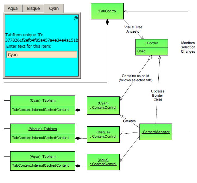
避免TabItem不被选中时销毁,重新实现TabControl控件
解决方案一:
WPF TabControl: Turning Off Tab Virtualization
解决方案二:
WPF's forgetful TabControl
It reference the article: Persist the Visual Tree when switching tabs in the WPF TabControl
but there is a bug,to solve the problem:
Although the demo provided in the article works, I did have to tweak the code to get it to work with my project. I found that my TabControl was being loaded, then unloaded, then loaded again when my application started. This was causing the TabLoaded event handler in PersistTabItemsSourceHandler to fire twice. The second time it fired, AttachCollectionChangedEvent() was throwing a NullReferenceException because Tab had been set to null in PersistTabItemsSourceHandler.Dispose() when the TabControl was unloaded.
To fix this I first moved the calls to AttachCollectionChangedEvent() and LoadItemsSource() from the TabLoaded event handler to the constructor. Thus, AttachCollectionChangedEvent() was only called once, as soon as Tab had been set.
This got rid of the NullReferenceException, however now adding a new view model did not add a new item to the TabControl. This was because the TabControl was still being unloaded, during which the CollectionChanged event was being detached. The only way I could find to solve this was to remove the call to PersistTabItemsSourceHandler.Dispose() in PersistTabBehaviour.RemoveFromItemSourceHandlers().
解决方案三:
using System;
using System.Collections.Specialized;
using System.Windows;
using System.Windows.Controls;
using System.Windows.Controls.Primitives;

namespace SharedUtilities.Controls
{
    /// <summary>
    /// The standard WPF TabControl is quite bad in the fact that it only
    /// even contains the current TabItem in the VisualTree, so if you
    /// have complex views it takes a while to re-create the view each tab
    /// selection change.Which makes the standard TabControl very sticky to
    /// work with. This class along with its associated ControlTemplate
    /// allow all TabItems to remain in the VisualTree without it being Sticky.
    /// It does this by keeping all TabItem content in the VisualTree but
    /// hides all inactive TabItem content, and only keeps the active TabItem
    /// content shown.
    /// </summary>
    [TemplatePart(Name = "PART_ItemsHolder", Type = typeof (Panel))]
    public class TabControlEx : TabControl
    {
        #region Data

        private Panel itemsHolder = null;

        #endregion

        #region Ctor

        public TabControlEx()
            : base()
        {
            // this is necessary so that we get the initial databound selected item
            this.ItemContainerGenerator.StatusChanged += ItemContainerGenerator_StatusChanged;
            this.Loaded += TabControlEx_Loaded;
        }

        #endregion

        #region Public/Protected Methods

        /// <summary>
        /// get the ItemsHolder and generate any children
        /// </summary>
        public override void OnApplyTemplate()
        {
            base.OnApplyTemplate();
            itemsHolder = GetTemplateChild("PART_ItemsHolder") as Panel;
            UpdateSelectedItem();
        }

        /// <summary>
        /// when the items change we remove any generated panel children and add any new ones as necessary
        /// </summary>
        /// <param name="e"></param>
        protected override void OnItemsChanged(NotifyCollectionChangedEventArgs e)
        {
            base.OnItemsChanged(e);

            if (itemsHolder == null)
            {
                return;
            }

            switch (e.Action)
            {
                case NotifyCollectionChangedAction.Reset:
                    itemsHolder.Children.Clear();
                    break;

                case NotifyCollectionChangedAction.Add:
                case NotifyCollectionChangedAction.Remove:
                    if (e.OldItems != null)
                    {
                        foreach (var item in e.OldItems)
                        {
                            ContentPresenter cp = FindChildContentPresenter(item);
                            if (cp != null)
                            {
                                itemsHolder.Children.Remove(cp);
                            }
                        }
                    }

                    // don't do anything with new items because we don't want to
                    // create visuals that aren't being shown

                    UpdateSelectedItem();
                    break;

                case NotifyCollectionChangedAction.Replace:
                    throw new NotImplementedException("Replace not implemented yet");
            }
        }

        /// <summary>
        /// update the visible child in the ItemsHolder
        /// </summary>
        /// <param name="e"></param>
        protected override void OnSelectionChanged(SelectionChangedEventArgs e)
        {
            base.OnSelectionChanged(e);
            UpdateSelectedItem();
        }

        /// <summary>
        /// copied from TabControl; wish it were protected in that class instead of private
        /// </summary>
        /// <returns></returns>
        protected TabItem GetSelectedTabItem()
        {
            object selectedItem = base.SelectedItem;
            if (selectedItem == null)
            {
                return null;
            }
            TabItem item = selectedItem as TabItem;
            if (item == null)
            {
                item = base.ItemContainerGenerator.ContainerFromIndex(base.SelectedIndex) as TabItem;
            }
            return item;
        }

        #endregion

        #region Private Methods

        /// <summary>
        /// in some scenarios we need to update when loaded in case the
        /// ApplyTemplate happens before the databind.
        /// </summary>
        /// <param name="sender"></param>
        /// <param name="e"></param>
        private void TabControlEx_Loaded(object sender, RoutedEventArgs e)
        {
            UpdateSelectedItem();
        }

        /// <summary>
        /// if containers are done, generate the selected item
        /// </summary>
        /// <param name="sender"></param>
        /// <param name="e"></param>
        private void ItemContainerGenerator_StatusChanged(object sender, EventArgs e)
        {
            if (this.ItemContainerGenerator.Status == GeneratorStatus.ContainersGenerated)
            {
                this.ItemContainerGenerator.StatusChanged -= ItemContainerGenerator_StatusChanged;
                UpdateSelectedItem();
            }
        }

        /// <summary>
        /// generate a ContentPresenter for the selected item
        /// </summary>
        private void UpdateSelectedItem()
        {
            if (itemsHolder == null)
            {
                return;
            }

            // generate a ContentPresenter if necessary
            TabItem item = GetSelectedTabItem();
            if (item != null)
            {
                CreateChildContentPresenter(item);
            }

            // show the right child
            foreach (ContentPresenter child in itemsHolder.Children)
            {
                child.Visibility = ((child.Tag as TabItem).IsSelected) ? Visibility.Visible : Visibility.Collapsed;
            }
        }

        /// <summary>
        /// create the child ContentPresenter for the given item (could be data or a TabItem)
        /// </summary>
        /// <param name="item"></param>
        /// <returns></returns>
        private ContentPresenter CreateChildContentPresenter(object item)
        {
            if (item == null)
            {
                return null;
            }

            ContentPresenter cp = FindChildContentPresenter(item);

            if (cp != null)
            {
                return cp;
            }

            // the actual child to be added.  cp.Tag is a reference to the TabItem
            cp = new ContentPresenter();
            cp.Content = (item is TabItem) ? (item as TabItem).Content : item;
            cp.ContentTemplate = this.SelectedContentTemplate;
            cp.ContentTemplateSelector = this.SelectedContentTemplateSelector;
            cp.ContentStringFormat = this.SelectedContentStringFormat;
            cp.Visibility = Visibility.Collapsed;
            cp.Tag = (item is TabItem) ? item : (this.ItemContainerGenerator.ContainerFromItem(item));
            itemsHolder.Children.Add(cp);
            return cp;
        }

        /// <summary>
        /// Find the CP for the given object.  data could be a TabItem or a piece of data
        /// </summary>
        /// <param name="data"></param>
        /// <returns></returns>
        private ContentPresenter FindChildContentPresenter(object data)
        {
            if (data is TabItem)
            {
                data = (data as TabItem).Content;
            }

            if (data == null)
            {
                return null;
            }

            if (itemsHolder == null)
            {
                return null;
            }

            foreach (ContentPresenter cp in itemsHolder.Children)
            {
                if (cp.Content == data)
                {
                    return cp;
                }
            }

            return null;
        }

        #endregion
    }
}
Style自定义
自定义ContentTemplate
<Style TargetType="{x:Type controls:TabControlEx}">
        <Setter Property="Template">
            <Setter.Value>
                <ControlTemplate TargetType="{x:Type controls:TabControlEx}">
                    <Grid>
                        <Grid.RowDefinitions>
                            <RowDefinition x:Name="row0" Height="Auto" />
                            <RowDefinition x:Name="row1" Height="4" />
                            <RowDefinition x:Name="row2" Height="*" />
                        </Grid.RowDefinitions>

                        <TabPanel x:Name="tabpanel"
            Background="Transparent"
            Margin="0"
            Grid.Row="0"
            IsItemsHost="True" />

                        <Grid x:Name="divider"
                Grid.Row="1" Background="Black"
                HorizontalAlignment="Stretch" />

                        <ScrollViewer Grid.Row="2"
                                      HorizontalScrollBarVisibility="Auto"
                                      VerticalScrollBarVisibility="Auto">
                            <Grid x:Name="PART_ItemsHolder" />
                        </ScrollViewer>
                    </Grid>
                    <!-- no content presenter -->
                    <ControlTemplate.Triggers>
                        <Trigger Property="TabStripPlacement" Value="Top">
                            <Setter TargetName="tabpanel" Property="Grid.Row" Value="0" />
                            <Setter TargetName="divider" Property="Grid.Row" Value="1" />
                            <Setter TargetName="PART_ItemsHolder" Property="Grid.Row" Value="2" />
                            <Setter TargetName="row0" Property="Height" Value="Auto" />
                            <Setter TargetName="row1" Property="Height" Value="4" />
                            <Setter TargetName="row2" Property="Height" Value="*" />
                        </Trigger>
                        <Trigger Property="TabStripPlacement" Value="Bottom">
                            <Setter TargetName="tabpanel" Property="Grid.Row" Value="2" />
                            <Setter TargetName="divider" Property="Grid.Row" Value="1" />
                            <Setter TargetName="PART_ItemsHolder" Property="Grid.Row" Value="0" />
                            <Setter TargetName="row0" Property="Height" Value="*" />
                            <Setter TargetName="row1" Property="Height" Value="4" />
                            <Setter TargetName="row2" Property="Height" Value="Auto" />
                        </Trigger>
                    </ControlTemplate.Triggers>
                </ControlTemplate>
            </Setter.Value>
        </Setter>
    </Style>
<!--The Style for TabItems (strips).-->
    <Style TargetType="{x:Type TabControl}">
        <Setter Property="Template">
            <Setter.Value>
                <ControlTemplate TargetType="TabControl">
                    <Grid>
                        <Grid.RowDefinitions>
                            <RowDefinition Height="Auto" />
                            <RowDefinition />
                        </Grid.RowDefinitions>

                        <TabPanel x:Name="HeaderPanel"
                          Panel.ZIndex ="1"
                          KeyboardNavigation.TabIndex="1"
                          IsItemsHost="true"
                          Margin="0 3 0 2" />

                        <Border BorderThickness="1" Grid.Row="1" BorderBrush="Black">
                            <ScrollViewer HorizontalScrollBarVisibility="Auto"
                                      VerticalScrollBarVisibility="Auto">
                                <ContentPresenter x:Name="PART_SelectedContentHost"
                                      SnapsToDevicePixels="{TemplateBinding SnapsToDevicePixels}"
                                      Margin="{TemplateBinding Padding}"
                                      ContentSource="SelectedContent" />
                            </ScrollViewer>
                        </Border>
                    </Grid>
                </ControlTemplate>
            </Setter.Value>
        </Setter>
    </Style>
为所有TabItem设定统一的默认风格。
How to set the default style for tabitem in a tabcontrol's style
<TabControl ItemContainerStyle="{StaticResource MyTabItem}"/>
参考:
want to make scrollable tabs for a tabcontrol
How to change appearance of TabItems in a scrolling WPF TabControl?
WPF: TabControl Series - Part 1: Colors and Sizes
作者:旭东
出处:http://www.cnblogs.com/HQFZ
关于作者:专注于微软平台项目架构、管理和企业解决方案。现主要从事WinForm、ASP.NET、WPF、WCF、等方面的项目开发、架构、管理。如有问题或建议,请不吝指教!
本文版权归作者,欢迎转载,但未经作者同意必须保留此段声明,且在文章页面明显位置给出原文连接。如有问题,可以联系我,非常感谢。
如果您该文觉得不错或者对你有帮助,请点下推荐,让更多的朋友看到,谢谢!

 浙公网安备 33010602011771号