

滚动条样式汇总
1.圆角矩形-常规
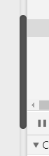


 body::-webkit-scrollbar {
            /*滚动条整体样式*/
            width: 10px;
            /*高宽分别对应横竖滚动条的尺寸*/
            height: 1px;
        }

        body::-webkit-scrollbar-thumb {
            /*滚动条里面小方块*/
            border-radius: 20px;
            box-shadow: inset 0 0 5px rgba(0, 0, 0, 0.2);
            background: #535353;
        }

        body::-webkit-scrollbar-track {
            /*滚动条里面轨道*/
            box-shadow: inset 0 0 5px rgba(0, 0, 0, 0.2);
            border-radius: 20px;
            background: #ededed;
        }
2.蓝色花纹 -小清新
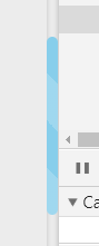
 body::-webkit-scrollbar {
            /*滚动条整体样式*/
            width: 10px;
            /*高宽分别对应横竖滚动条的尺寸*/
            height: 1px;
        }

        body::-webkit-scrollbar-thumb {
            /*滚动条里面小方块*/
            border-radius: 10px;
            background-color: skyblue;
            background-image: -webkit-linear-gradient(45deg,
                    rgba(255, 255, 255, 0.2) 25%,
                    transparent 25%,
                    transparent 50%,
                    rgba(255, 255, 255, 0.2) 50%,
                    rgba(255, 255, 255, 0.2) 75%,
                    transparent 75%,
                    transparent);
        }

        body::-webkit-scrollbar-track {
            /*滚动条里面轨道*/
            box-shadow: inset 0 0 5px rgba(0, 0, 0, 0.2);
            background: #ededed;
            border-radius: 10px;
        }
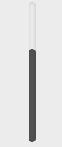
单独某个div得滚动条样式修改
<div class="test test-1">
      <div class="scrollbar"></div>
</div>
.test {
  width   : 50px;
  height  : 200px;
  overflow: auto;
  float   : left;
  margin  : 5px;
  border  : none;
  }
  .scrollbar {
  width : 30px;
  height: 300px;
  margin: 0 auto;
  }
  .test-1::-webkit-scrollbar {
  /*滚动条整体样式*/
  width : 10px;  /*高宽分别对应横竖滚动条的尺寸*/
  height: 1px;
  }
  .test-1::-webkit-scrollbar-thumb {
  /*滚动条里面小方块*/
  border-radius: 10px;
  box-shadow   : inset 0 0 5px rgba(0, 0, 0, 0.2);
  background   : #535353;
  }
  .test-1::-webkit-scrollbar-track {
  /*滚动条里面轨道*/
  box-shadow   : inset 0 0 5px rgba(0, 0, 0, 0.2);
  border-radius: 10px;
  background   : #ededed;
  }

 浙公网安备 33010602011771号