
matplotlib -> 散点图
matplotlib -> 散点图
众所周知。。Matplotlib可以画我们工作中基本的一些图列(没有营养的开场白....)
散点图是指在回归分析中,数据点在直角坐标系平面上的分布图,散点图表示因变量随自变量而变化的大致趋势,据此可以选择合适的函数对数据点进行拟合。
用两组数据构成多个坐标点,考察坐标点的分布,判断两变量之间是否存在某种关联或总结坐标点的分布模式。散点图将序列显示为一组点。值由点在图表中的位置表示。类别由图表中的不同标记表示。散点图通常用于比较跨类别的聚合数据。
--来源百度百科
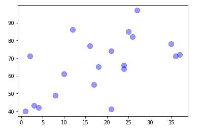
一个简单的散点图就完成了
x: x轴数据: 数据集或列表
y: y轴数据: 数据集或列表
s: 点的大小
c: 点的颜色
alpha: 点的透明图 0-1
加点难度
ax = np.random.randint(1, 40, (1, 20))
ay = np.random.randint(40, 100, (1,20))
az = np.random.randint(100,200,(1,20))
plt.scatter(x=ax, y=ay,c=az, s=100, cmap="jet", alpha=0.4)
plt.show()
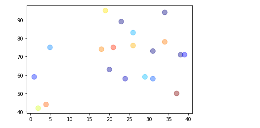
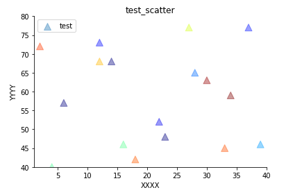
事情开始慢慢变得有意思了 上面不是说c是颜色嘛 为什么现在也可以是数据了呐[疑问]⬇
c: 可以是数据或者颜色 只不过如果是数据的话 颜色就要用另外的参数cmap
关于cmap: 网上有很多理解 解释 https://www.baidu.com/ 官方给出了一些推荐的色带⬇
cmap:
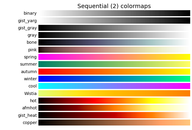
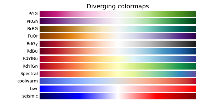

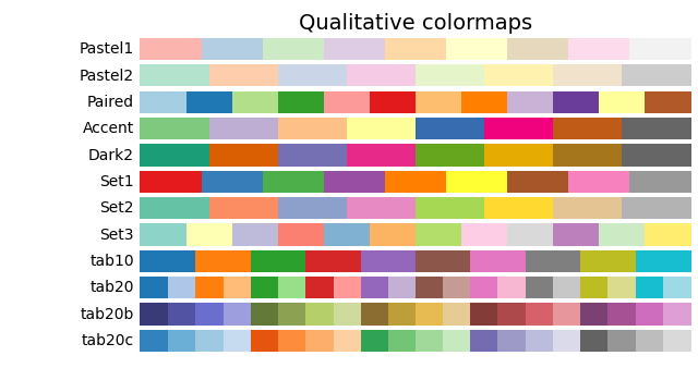
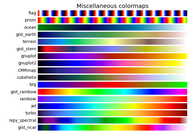
大致就是cmap="上面的色带" 官网有些详细的用发 我这里之说干货 详情移步--> https://matplotlib.org/stable/gallery/color/colormap_reference.html
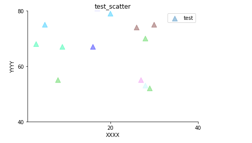
然后 一些基本操作[汗]
ax = np.random.randint(1, 40, (1, 20))
ay = np.random.randint(40, 100, (1,20))
az = np.random.randint(100,200,(1,20))
plt.scatter(x=ax, y=ay, c=az, s=100, marker = "^", cmap="jet", alpha=0.4, label="test")
plt.legend()
plt.xlabel("XXXX")
plt.ylabel("YYYY")
plt.gca().spines['top'].set_color('none')
plt.gca().spines['right'].set_color('none')
plt.title("test_scatter")
plt.ylim(40,80)
plt.xlim(1,40)
plt.show()
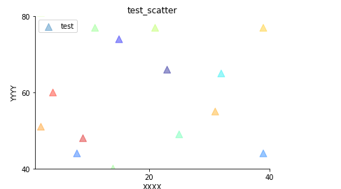
有些需求会涉及到间隔 例如x轴间隔 y轴间隔
ax = np.random.randint(1, 40, (1, 20))
ay = np.random.randint(40, 100, (1,20))
az = np.random.randint(100,200,(1,20))
plt.scatter(x=ax, y=ay, c=az, s=100, marker = "^", cmap="jet", alpha=0.4, label="test")
plt.legend()
plt.xlabel("XXXX")
plt.ylabel("YYYY")
plt.gca().spines['top'].set_color('none')
plt.gca().spines['right'].set_color('none')
plt.title("test_scatter")
plt.ylim(40,80)
plt.xlim(1,40)

major_locator = plt.MultipleLocator(20)
plt.gca().xaxis.set_major_locator(major_locator)
plt.gca().yaxis.set_major_locator(major_locator)

plt.show()
一些奇怪的需求 拼色带
import pandas as pd
import numpy as np
import matplotlib.pyplot as plt
from matplotlib import colors as cols

ax = np.random.randint(1, 40, (1, 20))
ay = np.random.randint(40, 100, (1,20))
az = np.random.randint(100,200,(1,20))
colordict = ["#B8F8FA", "#00FA9A", "#32CD32", "#00BFFF", "#0000FF", "#008000", "#EE82EE", "#6F2322", ]
map_colors = cols.ListedColormap(colordict, )
plt.scatter(x=ax, y=ay, c=az, s=100, marker = "^", cmap=map_colors, alpha=0.4, label="test")
plt.legend()
plt.xlabel("XXXX")
plt.ylabel("YYYY")
plt.gca().spines['top'].set_color('none')
plt.gca().spines['right'].set_color('none')
plt.title("test_scatter")
plt.ylim(40,80)
plt.xlim(1,40)

major_locator = plt.MultipleLocator(20)
plt.gca().xaxis.set_major_locator(major_locator)
plt.gca().yaxis.set_major_locator(major_locator)

plt.show()
matplotlib.colors 对颜色进行操作 拼接色带(非专业matplotlib 主要功能实现就OK)
16进制颜色 或其他可识别颜色皆可拼接 本质还是 数值大小==颜色深浅
还有一个重头操作曾经折磨我好长时间 colorbar
colorbar
将色带图例标注在图上
这个操作我也是摸索很久 网上不少大佬和萎大佬写的五迷三道 就怕我看懂似的 唉 所以还是自己做下总结吧
首先看下样子
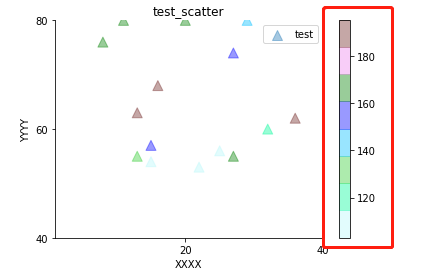
嘟~ 很简单的一个小玩意
# todo 具体实现 colorbar  plt.colorbar()
ax = np.random.randint(1, 40, (1, 20))
ay = np.random.randint(40, 100, (1,20))
az = np.random.randint(100,200,(1,20))
colordict = ["#B8F8FA", "#00FA9A", "#32CD32", "#00BFFF", "#0000FF", "#008000", "#EE82EE", "#6F2322", ]
map_colors = cols.ListedColormap(colordict, )
plt.scatter(x=ax, y=ay, c=az, s=100, marker = "^", cmap=map_colors, alpha=0.4, label="test")
plt.colorbar()
plt.legend()
plt.xlabel("XXXX")
plt.ylabel("YYYY")
plt.gca().spines['top'].set_color('none')
plt.gca().spines['right'].set_color('none')
plt.title("test_scatter")
plt.ylim(40,80)
plt.xlim(1,40)

major_locator = plt.MultipleLocator(20)
plt.gca().xaxis.set_major_locator(major_locator)
plt.gca().yaxis.set_major_locator(major_locator)

plt.show()
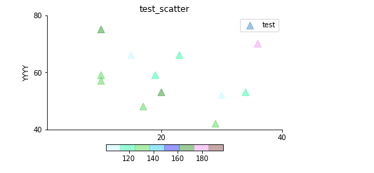
默认贴着上一个画图逻辑 会竖着立到散点图的右边 可能有些需求会要求 图例放到下边(这个东西也查了好久 毕竟刚接触 会懵逼[苦涩]) 不墨迹 参数如下 ⬇
plt.colorbar(orientation, shrink, pad, cax, ax)
orientation: 默认竖放 可改参数 ”horizontal”(默认横放 放在图的下方)
shrink: colorbar缩小比例 0-1
pad: 距离图的位置 (0.1亲测好用)
cax,ax ..... 据听说是可以调节colorbar的位置 据听说哈 不知道咋用[擦汗]
如果就这么简单就好了.. 上面完成后看一下效果
ax = np.random.randint(1, 40, (1, 20))
ay = np.random.randint(40, 100, (1,20))
az = np.random.randint(100,200,(1,20))
colordict = ["#B8F8FA", "#00FA9A", "#32CD32", "#00BFFF", "#0000FF", "#008000", "#EE82EE", "#6F2322", ]
map_colors = cols.ListedColormap(colordict, )
plt.scatter(x=ax, y=ay, c=az, s=100, marker = "^", cmap=map_colors, alpha=0.4, label="test")
plt.colorbar(orientation="horizontal",shrink=0.5,pad=0.1)
plt.legend()
plt.xlabel("XXXX")
plt.ylabel("YYYY")
plt.gca().spines['top'].set_color('none')
plt.gca().spines['right'].set_color('none')
plt.title("test_scatter")
plt.ylim(40,80)
plt.xlim(1,40)

major_locator = plt.MultipleLocator(20)
plt.gca().xaxis.set_major_locator(major_locator)
plt.gca().yaxis.set_major_locator(major_locator)

plt.show()
当然还有一些其他参数 如ticks 可以不让图例的标度按照数值c走 dd 其他参数 也可以设置 title label 等
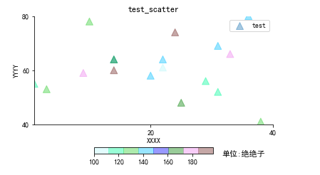
如果需要对刻度写一个单位的话 建议使用 title 下面的写法萌新就这么写就OK
plt.rcParams["font.sans-serif"] = ["SimHei"]
plt.rcParams["axes.unicode_minus"] = False
ax = np.random.randint(1, 40, (1, 20))
ay = np.random.randint(40, 100, (1,20))
az = np.random.randint(100,200,(1,20))
colordict = ["#B8F8FA", "#00FA9A", "#32CD32", "#00BFFF", "#0000FF", "#008000", "#EE82EE", "#6F2322", ]
map_colors = cols.ListedColormap(colordict, )
plt.scatter(x=ax, y=ay, c=az, s=100, marker = "^", cmap=map_colors, alpha=0.4, label="test")
cb = plt.colorbar(orientation="horizontal",shrink=0.5,pad=0.15)
cb.ax.set_title(r'单位:绝绝子', fontsize=11, x=1.25, y=-1.2)
plt.legend()
plt.xlabel("XXXX")
plt.ylabel("YYYY")
plt.gca().spines['top'].set_color('none')
plt.gca().spines['right'].set_color('none')
plt.title("test_scatter")
plt.ylim(40,80)
plt.xlim(1,40)

major_locator = plt.MultipleLocator(20)
plt.gca().xaxis.set_major_locator(major_locator)
plt.gca().yaxis.set_major_locator(major_locator)

plt.show()
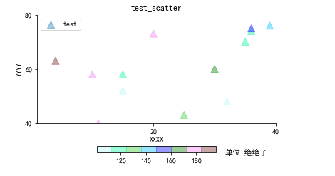
# 解决中文乱码问题
plt.rcParams["font.sans-serif"] = ["SimHei"]
plt.rcParams["axes.unicode_minus"] = False
有的小萌新刚抬着钢筋下了工地要问 为啥要用 set_title 不用set_label?
源码如是
def set_label(self, label, *, loc=None, **kwargs):
	"""
	Add a label to the long axis of the colorbar.

	Parameters
	----------
	label : str
		The label text.
	loc : str, optional
		The location of the label.

		- For horizontal orientation one of {'left', 'center', 'right'}
		- For vertical orientation one of {'bottom', 'center', 'top'}

		Defaults to :rc:`xaxis.labellocation` or :rc:`yaxis.labellocation`
		depending on the orientation.
	**kwargs
		Keyword arguments are passed to `~.Axes.set_xlabel` /
		`~.Axes.set_ylabel`.
		Supported keywords are *labelpad* and `.Text` properties.
	"""
	if self.orientation == "vertical":
		self.ax.set_ylabel(label, loc=loc, **kwargs)
	else:
		self.ax.set_xlabel(label, loc=loc, **kwargs)
	self.stale = True
if self.orientation == "vertical": self.ax.set_ylabel(label, loc=loc, **kwargs)
嗷?(根本没有小萌新 就是我[苦涩])
如果用set_label的 只可以在x轴方向移动 y轴?想到不要想
cb.ax.set_title(r'单位:绝绝子', fontsize=11, x=1.25, y=-1.2)
fontsize: title的字体大小
x: x轴方向 +-float or +=-int
y: y轴方向 +-float or +=-int
剩下就自己摸索调整吧
忘了点事 可以会有的需求吧
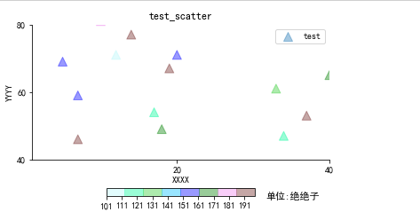
我要我的数值对标颜色范围! 必须马上现在
再次拼接色带
plt.rcParams["font.sans-serif"] = ["SimHei"]
plt.rcParams["axes.unicode_minus"] = False
ax = np.random.randint(1, 100, (1, 80))
ay = np.random.randint(1, 100, (1, 80))
az = np.random.randint(100,200,(1,80))
colorlevel = [100, 120, 121, 130, 131, 140, 141, 160, 181.0, 200.0 ]
colordict = ["#B8F8FA", "#00FA9A", "#32CD32", "#00BFFF", "#0000FF", "#008000", "#EE82EE", "#6F2322", ]
map_colors = cols.ListedColormap(colordict, )
norm = cols.BoundaryNorm(colorlevel, map_colors.N, )


plt.scatter(x=ax, y=ay, c=az, s=100, marker = "^", cmap=map_colors, alpha=0.4, label="test")
cb = plt.colorbar(orientation="horizontal",shrink=0.5,pad=0.15)
cb.ax.set_title(r'单位:绝绝子', fontsize=11, x=1.25, y=-1.2)
plt.legend()
plt.xlabel("XXXX")
plt.ylabel("YYYY")
plt.gca().spines['top'].set_color('none')
plt.gca().spines['right'].set_color('none')
plt.title("test_scatter")
plt.ylim(40,80)
plt.xlim(1,40)

major_locator = plt.MultipleLocator(20)
plt.gca().xaxis.set_major_locator(major_locator)
plt.gca().yaxis.set_major_locator(major_locator)

plt.show()
上面写的ticks 可以加入进来
plt.rcParams["font.sans-serif"] = ["SimHei"]
plt.rcParams["axes.unicode_minus"] = False
ax = np.random.randint(1, 100, (1, 80))
ay = np.random.randint(1, 100, (1, 80))
az = np.random.randint(100,200,(1,80))
colorlevel = [100, 120, 121, 130, 131, 140, 141, 160, 181.0, 200.0 ]
colordict = ["#B8F8FA", "#00FA9A", "#32CD32", "#00BFFF", "#0000FF", "#008000", "#EE82EE", "#6F2322", ]
map_colors = cols.ListedColormap(colordict, )
norm = cols.BoundaryNorm(colorlevel, map_colors.N, )


plt.scatter(x=ax, y=ay, c=az, s=100, marker = "^", cmap=map_colors, alpha=0.4, label="test")
cb = plt.colorbar(orientation="horizontal",shrink=0.5,pad=0.15,ticks=[i for i in range(1,300,10)])
cb.ax.set_title(r'单位:绝绝子', fontsize=11, x=1.25, y=-1.2)
plt.legend()
plt.xlabel("XXXX")
plt.ylabel("YYYY")
plt.gca().spines['top'].set_color('none')
plt.gca().spines['right'].set_color('none')
plt.title("test_scatter")
plt.ylim(40,80)
plt.xlim(1,40)

major_locator = plt.MultipleLocator(20)
plt.gca().xaxis.set_major_locator(major_locator)
plt.gca().yaxis.set_major_locator(major_locator)

plt.show()
丑了点 理解就OK。。
仅供参考

 浙公网安备 33010602011771号